
In October 2020, the web platform used for Tech News and the Excel Community was changed. Although there are many clear advantages of the new platform, one downside is the splitting of the content for both communities between current articles and the very extensive archive of articles built up over many years. The faculty team have sought to alleviate the problems by providing a tabular index to over 2,000 archive articles.
It is this index that forms the basis of our project. Given that we are the Excel Community, it seemed only right to consider the use of Excel as a method of making our archive of articles far more useful to our members. Excel and Power Query do have a part to play, but the majority of the project will be based on the freely available Excel spin-off product: Power BI Desktop. If you haven't already explored Power BI, you can find out more about it, and download the desktop edition for free, at:
Our Power BI report is based on combining the separate index pages for Tech News and the Excel Community to create a comprehensive table of links to the underlying articles. Because the archive is now fixed, this doesn't involve creating any dynamic link to the index pages on the Internet. Instead, we have just copied the index tables and pasted them into an Excel workbook. This also makes it possible to add columns to the original tables to hold information that will make the archive more accessible and more useful: for example, keywords and summaries to facilitate searching the archive.
We will be making the various project stages accessible as we go, meaning that you can add your own information or categorisations.
The story so far:
Part 1 – from web page to Excel Table
Part 2 – from Excel Table to web page
Spreadsheet Knowledge Base launches
Power BI report
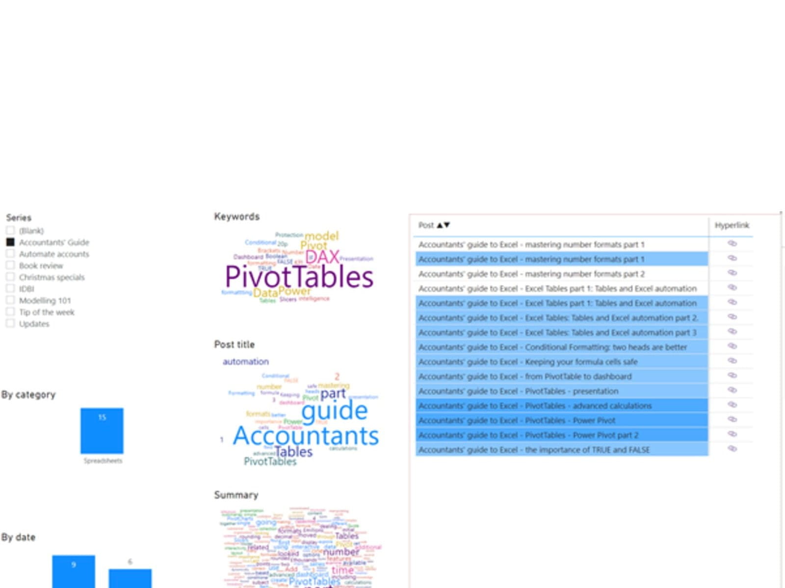
So far in Power BI, we have just linked to the combined table in the Excel workbook and added our Post field to the report which created a 'Table' visualization. We then added our additional, Hyperlink, column to the table and changed the Table properties to show that new column as a link icon rather than a long text URL. This Table will become the focus of our report, showing the list of posts that match different filter criteria and displaying further information about the contents of each post.
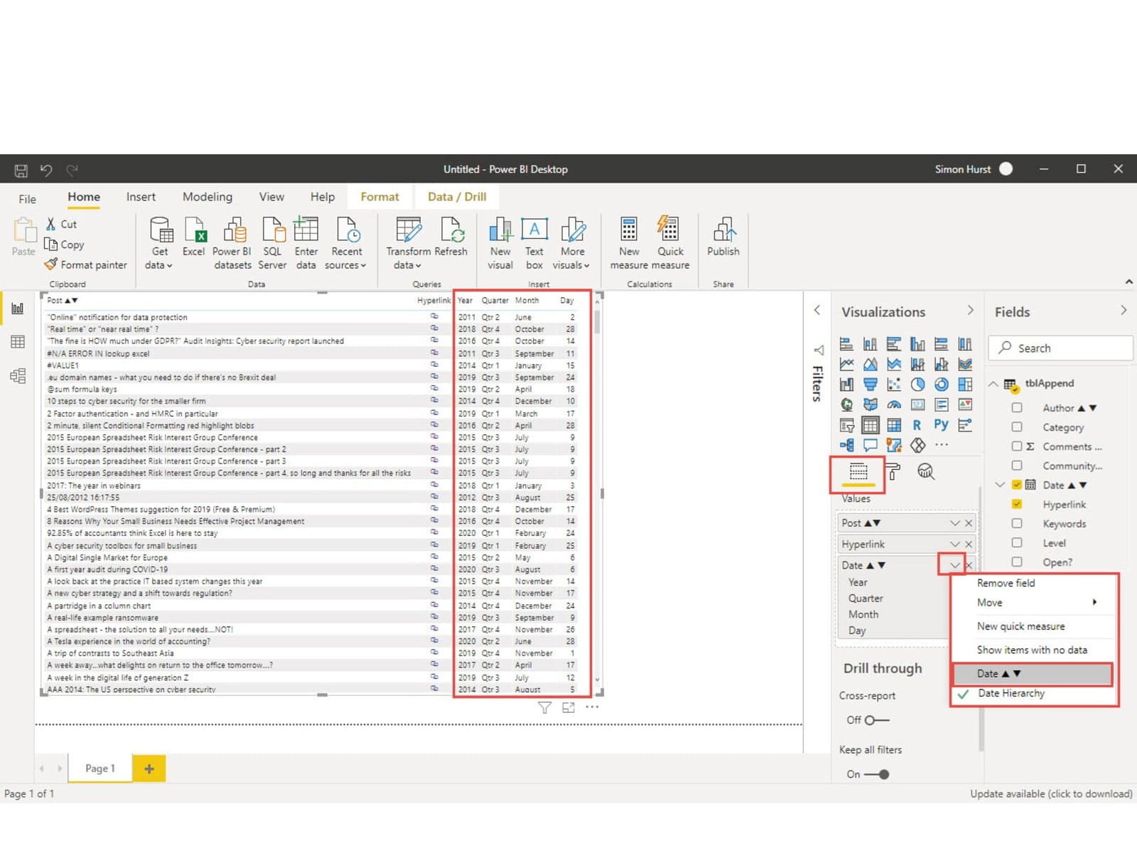
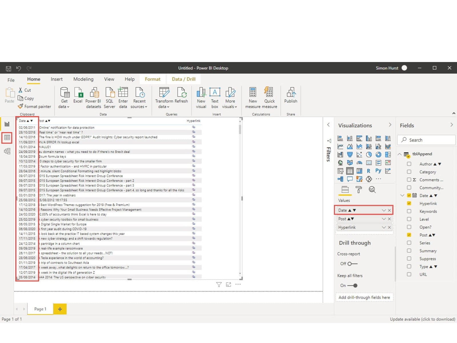
First of all, we will add a date column. This is not quite as straightforward as just selecting the existing Table and then selecting the check box next to the date field in the Fields pane. Doing this will, by default, add a full date hierarchy to our report. Instead of such a hierarchy, we just want a very narrow column that gives us the ability to sort our Table by date. Accordingly, we go to the Date dropdown in the Values area of the Visualizations pane and choose Date, rather than the existing Date Hierarchy:
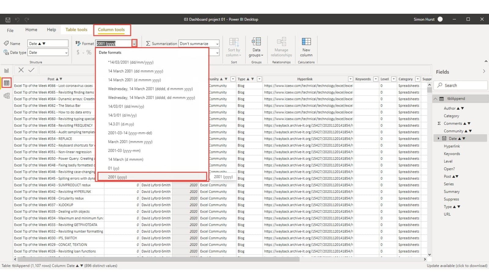
Here, we have clicked on the Date column header to select the column and then used the Format dropdown to choose the required date format.
It is now possible just to click on the Date header to sort our list of posts in Ascending or Descending date order.
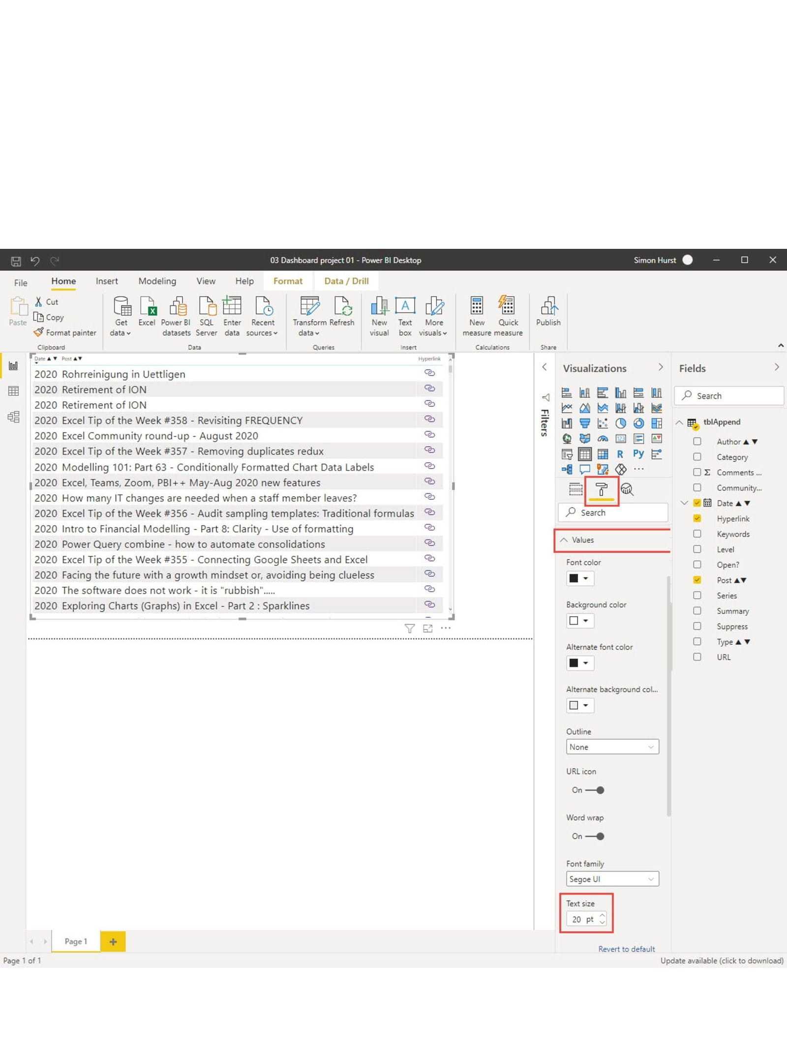
Next, we will look at formatting our Visualization. The Visualizations pane displays the properties of the currently selected Visualization. Properties are divided into three categories Fields, Format and Analytics, and the pane displays the properties for whichever of those categories is chosen by using the icons at the top of the properties section of the pane. We have already used the Fields properties to change the way our fields are displayed and the order of columns. To change the formatting, we click on the middle, Format, icon to display a list of attributes relevant to the type of visual in use. Clicking on an attribute heading then displays or hides the list of detailed properties for that attribute. In this example, we have selected Values to change the formatting of the contents of our Table columns. We have then increased the font size to 20 pt:
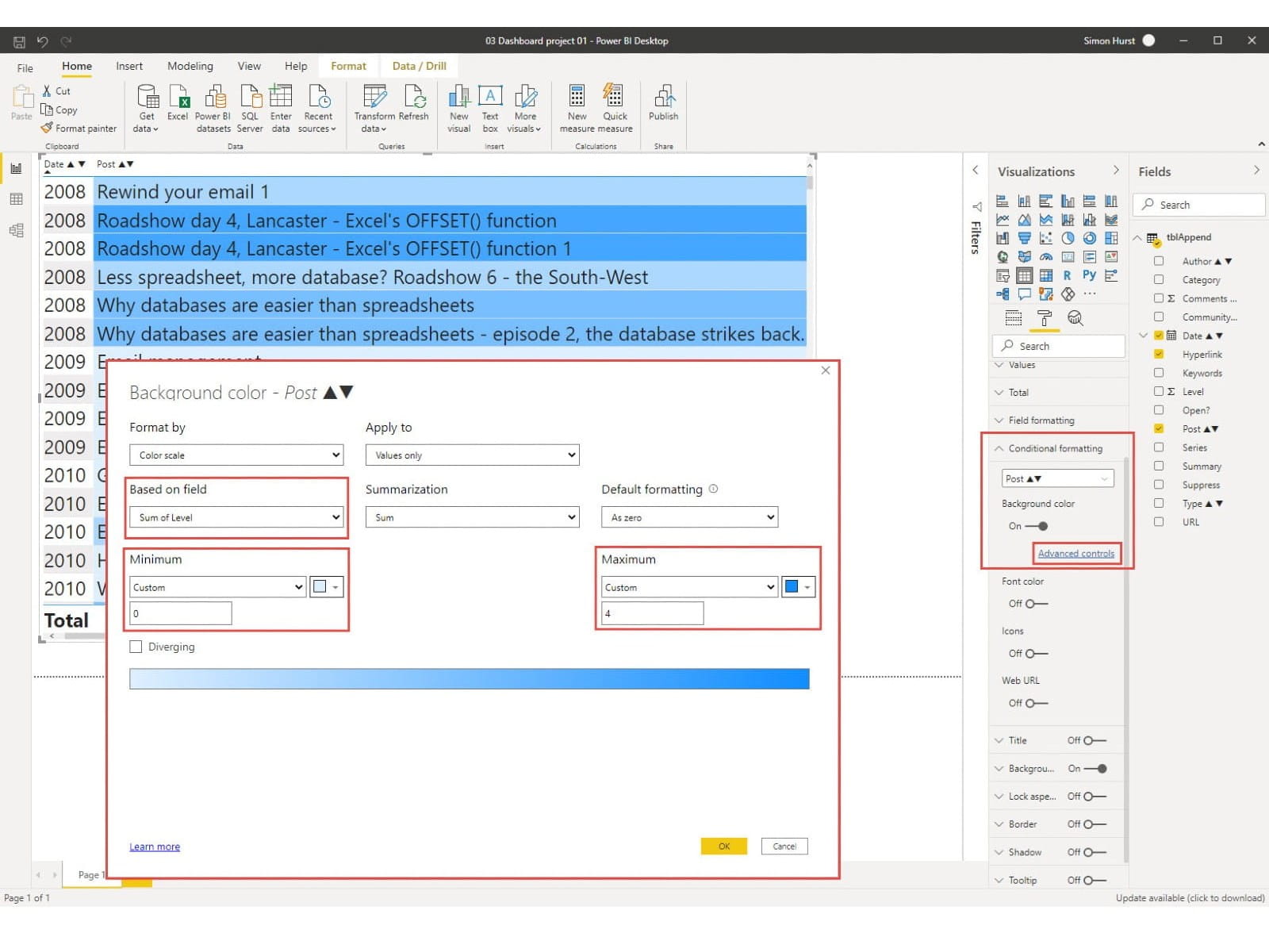
This displays a screen similar to the Excel Conditional Formatting dialog. We have chosen Level in the 'Based on field' dropdown. Note that your Level field is likely to have a text, rather than number, data type which will only allow you to use Count of Level. We can change this by using the Table view, in the same way that we did when we changed the format of the Date field. In this case, we change the Data type to Whole number, rather than changing the format. Once the Level data type is set to a number, we should be able to select Level as a sum from the 'Based on field' dropdown. We have also changed both the Minimum and Maximum values to be Custom entries of 0 and 4 respectively to include our 4 levels from 1-4 and to use 0 to show where we haven't yet allocated a Level value.
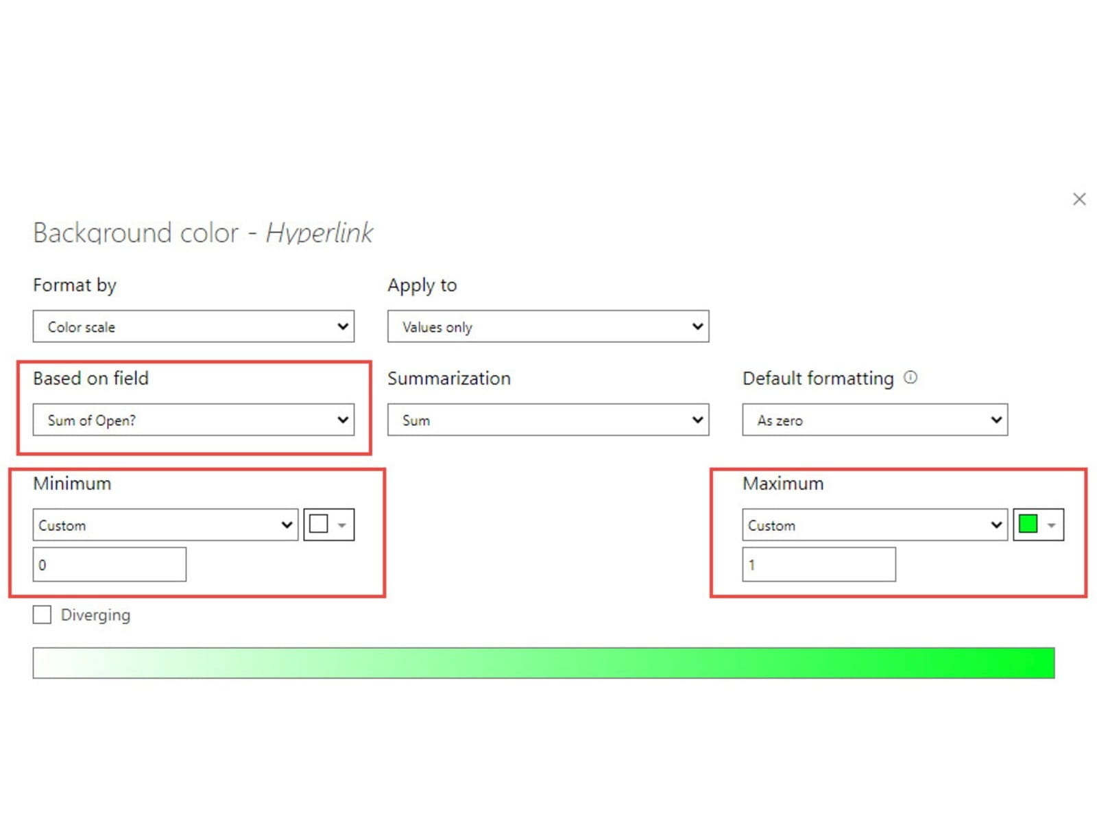
We can use an almost identical technique to set the data type of our Open? field to a whole number and use it to show posts that are open to all, with a green background:
Next time, we will start to add other Visualizations to our report to help us unearth the many gems within our archive treasure trove.
We have embedded the current stage of project development below:
At the moment, it is still very much a work in progress and any comments on useful ways in which we could provide access to the community content would be very welcome:
excel@icaew.com
Excel community
This article is brought to you by the Excel Community where you can find additional extended articles and webinar recordings on a variety of Excel related topics. In addition to live training events, Excel Community members have access to a full suite of online training modules from Excel with Business.

Archive and Knowledge Base
This archive of Excel Community content from the ION platform will allow you to read the content of the articles but the functionality on the pages is limited. The ION search box, tags and navigation buttons on the archived pages will not work. Pages will load more slowly than a live website. You may be able to follow links to other articles but if this does not work, please return to the archive search. You can also search our Knowledge Base for access to all articles, new and archived, organised by topic.
