
In October 2020, the web platform used for Tech News and the Excel Community was changed. Although there are many clear advantages of the new platform, one downside is the splitting of the content for both communities between current articles and the very extensive archive of articles built up over many years. The faculty team have sought to alleviate the problems by providing a tabular index to over 2,000 archive articles.
It is this index that forms the basis of our project. Given that we are the Excel Community, it seemed only right to consider the use of Excel as a method of making our archive of articles far more useful to our members. Excel and Power Query do have a part to play, but most of the project will be based on the freely available Excel spin-off product: Power BI Desktop. If you haven't already explored Power BI, you can find out more about it, and download the desktop edition for free.
Our Power BI report is based on combining the separate index pages for Tech News and the Excel Community to create a comprehensive table of links to the underlying articles. Because the archive is now fixed, this doesn't involve creating any dynamic link to the index pages on the Internet. Instead, we have just copied the index tables and pasted them into an Excel workbook. This also makes it possible to add columns to the original tables to hold information that will make the archive more accessible and more useful: for example, keywords and summaries to facilitate searching the archive.
We will be making the various project stages accessible as we go, meaning that you can add your own information or categorisations.
The story so far:
Part 1 – from web page to Excel Table
Part 2 – from Excel Table to web page
Spreadsheet Knowledge Base launches
Power BI report
Before going any further with the use of Power BI, I would like to admit that I am far from being a Power BI expert. Although I have been using Excel for decades, Power BI is a more recent development and there is a lot to learn. In addition, Power BI is subject to frequent updates and changes so there are always new and changed features to keep up to date with. Also, there are at least two main ways to arrive at Power BI – either as an extension to existing Excel skills or from a Business Intelligence/Data Analytics background. In this series, it is very much the Excel route that we are concentrating on; those with Business Intelligence skills might well approach the project in a completely different way.
So far in Power BI, we have linked to the combined table in the Excel workbook and created a 'Table' visualisation with the post title, date of posting and a clickable Hyperlink column with each hyperlink displayed as a link icon rather than a long text URL. We also used conditional formatting to change the colour of our post title field according to the proficiency level and the background of our hyperlink field according to whether the link is open or restricted.
This time, we are going to use the Tooltip feature to display a summary of each article when the user hovers over it in the table. The summary comes from one of the additional columns that we have added to our Excel Tables. This column allows us to paste in a suitable paragraph or other section from each underlying article, or to type some freeform text to act as our summary.
We can access the Tooltip settings for our Power BI table visualisation using the Format section of the Visualisations pane. As well as changing the actual formatting of the Tooltip, we can also choose the Type of Tooltip to use. The default Type will show a vertical list of the fields displayed in our table:
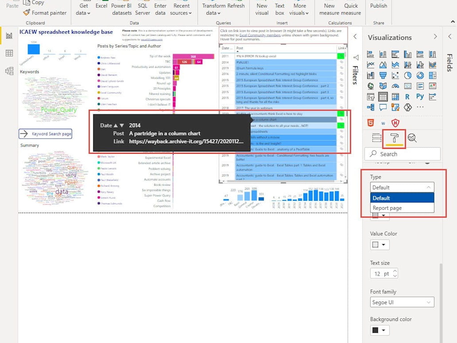
For this table, the default Tooltip is not particularly useful as, apart from the full text of the hyperlink, it just shows the same information as the table row. We want to use the Tooltip to display our Summary field instead. We can do this by changing the Type from 'Default' to 'Report page' and then referring to a particular page in our report that is designed to display our Summary field.
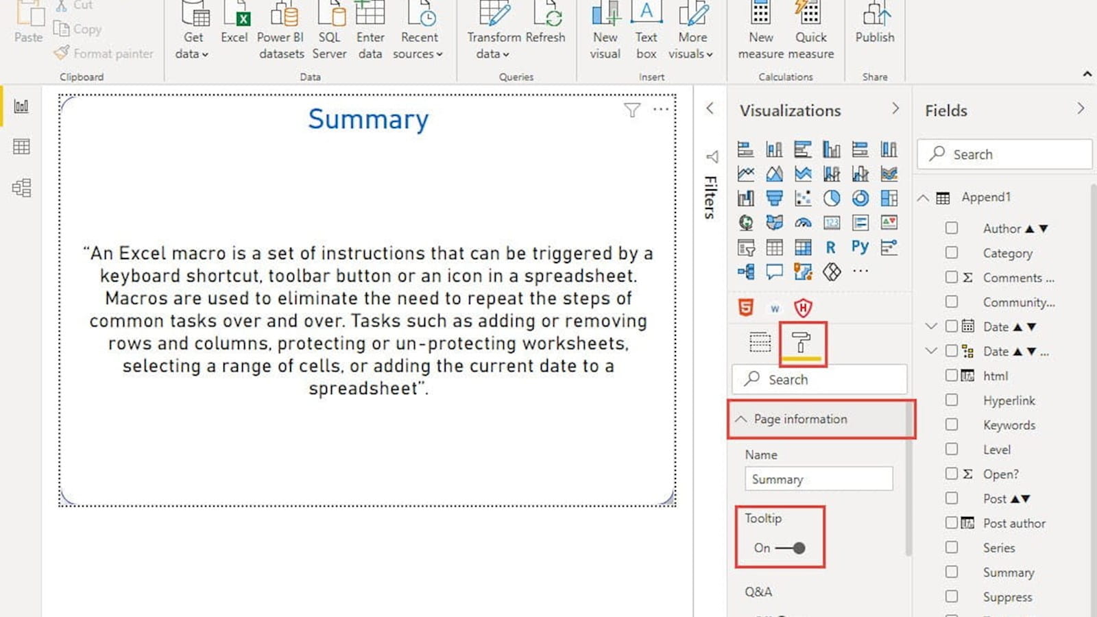
We have set up a new page called Summary, added a 'Card' visualisation to our new page and then just added the Summary field to the visualisation to display the Summary text. We need to set this report page up as an available Tooltip page by using the Format section of the Visualisations pane again, but this time without selecting our visualisation, so that we are looking at the formatting of our entire page. We can then click on the Page information dropdown and turn Tooltip on:
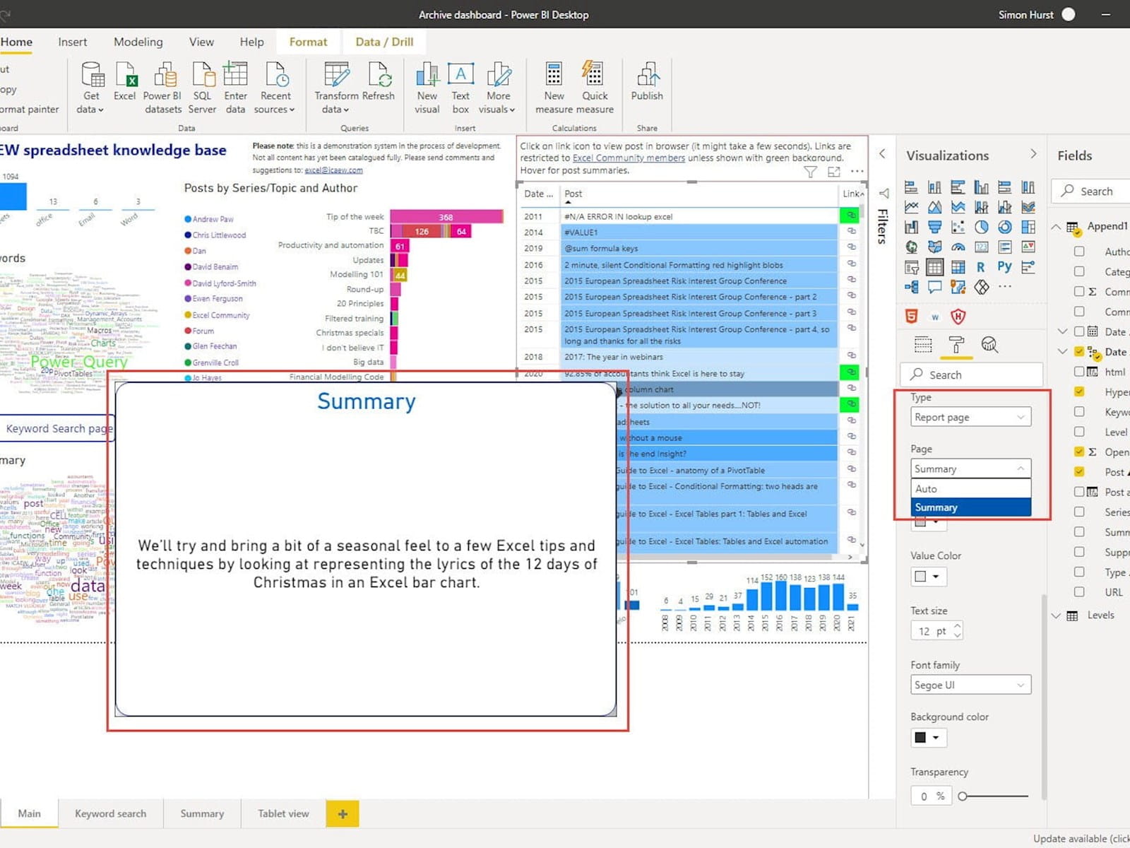
Now, for any visualisation, when we choose 'Report page' for the Tooltip dropdown, we can allocate our Summary page as the Tooltip:
We have embedded the current stage of project development below:
The 'Open in full-screen mode' icon in the bottom right-hand corner of the embedded report should show the contents at a more readable size with the Escape key returning you to the post.
At the moment, it is still very much a work in progress and any comments on useful ways in which we could provide access to the community content would be very welcome:
Excel community
This article is brought to you by the Excel Community where you can find additional extended articles and webinar recordings on a variety of Excel related topics. In addition to live training events, Excel Community members have access to a full suite of online training modules from Excel with Business.

Archive and Knowledge Base
This archive of Excel Community content from the ION platform will allow you to read the content of the articles but the functionality on the pages is limited. The ION search box, tags and navigation buttons on the archived pages will not work. Pages will load more slowly than a live website. You may be able to follow links to other articles but if this does not work, please return to the archive search. You can also search our Knowledge Base for access to all articles, new and archived, organised by topic.
