
Have you ever wanted to organise your risks and consequences based on the priority of the problem likely to occur and its damage? Across his next two articles, Liam Bastick will introduce you to a Risk Bubble chart which helps you to keep track of the likelihood of any given problem, the consequences the problem might cause and the size of the said problem.
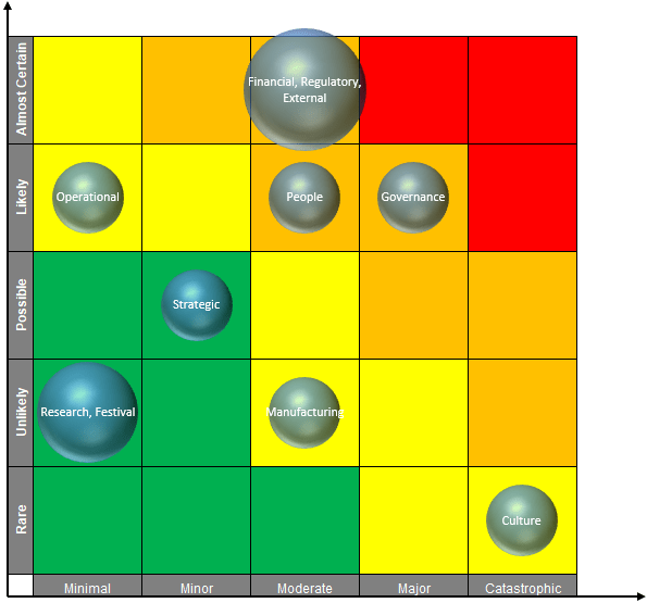
This chart categorises types of risk in two dimensions, i.e. both the impact of the risk and the likelihood of it occurring. The size of the bubble here simply shows how many categories meet the same criteria, but this could be replaced by a monetary value impact, the number of customers affected, etc. And yes, I do appreciate that using bubbles (circles) is not the best way to depict the number of risk types due to the area of a circle being proportional to the square of its radius! The aim of this article is not to defend such practice, but to show how to create such a chart given they are used for risk assessment / analysis. It is often used to complement financial modelling.
We’ll build up the chart in stages. A key element of this chart is the risk input table, which is automatically updated based upon your input(s) and the Risk Bubble chart. To assist us, there are a few key inputs we will be using here. The first table we have is a table we shall name the LU_Matrix (i.e. the “Look Up Matrix”), using Insert -> Table (CTRL + T) viz.
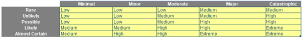
In this Table, we will name the row headings (in grey) as LU_Likelihood and the column / field headings (also in grey) as LU_Consequences. With this input, we can create a risk table that changes colour automatically.
The next input we need is the risk category table which determines the likelihood and consequence of a risk. Therefore, we will have the following table:
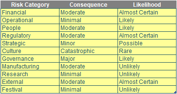
We name this table Risk_Category.
In this table, we can enter the Risk Category, Consequence and Likelihood here. This input will be used to make the Risk Bubble chart but we going to refine this data for it to be usable.
With all these inputs available, the question now is: how do we make the Risk Bubble chart? Well, let’s get started with the risk table…
Risk Table
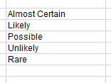
The first step is to construct the axis for this chart. For this task, we will employ the COUNTA, the SEQUENCE and the INDEX functions. What the COUNTA do is, as you guessed it, “count” every cell that is not blank. Therefore, we will count the number of the Likelihood categories:
=COUNTA(LU_Likelihood)
The output for this function will be five [5] as we have five likelihood categories in our example. Next, we need to generate a sequence of numbers which we will use the SEQUENCE function here. Then, we will wrap up this formula inside the SEQUENCE functions:
=SEQUENCE(COUNTA(LU_Likelihood))
What this will do is it will generate an array from one [1] to five [5]:

However, we want this array to generate in reverse order which is five to one. Hence, assuming you have dynamic arrays available in your version of Excel, we alter our formula as follows:
=SEQUENCE(COUNTA(LU_Likelihood),,COUNTA(LU_Likelihood),-1)
The third argument of the SEQUENCE function will specify the location we will start at and the fourth argument will specify the amount of increment for each subsequent value. This will give us the following (as before):

Alternative formulae may generate the same desired result.
Finally, we apply our INDEX function here to make the y-axis (vertical, or dependent, axis) of the chart:
=INDEX(LU_Likelihood,SEQUENCE(COUNTA(LU_Likelihood),,COUNTA(LU_Likelihood),-1))
The INDEX function will take the fifth item of the LU_Likelihood and put it on the top row, the fourth item put on the second row, and we repeat this process until we have the first item in the fifth row. After entering this formula into a cell in Excel this will have the following visual:
Then, we will go one cell below and go one cell to the right of the word “Rare” here to enter our second formula:
=LU_Consequences
After entering the formula in that cell (again, assuming you have Dynamic Arrays in your version of Excel), we will have the following visual:
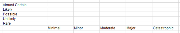
We applied the format here for a better looking (autofitting both the column widths and the row heights):
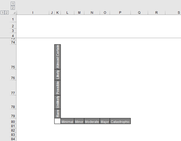
Assuming the grid is positioned as in the graphic (above), in cell L75, we will enter the following formula and populate this formula to the entire table:
=INDEX(LU_Matrix[[Minimal]:[Catastrophic]], MATCH($K75,LU_Likelihood,0), MATCH(L$80,LU_Consequences, 0))
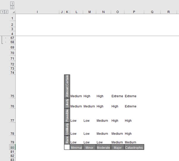
These MATCH functions will try to match the row position of the item on the left of the LU_Matrix and the column position of the item on the bottom of the LU_Matrix. Then the INDEX function will return the item in the exact row and column that we match on the LU_Matrix. After entering the formula and populating the formulate we will have the following visual:
To colour the inner region of the chart we will use conditional formatting. First, we select all the inner regions of the chart and select Conditional Formatting -> Highlight Cells Rules -> ‘Equal To…’:
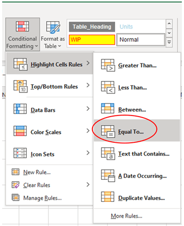
After selecting ‘Equal To…’ the following box will appear:
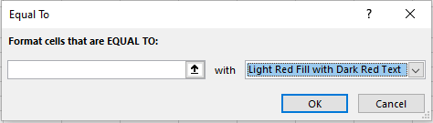
In the first box, we will put Low and in the drop-down box we will select ‘Custom Format…’:
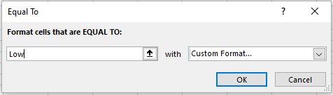
For the Custom Format, we choose the colour green for the font and the cell colour
We repeat this process for ‘Medium’, ‘High’ and ‘Extreme’. For ‘Medium’, we use the colour yellow, ‘High’, we’ll use the colour orange and for ‘Extreme’, we will use the colour red. After applying the conditional formatting, we will have the following visual:
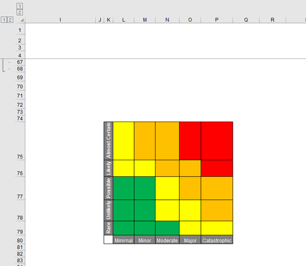
We then move this table and then resize this table to 100 pixels for the height and the width, we will have the following visual:
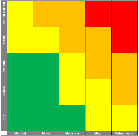
We then add two [2] axis arrows here for visual effect:
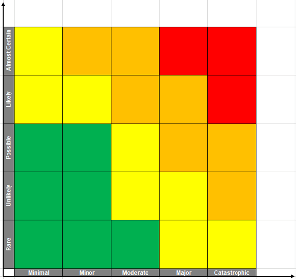
And that’s it, we have a colourful risk table (i.e. the more the likelihood increases and the consequence becomes risky, so will the colour become “more dangerous”).
Next time, we will create the bubbles to put on this chart and you’ll see the finished product in action.
Archive and Knowledge Base
This archive of Excel Community content from the ION platform will allow you to read the content of the articles but the functionality on the pages is limited. The ION search box, tags and navigation buttons on the archived pages will not work. Pages will load more slowly than a live website. You may be able to follow links to other articles but if this does not work, please return to the archive search. You can also search our Knowledge Base for access to all articles, new and archived, organised by topic.
