
Hello all and welcome back to the Excel Tip of the Week! This week, we have Creator post in which we’re taking a look at some options for how to lay out your PivotTables.
How to design your PivotTable
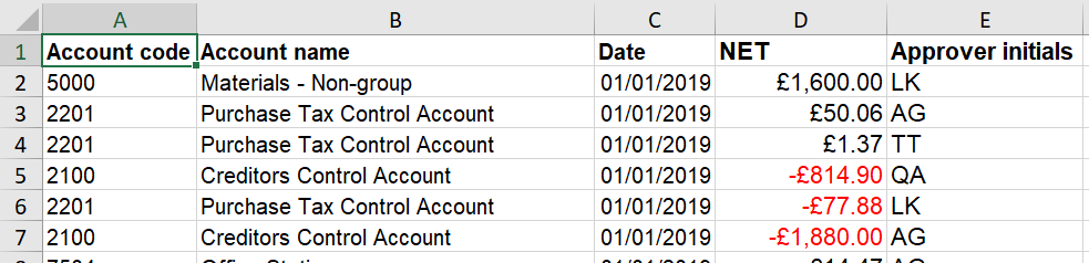
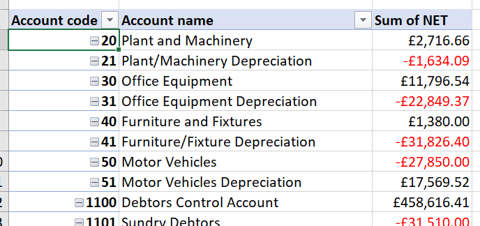
We are going to use the following dataset as our example:
When we create our PivotTable, we have a few areas where we can slot in the fields from the source data that we want to use:
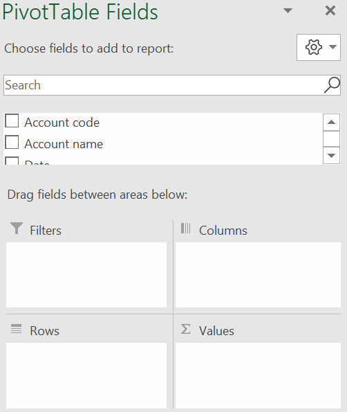
The basic options we have are to decide where each field from the source data shows up. As a reminder, the ways to include fields are:
- Filters – decide which items in the source data are used in the pivot at all
- Rows/Columns – labels; each unique value is shown once
- Values – data; summarised into a single value with a method of calculation we specify
For any given summary, the only design decision we really have at this stage is whether to put things as row labels or column labels. This is driven by preference, but in general I would say to use row labels for fields with lots of different values, and columns only for fields with a small number. We don’t want the user to have to scroll in two directions if possible as this makes the pivot very hard to read.
Here’s a simple design for a possible report pivot:
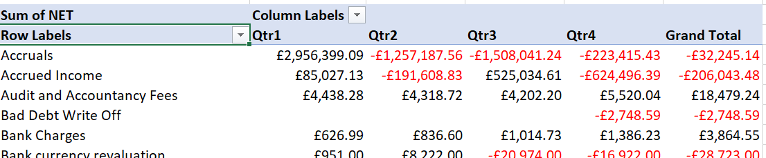
Here we have used the Account names field as a row label, a grouped version of the Date field as a column label, and the NET field as the values.
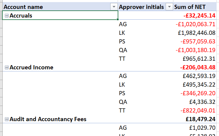
Things get more interesting however if we choose to include multiple row labels. Taking the dates out for a moment, here’s a look at how adding the Approver initials as a secondary row label looks:
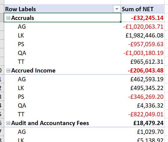
We see each Account name, with a subtotal at the top, followed by a listing of each approver and their individual total. Note that all the labels appear in a single column.
Incidentally, you can swap the order of the fields in the above menu to reverse the hierarchy, i.e. to make a listing of approvers broken down by account names instead of vice versa.
Shaking up the layout options
If you don’t like the default layout option, you actually have quite a lot of control over it – from the special PivotTable Design ribbon menu:
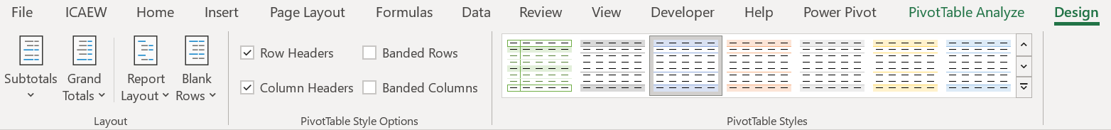
This is one of those special contextual menus that only appears while you have the pivot selected. There are some Styles options that affect the colouring over on the right, but we’re going to focus on the first box of options, the Layout options.
Subtotals
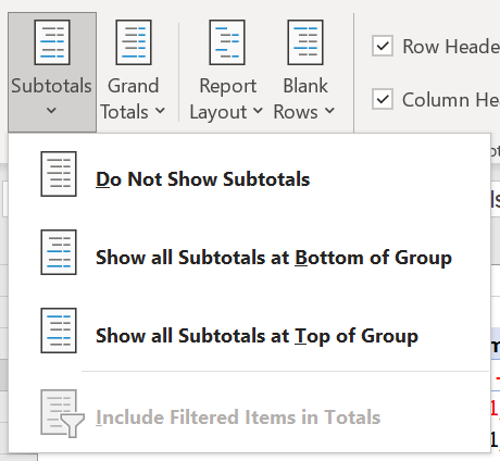
This lets you decide if group-by-group subtotals are shown at all, and if so where they appear relative to the group.
“Include Filtered Items in Totals” is greyed out here because I didn’t choose to add my data to Excel’s data model when creating my pivot; if you do use that option, then that button would allow your totals to always reflect the total of the entire group, even if a filter is applied.
Grand Totals
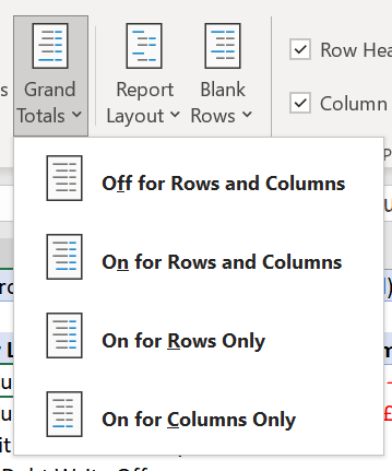
This is pretty self-explanatory. Turning off grand totals can be a real benefit for busier PivotTables, or in cases where a summary function is being used where grand totals don’t really make sense (like an average).
Report Layout
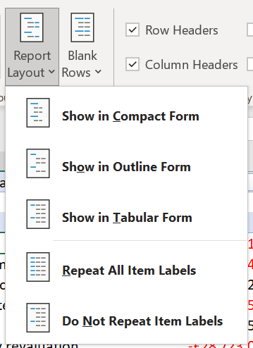
Here’s the real value option. “Compact form” is the Excel default, showing all layers of row labels in a single column.
Here’s our same example from before in Outline form:
And again in Tabular form:
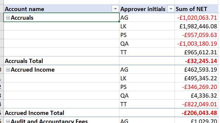
In both these cases, the two layers of row labels are each shown in their own column (if you’ve been using PivotTables for a long time, this might be familiar as the original layout used by PivotTables).
Depending on the situation, this layout can be clearer, or it can be busier and more clunky. But knowing where the option to switch lives is definitely worth it, so you can experiment as appropriate.
The other options on this menu let you decide whether the higher-order row labels are repeated for each subsequent row or (as we’ve done above) only included once.
Blank Rows
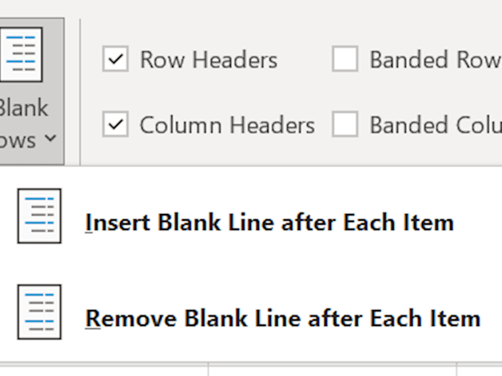
This rather esoteric option lets you space out your data, if you really want to:
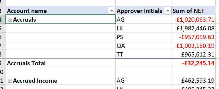
I personally think this is a big waste of space, but it’s there if you want it.
Combining all these options can be very powerful – for example, if we want to show the account codes as well as the account names, we can do that by using a Tabular layout, and removing the subtotals to prevent duplication:
This rather esoteric option lets you space out your data, if you really want to:
Finally, it’s worth noting that from Excel 2019 onwards, you can actually update which layout settings are used in your PivotTables by default, from File => Options => Data => Edit Default Layout:
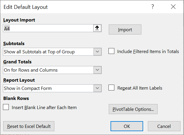
You can even import the settings from a pivot that you got just the way you want it, to be reused for later.
Related resources
- Excel Tips and Tricks #506: Creating a single master list after merging data
- Excel Tips and Tricks #505 – 3 ways of converting US Dates into UK formats
- Excel Tips and Tricks #504 - Accessing accessibility checkers for good spreadsheet practice
- Excel Tips and Tricks #503 – Printing under pressure, super quick presentation tips
- Excel Tips and Tricks #502
Search the Excel Community archive
This archive of Excel Community content from the ION platform will allow you to read the content of the articles but the functionality on the pages is limited. The ION search box, tags and navigation buttons on the archived pages will not work. Pages will load more slowly than a live website. You may be able to follow links to other articles but if this does not work, please return to the archive search. You can also search our Knowledge Base for access to all articles, new and archived, organised by topic.

