
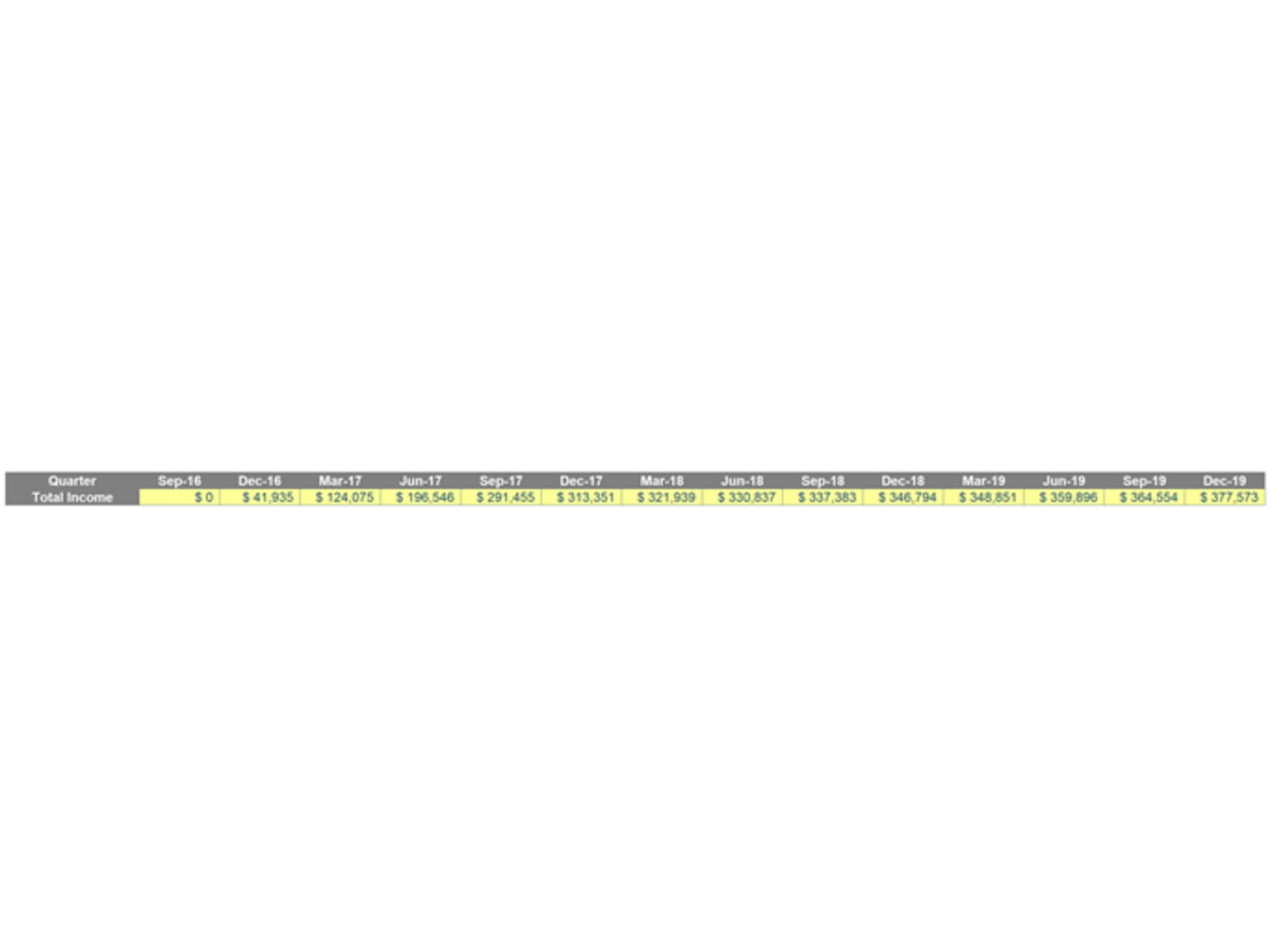
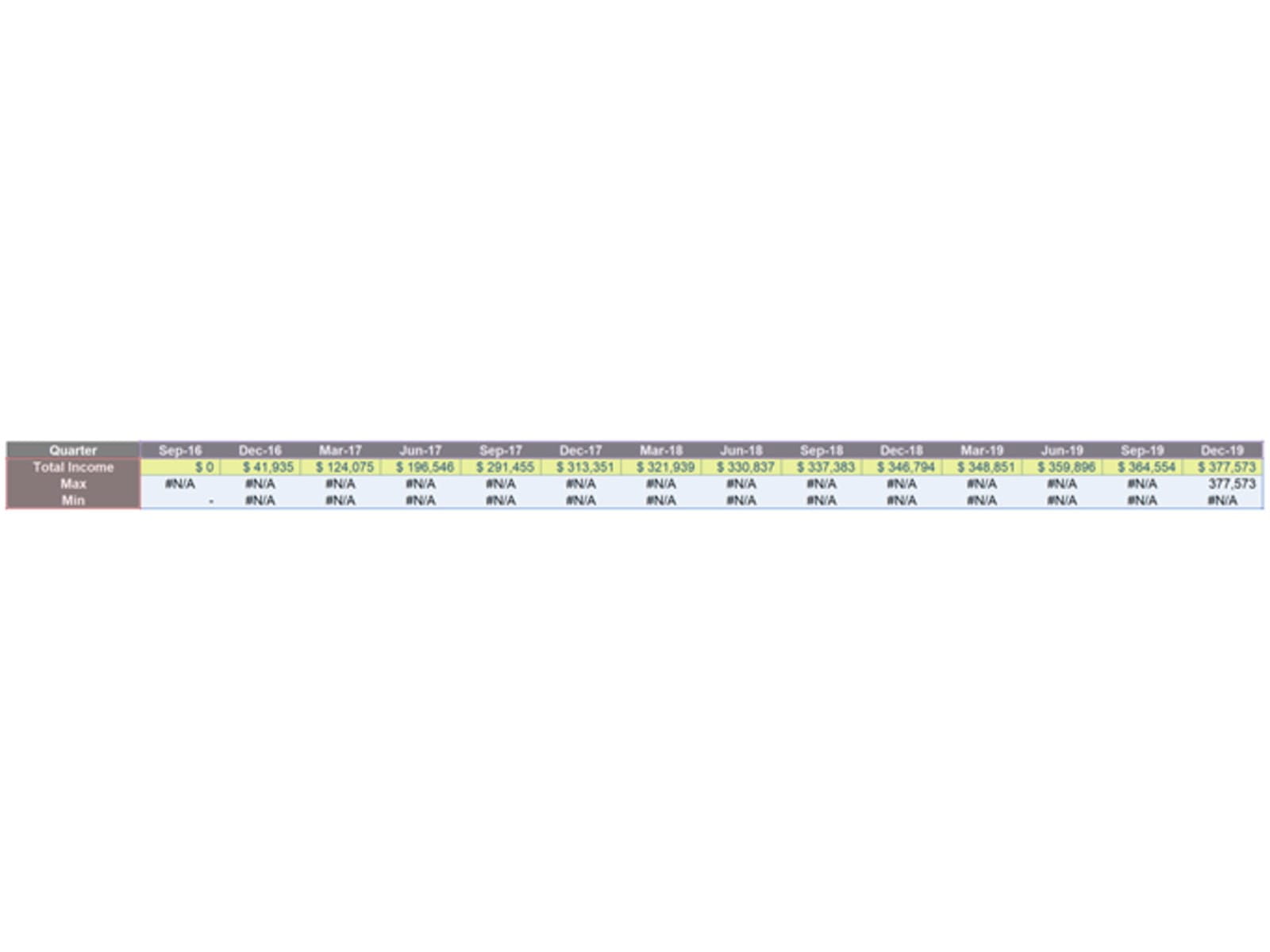
When creating financial models, charts are often an effective way to present data. Sometimes, you might wish to highlight specific data points, in order to emphasise them. For example, I have the following historical data for income for a company, summarised quarterly:
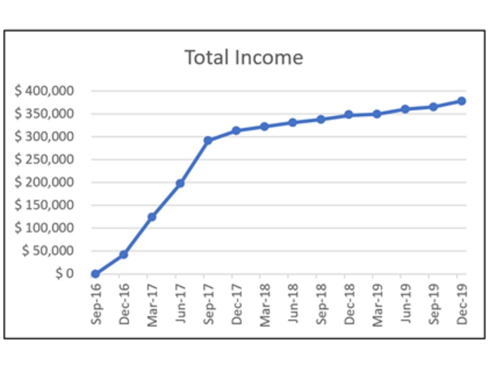
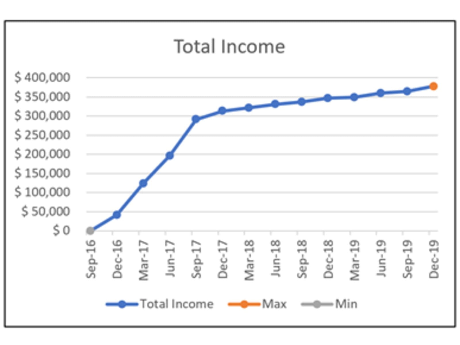
From the provided data, I plot a Line Chart such as the one below, which has a clear minimum and maximum in Sep-16 and Dec-19, respectively:
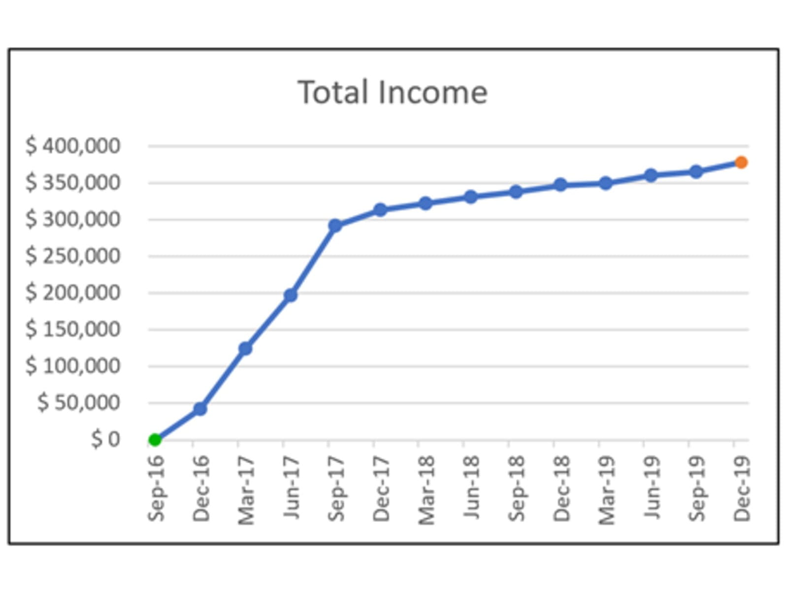
If I wish to highlight these points on the graph, it would be easy enough simply to highlight them and change the format of the points, e.g.
But what if the data changes? I would have to go back and edit the chart points each time there is a new maximum and minimum point. This is not the way to do it!
In this situation, let’s create dynamic highlights for the chart. To do that, I am going to use two “helper” data series: one series is to calculate the maximum and the other, the minimum (surprise, surprise):
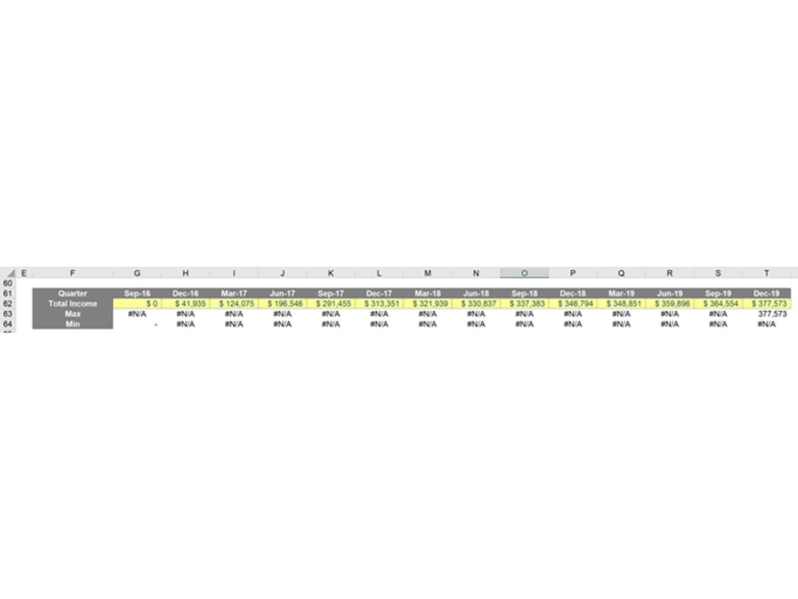
The ‘Total Income’ series represents the original series data that I used to construct the chart. Formulae are used to construct the Max and Min series; the Max series is calculated with the following formula:
=IF(G15=MAX($G15:$T15),G15,NA())
The Min series is calculated with this formula:
=IF(G15=MIN($G$15:$T$15),G15,NA())
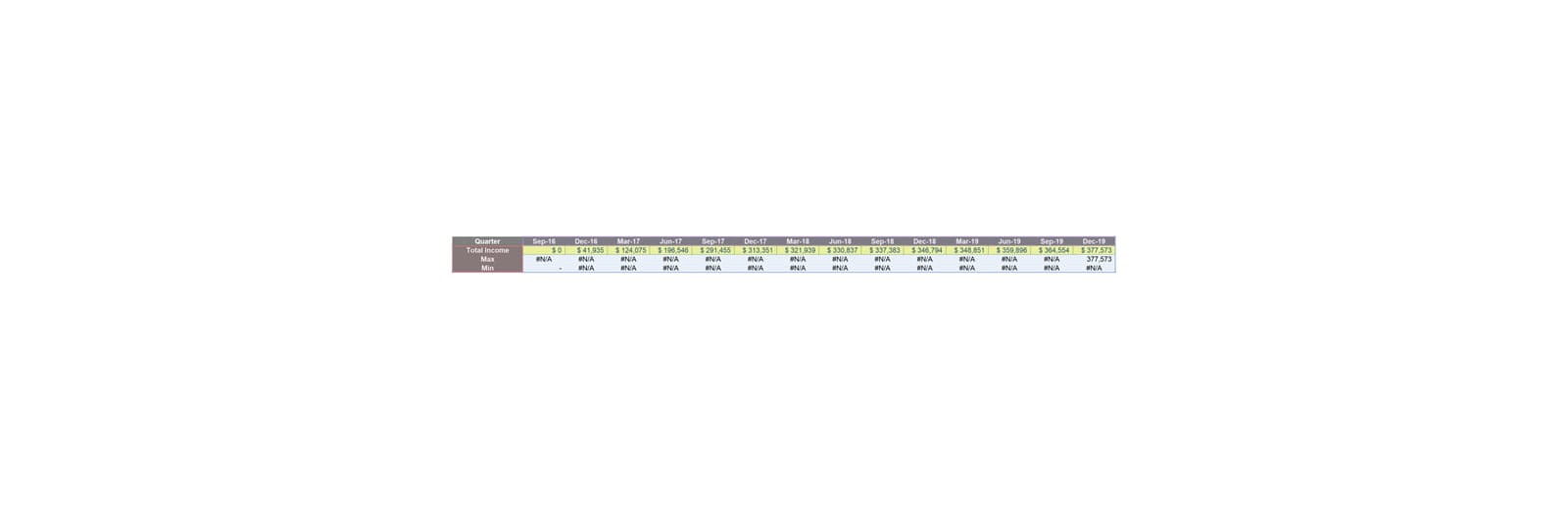
This results in the series only displaying the Maximum and Minimum value in the original chart data, and #N/A for everything else. Using formulae allows these two series to be dynamic, so when there is new data the Max and Min series will update accordingly. The #N/A error is deliberate as it prevents data being plotted as zero, depending upon the type of chart being selected (I have deliberately used a line chart here to demonstrate this point). Now that I have the data series, I can include them in the chart. I can do that by clicking on the original chart, and Excel will highlight the relevant data series:
I can then drag the values down:
Alternatively, I can right-click on the original chart and select the ‘Select Data’ option. Then, the ‘Select Data Source’ dialog will appear. I can then add new series by clicking on the ‘Add’ button on the left side of the dialog box:
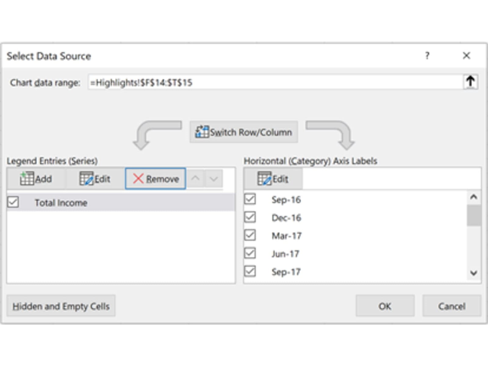
The two additional series are now added and shown in the ‘Legend Entries (Series)’ box:
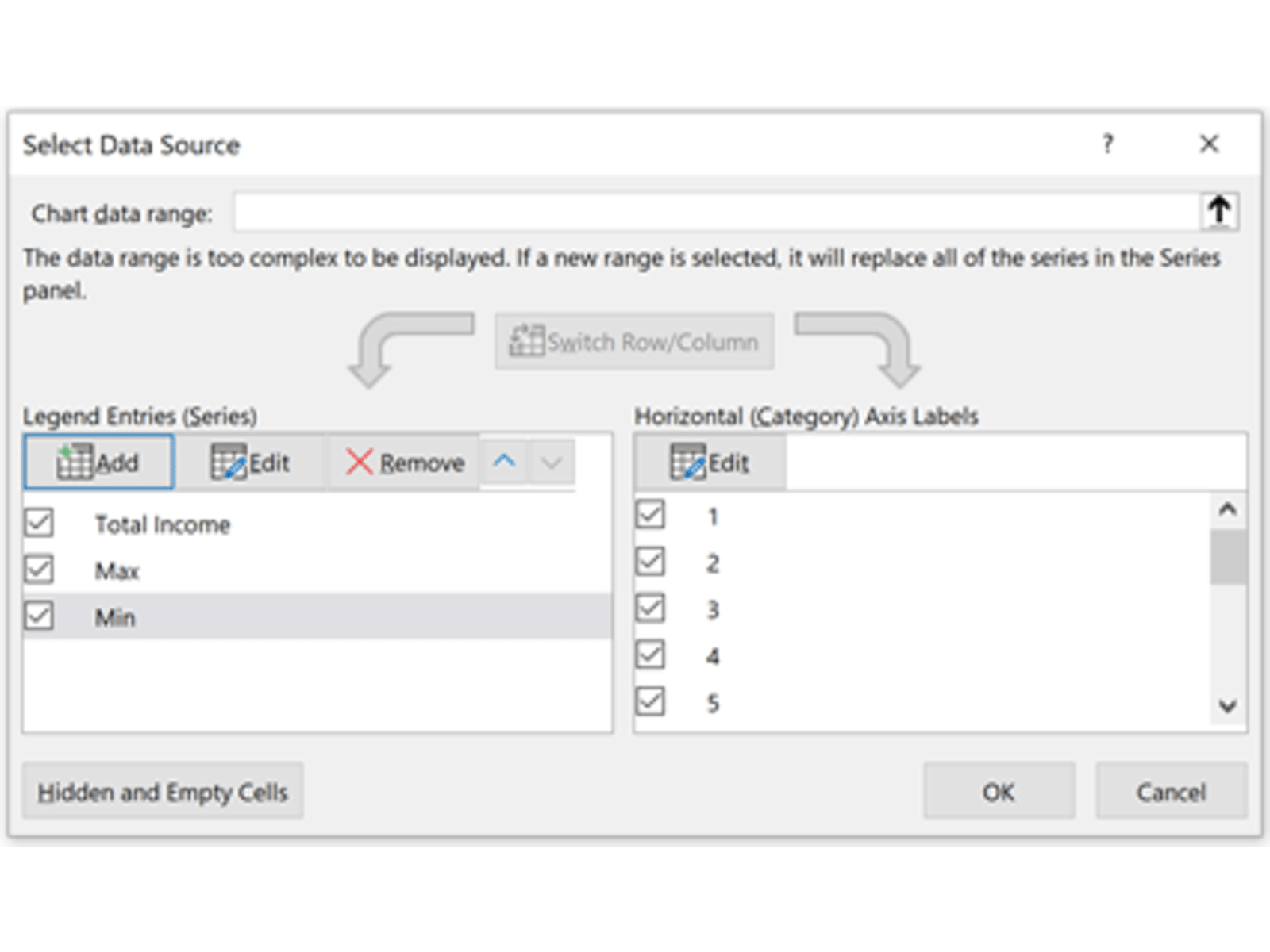
Do remember to reference the ‘Horizontal (Category) Axis Labels’ if the dates are replaced with sequential integers, as illustrated above; otherwise, this may cause charts to display incorrectly in alternative scenarios. The chart is now shown as the one below, with Max and Min are now chart series and will be changed dynamically depending on the data:
In essence, it is “conditional formatting” for a chart.
Archive and Knowledge Base
This archive of Excel Community content from the ION platform will allow you to read the content of the articles but the functionality on the pages is limited. The ION search box, tags and navigation buttons on the archived pages will not work. Pages will load more slowly than a live website. You may be able to follow links to other articles but if this does not work, please return to the archive search. You can also search our Knowledge Base for access to all articles, new and archived, organised by topic.
