
Sometimes in financial modelling, we look for methods of allocating costs over the life of a project.
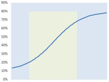
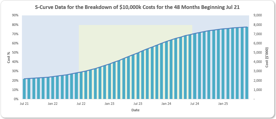
An S-curve is simply a graphical depiction of cumulative data for a project—such as costs, market share, elapsed time or some other KPI, usually plotted against time. From the above illustration, the reason it’s called an S-curve should be obvious (although some argue that the "S" actually stands for "sigmoidal", but those are technical spoilsports). Typically, cumulative projections analysed in this manner present in the shape of an "S".
This type of curve often takes shape as initial traction is often slow and completion can drag on too, with the rapid acceleration in progress (highlighted by the lighter area in the graphic, above) coming in between these two endpoints. Acceleration is gained as costs escalate, market share is gained, etc, but this cannot progress forever and eventually it slows down once more, the point at which deceleration commences is often (but not always) at the midpoint and this point of maximum growth is often referred to as the point of inflection.
This type of chart is therefore key in budget forecast and confirming projects are on track. Therefore, they are frequently used to measure progress, evaluate performance and make cash-flow forecasts. This means you need to be able to model an S-curve.
Obviously, S-curves are only an approximation and "real data" is very unlikely to ever perfectly fit an S-curve. This is because the underlying mathematics may cause the first and last periods to "jump" (these sort of curves are often perceived to have infinite tails) and because later periods may also see a project go into terminal decline (eg lose market share, be reimbursed costs etc.).
The aim here is to provide a simple example – not create a beast that can be tailored for any situation, spikes, normalisations, etc. The aim is to get the concept across – you can then modify the maths as you see fit thereafter.
As usual, I provide an Excel example – and make use of Excel 365 this time as I use dynamic arrays to "spill" my formulae. But first, we need inputs:
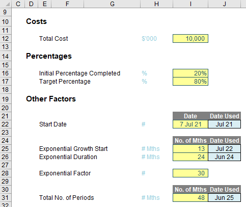
Here, I assume I am considering a forecast of total costs (cell I12, given the range name Total_Costs), with costs of 20% (cell I16, Initial_Percentage_Completed) already accounted for.
The start date of this forecast is given by I22, although it is cell J22 that is used for the formulae. This "Date Used" cell is named Start_Date and is defined as
=EOMONTH($I$22,0)
where the EOMONTH function returns the end of the month cited in cell I22 zero [0] periods in the future, ie the end of the month input.
Similarly, the total number of periods is input in cell I31 (No_of_Periods), which generates the final date in cell J31, given by the formula
=EOMONTH(Start_Date,No_of_Periods-1)
The Exponential Growth Start (cell I25, named Exp_Growth_Start_Month_No) specifies the period number where the period of rapid acceleration starts. This is given by the date calculated in cell J25 (Exp_Growth_Start), namely
=EOMONTH(Start_Date,Exp_Growth_Start_Month_No-1)
Similarly, the duration of this accelerated growth is input in cell I26 (Exp_Duration_in_Months) which then calculates the end month in cell J26 (Exp_Growth_End), viz.
=EOMONTH(Exp_Growth_Start,Exp_Duration_in_Months-1)
The only other factor here is the input value in cell I28 (Exp_Factor, which is not a TV show!), which derives the level of “bend” in the accelerated section. Pictorially, a lower value will give a "straighter" interaction,
You should also note that this may affect the values outside the range of accelerated growth too, depending upon the calculations used.
This brings me nicely on to discussing the formulae necessary:


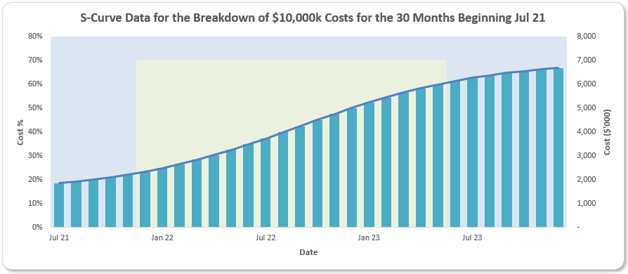
Apologies for the smaller second image above, but hopefully, you "get the picture".
Here, because I am using Excel 365, I have decided to use dynamic arrays to propagate the calculations. For instance, the formula in cell J40 is given by
=SEQUENCE(1,No_of_Periods)
which will generate a horizontal counter between one [1] and the No_of_Periods (48, note the second image above is truncated). If you don’t have dynamic arrays, you may just add a simple counter or else a formula such as
=IF(MAX($I40:I40)<No_of_Periods,MAX($I40:I40)+1,"")
in cell J40 instead.
The date in cell J41 simply converts the counter into the end of the appropriate month:
=EOMONTH(Start_Date,J40#-1)
Note the reference to cell J40# - this is the spilled range of the counter in row 40. As the number of periods varies, this calculation will also spill into a variable number of cells, eg if the number of periods is 48, the calculation will be in 48 columns; if the number of periods is six [6], the calculation will be in six columns, etc.
The formula in cell J42 defines the curve:
=Initial_Percentage_Completed+(Target_Percentage-Initial_Percentage_Completed)/
(1+Exp_Factor^((Exp_Growth_Start_Month_No+Exp_Duration_in_Months/2-J$40#)/
Exp_Duration_in_Months))
Now you see the reason for using range names! There are several formulae that can be used to generate an S-curve and I have elected to use the above one. Essentially, the formula relies upon several factors:
- minimum value: at what point does the S-curve start?
- maximum value: what is the expected maximum penetration / market share / cost (ie what is the value at the "top" of the S-curve)?
- start of acceleration period: when does the growth noticeably accelerate?
- duration of acceleration period: how long will the period of accelerated growth last before the rate of increase declines noticeably?
- exponential factor: the "characteristic" of the growth during the period of accelerated growth, as explained earlier.
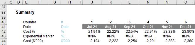
This formula derives the cumulative percentage and total costs – as in this example – can be calculated in cell J44 simply by multiplying this percentage by the appropriate figure:
=Total_Costs*J42#
This only leaves the calculation in row 43 to be explained. This "Exponential Marker" is simply a graphical device to identify the period of accelerated growth. For example, the formula in cell J43 is given by
=IF((J41#>=Exp_Growth_Start)*(J41#<=Exp_Growth_End),Target_Percentage,NA())
This formula identifies when the counter is in the exponential growth period and displays the Target_Percentage, otherwise #NA(), so that the data will not be displayed on the chart, regardless of the chart type used.
Do note the use of using two flags, ie J41#>=Exp_Growth_Start and J41#<=Exp_Growth_End, multiplied together, rather than using an AND expression. Arrays and logical functions do not work well together – but that’s a story for another day…
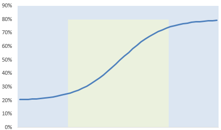
The chart can be generated reasonably easily from this data:
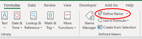
The chart title has been derived by adding a Chart Title, clicking on it and typing
='S-Curve Assumptions'!$N$10
in the Formula bar (best done by simply clicking on cell N10). This cell is "hidden", behind the chart and the formula
="S-Curve Data for the Breakdown of "&TEXT(Total_Costs,"$#,##0k")&" Costs for the "&TEXT(No_of_Periods,"#,##0")&" Months Beginning "&TEXT(Start_Date,"mmm yy")
has been typed into this cell to derive the dynamic title.
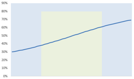
However, if you want the chart axes to be more dynamic so that changing assumptions automatically changes the chart, eg
you will need to get cleverer. Do you see how the x-axis (horizontal axis) has changed scale so fewer dates are displayed? To do this, we need the OFFSET function.
OFFSET Reminder
You may recall the OFFSET function, which employs the following syntax:
OFFSET(reference, rows, columns, [height], [width])
One of the arguments in square brackets (width) will be key here – but I will explain that momentarily.
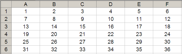
The “standard” OFFSET(reference, rows, columns) will select a reference rows rows down (-rows would be rows rows up) and columns columns to the right (-columns would be columns columns to the left) of the reference. For example, consider the following grid:
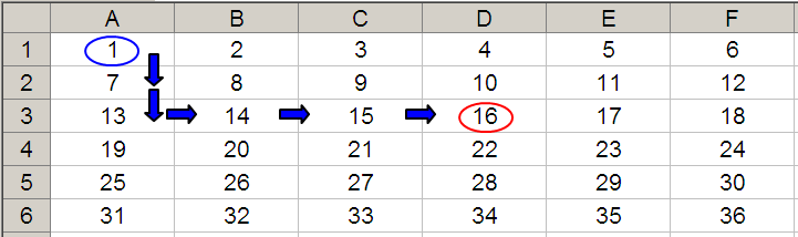
Let’s extend the formula to OFFSET(D4,-1,-2,-2,3). It would again take us to cell B3, but then we would select a range based on the height and width parameters. The height would be two rows going up the sheet, with row 3 as the base (ie rows 2 and 3), and the width would be three columns going from left to right, with column B as the base (ie columns B, C and D).
Hence OFFSET(D4,-1,-2,-2,3) would select the range B2:D3, viz.
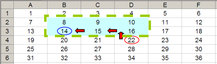
Note that OFFSET(D4,-1,-2,-2,3) = #VALUE! in versions of Excel that do not support dynamic arrays, since Excel cannot display a matrix in one cell, but it does recognise it. More interestingly:
- SUM(OFFSET(D4,-1,-2,-2,3)) = 72 (ie SUM(B2:D3))
- AVERAGE(OFFSET(D4,-1,-2,-2,3)) = 12 (ie AVERAGE(B2:D3)).
Here, it is the width factor in particular that will help us create a dynamic chart.
Returning to the Chart
For each row of our chart data,
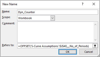
Here, I have created the following (dynamic) range names:
- Dyn_Counter: =OFFSET('S-Curve Assumptions'!$J$40,,,,No_of_Periods)
- Dyn_Date: =OFFSET('S-Curve Assumptions'!$J$41,,,,No_of_Periods)
- Dyn_Cost_Percentage: =OFFSET('S-Curve Assumptions'!$J$42,,,,No_of_Periods)
- Dyn_Exp_Marker: =OFFSET('S-Curve Assumptions'!$J$43,,,,No_of_Periods)
- Dyn_Cost_Amt: =OFFSET('S-Curve Assumptions'!$J$44,,,,No_of_Periods)
These define ranges starting in column J, but vary their width, depending upon the No_of_Periods specified – simple!
These range names can then be used as the references for the chart. For example, if I were to edit the chart series of the chart in our example file, you would see
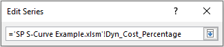
Note that the range has to refer to the name of the workbook as well – not just the range name. This is a requirement for dynamic range names to work (it is a point of Excel syntax).
Word to the Wise
The above highlights just one type of exponential / S-curve formula that could be employed. As mentioned earlier, S-curves should only be viewed as an approximation and “real data” is very unlikely to ever perfectly fit an S-curve.
Further, as actual data comes in you may be faced with how to revise an S-curve. If you update the data with actuals as they arise, you will need fewer periods for your S-curve analysis – but this will change its inherent characteristics.
For example, an S-curve might be for 20 periods originally, with 10 periods of accelerated growth (50% of the curve duration). After two months of actual data are incorporated, a re-cast curve may not be for 18 months with 10 periods of accelerated growth still (ie 55.6% of the curve duration).
Any variance analysis needs to take account of both the revised curve forecasts and the actual data. It may be simpler to fit data to the original curve instead using the remaining percentages scaled up to 100% instead – but this will be a personal choice.
Nothing is ever simple!
Join the Excel Community
Do you use Excel in your organisation? Are you using it to its maximum potential? Develop your skills and minimise spreadsheet risk with our Excel resources. Membership is open to everyone - non ICAEW members are also welcome to join.

Archive and Knowledge Base
This archive of Excel Community content from the ION platform will allow you to read the content of the articles but the functionality on the pages is limited. The ION search box, tags and navigation buttons on the archived pages will not work. Pages will load more slowly than a live website. You may be able to follow links to other articles but if this does not work, please return to the archive search. You can also search our Knowledge Base for access to all articles, new and archived, organised by topic.
