
With the introduction of many new chart types in Excel 2016 and later versions, Excel now has over a dozen main charts with lots of sub-types available. Good as Excel's charting capabilities might be, using Power BI to present the data from your Excel workbook opens up a whole new set of possibilities.
The Excel community is currently featuring an excellent series on charts in Excel contributed by John Tennent. The most recent post in the series looks beyond the main chart types to consider some of Excel's less common charts. Remember that the new archive portal allows you to display all the available articles in any series with a single click. In this case just click on 'Exploring charts' in the central 'Posts by Series/Topic and Author' bar chart.
Recently, a new feature was added to a range of Power BI charts – the ability to use 'small multiples'. The term 'small multiples' was popularised by Edward Tufte whose works on data visualisations we have mentioned several times in the past. Essentially, to facilitate comparisons, a set of small charts is used to display and compare different segments of a data set. Here, we have used the topical example of Coronavirus cases by age group. We have downloaded the CSV file from the Gov.UK Coronavirus dashboard site and saved in as an Excel workbook – we could also have linked to the original format CSV file directly. In Power BI, we have chosen Get Data and then chosen Excel workbook. We have created a link to our table of data and loaded the data into Power BI. We have then used a simple, built-in Line chart visualisation and set filters to only include the individual age groups and the most recent two months of data:
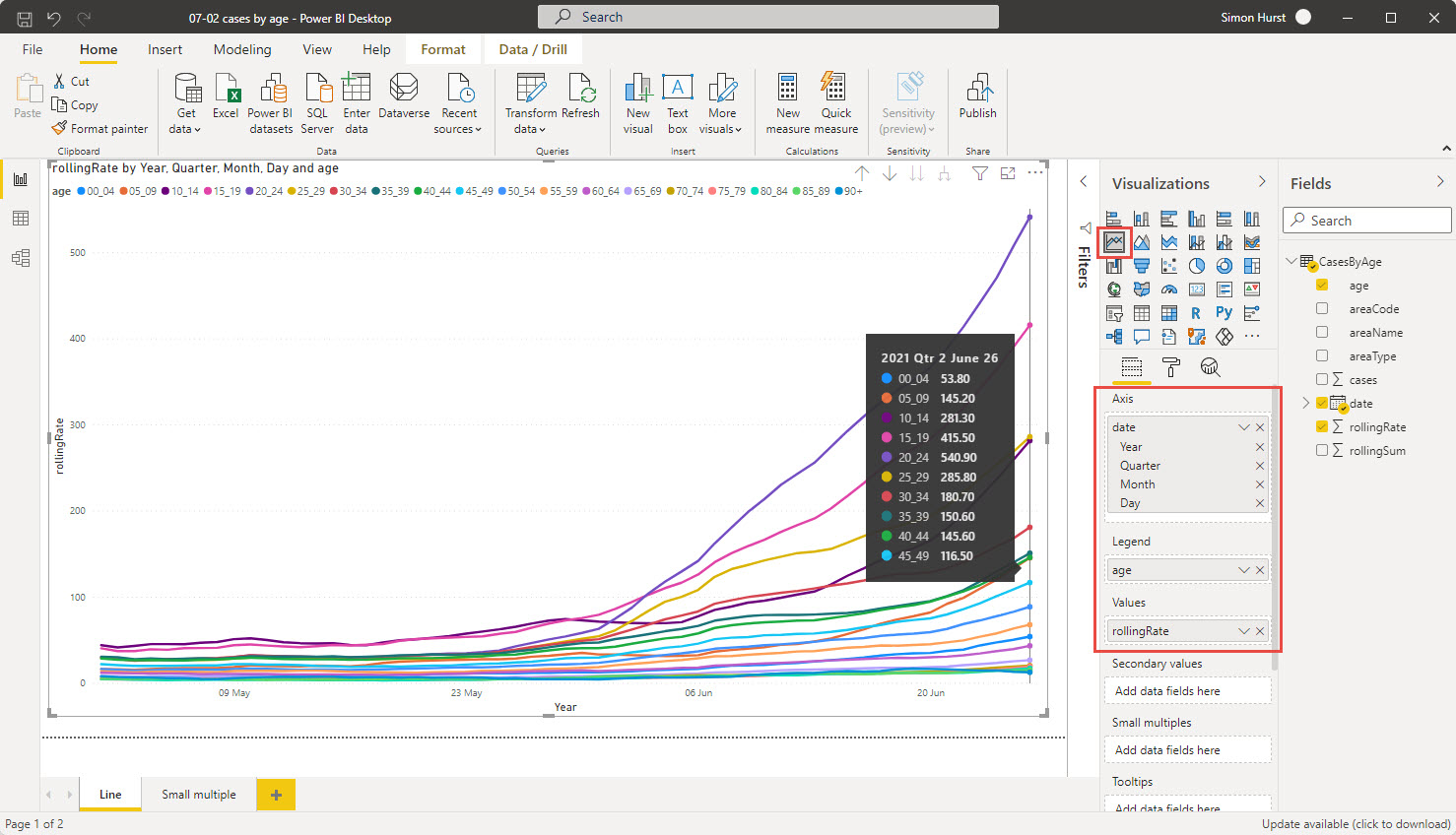
We have used date for the Axis, age as the Legend and rollingRate for the Values.
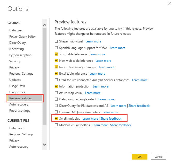
With the introduction of Small Multiples as a preview feature in December 2020 we have an additional way to visualise this data. Note that you might need to enable the preview feature by going to File, Options and settings, Options and choosing Preview features:
Once the Small multiples feature has been enabled, an additional, Small multiples, Field will appear in the Fields pane for bar, column, line and area charts. Here, we have dragged our Age field from Legend to Small multiples:
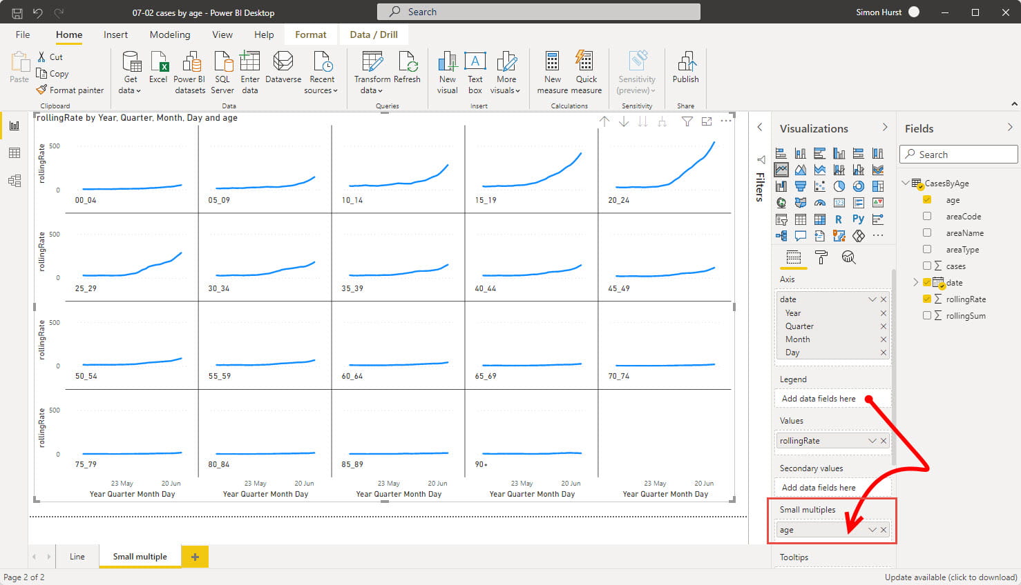
The Format section of the Visualizations pane includes some specific options for small multiples. As well as being able to change the formatting and positioning of the Title of each multiple, you can also control the 'grid' of multiples. In our case, we have chosen to position the titles at the bottom and set the grid to be 4 rows deep by 5 columns wide to accommodate our 19 individual charts.
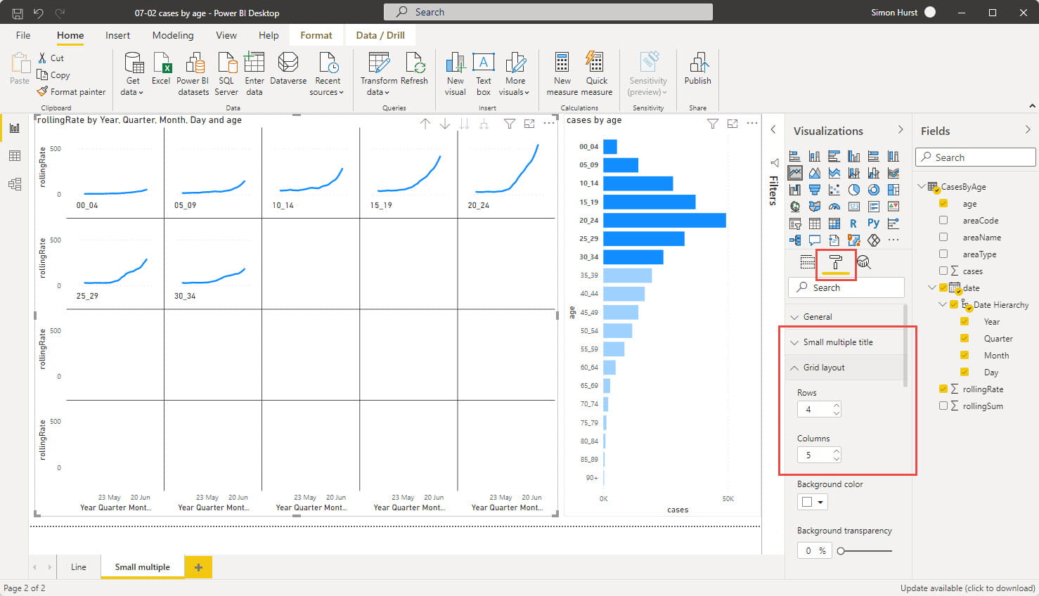
Like other Power BI visualisations, small multiples can be controlled by other charts. In this example we have added a bar chart based on cases by age and we can use Control+click to select several bars at the same time. When we do so, our Small multiples line chart will just display charts for the age ranges that we have selected:
Power BI makes the creation of small multiples straightforward. It is possible to do something similar in Excel, but it involves setting the data up in a very specific way, with blank entries to create gaps between each multiple. As well as being quite involved to do, it also offers less flexibility in how the multiples are arranged compared to using Power BI.
Excel community
This article is brought to you by the Excel Community where you can find additional extended articles and webinar recordings on a variety of Excel related topics. In addition to live training events, Excel Community members have access to a full suite of online training modules from Excel with Business.

Archive and Knowledge Base
This archive of Excel Community content from the ION platform will allow you to read the content of the articles but the functionality on the pages is limited. The ION search box, tags and navigation buttons on the archived pages will not work. Pages will load more slowly than a live website. You may be able to follow links to other articles but if this does not work, please return to the archive search. You can also search our Knowledge Base for access to all articles, new and archived, organised by topic.
