
Charts & Sparklines
Charts help us to identify patterns or trends that either support or contradict our expectation and help direct us to areas in the spreadsheet that may need further investigation. Reviewing charts at the line-item level can be more revealing than at the total level where certain types of error may cancel each other out. However, space on the spreadsheet makes it difficult to create a chart for every data row and that is where Sparklines can be used to achieve the same visual audit of the values being generated.
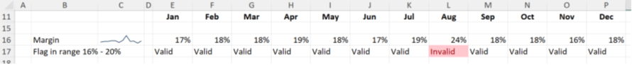
A Sparkline is a single cell chart. Take for example the following data series with the Sparklines in the second column:
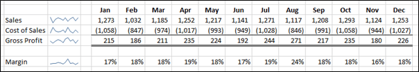
The Sparklines show fluctuation through the year, but the margin line shows that there seems to be a spike just after the mid-point. This spike might be valid, but it does invite a challenge as the margin percentage might be expected to stay reasonably constant. On closer investigation the number in August is 24%, far higher than the rest of the year. This encourages a validation of the data which prompts the discovery that the cost of sales should have been 946 and not 846. This may have been identified without Sparklines, but the more indicators that are used the more confidence can be derived from the spreadsheet. I can attest to finding errors in large blocks of data that I am fairly certain would have gone unnoticed without the Sparkline.
Best practice would suggest showing Sparklines on the left of the data which means they can be seen without horizontal scrolling. Especially models with more than eight columns of evaluation where much of the data can spill off the visual area of screen.
How to create and manage Sparklines
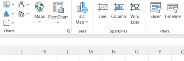
They are found on the INSERT ribbon to the right of Charts:
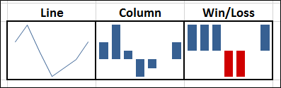
The Line Sparkline is perhaps the best for providing the visual audit. The Column Sparkline can be too dominant on the eye compared to the more subtle Line, especially when used on every row in a large block of data. As for the Win/Loss (which only distinguishes positive from negative numbers), there are few opportunities where it adds value.
Clicking on the chosen Icon will reveal the dialogue box as follows:
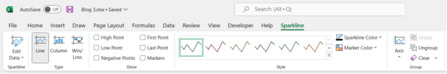
Working from left to right:
Edit Data: This allows you to change the data series, but also to specify how to handle missing data as well as hidden data (these can be shown on the charts as gaps, zeros or joined lines omitting data)
Type: Switch the display type of the Sparkline between the three options.
Show: These are a range of highlights – High Point, Low Point, Negative Points, First Point, Last Point and Markers. I must admit to never using these as they clutter the clear simplicity of the line.
Style: The colour of the line and marker points.
Axis: The Sparklines are small and thus to add an Axis can lose clarity. If the Sparkline is significantly increased in size (best achieved by increasing the font size of the Sparkline cell), then an Axis may be helpful. However, once you increased its size and added an Axis you might as well have drawn a proper Line Chart and gained all the extra clarity that it offers. The Sparkline is not for conveying accuracy.
One additional use of the axis is in being able to choose a scale that is the same for all Sparklines in a group. This enables them to be compared in absolute terms as well as their trend (although this may not be practical if the range of values is too great across the group). To have the scale the same click on the Axis icon and on the list of options select the ‘Same for all Sparklines’ item under both ‘Vertical Axis Minimum Value Options’ and ‘Vertical Axis Maximum Value Options’.
Clear: This is worth mentioning as a Sparkline does not behave like other Objects in Microsoft in that if you highlight a Sparkline and press delete nothing happens. Two ways to remove Sparklines are:
- Use this clear button on the Sparkline Tool Ribbon.
- Take a blank cell and either copy and paste over or drag over the Sparkline.
Ratios
Developing a set of ratios can add insight into the way a time series of values is evolving. Judgements about reasonableness can interpret the appropriateness of these metrics. If appropriate, checks can be included that flag when a ratio exceeds its expected range. Some examples might be EBITDA margin, net margin, EBITDA to cash flow, depreciation to gross asset value, leverage, receivable or payable days, or revenue per employee. Charts of these also reveal the trends that are emerging. Each of the trends should be challenged to justify their validity. For example, what is causing the margin to narrow or widen? Why is cash increasing or decreasing? Are there sufficient staff for the changing scale of the business?
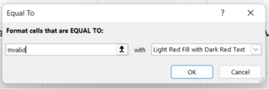
Continuing the example at the start of the blog you will see the margin has been calculated and flags can be used to identify when values fall outside a defined range. The expected values might be between 16% and 20%. A flag uses an =IF statement to signal valid or invalid. Conditional formatting can be added to make the invalid status more easily identified.
The formula used in row 17 is illustrated with L17:
=IF(AND(L16>=16%,L16<=20%),"Valid","Invalid")
For the test part of the =IF statement an AND function is used to allow more than one test to be completed. For the =IF to be True all the AND tests must be true. We use this combination of functions to check that margin falls within a range. Flags can use results of True/False or 0/1 although a clear text description can help users of the spreadsheet interpret the results more easily.
When applied in a spreadsheet the range values of 16% and 20% would be linked to input cells rather than typed into the formula. They are typed in this example to make it easier to see the structure of the functions being used.
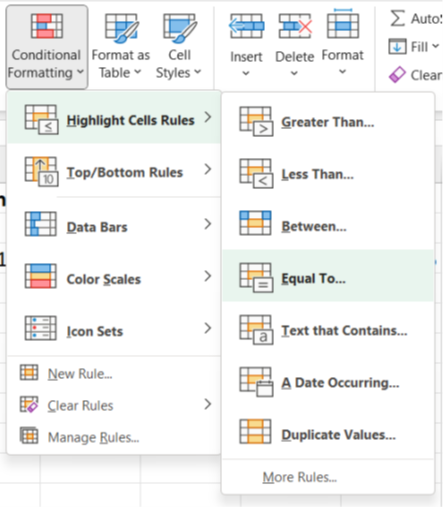
The conditional formatting is found on the HOME ribbon.
Taking time building in the Charts/Sparklines, Ratios and Flags to a spreadsheet helps identify errors especially when scenarios are being explored. While the base case may meet expectations, that confidence needs to be maintained as alternative data is entered.
In blog 4 we will look at completing the first part of the Detailed Reviews covering design principles and formula errors.
- How to Review a Spreadsheet: Part 6 - other useful functions
- How to review a spreadsheet: Part 5 - the Formula Auditing Group
- How to review a spreadsheet: Part 4 - design principles and formula errors
- How to review a spreadsheet: Part 3 - analytical review
- How to review a spreadsheet: Part 2 - data review
Archive and Knowledge Base
This archive of Excel Community content from the ION platform will allow you to read the content of the articles but the functionality on the pages is limited. The ION search box, tags and navigation buttons on the archived pages will not work. Pages will load more slowly than a live website. You may be able to follow links to other articles but if this does not work, please return to the archive search. You can also search our Knowledge Base for access to all articles, new and archived, organised by topic.