
Until recently, I harboured the naïve and ridiculously over-optimistic view that increased access to easy-to-use data analysis and reporting tools, such as Microsoft's Power BI, would promote the production of important graphical presentations that would help to change the world for the better.
However, it is becoming increasingly evident that such tools are just as well-suited to spreading inaccurate and poorly researched opinions.
As an example, a few weeks ago a post appeared on my LinkedIn feed that showed line charts of the Covid-19 case v. deaths statistics for several European countries since the start of the pandemic. The post helpfully highlighted the figures from a point near the peak of the first wave and then another point at the then current position during September. The conclusion drawn was that, because in September there were almost no deaths, even though the number of cases was higher than in the previous peak, we could all breathe a sigh of relief. Without attempting to replicate the original post, this example, based on the UK published figures, shows how a chart based on the available data could, at first glance, seem to support that conclusion:
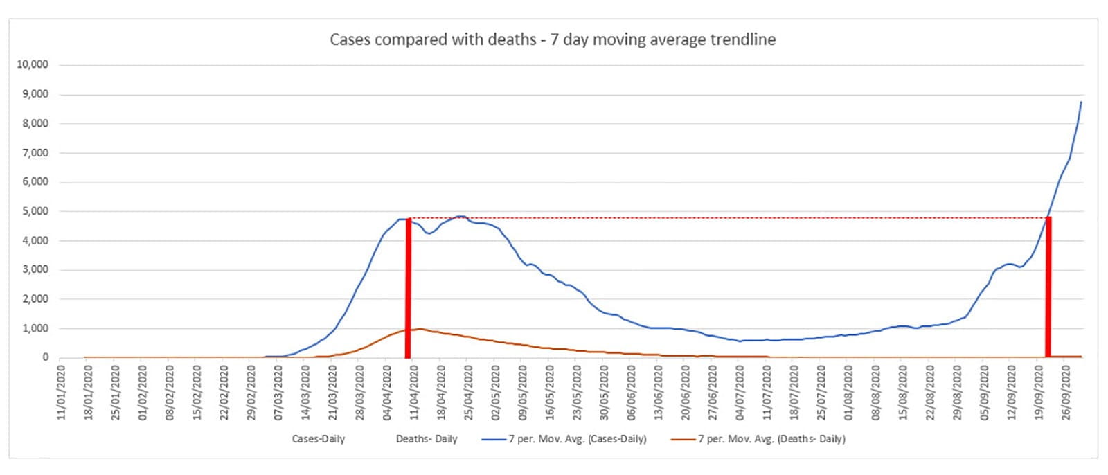
We can see that, looking at cases in April compared to a similar level number of cases in September, deaths seem to have gone from close to 1,000 per day, down to well below 100.
The first thing that struck me when I saw how the LinkedIn post had represented these figures was the failure to take account of any lag between the report of a case and the date when cases reported on that date could have resulted in death. It is difficult to bring in any exact measure for this lag, as the period can vary greatly, and might well be very different at different points through the pandemic. Perhaps all that you can conclude is that it is definitely misleading to compare cases reported on one day with deaths reported on the same day.
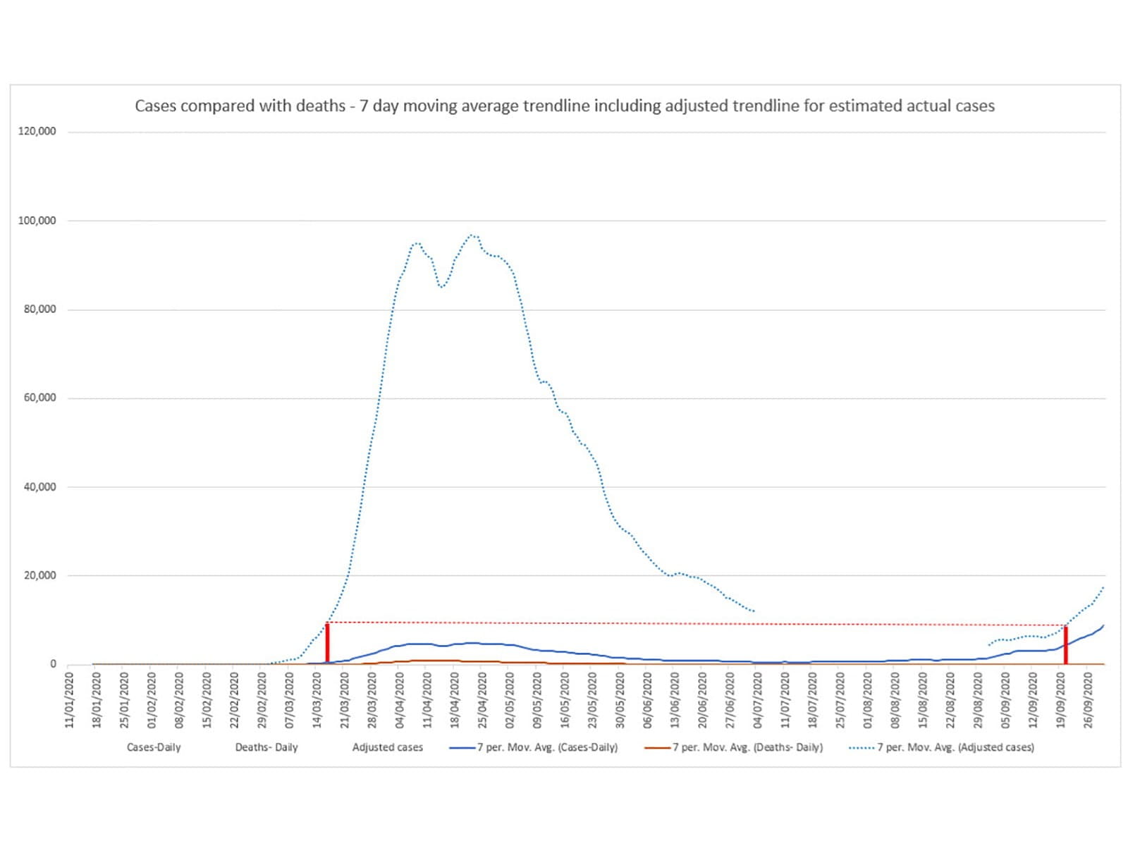
Looking more deeply, while the lag is an important factor in how the figures can be misread, there are other factors that can be even more significant. Many published charts include an annotation pointing out the difference in the testing regime between the first peak and the Autumn peak. In the UK, testing capacity during the first peak meant that testing was very targeted and didn't even attempt to establish the true number of cases in the country. By September, mass testing and greatly increased capacity, meant that the number of cases reported was much closer to the actual number of cases. Although it is currently impossible to know for sure, many estimates suggest that at the April peak, actual cases were about 100,000 a day, so 20 times as high as the number of cases reported. By September and October, evidence from random surveys allows us to make a much more informed estimate of the actual number of cases. During a period when approximately 25,000 cases per day were being reported, the random surveys suggested that actual cases were probably running at around twice that level. The figures for deaths, although subject to some inaccuracy and some change in the way they are calculated between the peaks is much closer to a representation of the actual figure.
Accordingly, to draw any sort of meaningful comparison between the first and second peaks we would need to adjust our charts to show the actual figures that the cases represent. For example, we could add a trendline showing the reported figures in the first wave multiplied by 20 and then (arbitrarily) change this to a factor of 2 from the start of September. If we draw our comparison lines based on this estimated trendline, the comparison is a very different one, even if we don't allow for any lag in cases versus deaths. In fact, coincidentally, rather than showing a massive difference between the two waves, the days highlighted here both had exactly the same number of deaths reported:
I am happy to accept that there might be many faults with my own representation of the data, a former article from the archive demonstrated how differently people can react to charts: https://wayback.archive-it.org/15130/20201006135359/https://ion.icaew.com/technews/b/weblog/posts/letsplayangrychartsinexcel
The best conclusion might be that we don't have accurate enough data to draw any definite conclusion at this stage, but even that conclusion is a long way from the indication in the original chart that the second wave looked a lot less threatening than the first wave.
At a time when data is increasingly accessible, and it is also increasingly easy to turn raw data into plausible-looking visualisations, the skills required to question what you are presented with and to identify any errors, or deliberate attempts to mislead, are increasingly essential, both in business and life more generally. A greater familiarity with visualisations and with how to work with data can also help us to create compelling refutations of misleading content. However, the starting point has to be our key skill of questioning everything and requiring evidence and context.
Perhaps it's about time that ICAEW redesignated history and politics as a relevant degree: https://apps.icaew.com/cpldirectory
Excel community
This article is brought to you by the Excel Community where you can find additional extended articles and webinar recordings on a variety of Excel related topics. In addition to live training events, Excel Community members have access to a full suite of online training modules from Excel with Business.

Archive and Knowledge Base
This archive of Excel Community content from the ION platform will allow you to read the content of the articles but the functionality on the pages is limited. The ION search box, tags and navigation buttons on the archived pages will not work. Pages will load more slowly than a live website. You may be able to follow links to other articles but if this does not work, please return to the archive search. You can also search our Knowledge Base for access to all articles, new and archived, organised by topic.