
Hello and welcome to the continuing series from the Excel Community's Financial Modelling committee, in which we will work through the chapters of our Financial Modelling Code and explain how each element translates into practice.
Making models for humans
In my early days of building financial models I remember very clearly a client looking at one of my dashboards and casting the model out, exclaiming it was the worst model he’d ever seen. Well I looked at that model and the logic seemed fine, so I took another approach and focussed on giving the client what he wanted at first glance.
I did nothing more than adjust the dashboard: clustering information next to similar content, changing the size of headers, zooming in a little, and finally adding a splash of colour to make sure the client’s KPIs really popped out. The result? A happy client, who appeared to think we had completely reworked what I suppose he thought was an error-strewn model. In fact, we hadn’t corrected any errors at all – our mistake was in the presentation.
When you think about it, an enormous amount of time is spent these days formatting reports and memos. An Information Memorandum is often a professional looking glossy brochure whilst containing the same information that a simple cheap, stapled, black-and-white print would have had. Visual standards are high throughout the world of business: in presentations, in documents, in websites. It makes sense that financial models need to have a similar standard of presentation, with the emphasis on communicating quickly and clearly so that they can be used as efficiently (and as little!) as possible.
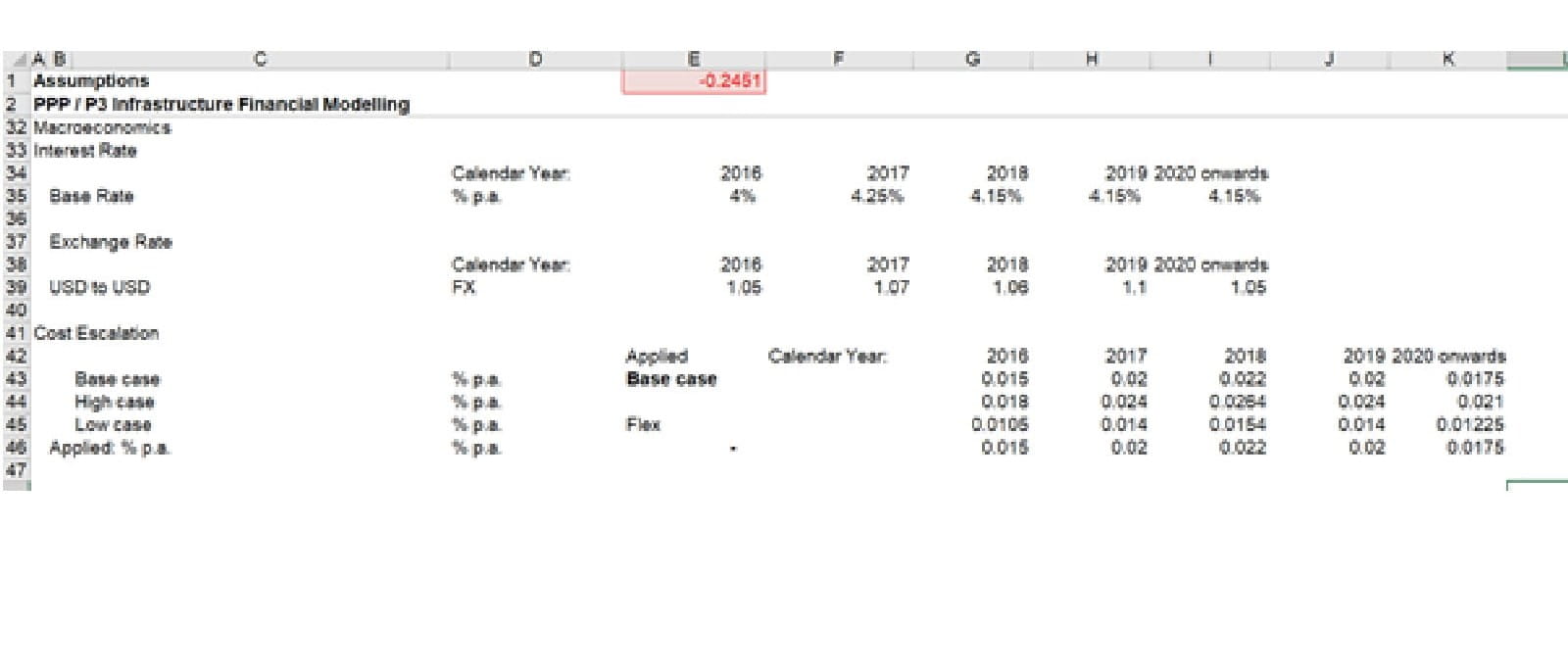
Figure 1: Lack of colour and predefined styles. Which are the important headers? Which are input cells?
Following the right path
The ICAEW’s Financial Modelling Code includes a sensible set of guidelines to help you prepare financial models that work for you and the model user. When preparing a model, one can use formatting to guide the user’s eye, to give context to the contents of cells, to make the model easy to read and provide the right level of detail.
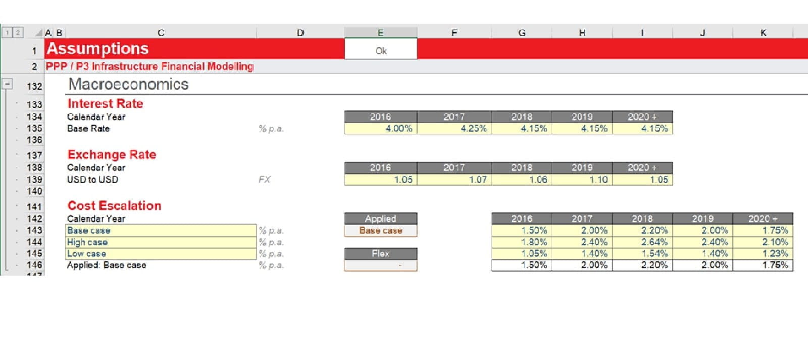
Figure 2: Examples of use of styles, including inputs and clear hierarchy of headings. That’s better!
Microsoft’s implementation of standard formats in Excel is a good place to start. They have thought hard about what formats are commonly needed in models and added those formats – in the form of Styles – in the standard Excel file. Those formats include:
- Headings and titles, including table headers
- Input and output formats
- Number formats designed for monetary numbers, for percentages and for dates
- Various highlight formats for emphasis, such as for flags or checks.
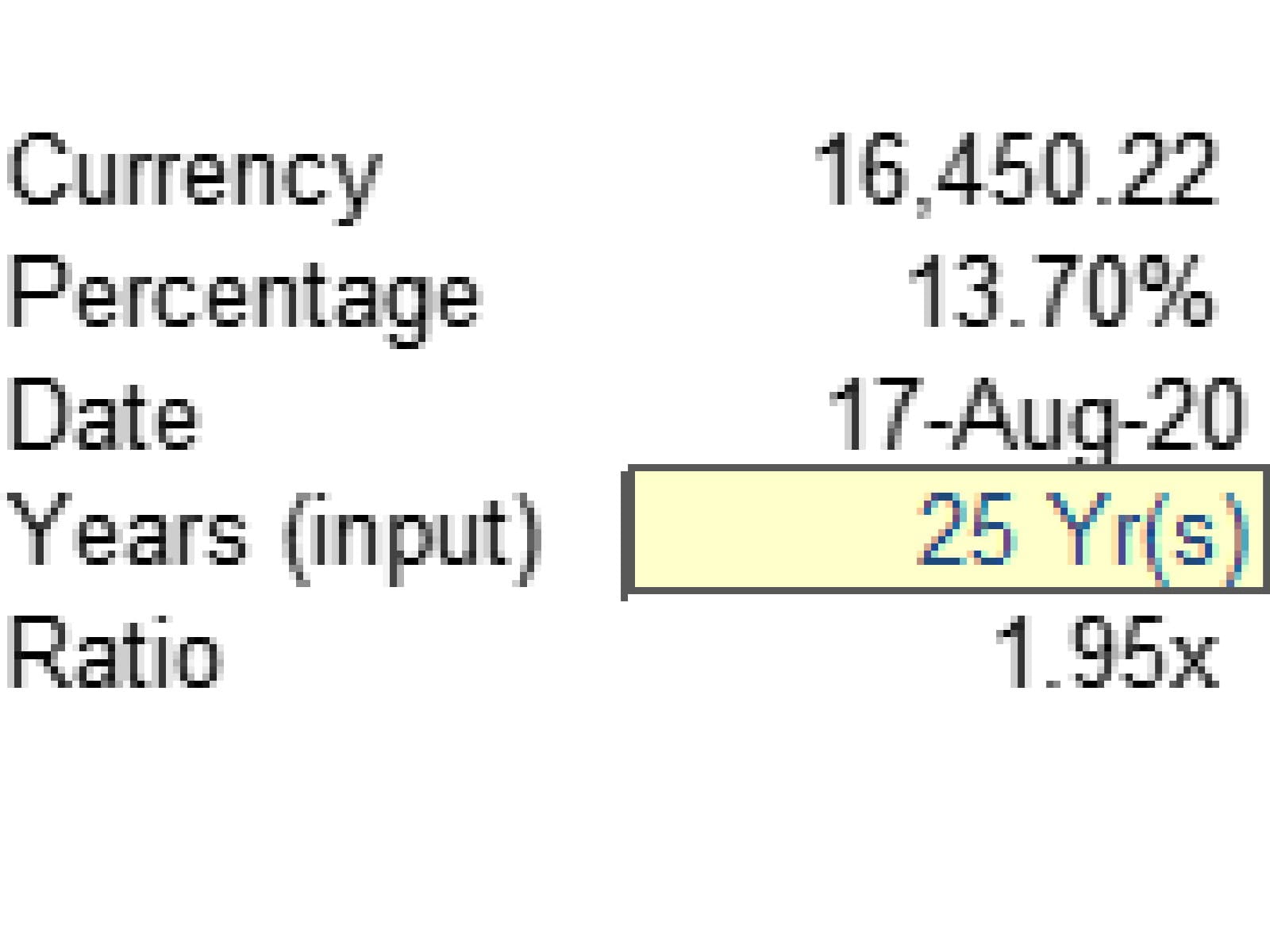
Figure 3: Some well used number formats
Of those formats, perhaps the most important are inputs. When using a model, the user must understand immediately which cells they are allowed to change and which they cannot. Microsoft understand this and have created their own Input style – in a rather unattractive peachy orange fill, it has to be said. Actually, the industry norm was yellow fill long before Microsoft got involved, but you’ll see different styles and colours used in different firms, such as blue font or tasteful light blue fill.
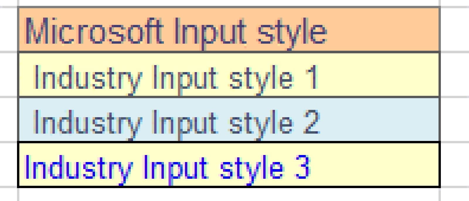
Figure 4: Various input/assumption styles in use
Scrubbing up
The key to good formatting is planning the formats in advance, so that you have a cohesive, consistent and well-organised presentation. Choose your formats up-front before you begin. You might want to think about:
- Number formats at the right level of detail. If the model is in millions of dollars, then number formats at the level of individual dollars are too detailed.
- Heading formats to indicate the relative importance of each item. Consider the size, colour and features such as underline or bold.
- Conditional formatting to highlight anomalies and values of interest. Use sparingly as overuse can make the presentation more – not less – confusing, and affects model performance too.
- A key to explain the meaning of different formats, included in your model instructions. Usually these are included on the input sheet, a separate guide sheet or they could be in a separate instruction manual document.
- Finally, consider using the Excel “styles” to organise formats in advance and be able to apply or change formats with a single click.
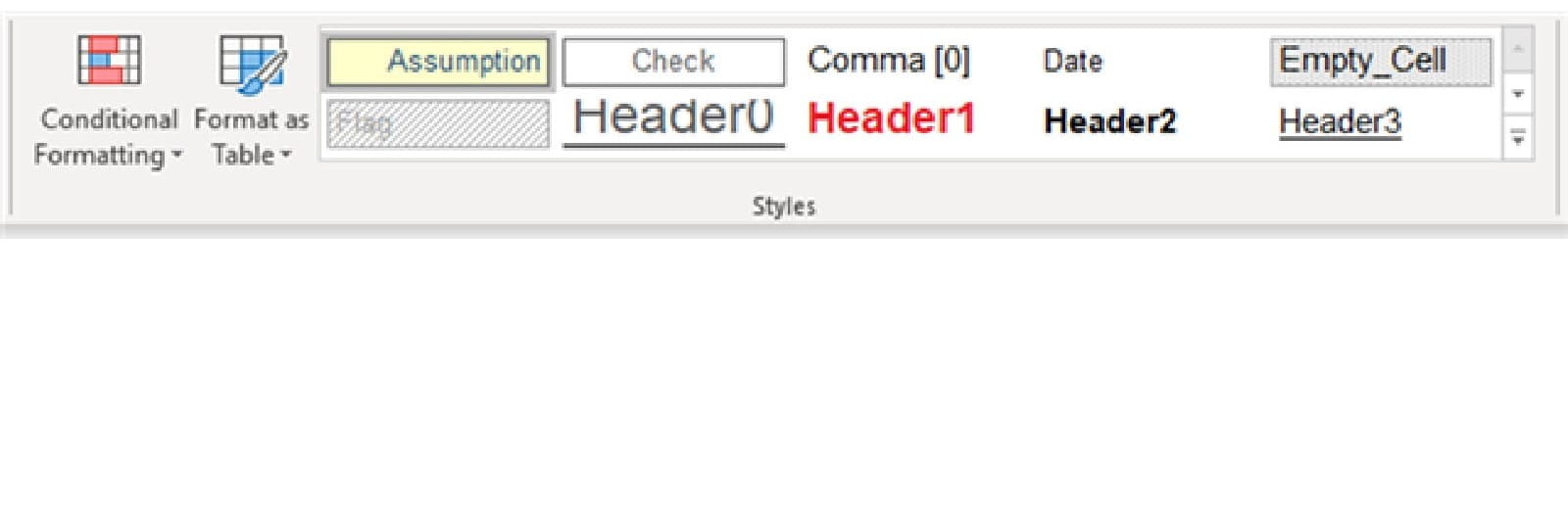
Figure 5: The Styles section of the Home ribbon, populated with some example styles
Remember: the formatting does matter and don’t always assume that because users are getting the wrong impression the model is full of errors – it may just need a lick of colour and a bit of a polish.
- Intro to Financial Modelling - Part 19: Wrap-up
- Intro to Financial Modelling - Part 18: Sensitivities and Scenarios
- Intro to Financial Modelling - Part 17: Calculation Techniques - Loan Calculations
- Intro to Financial Modelling - Part 16: Calculation Techniques - Flags and Masks
- Intro to Financial Modelling - Part 15: Error reduction - Common pitfalls
Excel community
This article is brought to you by the Excel Community where you can find additional extended articles and webinar recordings on a variety of Excel related topics. In addition to live training events, Excel Community members have access to a full suite of online training modules from Excel with Business.

Archive and Knowledge Base
This archive of Excel Community content from the ION platform will allow you to read the content of the articles but the functionality on the pages is limited. The ION search box, tags and navigation buttons on the archived pages will not work. Pages will load more slowly than a live website. You may be able to follow links to other articles but if this does not work, please return to the archive search. You can also search our Knowledge Base for access to all articles, new and archived, organised by topic.
