
A Sparkline is a single cell chart. With that description it may not seem that exciting, but its use as a visual audit of a data series is invaluable and was perhaps the most useful addition that arrived with Excel 2010. It is not available on previous versions.
Take for example the following data series with the Sparklines in the second column:
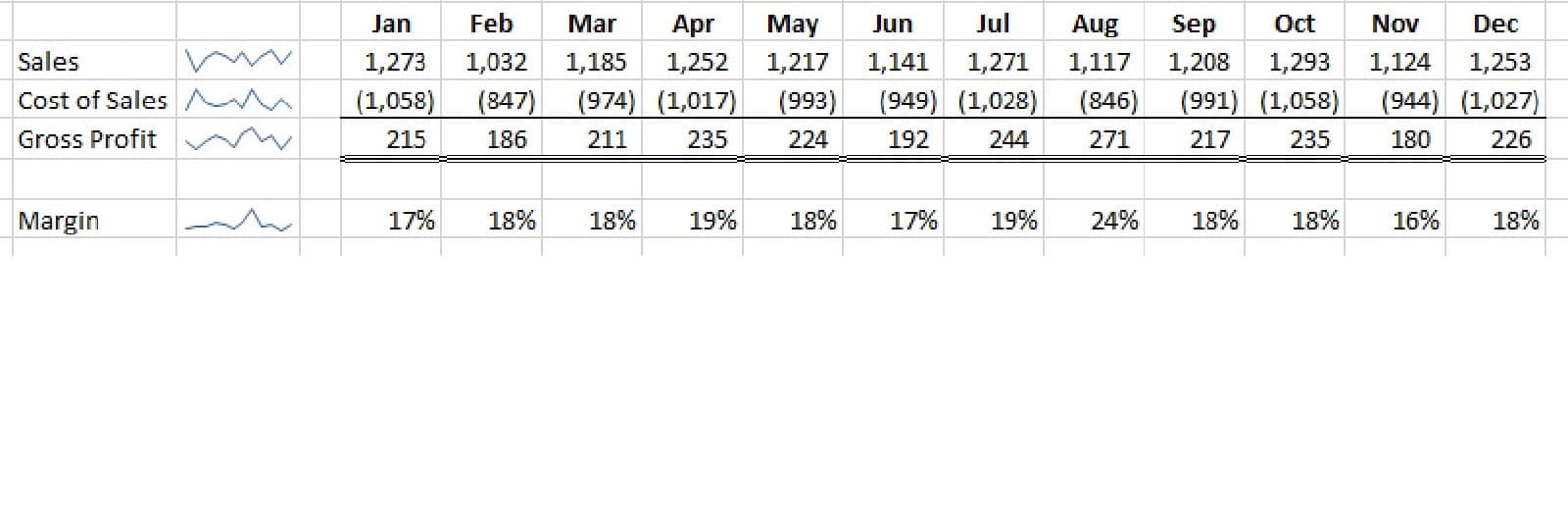
The Sparklines show fluctuation through the year, but the margin line shows that there seems to be a spike just after the mid-point. This spike might be valid, but it does invite a challenge as the margin percentage would be expected to stay reasonably constant. On closer investigation the number in August is 24%, far higher than the rest of the year. This encourages a validation of the data which reveals the cost of sales should have been 946 and not 846. This may have been identified without Sparklines, after all there is only four lines of data. I can attest to finding errors in large blocks of data that I am fairly certain would have gone unnoticed without the Sparkline.
Best practice would suggest showing them on the left of the data which means they can be seen without horizontal scrolling. Especially models with more than ten columns of evaluation where much of the data can spill off the visual area of screen.
How to create and manage Sparklines?
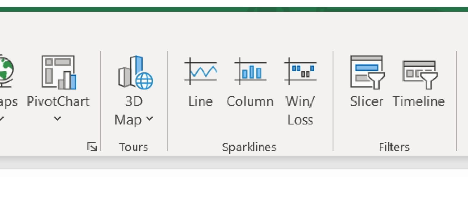
They are found on the INSERT ribbon to the right of Charts
For speed of use it is best to click on the cell where you want the Sparkline before selecting it from the Ribbon as this will automatically populate one part of the dialogue box. There are three types of Sparkline:
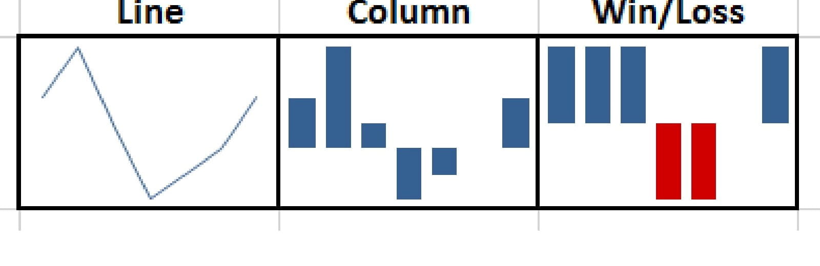
These have all been generated from the same set of data:
The Line Sparkline is perhaps the best for providing the visual audit. The Column Sparkline can be too dominant on the eye compared to the more subtle Line, especially when used on every row in a large block of data. As for the Win/Loss (which only distinguishes positive from negative numbers), I am yet to find an operational use for it!
Clicking on the chosen Icon will reveal the dialogue box as follows:
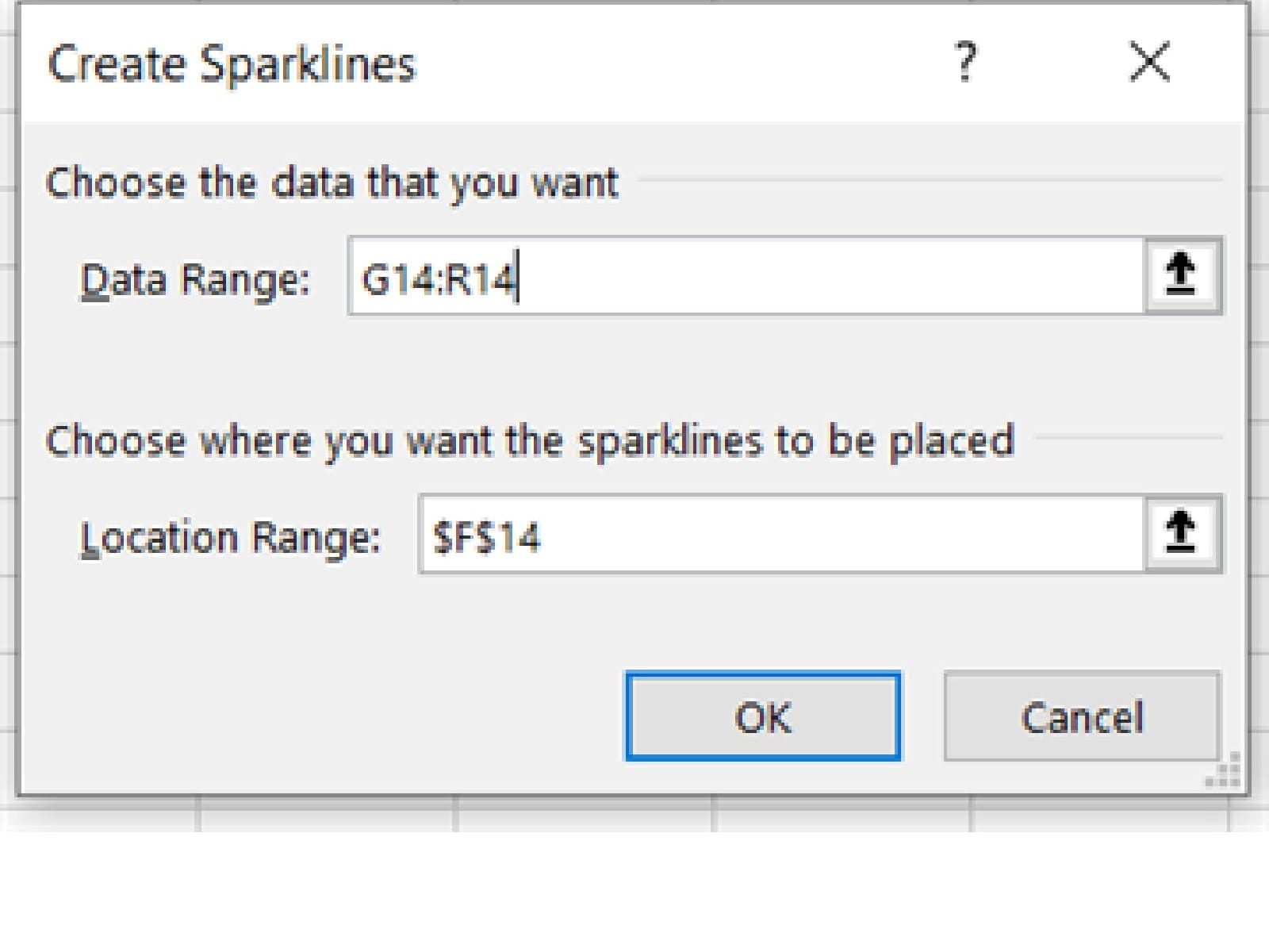
Data Range : This is the series of values to be displayed
Location Range: This is the cell where the Sparkline will be displayed (as mentioned above it is automatically populated with the cell reference for the current active cell before the function was called).
In the example both inputs are one row high. However, multiple rows can be selected, but the range height (number of rows selected) for both inputs must be the same or an error message appears.
Once created Sparklines can be copied and pasted just like other cell contents.
If you click on a Sparkline a new Ribbon appears at the top of the screen providing a range of additional functionality:
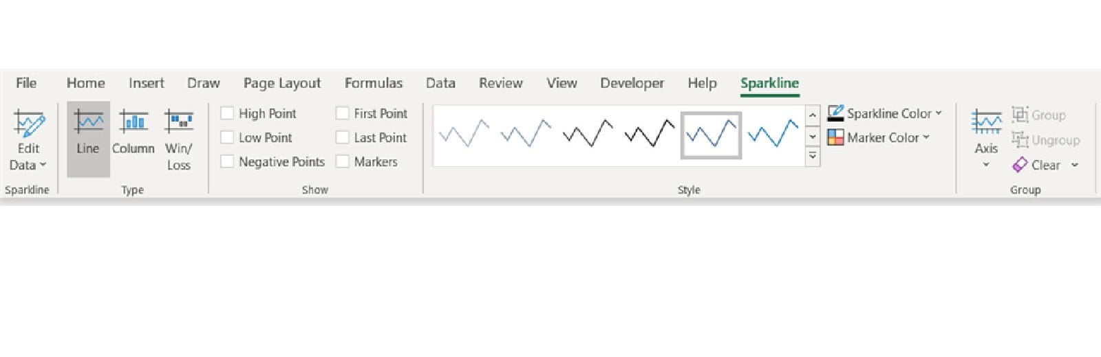
Working from left to right
Edit Data: This allows you to change the data series, but also to specify how to handle missing data as well as hidden data (these can be shown on the charts as gaps, zeros or joined lines omitting data)
Type: Switch the display type of the Sparkline between the three options
Show: These are a range of highlights on the Sparkline – High Point, Low Point, Negative Points, First Point, Last Point and Markers. I must admit to never using these as they clutter the clear simplicity of the line with marker points.
Style: The colour of the line and marker points
Axis: The Sparklines are small and thus to add an Axis can lose clarity. If the Sparkline is significantly increased in size (best achieved by increasing the font size of the Sparkline cell), then an Axis may be helpful. However, once you increased its size and added an Axis you might as well have drawn a proper Line Chart and gained all the extra clarity that it offers. The Sparkline is not for conveying accuracy.
One additional use of the axis is in being able to choose a scale that is the same for all Sparklines in a group. This enables them to be compared in absolute terms as well as their trend (although this may not be practical if the range of values is dissimilar across the group). To have the scale the same click on the Axis icon and on the list of options select the ‘Same for all Sparklines’ item under both ‘Vertical Axis Minimum Value Options’ and ‘Vertical Axis Maximum Value Options’.
Clear: This is worth mentioning as a Sparkline does not behave like other Objects in Microsoft in that if you highlight a Sparkline and press delete nothing happens. Two ways to remove Sparklines are:
- Use this clear button on the Sparkline Tool Ribbon
- Take a blank cell and either copy and paste over or drag over the Sparkline
- Exploring Charts (Graphs) in Excel – Part 2: Sparklines
- Exploring Charts (Graphs) in Excel - Part 3: Line Charts
- Exploring Charts (Graphs) in Excel - Part 4: Enhancing line charts
- Exploring Charts (Graphs) in Excel - Part 5: Column/Bar Charts, Clustered, Stacked and 100%
- Exploring Charts (Graphs) in Excel - Part 6: enhancing bar charts – creating funnel and tornado charts
Archive and Knowledge Base
This archive of Excel Community content from the ION platform will allow you to read the content of the articles but the functionality on the pages is limited. The ION search box, tags and navigation buttons on the archived pages will not work. Pages will load more slowly than a live website. You may be able to follow links to other articles but if this does not work, please return to the archive search. You can also search our Knowledge Base for access to all articles, new and archived, organised by topic.
