
This article will take you through how to build a line chart and over the next few in the series will add increasing sophistication. The screen shots are from Excel version 16.0 and while your version may look slightly different the functionality will be broadly similar.
We will take two data series and plot them on a two dimensional chart (for those of you rusty on conventions X is the horizontal axis and Y in the vertical axis). We will use the following data:
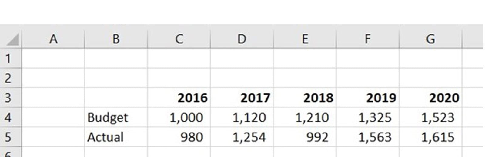
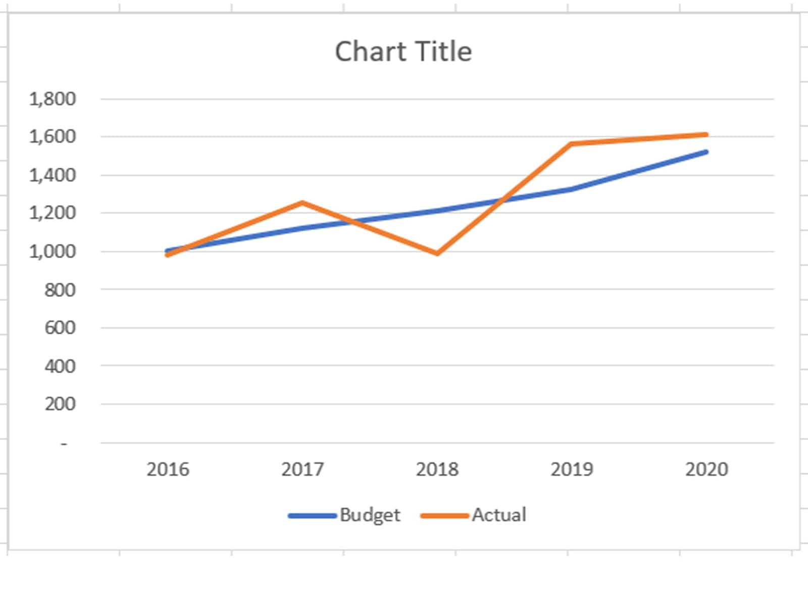
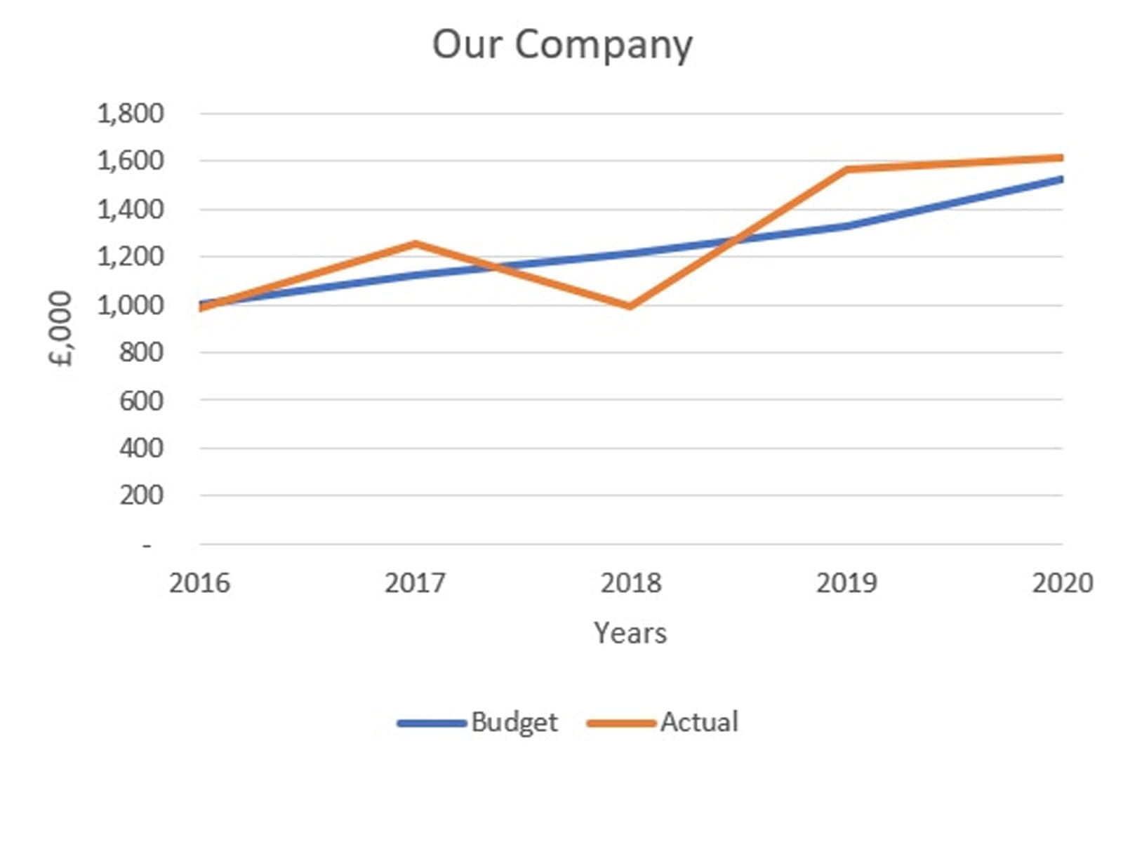
The easiest way to start is to highlight the two series, including their titles in column B and the column headers in row 3 (B3:G5). Then click on the Insert Ribbon, Charts, Line and top left option 2-D Line. The following chart will be drawn.
You will see the column headers will automatically form the X Axis labels; this is because there is no title on their left in column B. If the word ‘Years’ was entered in B3 then that whole row would appear as an additional line on the chart and the numbers 1, 2, 3… would appear as the X Axis labels.
You will also see that the chart has legend at the bottom with the row titles taken from column B. You can edit the row titles in their cell and the Chart legend will change too.
Changes to the Chart can be done through the Chart Design and Format Ribbon (that will appear when you click on the Chart) or by right clicking on the attribute of the Chart that you want to change.
In previous versions there was a two part ribbon called Chart Tools (Design and Format). Going back further to 2010 the Chart Tools Ribbon was in three parts (Design, Layout and Format). The Layout elements added to the Design tab in later versions.
Chart Design
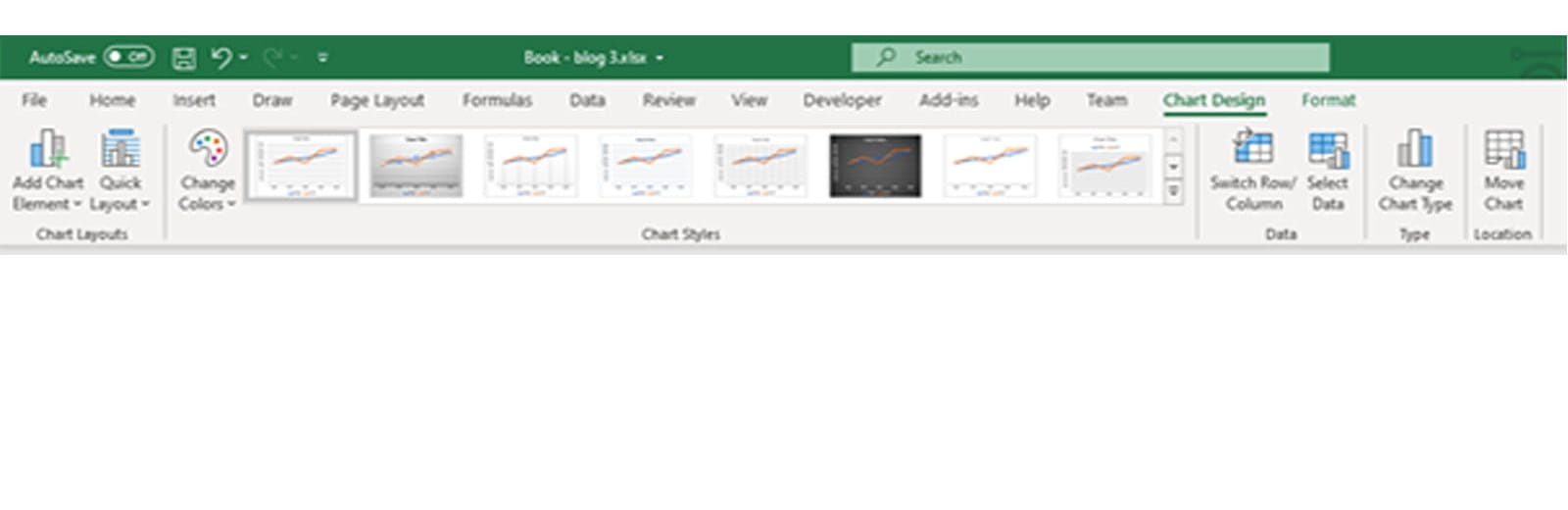
- Add Chart Element – Add Axis, Title, Gridlines and Trend lines – these will be covered throughout the blog series
- Quick layouts – A variety of options for where the Legend, Titles and Data will be displayed in the Chart Area
- Chart Styles – Colour schemes, but defining your own will be explained in the next few blogs
- Switch Row/Column – Swaps the X and Y axis data
- Select Data – A dialogue box to manage the data series and axis data – illustrated below
- Change Chart Type – Switch to another format, block, pie etc – each will be explained in later blogs
- Move Chart – This allows you to show the Chart on its own tab rather than sitting on the Worksheet
Format
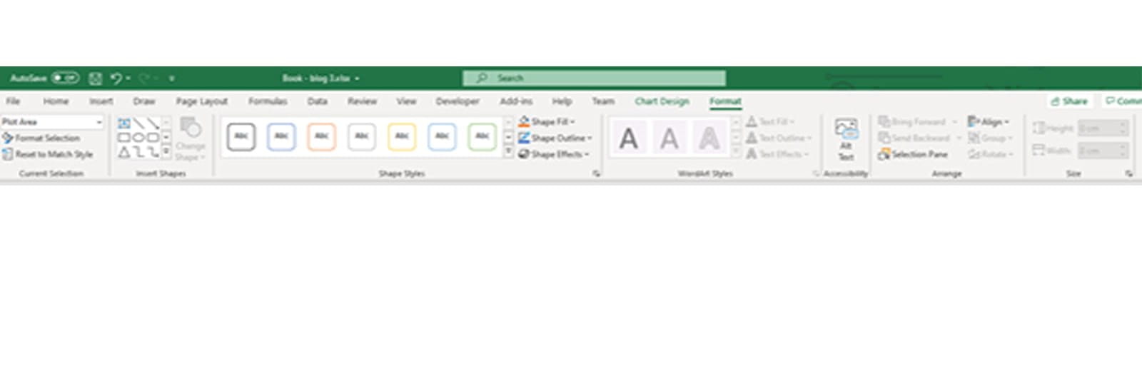
- Format Selection – A drop down box that allows you to select a part of the Chart Area and format it – this will be explained in blog 4
- Insert – Add objects to the Chart Area as in other applications
- Shape styles – Colour formats for the area specified in the Format Selection drop down box
- WordArt Styles – Text for the Title, Axis and Legend
- ALT text – Description of object
- Arrange – Alignment of the object as with other applications especially PowerPoint
- Size – The size of the Chart Area
Managing the Data Series
To access the Data Series go to the Chart Design Ribbon – Select Data or right click on any Chart line and click Select Data… The following dialogue box will appear:
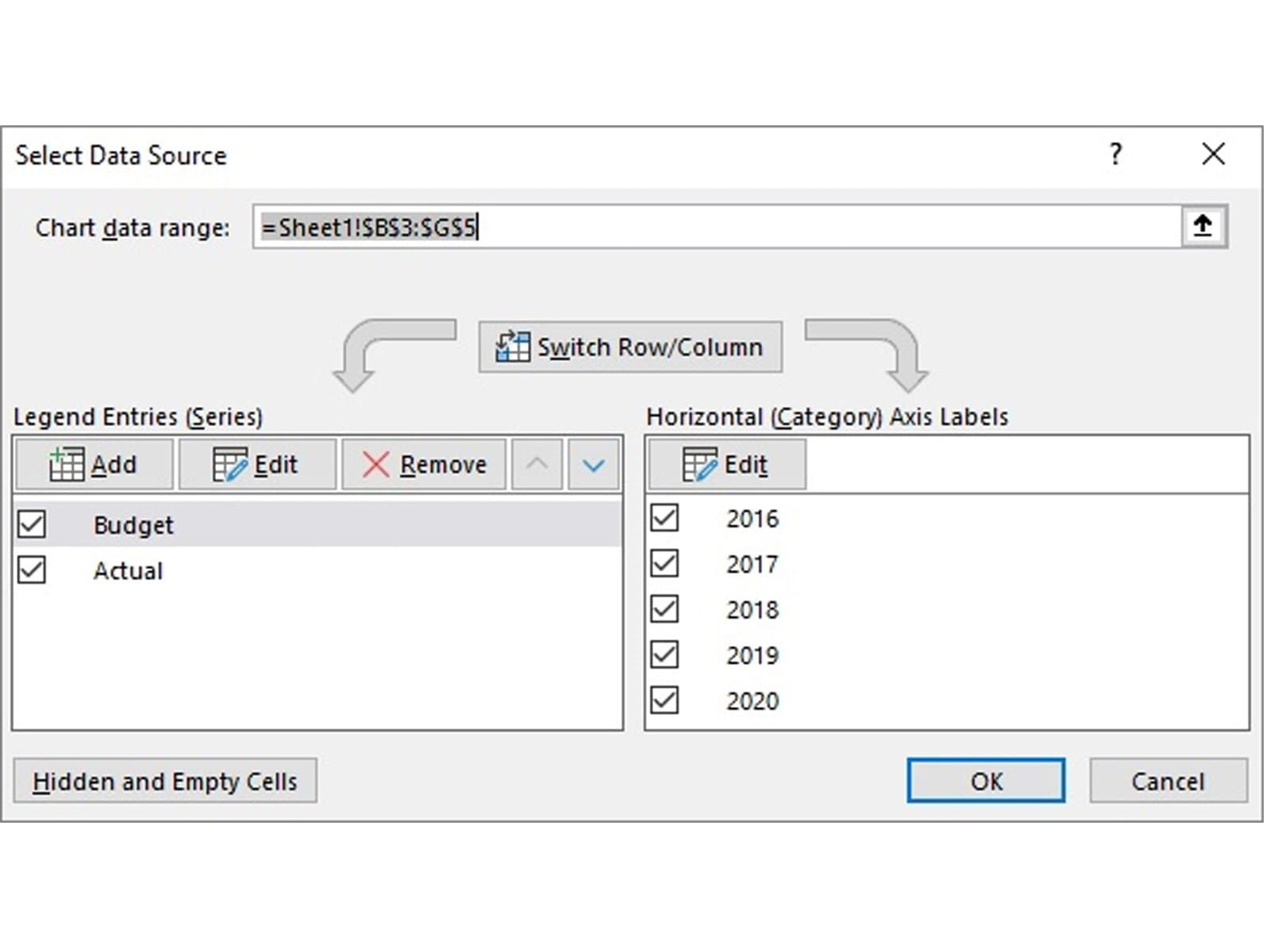
At the top is the Chart data range – you will see this range covers the two series, headers and row titles. There is the switch row and column button (as mentioned above in the Chart Design tab). Then two data boxes. The left lists the lines to be drawn. The right details the horizontal axis.
On the left you will see that data lines can be Added, Edited and Removed. If the initial set up (described above) was incomplete, then you can change it; add more data series or more years. These can be amended as follows.
To add a line – click on Add and the following dialogue box appears:
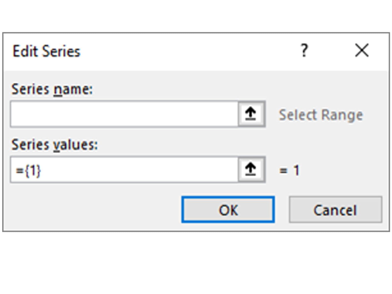
Select the cell for the Series name and then the range for the Series values and click OK. Note that the Series values range will default to a value of ={1} until a range is entered. The reference will start with = and be followed by a sheet reference e.g. for Budget above =Sheet1!$C$4:$G$4.
In the series values it is possible to enter a series of fixed values that are not held in cells on the worksheet this would be entered in curly brackets as ={120,200,300,400}.
Line display order - you will see on the Chart image above that the two lines are close and where they cross the orange line is on top of the blue. This is because they are plotted in order from top to bottom. I.e. Budget is plotted first then Actual. If you want to reverse the order then use the Move Up and Move Down arrows at the top right of the left hand box.
The right hand box has the horizontal axis – this can be entered as a range or a set of fixed values/ text held within curly brackets and separated by commas (as shown above). For text values the text must be contained in double quotes for example ={“Year 1”,”Year 2”}. Further techniques to manage the horizontal axis will be covered in blog 4.
At the bottom left of the dialogue box is a button for handling data in Hidden and Empty cells – we will explore this in blog 12.
Formatting the Chart
Having created the Chart with the data series, series names and data for Y axis, next comes some formatting. There is a multitude of attributes to be selected, most are accessed by right clicking on a part of the Chart and context sensitive options will be provided, many of these will be covered in blog 4. To get us started:
The X axis can be set as ‘between tick marks’ (formerly known as categories) or ‘on tick marks’ (formerly known as time series). The difference is where the data points are shown relative to the marker.
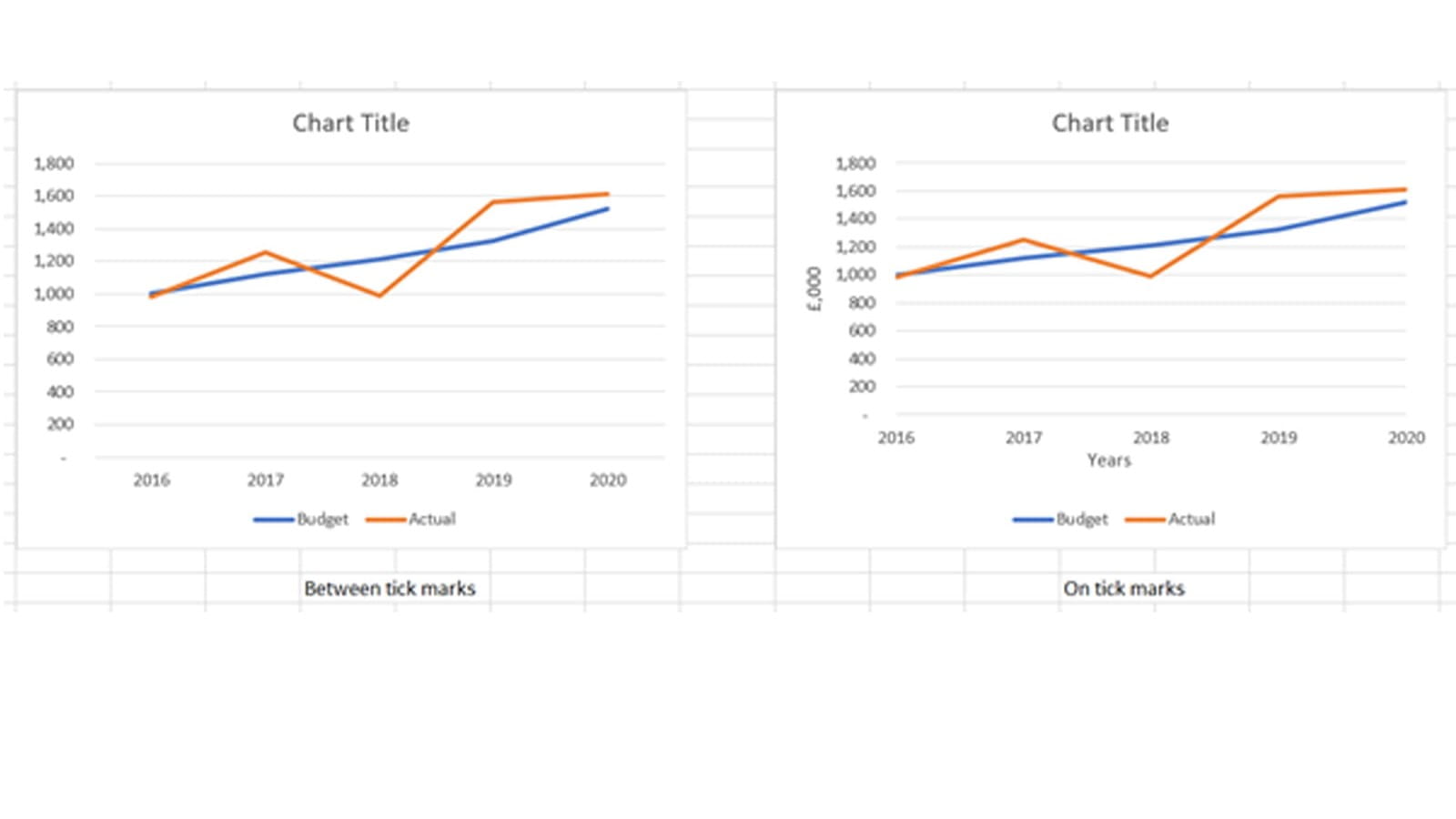
Most business Charts will be ‘on tick marks’ and therefore be on the X axis values – to select this right click on any of the X axis data values and from the menu select Format Axis.
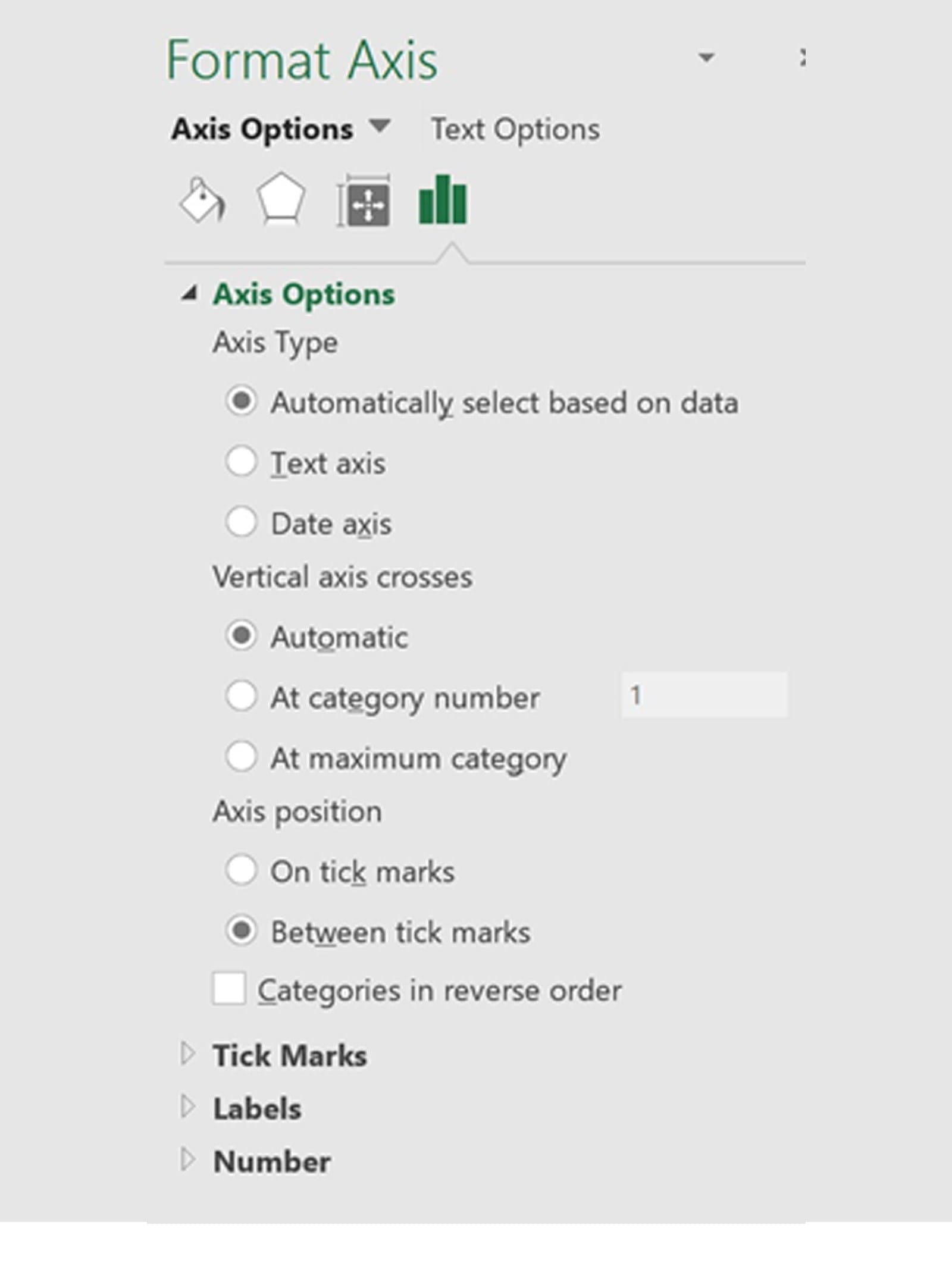
The following Dialogue box will appear (we will cover many of the options in blog 4), but for this one see Axis position (at the bottom of the list) and select ‘on tick marks’.
Finally to insert a Chart Title and Axis Labels if they are not already visible.
Go to the new Chart Design Ribbon and in the ‘Add Chart Elements’ section click Chart Title and choose ‘Above Chart’. To enter text you can click the text box that appears and type straight onto the Chart, you can enter text in the formulae bar or press = in the formulae bar and select a cell that it will be linked to. Changes in the linked cell will change the title on the Chart.
For the Axis click Axis Titles (as above for Chart Title) and for Horizontal click ‘Primary Horizontal’ which will place the title in the middle below the X axis. For the vertical click ‘Primary Vertical’ which will write vertically beside the Y axis. To enter text in both these Axis title text boxes has the same set of options as for the Chart Title and can be linked to a cell content.
On completion of the stages listed above the Chart should be as follows:
As mentioned above the next blog will develop the graphics further, formatting the axis values and changing styles and layouts.
- Exploring Charts (Graphs) in Excel – Part 2: Sparklines
- Exploring Charts (Graphs) in Excel - Part 3: Line Charts
- Exploring Charts (Graphs) in Excel - Part 4: Enhancing line charts
- Exploring Charts (Graphs) in Excel - Part 5: Column/Bar Charts, Clustered, Stacked and 100%
- Exploring Charts (Graphs) in Excel - Part 6: enhancing bar charts – creating funnel and tornado charts
Archive and Knowledge Base
This archive of Excel Community content from the ION platform will allow you to read the content of the articles but the functionality on the pages is limited. The ION search box, tags and navigation buttons on the archived pages will not work. Pages will load more slowly than a live website. You may be able to follow links to other articles but if this does not work, please return to the archive search. You can also search our Knowledge Base for access to all articles, new and archived, organised by topic.
