
So far in the Blog series we have focused on creating Line charts and exploring some of the features and options available to display the underlying data in the most appropriate manner. In this Blog we will look at alternative chart types. Helpfully many of the features and options (such as titles, axis and bounds) are the same as those for a Line chart.
Column or Bar charts
These charts are essentially the same with Column being vertical and Bar being horizontal. They are best used for discrete or categorical data rather than continuous. For example a sample of people asked their favourite fruit would be best displayed as a Column or Bar chart whereas the sales by day for a month might be better displayed as a Line chart. Take the following data and highlight all eight cells.
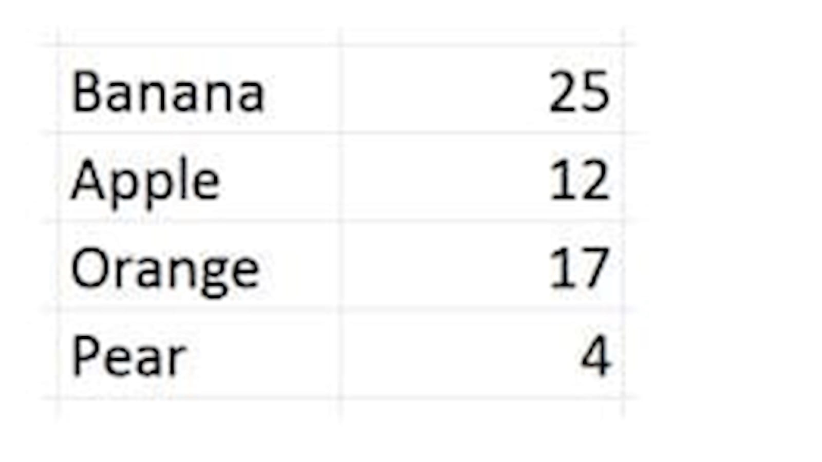
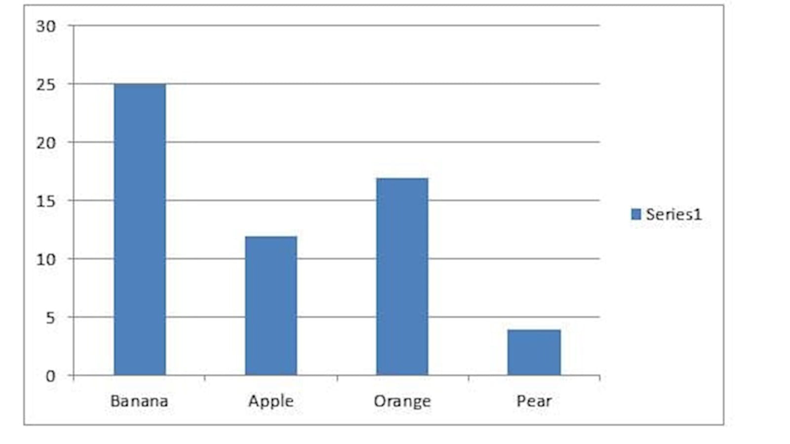
On the Insert ribbon click on the Column Icon and select the 2-D Clustered option. The following will be drawn.
The gap between the columns can be widened and narrowed by right clicking on the column and selecting Format Data Series. Under Series Options the Gap Width slider can be moved to widen and narrow the columns. Technically as the data is discrete the columns should not touch.
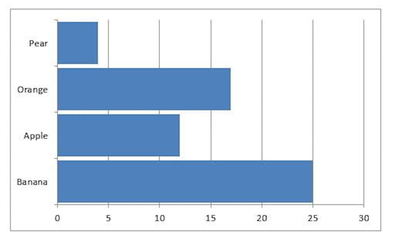
To turn this into a Bar chart right click on the chart and select Change Series Chart Type… from the options select Bar and 2-D Clustered again.
The clustered aspect is used to group blocks together for example take the following sales data:
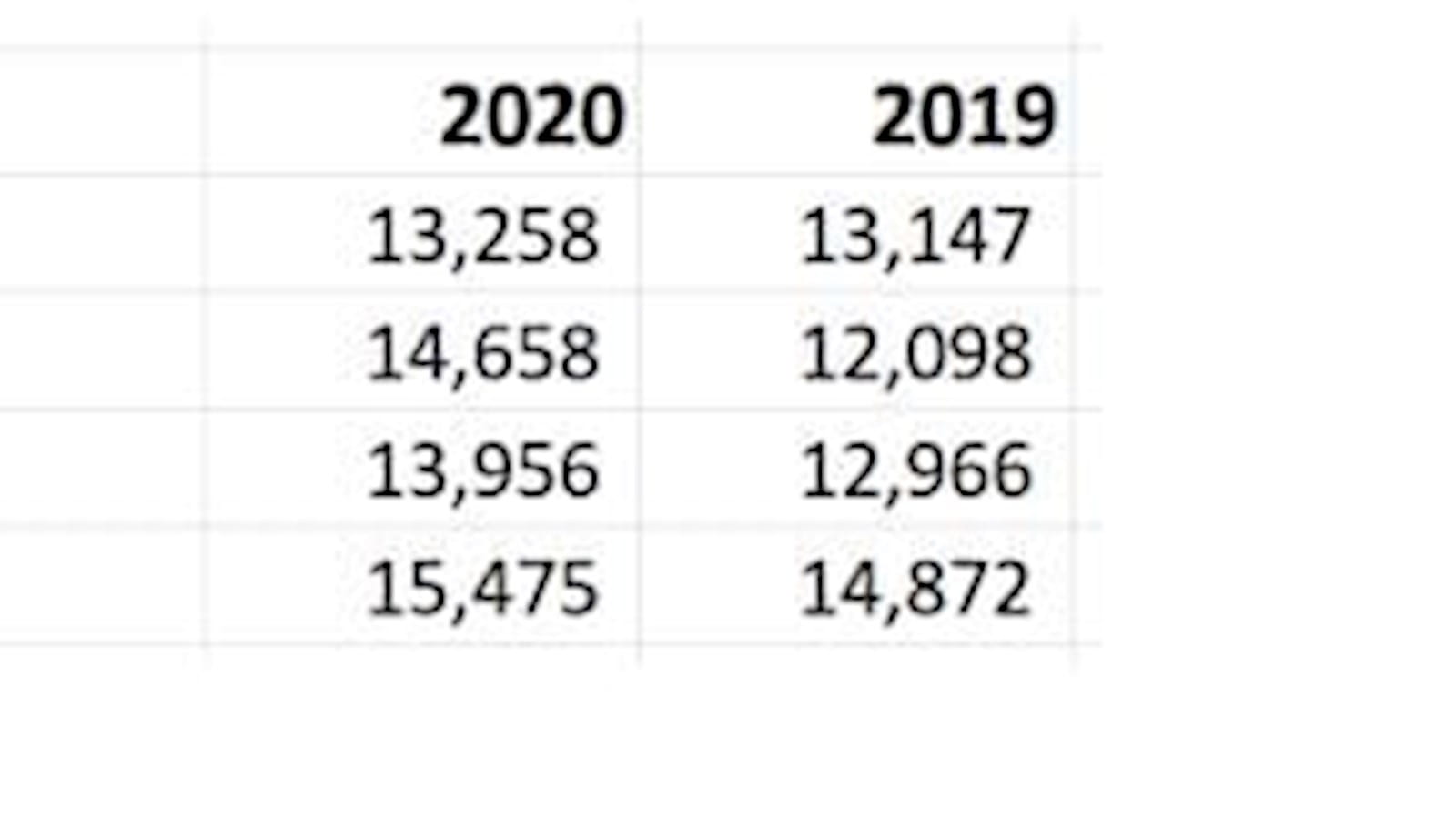
As above highlight all the data including the column and row headers and select the 2-D clustered chart. The following will be drawn.
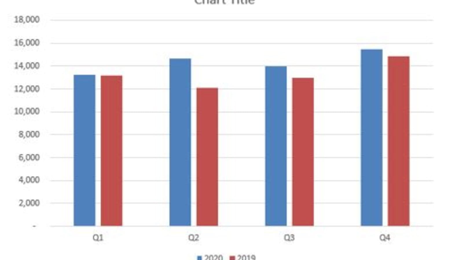
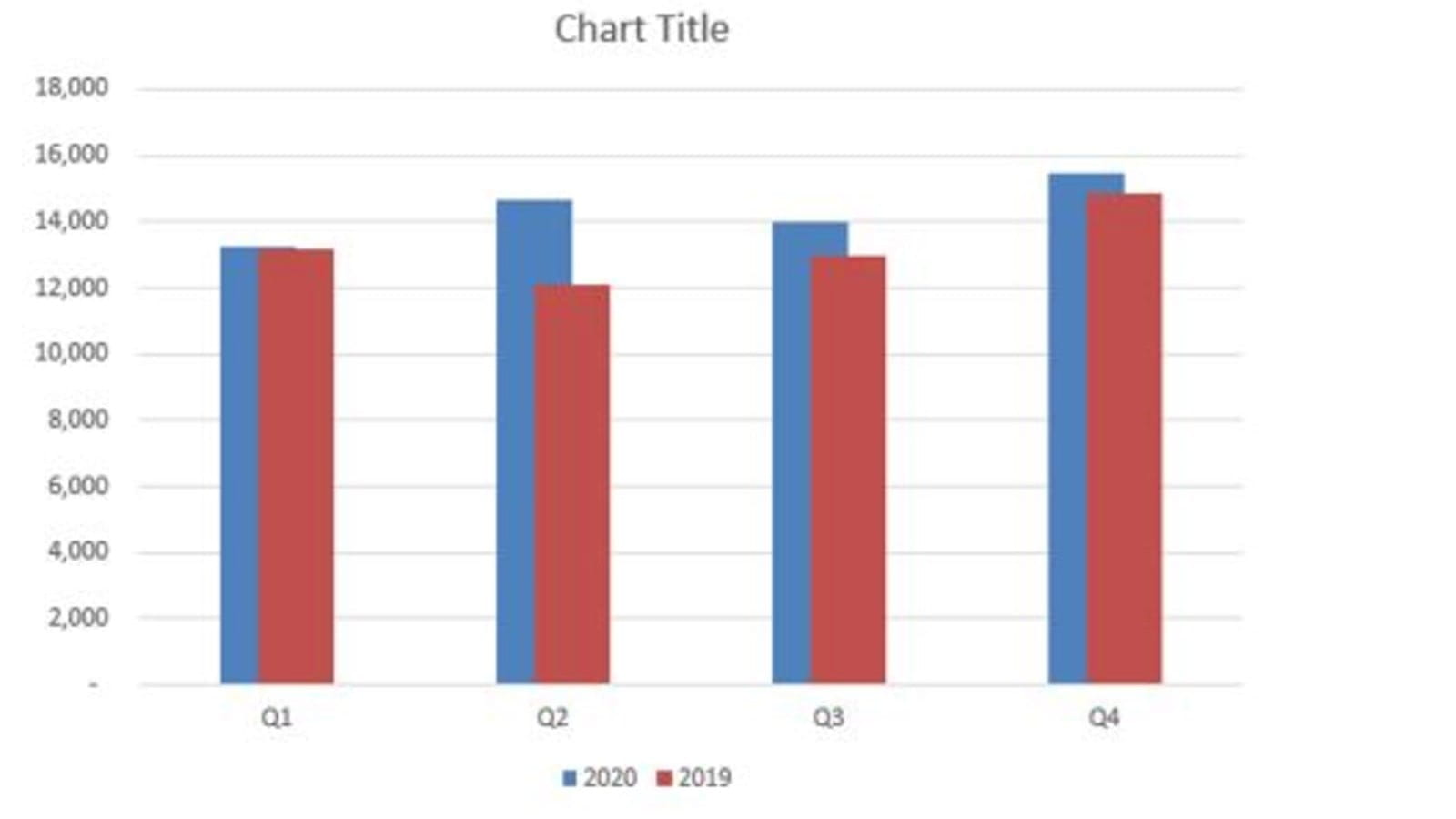
In the same place where we flexed the Gap Width in the above example you can also flex the overlap. This will move the 2020 and 2019 numbers apart or indeed overlap them. Below is shown with a 50% overlap. As in Blog 2 if you want the colours displayed the other way around (blue on top of red) then right click and Select Data. In the left hand side of the dialog box move the 2019 set to the top of the list so it is laid down first and 2020 to the bottom.
The columns can be changed to cylinders, cones and displayed in 3-D as well. By right clicking on the chart and selecting Change Series Chart Type… these options can be easily explored. As mentioned in Blog 1 there is a balance between medium and message. In a pole of FDs that were asked to vote on their least favourite Excel feature, it was 3D charts that topped the list. Simplicity and clarity are the adage for communicating information.
Stacked column charts
These charts are best used to illustrate components parts of a total. Take for example the following product data for an ice cream business:
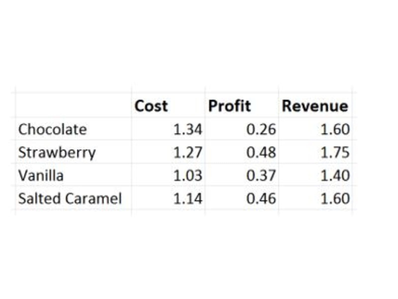
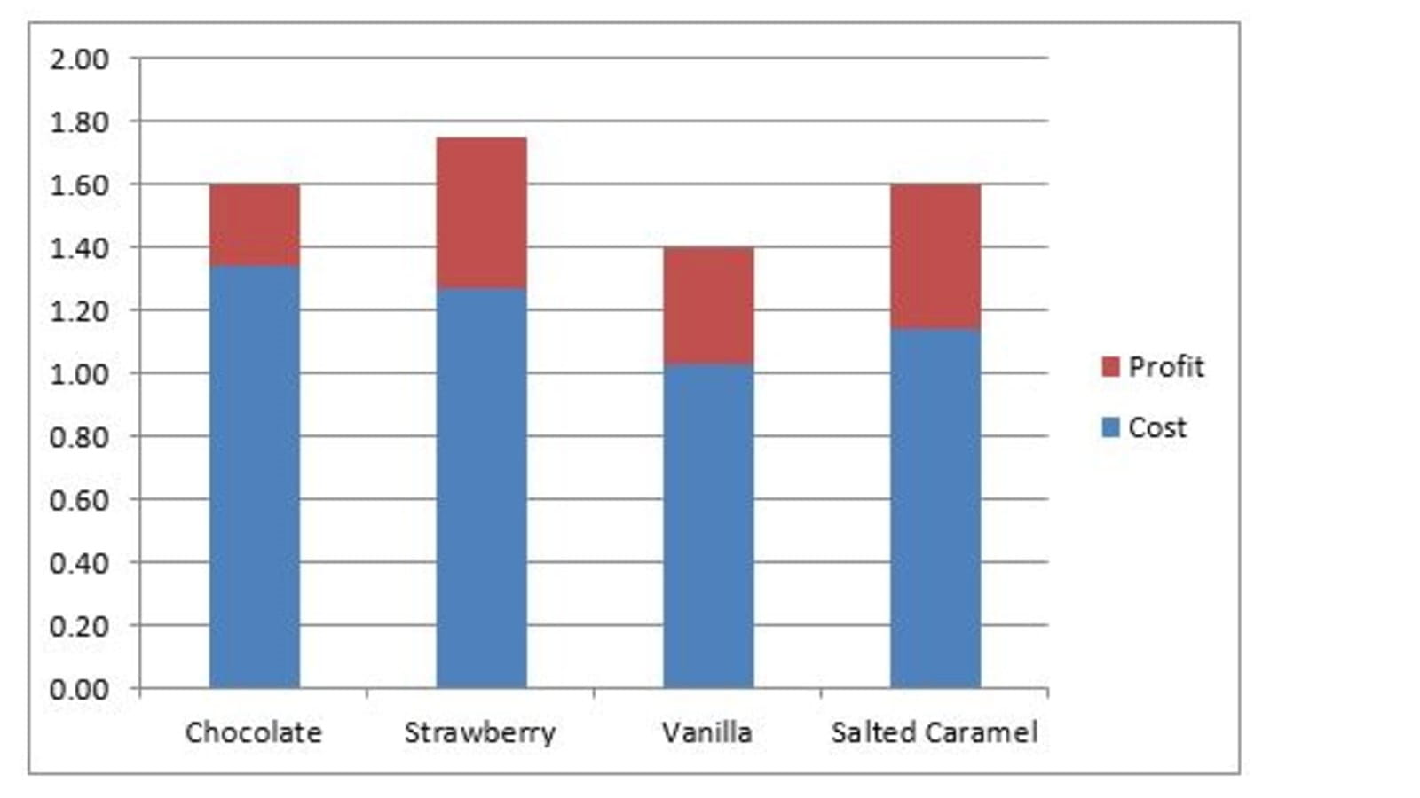
In this case select the cost and profit cells together with the column and row headers and select the 2-D stacked column chart. We have deliberately not included the revenue data as the ‘stacking’ of the other two pieces of data will calculate the revenue as the total height of the column.
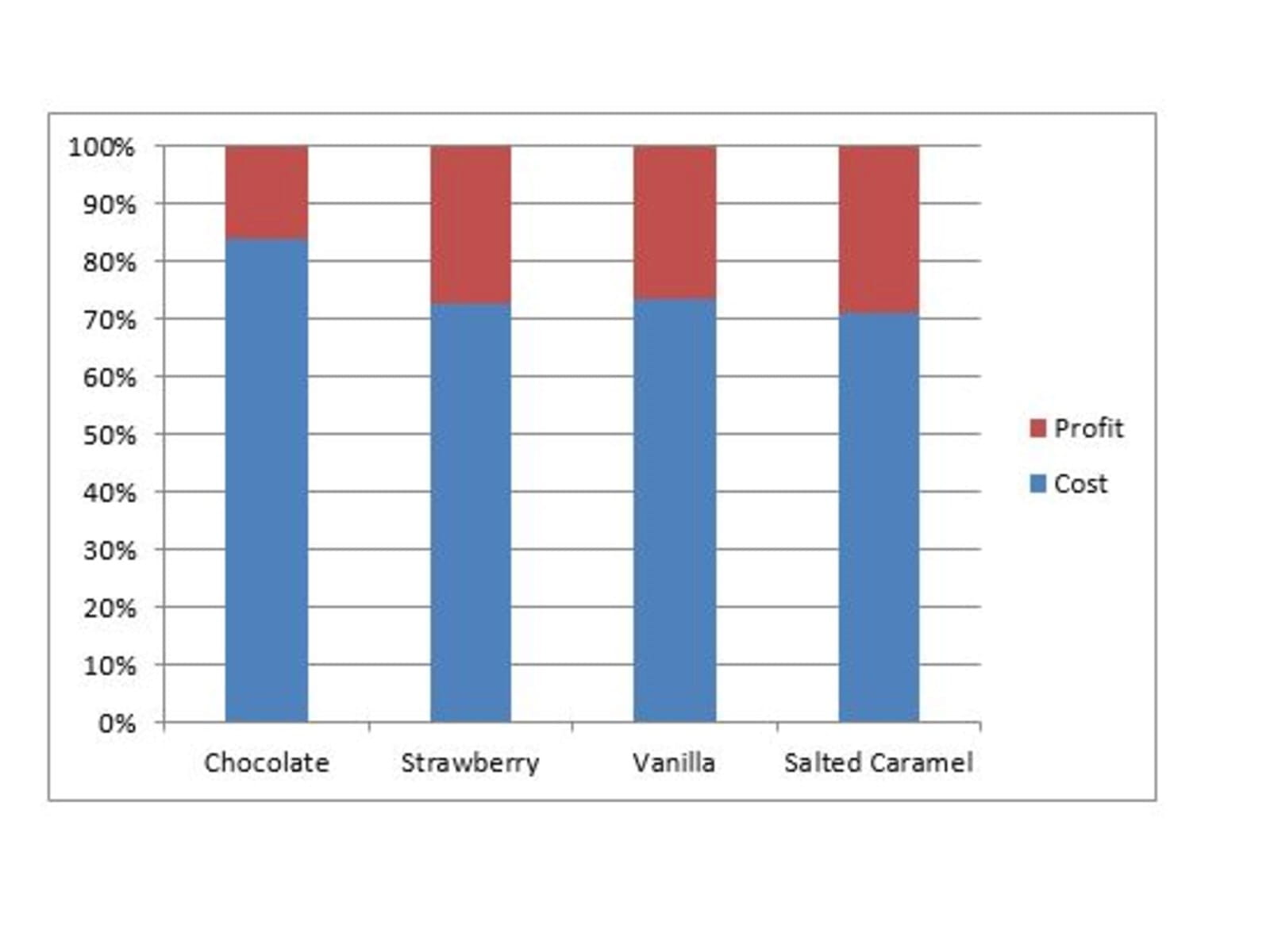
100% stacked column charts
In the chart above each of the columns is a different height and thus it is not clear which of the four products makes the greatest profit. The 100% chart makes all the columns the same height and thus reveals the one which has the greatest profit percentage. To create this chart just right click on the existing chart and Select Series Chart Type… and choose 100% stacked Column.
As with the previous articles the best way to understand all the options is to simply play and explore the range of permutations that are available.
- Exploring Charts (Graphs) in Excel – Part 2: Sparklines
- Exploring Charts (Graphs) in Excel - Part 3: Line Charts
- Exploring Charts (Graphs) in Excel - Part 4: Enhancing line charts
- Exploring Charts (Graphs) in Excel - Part 5: Column/Bar Charts, Clustered, Stacked and 100%
- Exploring Charts (Graphs) in Excel - Part 6: enhancing bar charts – creating funnel and tornado charts
Archive and Knowledge Base
This archive of Excel Community content from the ION platform will allow you to read the content of the articles but the functionality on the pages is limited. The ION search box, tags and navigation buttons on the archived pages will not work. Pages will load more slowly than a live website. You may be able to follow links to other articles but if this does not work, please return to the archive search. You can also search our Knowledge Base for access to all articles, new and archived, organised by topic.
