
Hello all and welcome back to the Excel Tip of the Week! This week we have a General User post in which we’re going to look at the esoteric and quirky 3D maps feature.
What is 3D maps?
3D maps can be used to create an animated visualisation of data with a geographic element, and which can even show the data updating over time. Here’s a sample:
These are relatively simple to make – requiring only minimal data and no specialist knowledge. To start, get your data into a format like this:
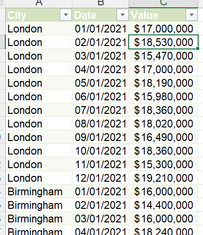
If your data is currently in a 2D layout (with dates across the top), then TOTW 425 on unpivoting can help you easily transform it.
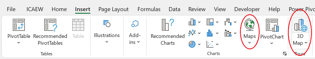
From here, select your data and use Insert => 3D Map:
Note that there is also the Maps chart type, which you can use to create a static map chart.
3D Maps will open this new window:
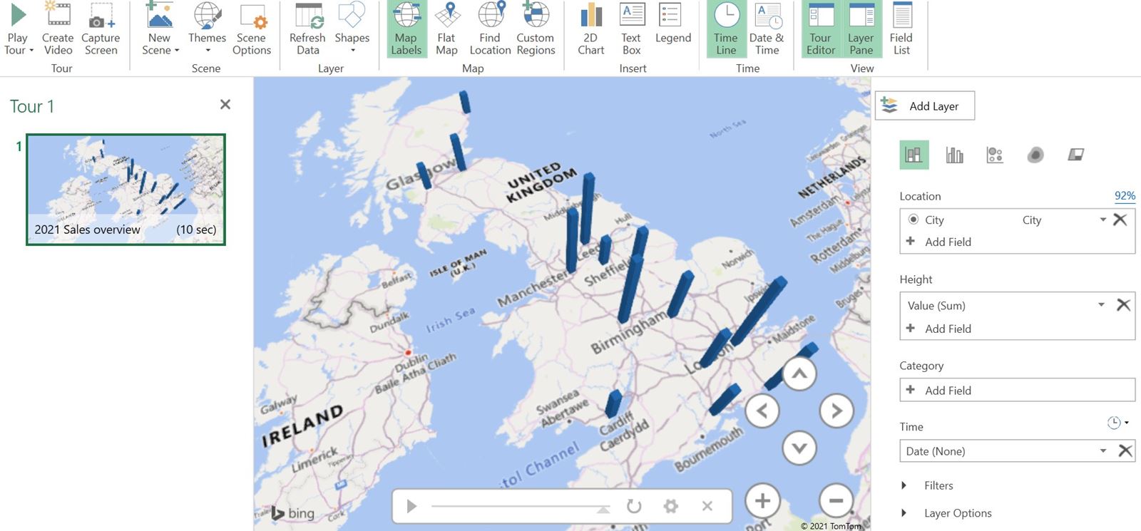
From here you can select which fields to use for which elements of the visualisation. As you can see here, we’ve chosen the City field for the Location, Value field for the Height, and the Date field for the Time. This is all you need to create the visualisation! You can also use the on-screen buttons or a left-click and dra to adjust the camera position, angle, and zoom of the visualisation.
Going further with 3D maps
As well as the basics, you can also create several different Tours and have them play one after the other to make a more complex presentation. You can also tweak the type of map being used – from a simple cartographic map like the above example to a more realistic satellite map or other option. You can also use a custom image instead of a map.
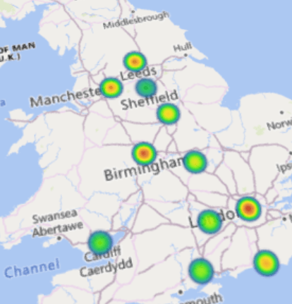
You can also visualise the data in other ways than pillars – for example as bubbles or as heat maps:
You can also add annotations to individual points with descriptions of what’s going on there, or just with a label showing the data. Unfortunately you can’t add these wholesale, and instead need to add them to each data point in turn.
Download the accompanying file and have a play around with it yourself! This also includes a simple Power Query that transforms the tabular source data into the required 3-column format.
Join the Excel Community
Do you use Excel in your organisation? Are you using it to its maximum potential? Develop your skills and minimise spreadsheet risk with our Excel resources. Membership is open to everyone - non ICAEW members are also welcome to join.

- Excel Tips and Tricks #506: Creating a single master list after merging data
- Excel Tips and Tricks #505 – 3 ways of converting US Dates into UK formats
- Excel Tips and Tricks #504 - Accessing accessibility checkers for good spreadsheet practice
- Excel Tips and Tricks #503 – Printing under pressure, super quick presentation tips
- Excel Tips and Tricks #502
Archive and Knowledge Base
This archive of Excel Community content from the ION platform will allow you to read the content of the articles but the functionality on the pages is limited. The ION search box, tags and navigation buttons on the archived pages will not work. Pages will load more slowly than a live website. You may be able to follow links to other articles but if this does not work, please return to the archive search. You can also search our Knowledge Base for access to all articles, new and archived, organised by topic.
