
Applying default conditional formats is very straightforward and can be accomplished with just a couple of clicks, but delving a little deeper can help you to use conditional formatting in additional ways and to tailor your format to your own requirements. After looking in part 1 at some of the more advanced ways to use cell formats as part of conditional formatting, in this episode, we are looking in depth at the graphical conditional formats.
Introduction
The conditional formatting feature in Excel can be used very simply, with just a few clicks required to highlight significant cells or to apply one of three types of graphical format to a range of cells. However, taking the time to explore the capabilities of conditional formatting in a bit more detail can help you to extend what you can achieve and ensure that your formatting looks exactly how you want it to.
In the first part of a short series, we looked at some of the less obvious options available within the Highlight Cells and Top/Bottom rules sections and this time we move on to look at Data Bars, Colour Scales and Icon Sets.
Data Bars
From the Conditional Formatting dropdown, there is a choice of 12 different Data Bars: six different colours for each of Solid and Gradient bars. However, as we saw last time with the Highlight Cells and Top/Bottom rules, a More Rules… option provides many additional possibilities.
The first part of the series ended with a look at the range of colours that can be used throughout the conditional formatting options and, accordingly, the New Formatting Rule dialog for Data Bars allows the choice of any Windows colour, including the user of RGB values for specific colours, for the bar itself and, separately, for the bar border.
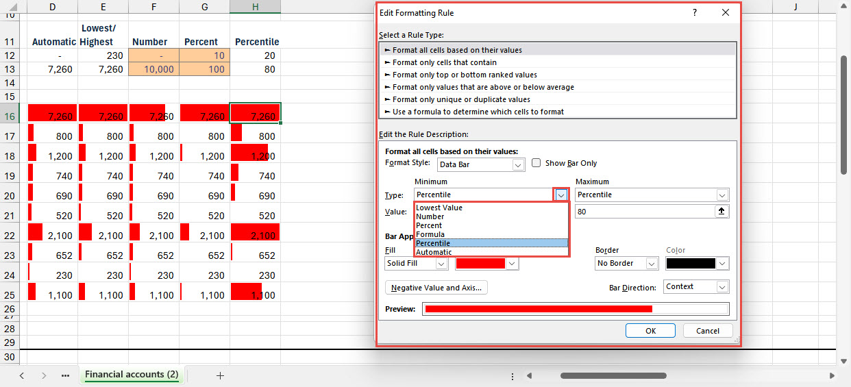
There are several options for setting the Minimum and Maximum values used in calculating the width of the bar. As well as the default Automatic calculation, you can use the Lowest/Highest values in the range of cells selected; type in your own Number; Percent or Percentile or use a Formula to calculate one or both values. In the examples below, where an option can use cell references for the values, rather than typed values or not needing a value, we have formatted cells using the Input Style:
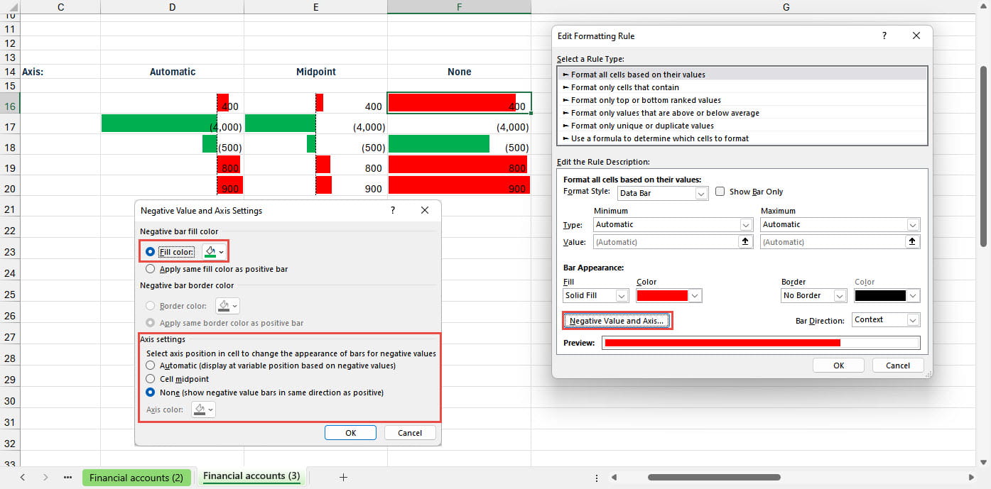
A 'Negative Value and Axis…' button displays a dialog that allows you to choose the colour for any negative value bars and borders as well as choosing where to place the axis that separates negative and positive bars. The None option for the axis is worth clarifying: by default this will set the axis at the lowest value, so the most negative value will have a zero width data bar with all the other data bars starting from this position. Different colours for positive and negative numbers will still be used:
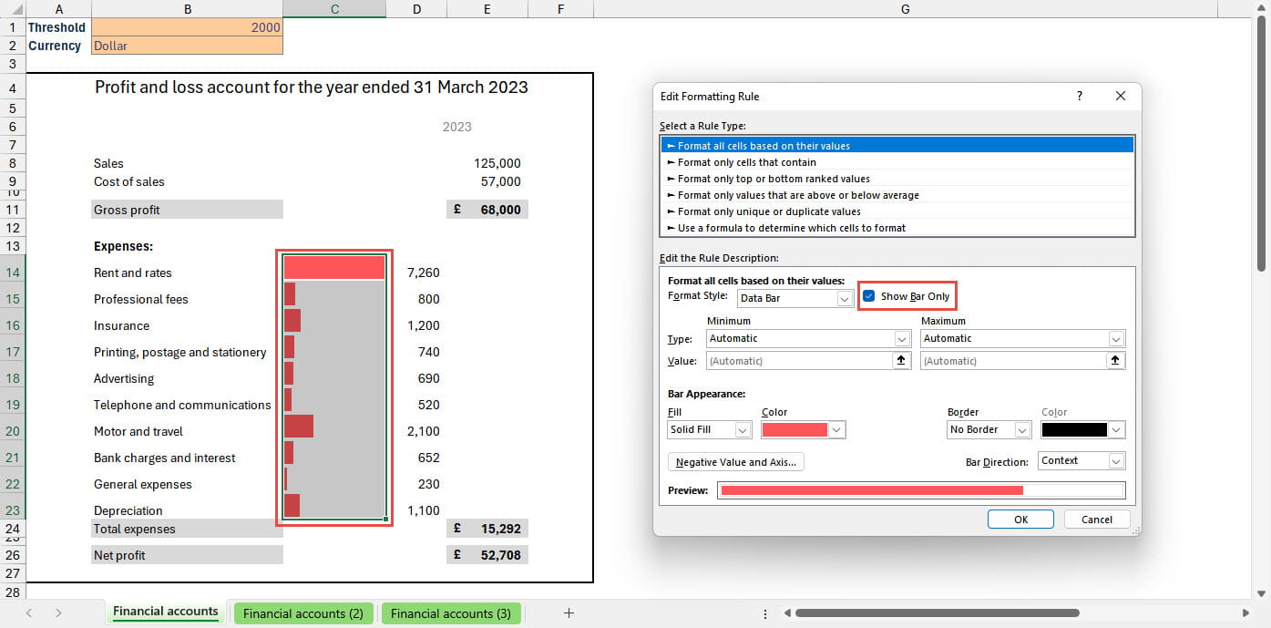
Returning to the main New Formatting Rule dialog, you can choose the direction of the data bar and, importantly, choose to Show Bar Only. This allows you to replace the values with data bars which can be particularly effective when used in a PivotTable. Alternatively, you can add another column that refers to the original values, and then show the data bars separately from the values:
Colour Scales
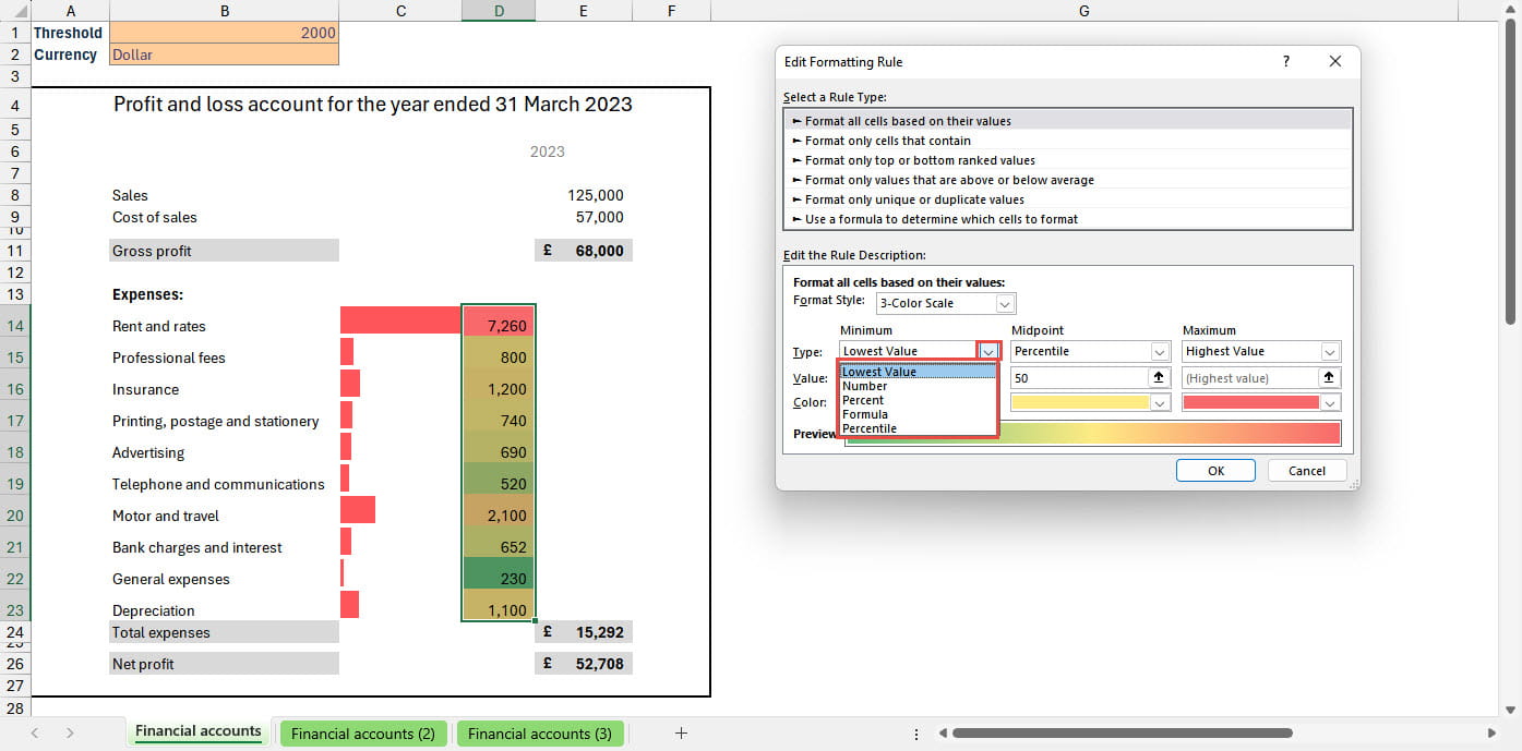
Once more, the Conditional Formatting dropdown gives a choice of 12 different colour scales using different colours split between six two-colour scales and six three-colour scales. The More Rules… button includes some further options, but far fewer than for Data Bars. You can choose between two and three colour scales and set the colours for each. There is also a set of choices for how to calculate the Minimum and Maximum values and, for three-colour scales, the Midpoint:
Icon Sets
The third of the three graphical conditional formats is Icon Sets. This type of formatting adds icons to each of a range of cells based on the comparative values. The Conditional Formatting dropdown for Icon Sets includes four sections:
- Directional: between 3 and 5 arrow-shaped icons
- Shapes: mainly 'traffic light' type shapes but with sets of 4 as well as 3 shapes
- Indicators: flags and symbols for good, average, bad
- Ratings: stars and chart diagrams for dividing values into between 3 and 5 rating categories
Like the other two types of graphical conditional format, the More Rules… option at the bottom of the dropdown list allows detailed control over several aspects of how the icons are used. The Icon Style dropdown allows the choice of any of the icon sets as displayed in the main dropdown, with the Reverse Icon Order command allowing the order of the icons within each set to be reversed. In recent versions of Excel, it is possible to choose individual icons, mixing icons from any of the sets available. In addition, there is a No Cell Icon option available for each individual icon. Again, in common with Data Bars and Colour Scales, there are options for how the threshold values are calculated:
In this practical example, we have adopted a minimalist approach to use red traffic light circles in an adjacent column that refers to the values in our expenses column, in order to highlight those expenses that exceed a threshold value entered into a cell:
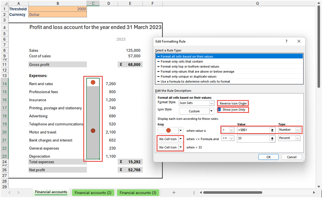
Note that, to achieve this, we have used the Reverse Icon Order button; turned on the Show Icon Only option; set the icons for the bottom two ratings to No Cell Icon and changed the value Type to Number and the Value itself to refer to the contents of cell $B$1.
Conclusion
In the third part of the series, we will look at how to work with multiple rules, including how we can use our single highlight in earlier versions of Excel. We will also look at some other uses of conditional formatting, including how it works with PivotTables and Power Query tables, as well as some more unusual applications of conditional formatting, such as peril sensitivity and the cloak of invisibility.
Archive and Knowledge Base
This archive of Excel Community content from the ION platform will allow you to read the content of the articles but the functionality on the pages is limited. The ION search box, tags and navigation buttons on the archived pages will not work. Pages will load more slowly than a live website. You may be able to follow links to other articles but if this does not work, please return to the archive search. You can also search our Knowledge Base for access to all articles, new and archived, organised by topic.