
Tired of mind-numbing presentations packed with endless bullet points and text-heavy slides? We explore why traditional PowerPoint practices fail, uncover common pitfalls and share practical tips for crafting engaging, story-driven presentations. Transform your next slide deck from a snooze-fest into a memorable experience.
Have you attended a presentation that looks like the slide below before? Have you attended 100? Have you ever given a presentation?
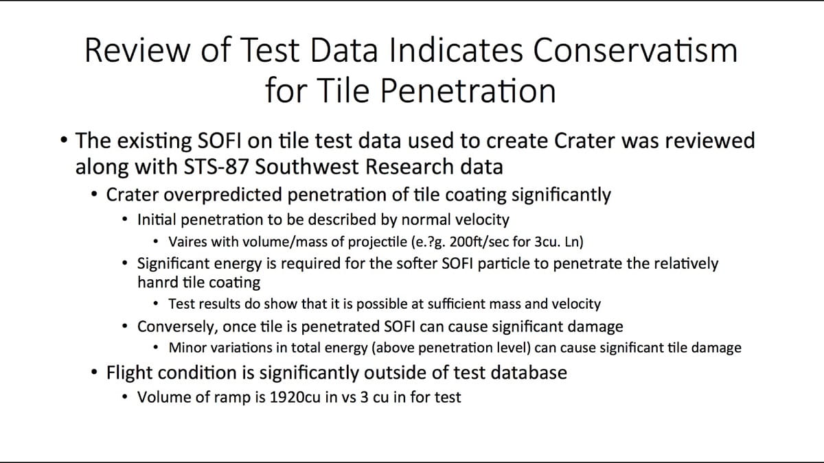
Not only does that slide exist, but it caused literal ‘Death by PowerPoint’.
I will run through some scientific evidence of why bullet points are unsuitable as well as some simple PowerPoint tricks to avoid them and what to use instead.
Firstly, let’s assess one large inherent flaw in using PowerPoint presentations for storytelling and the single feature that can address that, a feature that many regular PowerPoint users may not have heard of.
Storytelling across slides
The nature of PowerPoint’s sequential slides makes storytelling hard
Most presentation/PowerPoint blogs, articles, books, videos and courses will tell you that presentations need to be told as stories but with only one slide appearing on screen at a time that becomes so difficult. Slides break up stories, plus preparing slides as single pages means both writing and telling these stories are difficult. In 2016, PowerPoint created a solution to tackle this.
PowerPoint’s Morph feature completely reimagines presentation building
Admittedly, PowerPoint transitions are tacky but there is a new feature released under the Transitions tab called Morph which creates a video-like sequence from the previous slide to the current one, thus enabling cross-slide storytelling. Once you have uncovered the abilities of Morph, you are more likely to think of presentations as sequential stories. Follow these steps.
- Duplicate a slide (or create a blank one with some of the same elements copied)
- On the second slide, move objects, recolour, change fonts, crop images
- Select the second slide and click on Transitions tab > Morph.
Morph will create frame by frame, video-like transitions between each element that is identical with different properties like shown in these slides or in the video below.
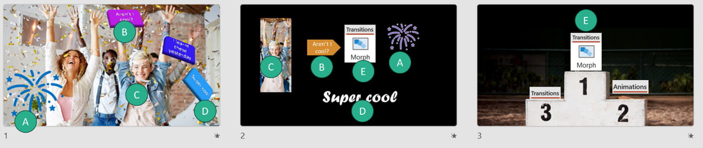
The video here shows the fundamentals as well as more advanced use cases, like morphing completely unrelated objects from one to another or morphing letter by letter across slides.
What about non-morph transitions & animations
In PowerPoint, “transitions” control movement between slides while “animations” control movement of objects on a single slide.
Occasionally I use the transition and animation called “Fade”. It’s worth noting that if a Morph transition is applied but there is nothing to morph, then it will become a fade transition.
Animations can be useful, but mainly when something should appear one by one. However, instead I would recommend using a multi-slide sequence with Morph.
Animations have many features but the risk of animations not appearing as expected is high due to the abundance of features. The most common issue is animations appearing in an unwanted order.
On a side note, Canva has done a better job than PowerPoint of integrating AI into animations as it suggests smart looking animation combinations which happen as soon as the slide appears.
Text in slides
Are bullet points really that bad?
Harvard research shows that 20% of people’s brains will switch off just at the sight of bullet points.
While “The Redundancy Principle” states that if an audience member is reading and listening to the same content at the same time, then 1+1 ≈ 0. People will absorb far less because information from two inputs increases working memory load which interferes with learning rather than facilitating it.
It’s tremendously difficult to “not read the slides”
For this illustration look at the image below and say the colour of the text.
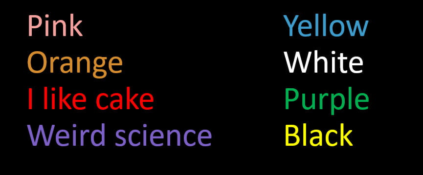
Most take longer to get the last ones right because of “the Stroop Effect”. The science states that because the brain reads faster than it’s able to interpret the meaning, the automatic reading works first and the interpretation lags.
A similar thing occurs when slides display text, the automatic action which is to read the text, so a presenter trying to not read results would require more brain power at the expense of slower interpretation. Add a stage-fright stricken brain and the result is your brain telling “don’t read the slides” but reading them anyway.
“But, making bullet points is quick, I don’t have time for diagrams and images…”
Convert bullets to diagrams or icons in three clicks on PowerPoint
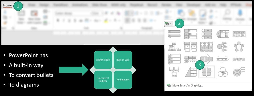
Type out bullet points as you normally do, then click Home tab > diagram icon > choose a graphic. This “SmartArt” feature has been around for almost 20 years but gets a bad reputation because of how embarrassing the similar sounding “Clip Art” was. There is also a way to make SmartArt from scratch, but this method is superior. SmartArt has simple customisation options, but what makes it stand out is the ability to edit through a bullet point user interface while the output is a diagram.
Icons prompt your brain better than text
PowerPoint has got thousands of assets called “Icons” on the Insert tab. In contrast to pictures, icons are vector images that can be recoloured as if they were shapes so they stand out and can follow corporate branding.
AI can also turn bullets into icons. If you are editing a slide with bullet points, click on Designer on PowerPoint’s home tab to use AI to convert bullets into icon diagrams.
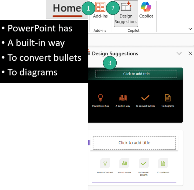
This video shows the process to convert bullets into icons using the Designer AI:
If thousands of icons aren’t enough, Canva has millions of stock assets in its free catalogue and hundreds of millions in its paid one.
How much is too much in a slide?
In his TEDx talk “How to avoid death by PowerPoint” Swedish presentation wizard David JP Phillips argues that six objects are the limit. Audience members will maximise the “Iconic Memory” until that point, otherwise you’d lose your audience. I also recommend people stick to 30 minimum for font size so people in the back of a reasonably sized room can read them.
Our brains interpret an “object” as a title, an image, a short phrase, a company logo, a slide number etc.
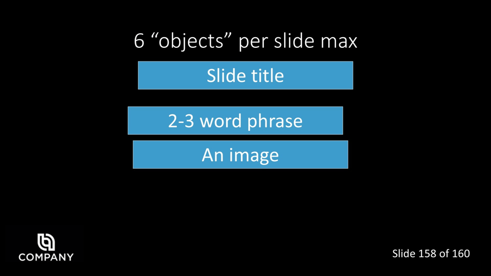
I came to your company for this presentation, you don’t need to remind me with a logo on every slide, but there may be a sigh of relief seeing “Slide 158/160”.
PowerPoint’s underused alignment tools are key
Did the above slide annoy you, with non-aligned objects? Audiences get distracted from non-aligned objects. We’ve all seen the red lines as you move objects around but that is usually not enough for me, PowerPoint’s built-in “Align” tools are simple and useful. You can find them either under Home tab > Arrange > Align or under Picture/Shape format tab > Align.
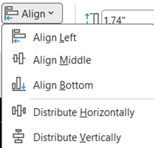
If you’re curious for more alignment tricks, take a look at this video.
Literal death by PowerPoint
This slide was presented by Boeing engineers to NASA’s management team in 2003. I added the green rectangle to highlight the key point which was nine points deep.
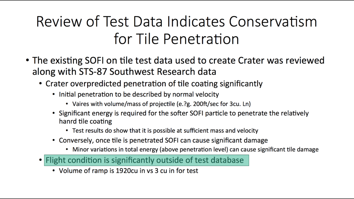
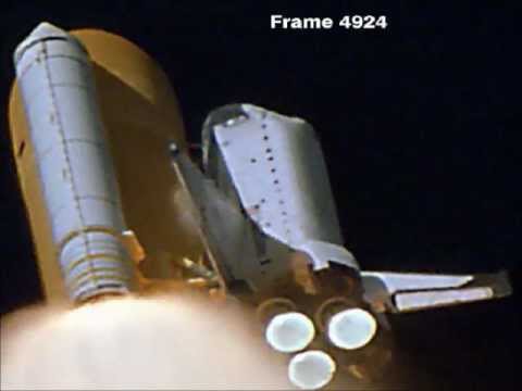
In 2003, after ignoring the detail, the Columbia spacecraft burned on re-entry experiencing a foam strike and seven people sadly lost their lives. Maybe that could have been avoided if a slide headline would have instead said “Foam strike more than 600 times bigger than test data”. The below image is NASA launch footage showing the moment the foam struck the shuttle’s left wing.
Archive and Knowledge Base
This archive of Excel Community content from the ION platform will allow you to read the content of the articles but the functionality on the pages is limited. The ION search box, tags and navigation buttons on the archived pages will not work. Pages will load more slowly than a live website. You may be able to follow links to other articles but if this does not work, please return to the archive search. You can also search our Knowledge Base for access to all articles, new and archived, organised by topic.
