
In this post, we’re looking at a quick, simple tip that will save a lot of frustration if you regularly work with charts in Excel.
The problem
Let’s suggest you’ve built a chart. You have considered all the data visualization principles and taken the time to ensure it is perfectly formatted.
The chart below is an example.
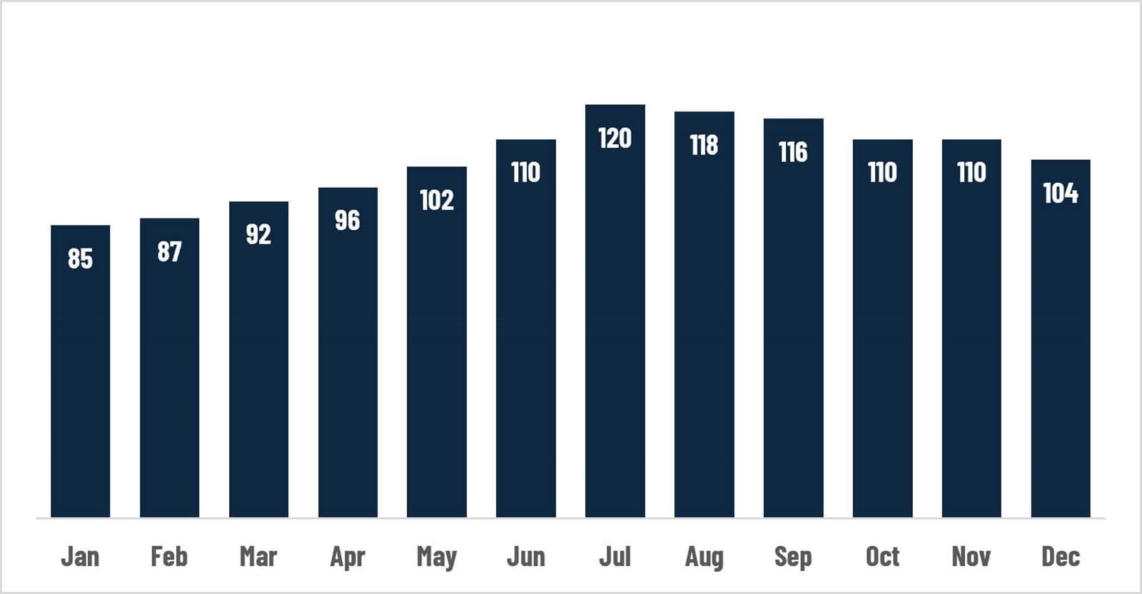
You decide you want the chart to point to a different data range.
When you click on the chart, Excel displays the “chart foils” (the coloured data regions). I heard a Microsoft employee use this term once. I’ve never heard anybody else use it. Since we don’t have a better name, let’s use it.
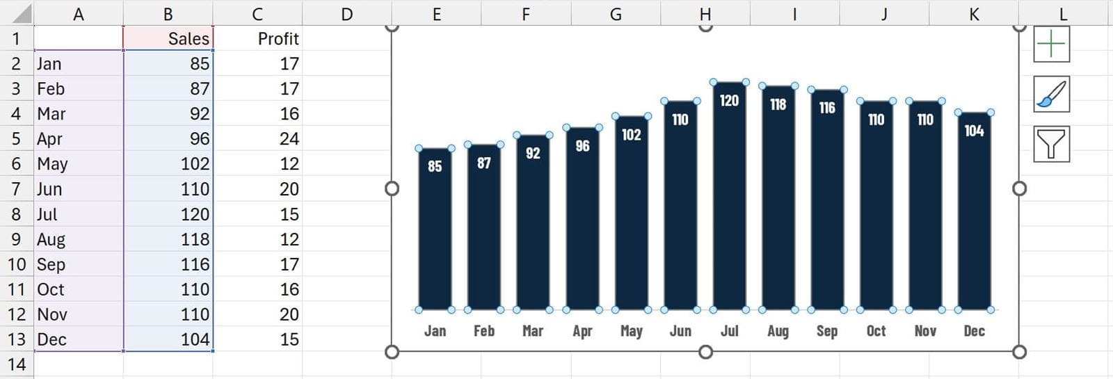
To repoint the chart to the new values, just click and drag the foil to the range.
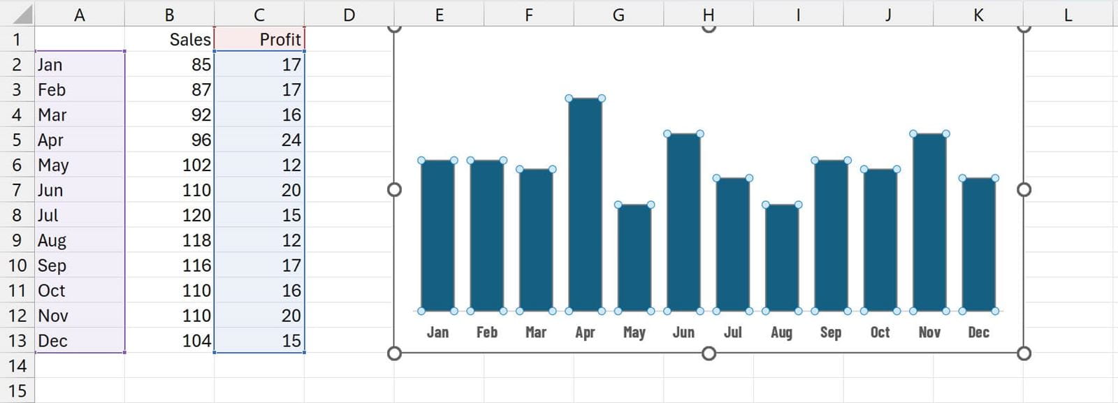
In the screenshot above, I have dragged the foils onto the profit cells.
Unfortunately, some of the formatting now disappears. In our example, the data labels disappeared, and the fill colour changed.
That is pretty frustrating. But the good news is that we don’t need to reformat the chart again.
The quick manual fix
There is a quick manual fix for this lost-formatting problem. Use this if you only need to do it occasionally.
- Press Ctrl + Z to return the chart to its previous state.
- Select the chart area and press Ctrl + C to copy it.
- Edit the chart again (this will break the formatting).
- With the chart area selected, click Home > Paste (drop-down) > Paste Special….
- From the dialog box, select Formats and click OK.
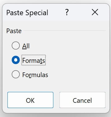
This reapplies the original formatting and restores the previous look and feel.
Change the settings
If you perform this type of action often, there is a better way.
Excel has a little-known setting that controls this behaviour. Once the setting is removed, the formatting will always be retained.
- In Excel, click File > Options.
- In the Excel Options dialog box, click Advanced.
- Scroll to the Chart section.
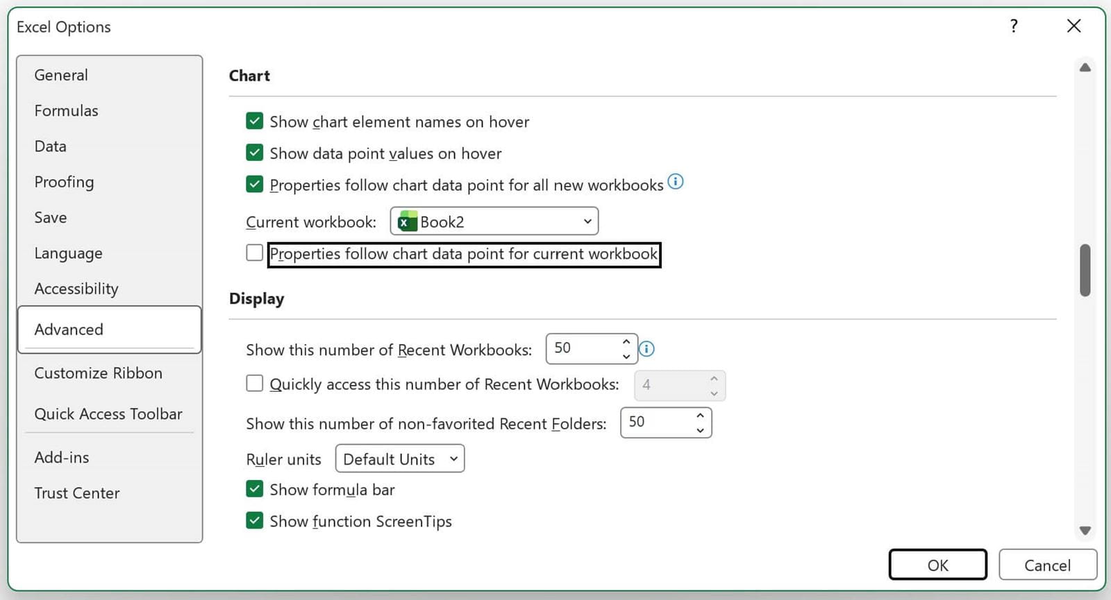
- Uncheck Properties follow chart data point for current workbook.
- Click OK.
Now, when you move any chart foils in the workbook, the formatting doesn’t change.
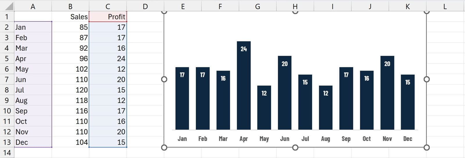
As shown in the screenshot above, the formatting remains.
There are two similar options in the dialog box:
- Properties follow chart data point for all new workbooks - This determines the default setting for each new workbook created.
- Properties follow chart data point for current workbook - This removes the setting for the current workbook only.
Whether you toggle the option on/off, set it for a specific workbook, or apply it to all new workbooks, there is no reason to be frustrated by Excel changing the chart formatting on you.
Archive and Knowledge Base
This archive of Excel Community content from the ION platform will allow you to read the content of the articles but the functionality on the pages is limited. The ION search box, tags and navigation buttons on the archived pages will not work. Pages will load more slowly than a live website. You may be able to follow links to other articles but if this does not work, please return to the archive search. You can also search our Knowledge Base for access to all articles, new and archived, organised by topic.
