
What is a sparkline and what are they for?
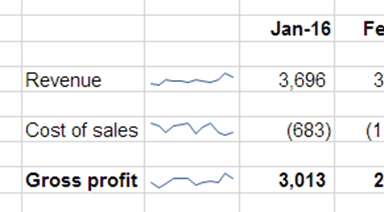
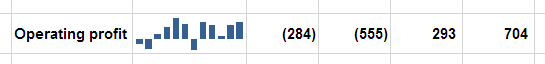
Sparklines were added to Excel as of 2010, but still very few people use them. They are, quite simply, a way to compare values at a glance - similar to charts, but much, much smaller, being only the size of a single cell. This means that you can have several of them close together without confusing matters, and can present them right alongside the data they summarise.
How to work with sparklines
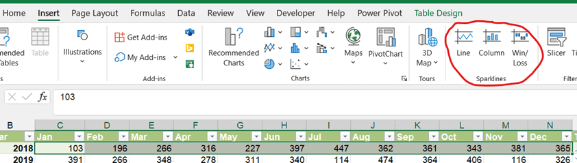
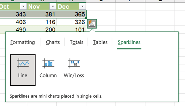
Sparklines are easy to create by one of two methods. Once you have your row or column of data, simply select it and either go to Insert > Sparklines, or use the Quick Analysis tool (Ctrl+Q) and select Sparklines:
If you use the Quick Analysis tool, the sparkline is automatically created next to or underneath the selected data.
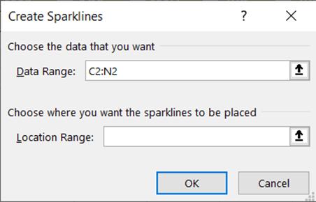
If you want to create similar sparklines for several rows of data, you have a few options. At the time of creation, you can select a whole block of data, and then set the location range as an appropriately-sized row or column, and Excel will create a range of sparklines for you - it will even ignore blank rows. Alternatively, once you've made one sparkline, you can copy and paste the cell that contains it and the copy will move its data range accordingly - just like copying a formula. Or, when creating a sparkline from the Quick Analysis tool, it will automatically create a separate sparkline for each row/column.
Formatting your sparkline
First things first: Sparklines are designed for at-a-glance summary and are not appropriate for detail-heavy use cases. If you're wanting to get deeper into data visualisation, use a chart.
If you do want to delve deeper, selecting any cell with a Sparkline in it will add the special Sparkline menu to your Ribbon:
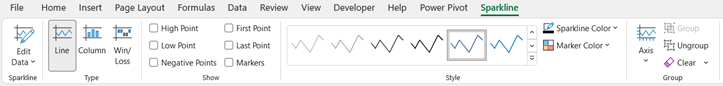
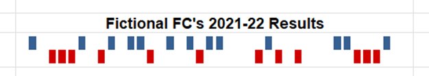
The check boxes halfway through this menu can be used to add highlights to a Sparkline to emphasise certain values. For line type Sparklines the values are highlighted with a dot; for column types they are marked with a different colour.
While the Style options are self-explanatory, the Axis options let you apply further customisations. You can choose to reverse the Sparkline, show the zero axis and change the scale. By default, each Sparkline will set its own axes to best use the space available in the cell - but here you can manually set the axes, or take a group of linked Sparklines and force them all to use common axes for easier between-cell comparisons. This tends to work best where you have clear variation between different rows/columns, and you’ve resized the cell to be able to show the Sparkline scale more clearly:
Sparklines do behave a bit oddly in that Excel considers the cells to be “empty” – you can’t “delete” a Sparkline (you have to “Clear” it from the Sparkline menu in the Ribbon), and you can type over a Sparkline – this does however mean you can do some quite clever interactions with Sparklines, such as overlaying multiple Sparklines in a single cell.
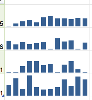
Sparklines can also work well in combination with some conditional formatting on the relevant cells – data bars, colour scales or icon sets can further visually enhance the presentation:

Though always remember, less is more – this is not an example of best practice!
All in all, Sparklines are a simple to make feature that can add a little visual note to data. They can be handy for improving the look and feel of your spreadsheet, or for adding another way of spotting outliers - especially when data ranges extend beyond one screen's worth. This is especially relevant to elements of our Financial Modelling code, such as including checks in models and using clear formatting, and can also support the spreadsheet review process in identifying data integrity and consistency errors.
Archive and Knowledge Base
This archive of Excel Community content from the ION platform will allow you to read the content of the articles but the functionality on the pages is limited. The ION search box, tags and navigation buttons on the archived pages will not work. Pages will load more slowly than a live website. You may be able to follow links to other articles but if this does not work, please return to the archive search. You can also search our Knowledge Base for access to all articles, new and archived, organised by topic.
