
This series of blogs will show you how to use the many Chart options in Excel and apply the vast array of graphical choices and features that are available. We will begin with a simple Sparkline, that provides a unique visual audit of data, through to multi-layered double axis Charts.
Excel calls this tool set ‘Charts’; so what is the difference been a Chart and Graph? – The best definition I have found is:
- A graph is a diagram of a mathematical function
- A chart is a graphic representation of data
As this blog is illustrating business applications we are therefore producing Charts.
In 1982 A.S.C. Ehrenberg wrote a book titled ‘A Primer in Data Reduction’ to help us make sense of the increasing amount of data that computers were capturing and storing. If it was apparent back then that distilling data down to useful information was difficult, I wonder what he would make of the data warehouses we have today?
In the book he comments on Charts as “a means of making results clear and memorable though not good for communicating quantitative details or complex story-lines. A chart should be easy on the eye and the message it portrays should be capable of being summarised in a sentence”. The series of blogs will be written to heed this quote. Therefore, we will avoid multiple lines and colours which can confuse rather than clarify.
Charts can convey messages in management reports much more effectively than tables of data, particularly to people who have Numerophobia or a visual learning style. The first FD I worked for told me to make sure my reports ‘spread light not generated heat’. Perhaps Charts provide an effective way of fulfilling that aim.
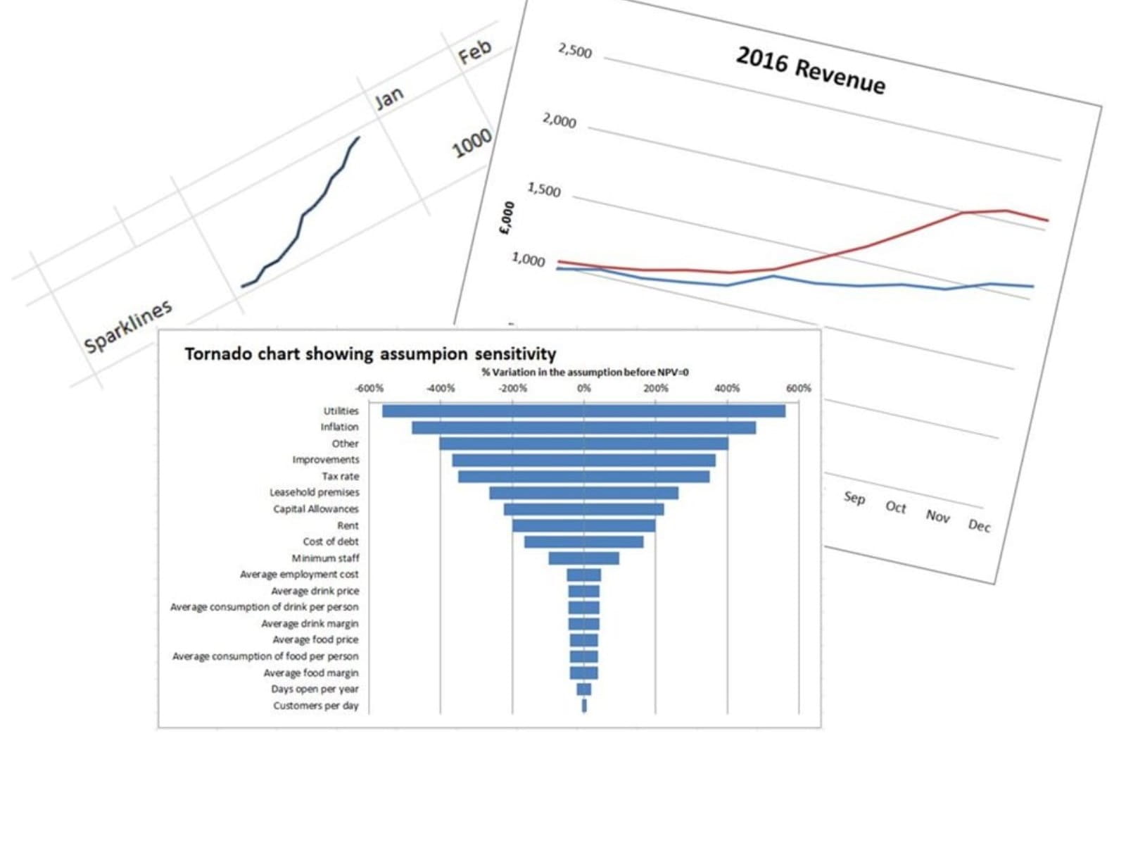
Over the next few months the series of blogs will start at the beginning and build up to the more advanced areas. Some illustrations of the charts we will produce are as follows:
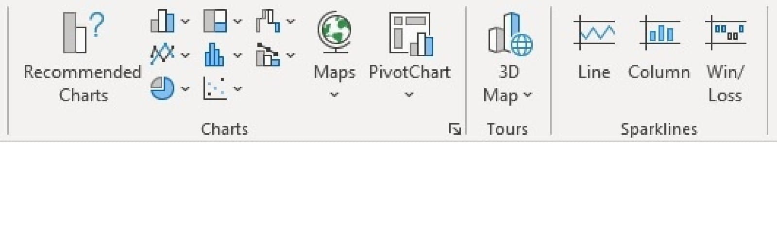
All the Charts are accessible off the middle of the Insert Ribbon as shown below:
The series will develop as follows:
| 2 | How to use Sparklines showing the various options and features |
|---|---|
3 |
Creating line charts, managing data series, axis position (on/between marks), axis labels and titles (linked to a cell). |
4 |
Enhancing line charts with axis bounds, axis units. Formatting axis text, dates and data |
5 |
Column/bar charts, clustered, stacked and 100%. |
6 |
Enhancing block/bar charts – creating tornado charts with bar charts |
7 |
Other chart types and their uses – Area, scatter, bubble, surface, stock, doughnut and pie |
8 |
Best practice in layout titles, labels, legends, axis crossing, gridlines and tick marks, dynamic and static with =OFFSET |
9 |
Colours, shadows and graphics (adding clarity not unnecessary use of options). Adding backgrounds. 3d charts |
10 |
Data series, dual axis, multi-chart overlays and waterfall charts |
11 |
Adding trend lines through data series and using the functions =FORECAST, =TREND, =SLOPE and =INTERCEPT |
12 |
Controlling zeros and missing data, hanging lines using =NA, using conditions to highlight attributes (peaks, troughs), saving a chart as a picture to use in other application |
Screen shots will be from Excel within Microsoft 365 = version 2019
Excel version 2016 - Can do all the charts that will be explained in this series.
Excel versions 2010 and 2013 – The new Waterfall Chart in 2016 cannot be done in these versions but a timeless workaround will be explained in blog 10 to enable these to be created
Excel 2007 and previous – Compatibility with these versions will not be considered. The Excel 2010 version saw the introduction of Sparklines which are not backwards compatible.
Excel community
This article is brought to you by the Excel Community where you can find additional extended articles and webinar recordings on a variety of Excel related topics. In addition to live training events, Excel Community members have access to a full suite of online training modules from Excel with Business.

- Exploring Charts (Graphs) in Excel – Part 2: Sparklines
- Exploring Charts (Graphs) in Excel - Part 3: Line Charts
- Exploring Charts (Graphs) in Excel - Part 4: Enhancing line charts
- Exploring Charts (Graphs) in Excel - Part 5: Column/Bar Charts, Clustered, Stacked and 100%
- Exploring Charts (Graphs) in Excel - Part 6: enhancing bar charts – creating funnel and tornado charts
Archive and Knowledge Base
This archive of Excel Community content from the ION platform will allow you to read the content of the articles but the functionality on the pages is limited. The ION search box, tags and navigation buttons on the archived pages will not work. Pages will load more slowly than a live website. You may be able to follow links to other articles but if this does not work, please return to the archive search. You can also search our Knowledge Base for access to all articles, new and archived, organised by topic.
