
In Blog 5 we explored how to create Column and Bar charts, in this Blog we will continue using these to create Funnel and Tornado charts. From 2016 onwards there is a Funnel chart option within Excel, but this only displays one set of data with bars that are of equal length either side of the centre (equivalent to centring the bars on a chart rather than left justifying them). For two sets of data with differing sized bars either side of the centre we must use the traditional method of a stacked bar chart.
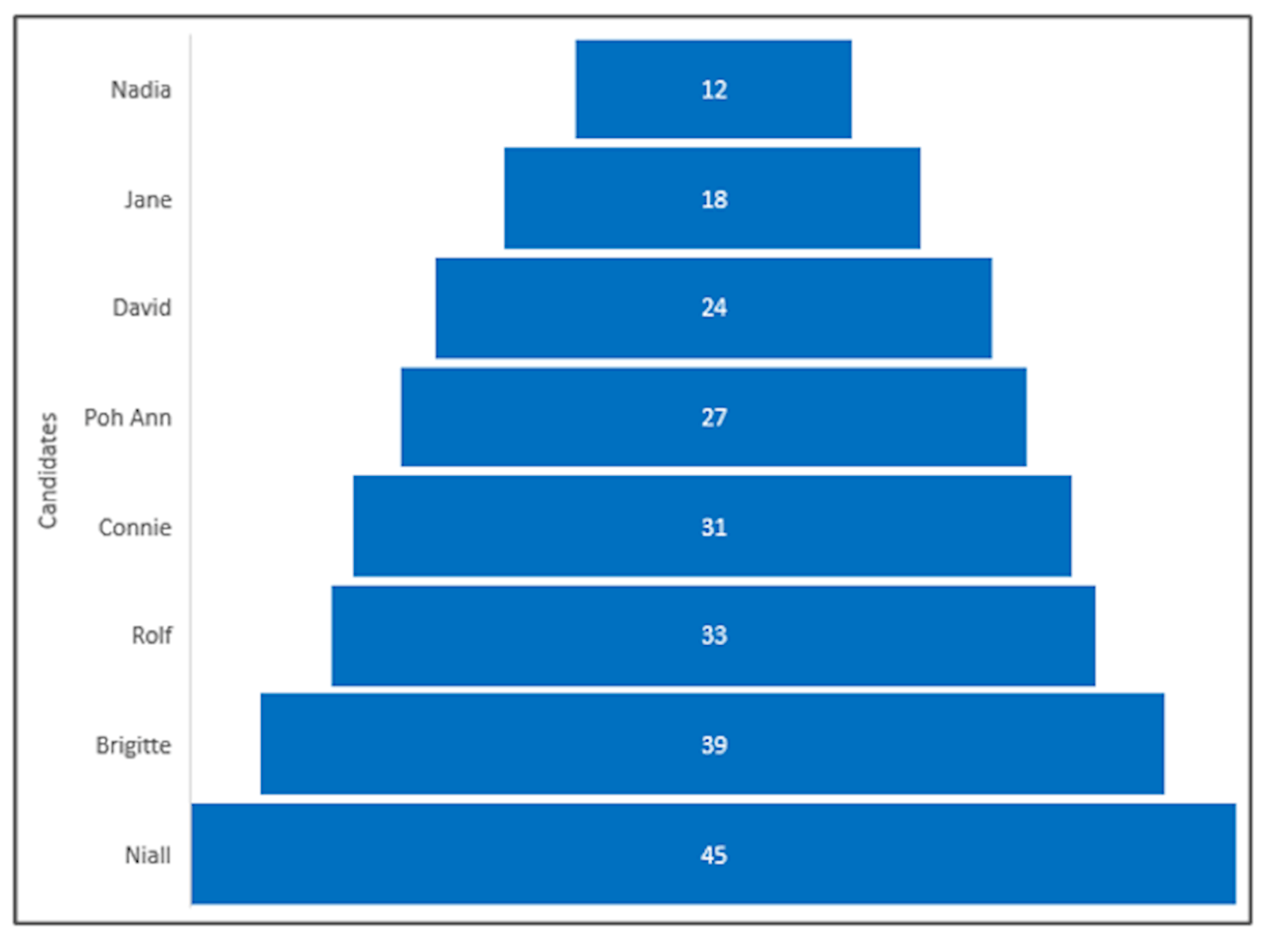
Election Results – bars are of equal length either side of the centre.
Age profile of a population – two data sets either side of the centre.
These charts are great for displaying data where the relative size of the values is important. Financial uses might be for illustrating variances in monthly budget compared to actual (the larger the bar the bigger the variance experienced) or in a business case to illustrate the sensitives of each assumption (the smaller the bar the more sensitive the outcome is to a change in that assumption value).
We will illustrate how to create each of these charts as follows:
Funnel chart – one set of data
We will use the data as follows:
Votes for each candidate:
|
Nadia |
12 |
|
Jane |
18 |
|
David |
24 |
|
Poh Ann |
27 |
|
Connie |
31 |
|
Rolf |
33 |
|
Brigitte |
39 |
|
Niall |
45 |
Before drawing the chart, an option is to sort the data so that it will display with a funnel effect. In this case the smallest value is at the top which creates a pyramid effect.
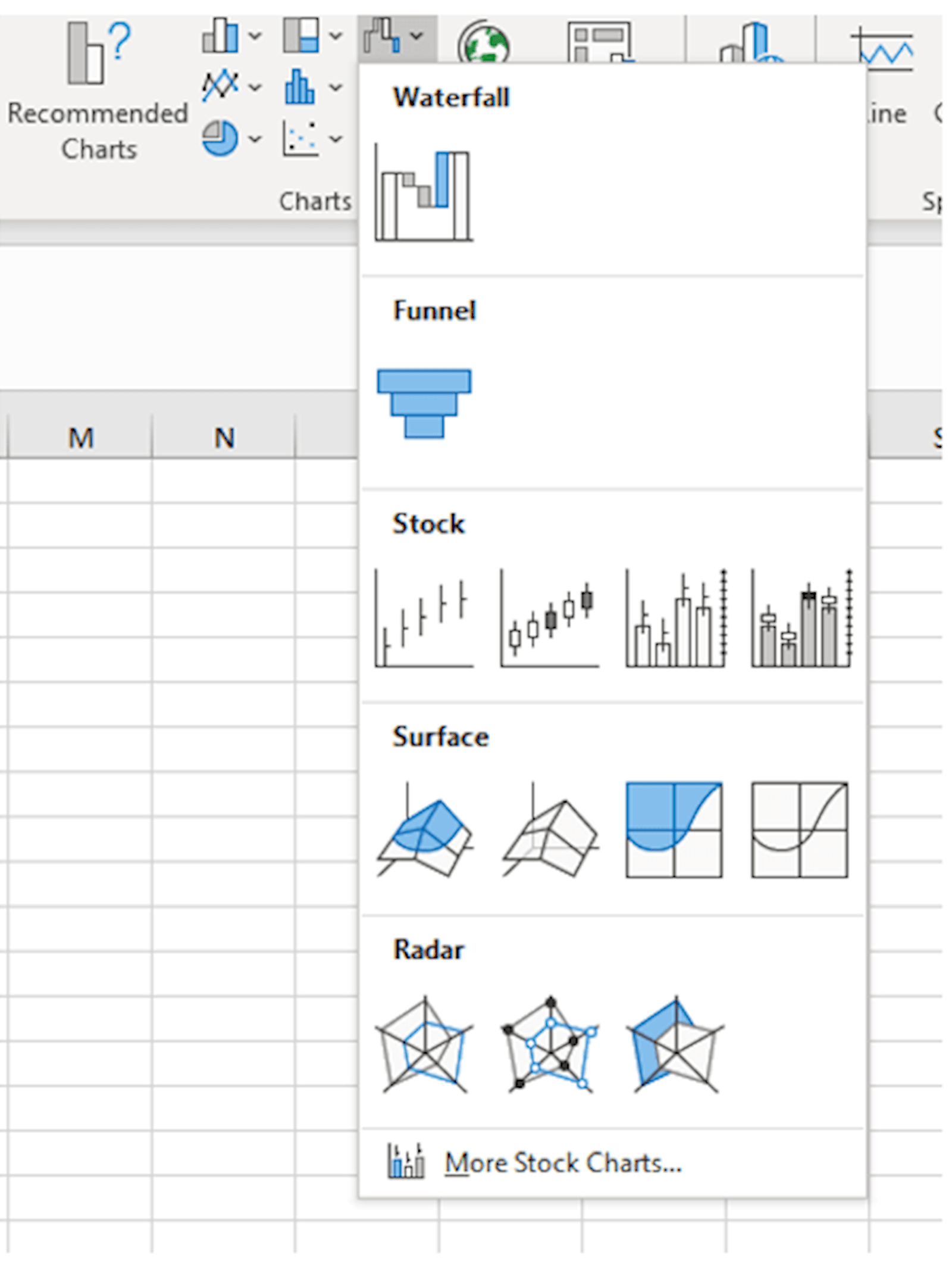
To create the chart, highlight the names and values and then on the Insert Ribbon, Charts, and the top right under the waterfall icon are a range of charts with funnel being the second option.
The result will be the funnel shown at the start of the blog.
Tornado chart – two sets of data
For the two sets of data the process is more complicated. It will be a stacked bar chart with one set of values being greater than zero and one less than zero. The data to be displayed on the left being the negative values.
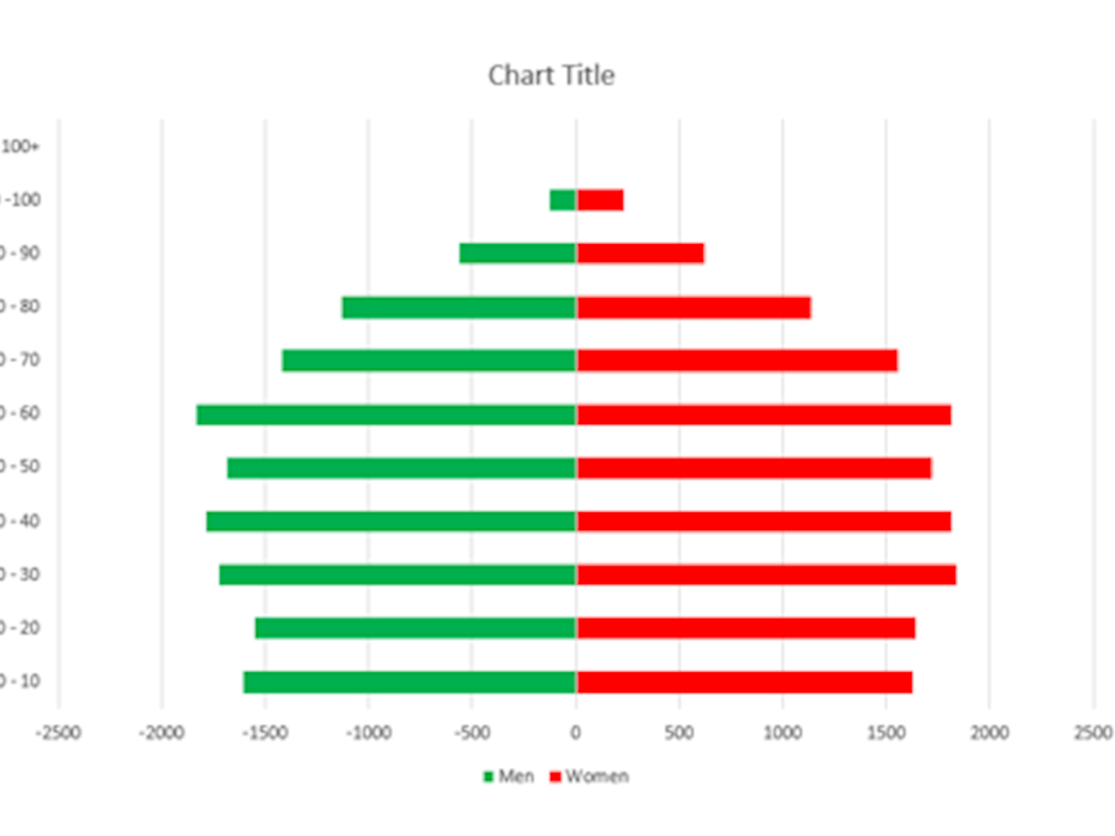
The data below represents the number of people in age bands for a town.
|
Men |
Women |
|
|
100+ |
0 |
1 |
|
90 -100 |
-123 |
229 |
|
80 - 90 |
-564 |
625 |
|
70 - 80 |
-1127 |
1133 |
|
60 - 70 |
-1421 |
1555 |
|
50 - 60 |
-1828 |
1811 |
|
40 - 50 |
-1685 |
1719 |
|
30 - 40 |
-1788 |
1814 |
|
20 - 30 |
-1721 |
1837 |
|
10 - 20 |
-1547 |
1639 |
|
0 - 10 |
-1605 |
1630 |
To create the chart highlight the data block and click on the Insert Ribbon, Charts, Bar charts, and select 2-D stacked bar chart and the following will appear
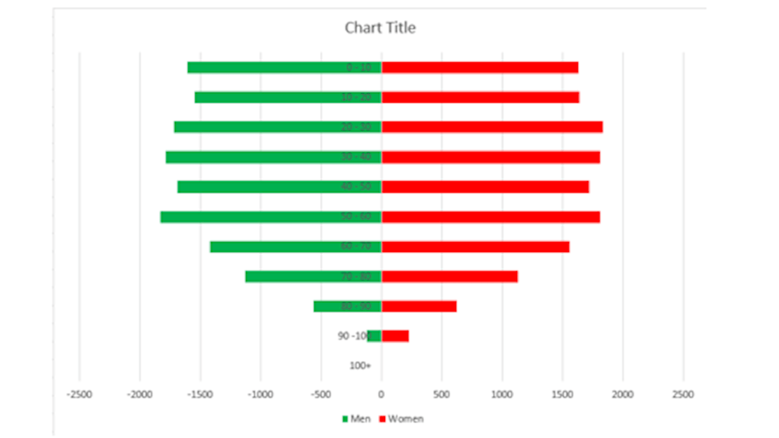
You may recall from Blog 3 that charts are drawn with the first line of data being plotted first hence the group of centenarians is drawn first and displayed at the bottom of the chart. As a consequence, the chart appears upside down compared with the data.
Two ways to solve this problem:
- Prepare the data the other way around and thus it will be drawn correctly or
- Right click on one of the values for the vertical axis and select Format Axis. There is an option near the bottom of the Axis Option list ‘Categories in reverse order’ – tick this box and they will be displayed the right way around.
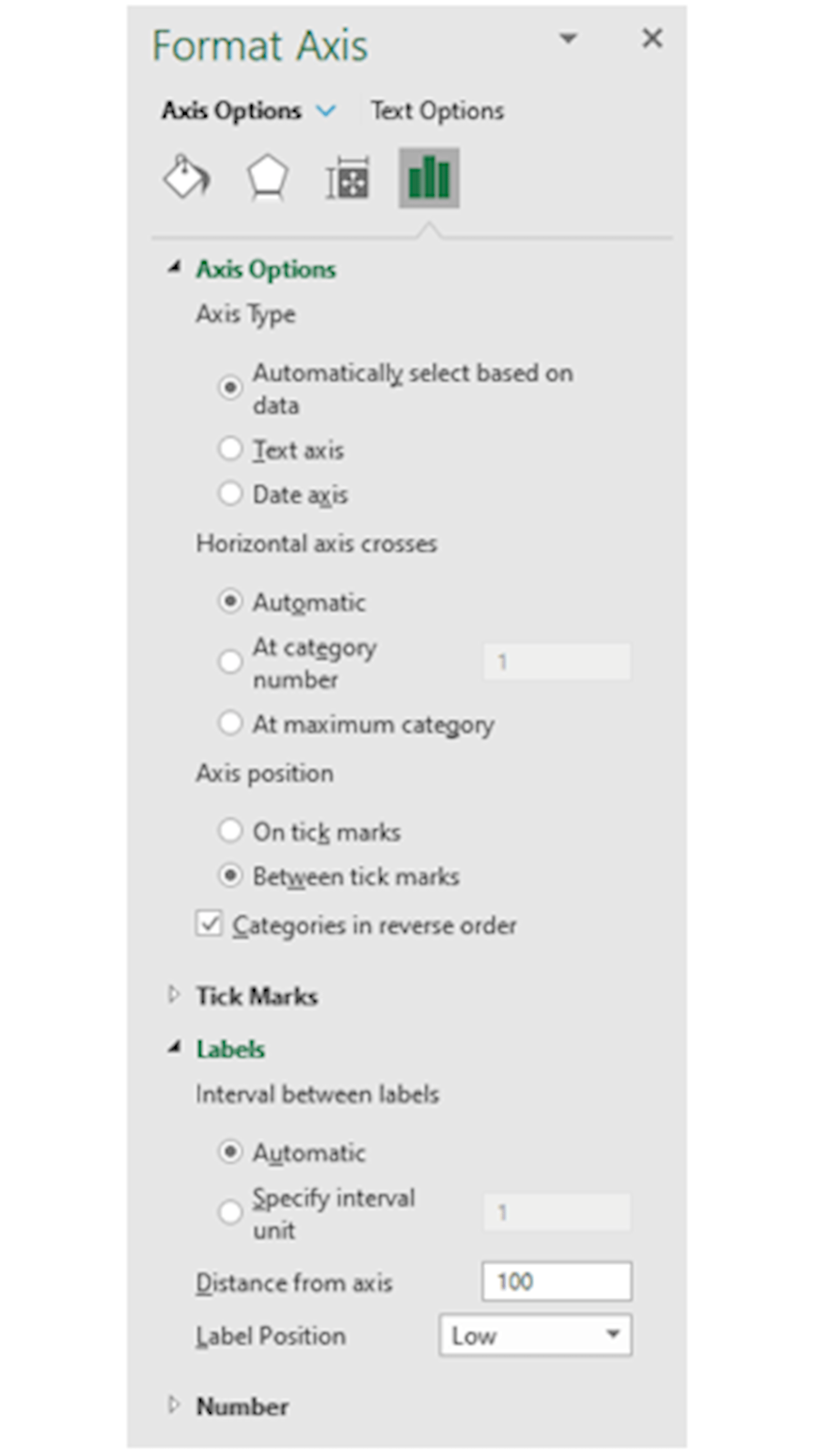
Under Labels further down the list of options there is also the facility to move the label position. Instead of the labels appearing in the middle of the chart (Next to Axis) the text can be moved to the side. Select Low to move the labels to the left and High to move them to the right.
The chart should now appear as follows with the data in the correct order and the axis labels on the left.
Widening and colouring the bars was covered in blog 5. For quick reference, it is repeated here. Right click one of the bars and select Format Data Series. To widen the bars, use the Gap Width tool. It defaults to 150% and for the chart displayed this is changed to 20%.
To colour the bars select the paint pot icon at the top and choose your preferred colour.
In blog 3 we described how to populate the Chart Title text box. Simply right click and enter the title or in the formula bar use =cell refence to link the title to the cell contents where the title already exists.
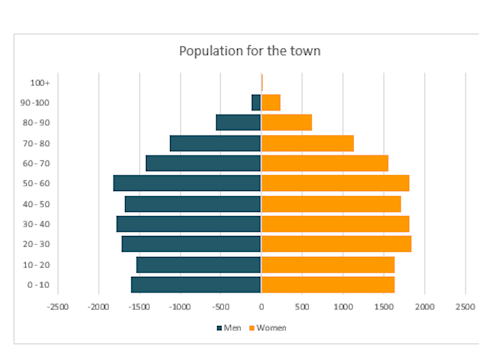
It would be wrong to have negative values on the horizontal axis for the number of men. So we need to have positive values both sides of the centre. This can be done by creating your own number format.
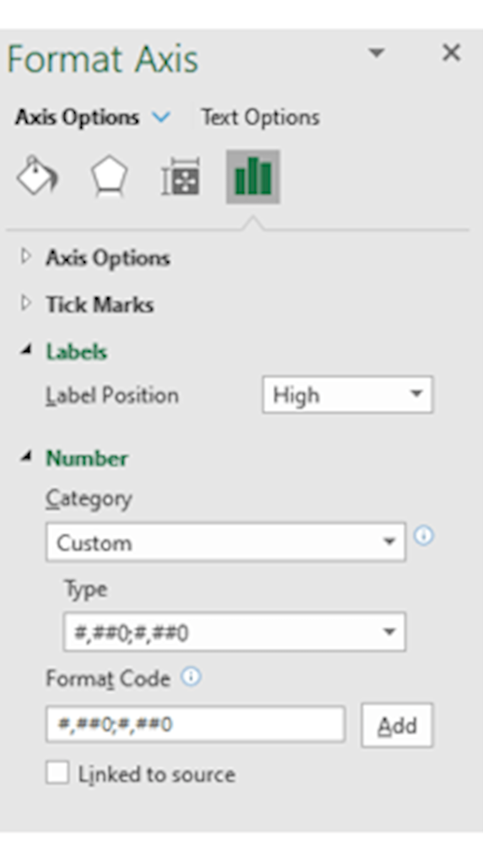
Right click on a horizontal axis value and select Format Axis. Under Number there will be a section titled Category that may well be defaulting to General. On the drop down menu change this to Custom.
In the Format Code text box type in:
#,##0;#,##0 and then press the Add button
If you are unfamiliar with number formats the left of the semi colon is the positive format and the right is the negative format. The # shows a digit if there is one to display or will be blank. The 0 displays a 0 if there is a zero value. The comma will display as a thousand separator. A normal format would be #,##0;-#,##0 with a minus for the negatives. By setting up your custom format you are making the display of both sides of the chart positive.
Once the Add button has been pressed this new format should appear in the Type box.
The final chart will be the one displayed at the start of the blog.
- Exploring Charts (Graphs) in Excel – Part 2: Sparklines
- Exploring Charts (Graphs) in Excel - Part 3: Line Charts
- Exploring Charts (Graphs) in Excel - Part 4: Enhancing line charts
- Exploring Charts (Graphs) in Excel - Part 5: Column/Bar Charts, Clustered, Stacked and 100%
- Exploring Charts (Graphs) in Excel - Part 6: enhancing bar charts – creating funnel and tornado charts
Archive and Knowledge Base
This archive of Excel Community content from the ION platform will allow you to read the content of the articles but the functionality on the pages is limited. The ION search box, tags and navigation buttons on the archived pages will not work. Pages will load more slowly than a live website. You may be able to follow links to other articles but if this does not work, please return to the archive search. You can also search our Knowledge Base for access to all articles, new and archived, organised by topic.
