
Hello and welcome back to Excel Tips and Tricks! This week, we have a Creator level post where we explore how to use different components of conditional formatting including data bars, colour scales and icon sets.
This tip will explore different components of conditional formatting. A comprehensive introduction to conditional formatting has been covered in Tip #276.
What is conditional formatting?
Conditional formatting is a feature that allows you to set up rules that can change a cell's format and appearance based on its contents. So, you can have a cell change colour based on what number or text is shown in it or display a symbol next to any value that falls outside of a given range.
Conditional formatting is useful for creating dynamic and visually appealing spreadsheets. It can be helpful to highlight outliers and data, making your spreadsheets easier to read and understand.
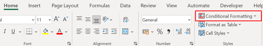
You can find conditional formatting in the ‘Home’ tab in Excel under styles.
Conditional formatting is useful for creating dynamic and visually appealing spreadsheets. It can be helpful to highlight outliers and data, making your spreadsheets easier to read and understand.
You can find conditional formatting in the ‘Home’ tab in Excel under styles.
Data Bars
Data bars can help to highlight the relationship of values in a cell range. This functionality creates small in-cell bar charts to help visualise your data set.
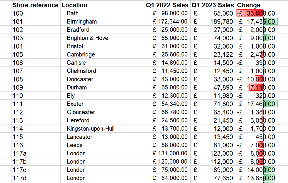
For example, I can use data bars to visualise the movement in sales when comparing prior year figures to current year.
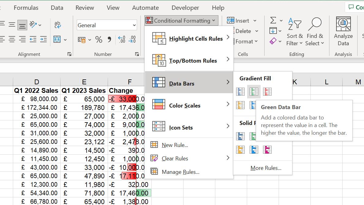
To add this formatting, I select the data and under the conditional formatting menu select the ‘Data Bars’ option. From here, I can select the gradient. In my example, I selected the green data bar to show positive movements in green and negative movements in red.
For example, I can use data bars to visualise the movement in sales when comparing prior year figures to current year.
To add this formatting, I select the data and under the conditional formatting menu select the ‘Data Bars’ option. From here, I can select the gradient. In my example, I selected the green data bar to show positive movements in green and negative movements in red.
Once the formatting is applied, my analysis looks like this.
Colour Scales
Colour scales are an effective way to highlight the relationship of values in a cell range. Using this functionality, you can apply a colour scale to your data where the intensity of the cell's colour reflects the value's placement in a range.
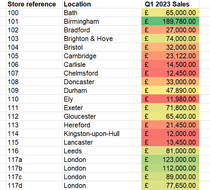
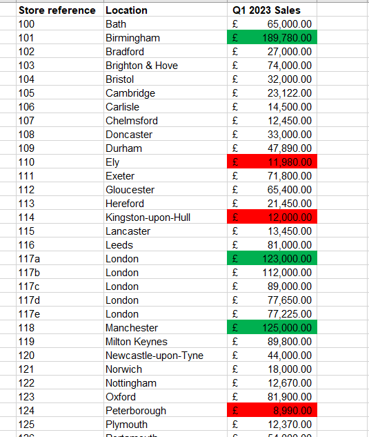
A simple example would be to apply a colour scale to my sales data to help visualise in a gradient the top performing stores in green to the lowest performing stores in red.
A simple example would be to apply a colour scale to my sales data to help visualise in a gradient the top performing stores in green to the lowest performing stores in red.
However, colour scales can be used in more interesting ways. For example, if I want to see the three best and worst performing stores more clearly in my data, I can do this by selecting ‘Color Scales’ from the conditional formatting menu and selecting ‘More Rules’.
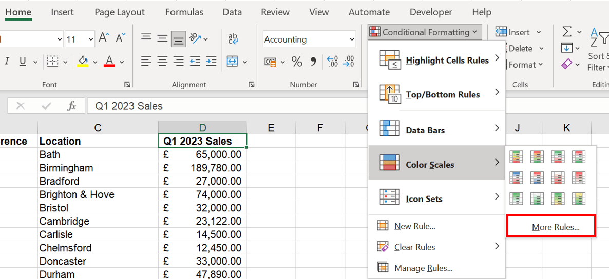
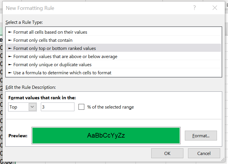
A pop-up menu will appear where I can select the ‘Format only top or bottom ranked values’ rule. In the example below, I’ve edited the rule to show me the top three values and have updated the formatting so these values appear in green.
I can do the same for the bottom three values so that my data looks like this!
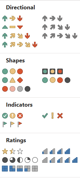
Icon Sets
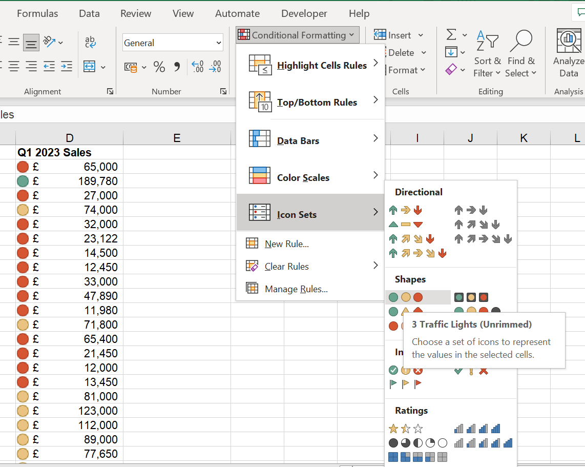
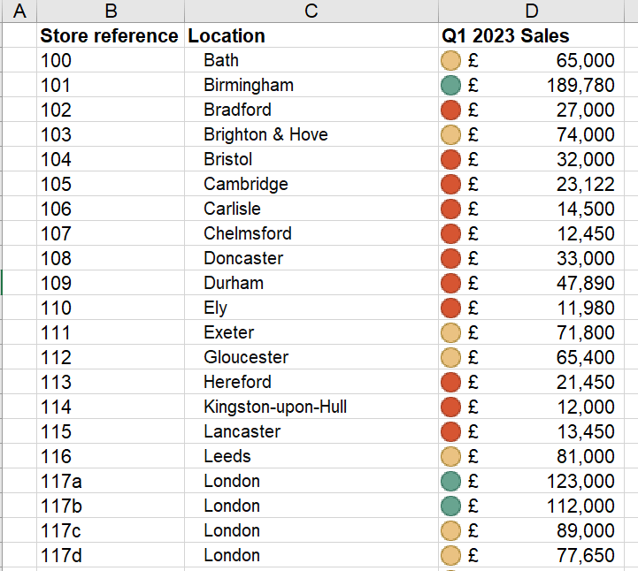
Icon sets can highlight cells in specific thresholds by assigning icons. For example, you may use the icon sets to group data on sales from different stores to help visualise high-performing and low-performing stores based on targets. The traffic light icons can help us to do this and are a great way to create a more dashboard-style experience.
To set this up, I select the data and under the conditional formatting menu select the ‘Icon Sets’ option. From here, I select the traffic lights option. This will apply the conditional formatting to my data based on a default threshold.
To set this up, I select the data and under the conditional formatting menu select the ‘Icon Sets’ option. From here, I select the traffic lights option. This will apply the conditional formatting to my data based on a default threshold.
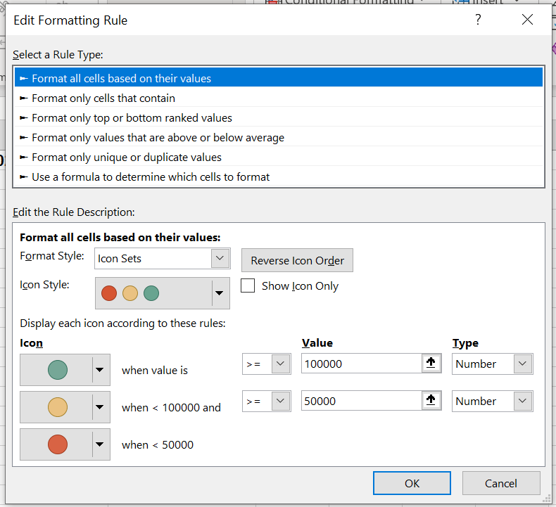
In this example, I would like to set my own thresholds so that stores that have sales above £100,000 are marked with a green icon, stores with sales between £100,000 and £50,000 are marked with an amber icon and those below £50,000 are marked with a red icon.
To do this, in the conditional formatting menu I click on ‘Manage Rules’. This will open the ‘Conditional Formatting Rules Manager’ where I can see all the rules applied to my worksheet.
To do this, in the conditional formatting menu I click on ‘Manage Rules’. This will open the ‘Conditional Formatting Rules Manager’ where I can see all the rules applied to my worksheet.
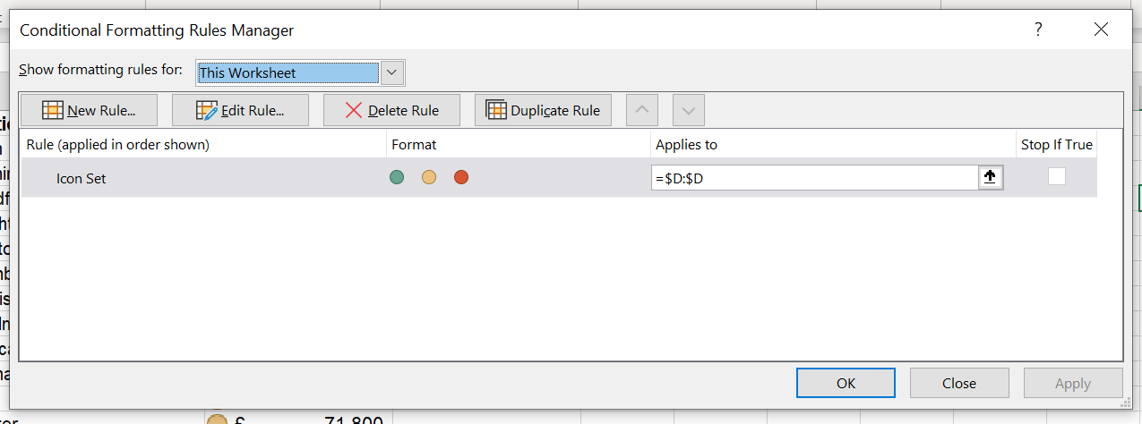
From the manager, I can select the rule I’ve just added and click on ‘Edit Rule’. From here, I can edit the rules to add a range of values for the icons in line with the thresholds I want.
Once this is applied, the formatting is updated.
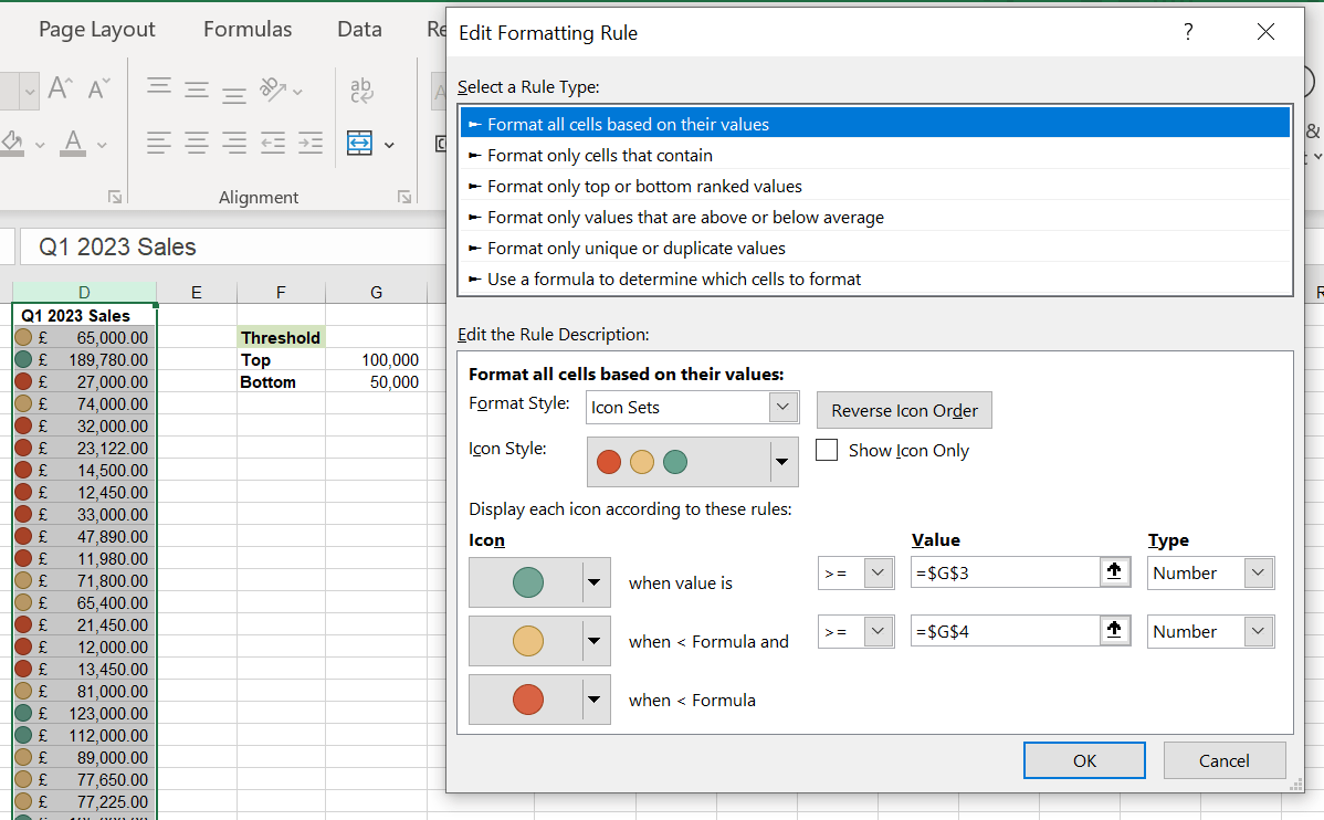
To make it even more robust, those thresholds could be input parameters within the spreadsheet, allowing them to be more dynamic and the colour-coding more transparent to reviewers.
Icon sets can be used for lots of different use cases. You can use icons as a rating system or for progress and status updates.
- Excel Tips and Tricks #506: Creating a single master list after merging data
- Excel Tips and Tricks #505 – 3 ways of converting US Dates into UK formats
- Excel Tips and Tricks #504 - Accessing accessibility checkers for good spreadsheet practice
- Excel Tips and Tricks #503 – Printing under pressure, super quick presentation tips
- Excel Tips and Tricks #502
Archive and Knowledge Base
This archive of Excel Community content from the ION platform will allow you to read the content of the articles but the functionality on the pages is limited. The ION search box, tags and navigation buttons on the archived pages will not work. Pages will load more slowly than a live website. You may be able to follow links to other articles but if this does not work, please return to the archive search. You can also search our Knowledge Base for access to all articles, new and archived, organised by topic.