Last time, we looked at one way of automatically highlighting certain cells in a PivotTable using conditional formatting. There are several different ways of using conditional formatting to apply highlights, with Colour Scales and Icon Sets being perhaps the most obvious. These two graphical conditional formats are included in the Conditional Formatting dropdown and can easily be applied with a mouse click or two. However, sometimes using too many colours and too many different icons can have the opposite effect to that intended, obscuring the information rather than drawing attention to the key points. We’ll look at how to avoid this issue when using Icon Sets.
Introduction
An effective spreadsheet report isn’t just one that displays the required information accurately. It’s often helpful to also ensure that those using the report have their attention drawn to the key figures.
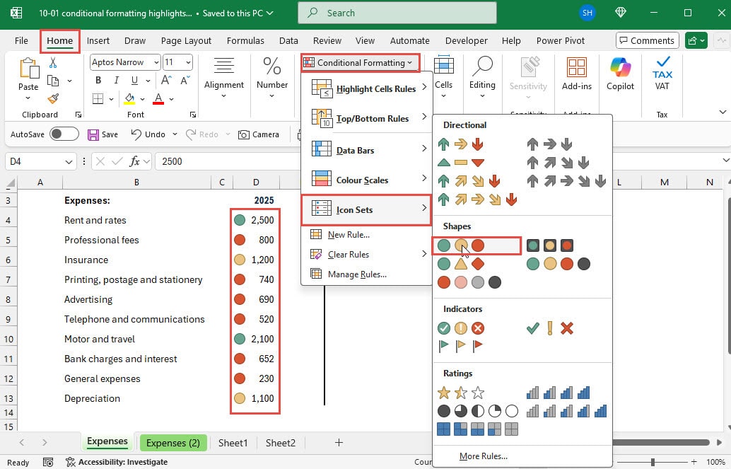
We can use Conditional Formatting, Icon Sets to highlight values according to their values. In this simple example of some expense values from a set of accounts, we have selected all the values in column D and used the Home Ribbon tab, Styles section, Conditional Formatting dropdown to select a set of icons which will be applied automatically by assessing the different figures in the range. We have used the ‘traffic lights’ icons. By default, this will apply the green traffic light to the highest values, the amber to the middle values and red to the lowest values:

Customise your Icon Sets
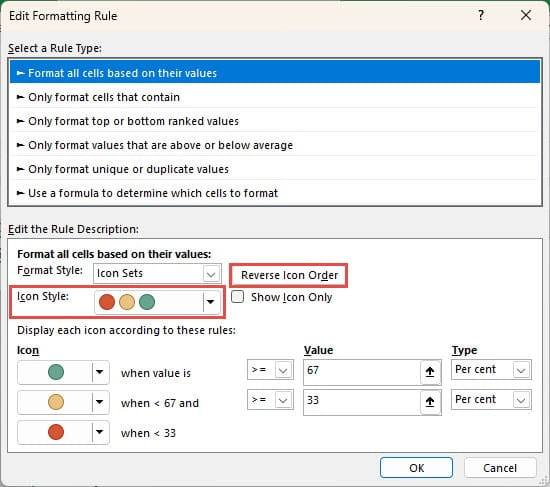
We are going to look at using the Conditional Formatting Rules Manager to edit our formatting rules and bend the icon set to our will. The manager dialog is accessed by selecting the cells containing the conditional format and choosing Manage Rules… from the Conditional Formatting dropdown. From the manager dialog we can select the relevant rule and click on the Edit Rules… button to open the Edit Formatting Rule dialog:

Depending on the nationality of the audience, we might feel that high expense values are more concerning than low values, so the first change we might make from the default is to click on the Reverse Icon Order button. This will switch high value highlights to red and the low value highlights to green.
While discussing icon colours, it’s also worth considering the issue of coloured icons for those who are colourblind. If someone has difficulty distinguishing red and green, then using an icon set that varies just in colour and not in shape could be confusing. Accordingly, it would be preferable to choose one of the icon sets that uses different shapes as well as different colours, such as the icon sets in the Directional category, or the Symbol based sets in the Indicators category. In our case, as we shall see, we want to end up with a single icon to highlight our high values so the icon colour is not necessarily significant.
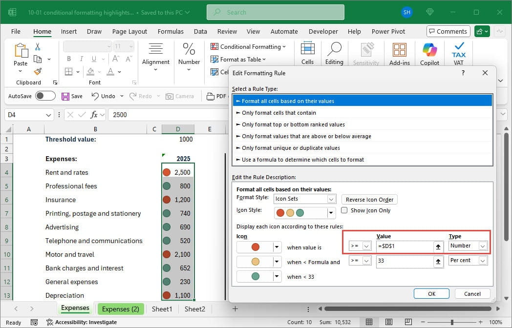
Next, we might want to base our highlights on specific threshold values. For now, we will just use a single threshold value, held in cell D1, to trigger our red traffic light. Note that we have used dollar signs in our reference to $D$1 to make the reference absolute. Also, we have changed the Type from Percent to Number. The Type dropdown also includes Formula and Percentile options:

Referring to a cell, rather than including the value in the formula directly, not only makes the threshold value more visible, but also makes it much easier for a user to change it, or to make the threshold value the result of a calculation entered into the cell.
I see no icons
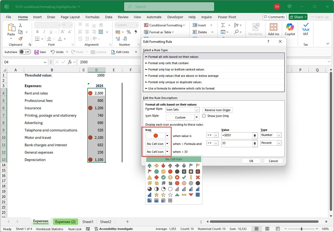
It’s probably the case that, if our main aim is to highlight the values that exceed our threshold, our green and amber traffic light icons serve no useful purpose. Each of the icons in our Icon set has its own dropdown and we can use this to combine icons from different icon sets or to turn icons off altogether. In our case we will just set the amber and green dropdowns to No Cell Icon, so that we are just left with a red circle highlighting each value that exceeds the threshold value entered into cell D1:

Conclusion
It’s quick and straightforward to apply the default conditional formats, including the graphical options such as Cell Icons. However, it’s worth exploring some of the more detailed options available for all the graphical formats as these can greatly increase the flexibility of both evaluating the conditions and the formatting itself. Often, simplifying the formatting to reduce any unnecessary distractions can make a big difference to the impact and value of your reports.
Next time, we will look at some additional ways to extend the capabilities of conditional formatting.
Additional resources
You can explore all aspects of Excel, including all aspects of the use of conditional formatting using the ICAEW Excel archive portal:
The 'Open in full-screen mode' icon in the bottom right-hand corner of the embedded report should show the contents at a more readable size with the Escape key returning you to the post.
Archive and Knowledge Base
This archive of Excel Community content from the ION platform will allow you to read the content of the articles but the functionality on the pages is limited. The ION search box, tags and navigation buttons on the archived pages will not work. Pages will load more slowly than a live website. You may be able to follow links to other articles but if this does not work, please return to the archive search. You can also search our Knowledge Base for access to all articles, new and archived, organised by topic.

