
Microsoft has introduced several revolutionary new features in Excel in recent years. In particular, Microsoft’s Copilot feature uses AI to help with Excel tasks. However, there might be another Excel feature that is even more impressive.
Introduction
It has been a busy time for Excel enhancements. Dynamic Arrays fundamentally changed how Excel functions and formulas work and, since their introduction, the power of Dynamic Arrays has been increased by a stream of new functions designed to take advantage of the new opportunities that they present. Then, of course, we have Artificial Intelligence. Microsoft’s Copilot feature, available with a chargeable additional licence, uses AI to help with a range of work tasks across the Office suite of applications in response to ‘natural language’ prompts.
Obviously, these features are nothing less than revolutionary but there is an Excel feature that goes even further. This feature can take you from a table of data to an interactive dashboard with just a few mouse clicks and drags, and without needing to grapple with a single Excel formula.
Recommended
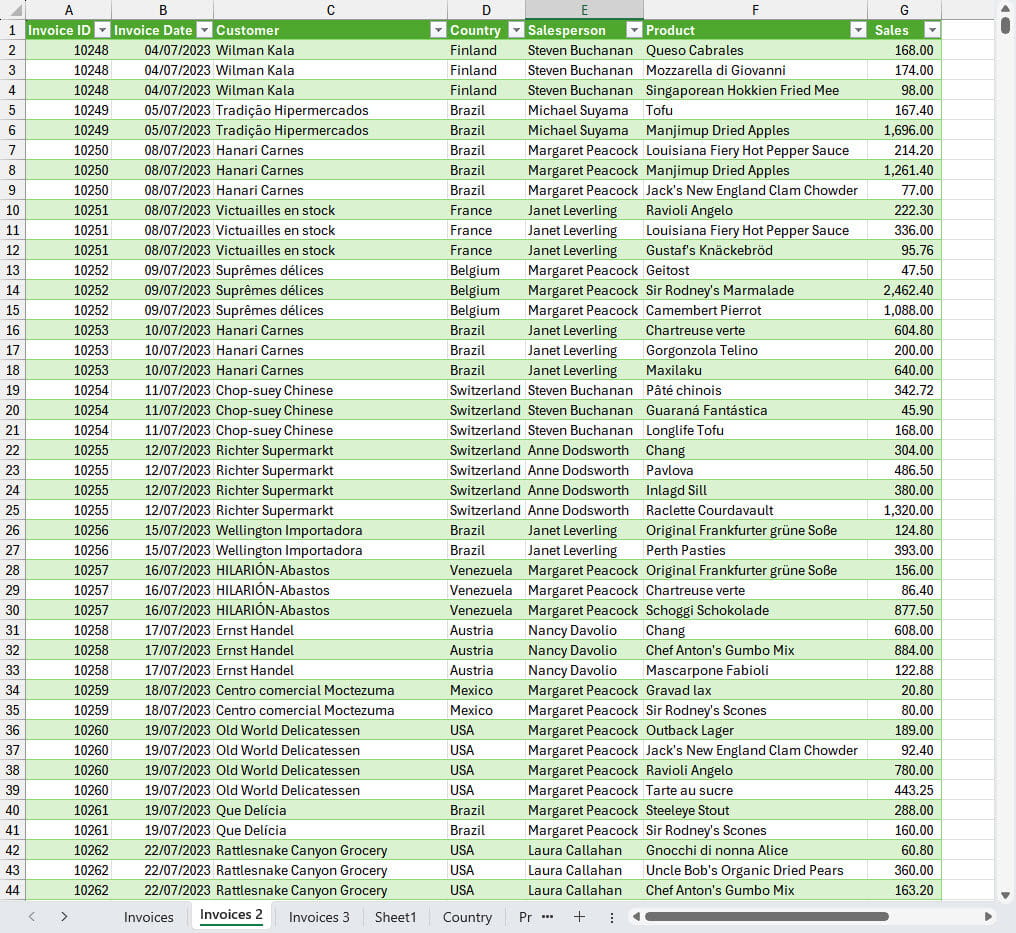
We have a table of sales invoice data that includes columns for invoice date, customer, country, salesperson, product and sales amount. Our aim is to turn this into an interactive, graphical dashboard that will help our user to understand key aspects of the management information lurking within the detailed data. We also want to allow the user to make their own choices about the areas of the data that they want to focus on:
We can click on any cell within our table and ask Excel to recommend ways in which to summarise it. Assuming that we are interested in analysing our sales by customer, country, salesperson and product, we can choose the appropriate recommendation and let Excel create our summary table for us – clicking and dragging with the mouse where necessary to organise the data in the way in which we want to see it.
Initially, the summaries are just created as tables of numbers, but Ribbon tab commands allow us to create simple charts based on each of our tables. These charts can then be moved to a single, dashboard sheet where we do need to put in a bit of manual effort to arrange them neatly. Once this is done, we can employ another key feature component to create a graphical filter that allows a user just to click on an item, such as a particular customer or product, or to select multiple items, in order to filter the entire dashboard:
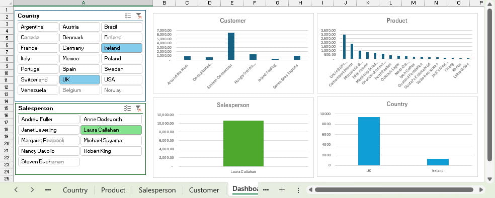
So, we have an interactive, graphical dashboard, created with a few clicks and drags and without having to use a single Excel function or even enter a single formula.
Fantastic as this feature is, it’s not yet perfect. For one thing, it only works with the more basic Excel chart types. However, until recently, its main issue was the need to perform a refresh operation whenever the underlying data table changed so that all the summary tables and charts reflected the updated data. A recent feature update, currently available to those on the Microsoft 365 Beta channel, will eliminate this need to refresh the reports and charts manually.
OK, it’s a fair cop
As you probably worked out some time ago, our wonder new feature is, in fact, a very old feature: PivotTables. After clicking on any cell in our data table, the Insert Ribbon tab, Tables group, Recommended PivotTables command opens a pane that displays a set of possible PivotTables based on the data. Once each of the PivotTables has been created, we can click in any cell in a PivotTable and, from the Insert Ribbon tab, Charts group, choose Recommended Charts, or click directly on of the basic chart types, to create a chart based on our PivotTable. Once we have created all four of our charts, we can add a worksheet to use as our dashboard. It then just takes a right-click in each chart to choose Move Chart. This allows us to move them all to the dashboard sheet. We need to use some manual effort to tidy the charts up and arrange them neatly. We then click on any chart and insert our two Slicers based on the Country and Salesperson fields. We can use the Slicer Ribbon tab to set up the number of columns and the style. The Report Connections command allows us to attach our Slicer to any, or all, of the PivotTables based on the same data source.
Conclusion
In the past, PivotTables have often felt like Excel’s Marmite feature – some Excel users love them while, for others, the failure to automatically update when the underlying data changed was more than they could swallow. If you are in the ‘hate it’ camp, then the imminent introduction of Auto Refresh for PivotTables might be just the trigger you need to re-evaluate your favourite spreadsheet feature.
Additional resources
You can explore all aspects of Excel, including the latest updates and, of course, PivotTables, Pivot Charts, Slicers and Dashboards using the ICAEW Excel archive portal:
Archive and Knowledge Base
This archive of Excel Community content from the ION platform will allow you to read the content of the articles but the functionality on the pages is limited. The ION search box, tags and navigation buttons on the archived pages will not work. Pages will load more slowly than a live website. You may be able to follow links to other articles but if this does not work, please return to the archive search. You can also search our Knowledge Base for access to all articles, new and archived, organised by topic.
