
PivotTables
PivotTables are the quintessential analytics tool (select data > Insert tab > PivotTable and then drag and drop using the PivotTable report builder). If you’re new to PivotTables, then you can learn how to make them via the video below.
For this article, I’ll fast forward how to build Pivots and show some productivity tips.
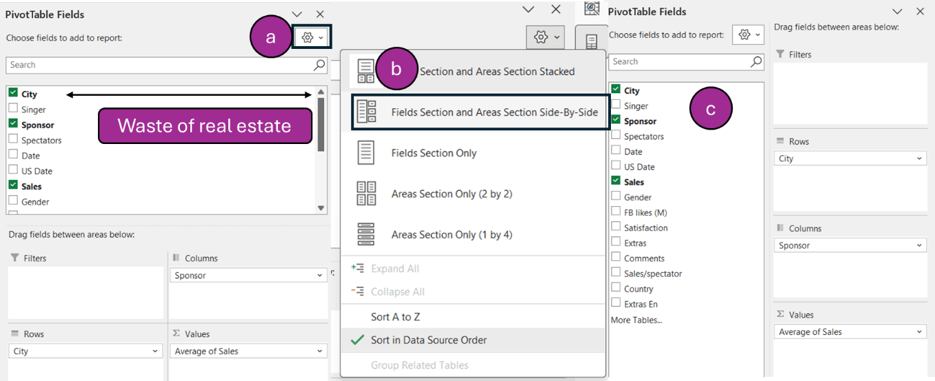
- View Pivot field and areas side by side: This two-click setting should be done by every laptop user. PivotTables were first launched for desktops – big screens meant screen real estate wasn’t important. But now we have laptops, this view is far superior.
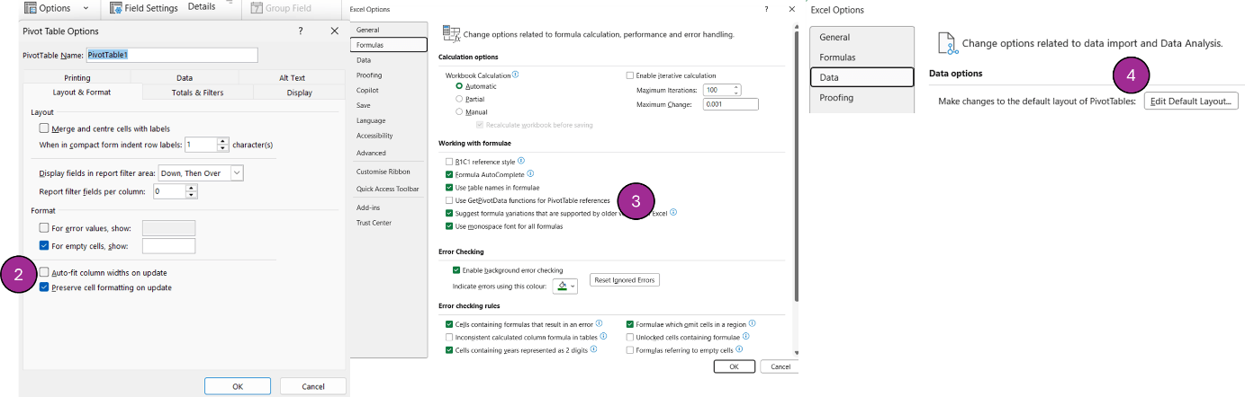
- Stop the columns resizing when you click refresh: Click on your PivotTable > Analyse tab > Options > Uncheck “Auto-fit column widths on update” (as per the image below).
- Stop getting =GETPIVOTDATA: When you type = and click to link a cell in a PivotTable, you often get something like =GETPIVOTDATA("Sales",$A$2,"City","Glasgow","Sponsor","Apple"), instead of a normal cell reference. But this is a setting easily changed. Click File > Options > Formulas and uncheck the box that says “Use GetPivotData functions for PivotTable references”.
- Save default Pivot layout: If you always find yourself creating a specific style of PivotTables (eg, no subtotals, green base, report layout with “repeat all rows”), then you can go to File > Options > Data > Edit Default Layout and fine tune. (This is available for Office 2024 or more recent.)
Quick PivotTable creation
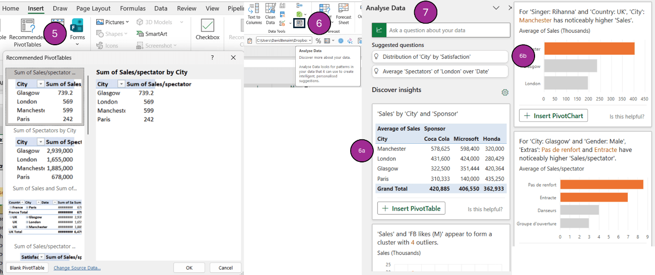
- Pivot suggestions: Select the data > Insert tab > Recommended PivotTables, and Excel suggests some ideas for Pivots you may want to create.
-
Analyse data with AI: By clicking Data tab > Analyse data, Excel will use AI to suggest ideas. They are better than “Recommended PivotTables”. This feature was released five years before Chat GPT and Copilot, so it’s less sophisticated. Still, it’s great to quickly get results. There are three types of charts that appear:
- Blue results will populate PivotTables.
- Orange results will have insights from PivotTables (eg, outliers, majorities etc.).
- Grey results will not be PivotTables, but frequency distribution through histograms.
The search bar above can create Pivots from prompts.
- Ask a question about your data via Analyse Data: Using the same command, you can ask questions such as “Top 5 cities by sales in Scotland in a bar chart”. This takes four instructions: to return a city by sales visual, that has filters for only Scotland, and for top five, and returns it in a bar chart.
This video shows how to ask questions with Analyse Data:
Charts
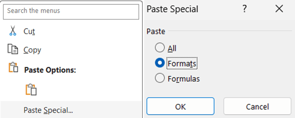
- Paste Special in charts: When you have a preferred chart format, you can copy that chart then click on another chart and choose Paste dropdown > Paste Special and click “Formats”. You can alternatively Paste Special > Formulas, and maintain the source formats. One would expect this to work via the format painter, but it doesn’t. From my experience, it’s a bit buggy with what it pastes and what it doesn’t.
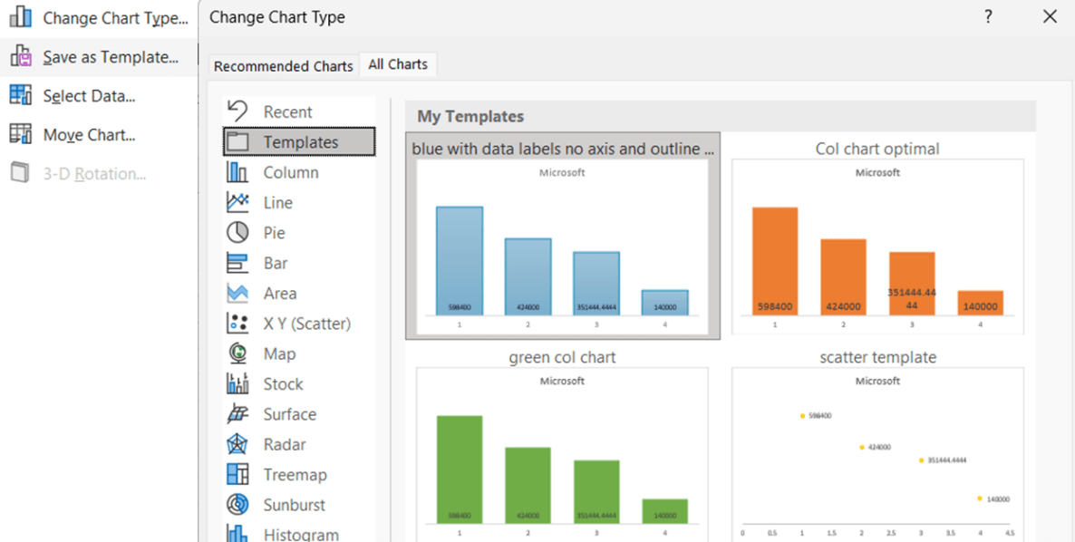
- Save chart template: After adjusting a chart in a style you like, you can right-click it > Save as template. Retrieve your chart templates across files by clicking Insert tab > Recommended charts > Templates.
- Press delete on your keyboard: Click an item you don’t want and remove it by clicking “Delete” on your keyboard.
- Chart preset layouts: Click Chart Design and choose a style.
- Alternate chart colour palette: Click Page Layout > Colours to amend.
The charting tips shown above (9-12) are showcased in this video:
- Column chart shortcut: Create a vertical column chart by selecting your data and clicking F11. This creates a special chart page in your file.
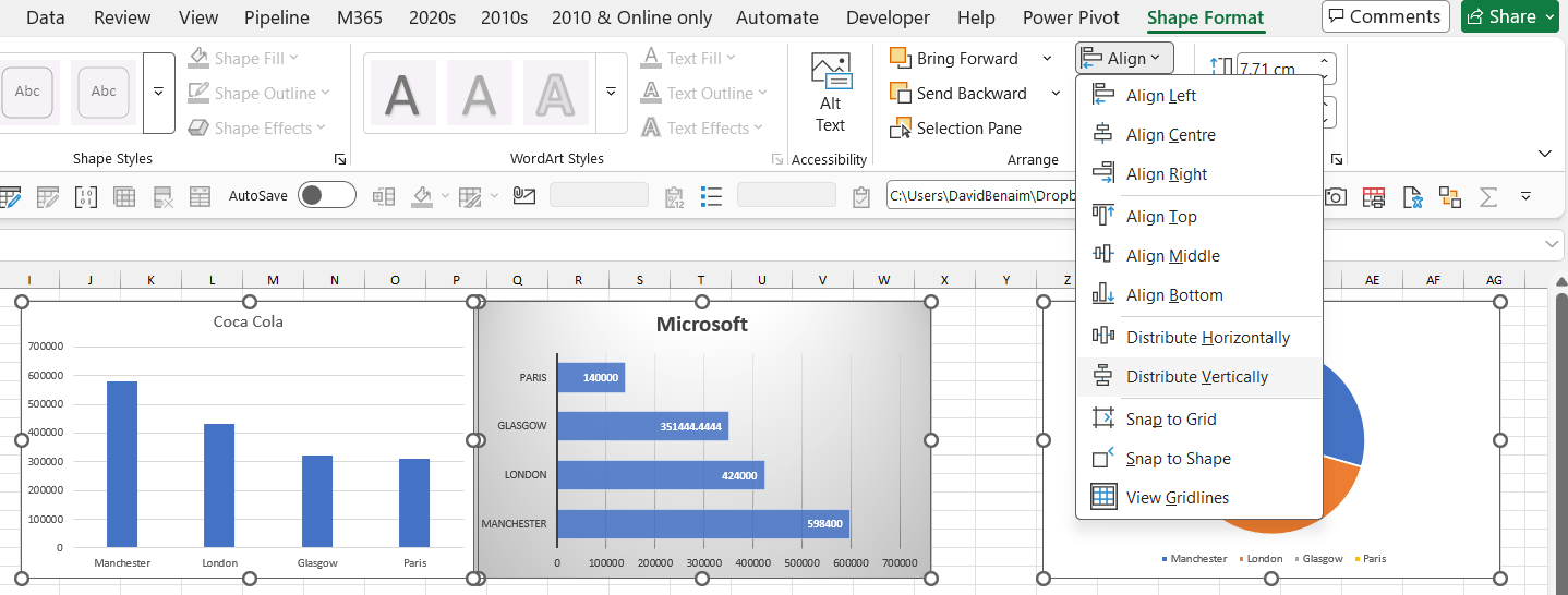
- Align and distribute multiple charts: Select Charts > Shape Format > Align, and explore the options.
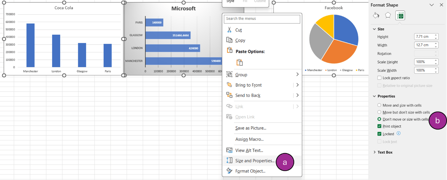
- Get charts (and objects) to not resize when adjusting column widths: Select charts, right-click and select “Don’t move or size with cells”. If you right-click one chart, select “Format chart area”, then click on the sizing icon on the top right before going to Properties.
Filtering
- “Ctrl Shift L” to filter: This toggles on/off filters from anywhere in the table. It’s a very fast way to remove many filters. Here are companion shortcuts:
- Once the filters are on, press “Ctrl up arrow” to jump to the filter location.
- After you’re positioned in the filter cell, press “Alt down arrow” to open the filter.
- Press “E” to jump to the search box.
- Press “Spacebar” to check or uncheck a box.
- Press “Enter” from anywhere for “OK”.
- Use arrows to move the cursor (but note: with date filters, it acts funny sometimes).
- Have entirely blank rows above your column headers: This ensures filters go in the right place. If you don’t have this, filters will jump to a higher row, usually row number 1.
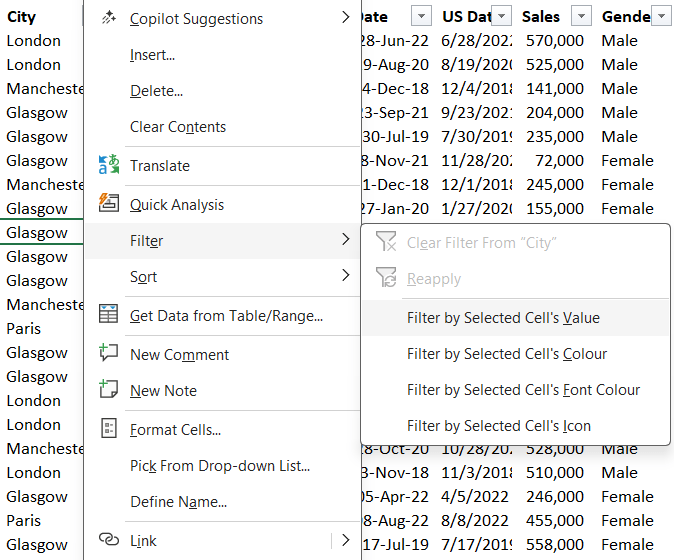
- Filter by a specific cell’s value: Right-click a value > Filter > Filter by Selected Cell’s Value. There are other less useful filter options on that menu, as well as sort options.
- Use =FILTER: This is a new function that allows you to create a table that follow filter criteria.
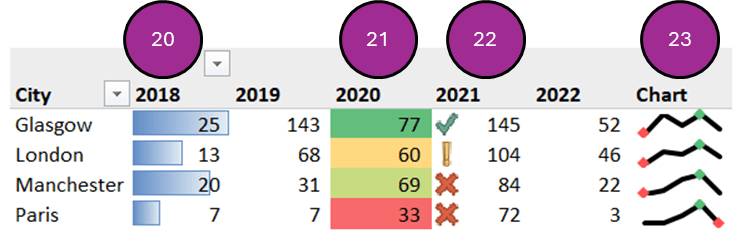
In cell charts
- Create in cell bar charts: Select the data > Home > Conditional formatting > Data bars.
- Create in cell heat maps: Select the data > Home > Conditional formatting > Colour scales.
- Create in cell icon sets: Select the data > Home > Conditional formatting > Icon sets. Please note: for these, you’d usually need to set the limits by clicking Home > Conditional formatting > Manage rules > Edit rule, and type in which numbers are the limits where the icons switch.
- Create in cell charts with Sparklines: Select the data > Insert > Sparklines > Line. Select the cells your chart should appear in after. A few things to note:
- By default, Sparklines will compare just for that row. You can change this by clicking the Sparkline then Sparkline tab > Axis. But the default is usually what works for me.
- If the source data is hidden, you can click Sparkline tab > Edit data > Hidden and empty cells, and amend.
- Sparklines can be column, win/loss and line charts, but I personally find it works best with lines.
- You can choose to have markers at all points, highest or lowest etc.
This video showcases the types of in cell charts:
Conclusion
There are various ways to speed up your analytics processes – this series will return in May 2026 with another article on productivity tips.
Archive and Knowledge Base
This archive of Excel Community content from the ION platform will allow you to read the content of the articles but the functionality on the pages is limited. The ION search box, tags and navigation buttons on the archived pages will not work. Pages will load more slowly than a live website. You may be able to follow links to other articles but if this does not work, please return to the archive search. You can also search our Knowledge Base for access to all articles, new and archived, organised by topic.
