
In this blog we will explore how to ‘add’ charts together whether they be of different styles (line, bar, area etc.) or with very different scales (dual axis charts). We will finish with a waterfall chart that since 2016 has been available as an Excel chart option.
Adding charts together
To illustrate this process, we will use the following chart that summarises the result of a Monte Carlo Analysis.
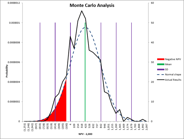
Monte Carlo analysis is used to explore multiple scenarios for a business opportunity and identify the ‘arena of possible outcomes’. In the above example the NPV of the opportunity is captured for 500 scenarios (a Visual Basic loop is very helpful to capture this type of data). The data forms a normal distribution curve around an expected value (the Mean). The example is being used to show how to display five charts of three different types with a dual axis. Unfortunately, the blog does not have the space to explain how to run a Monte Carlo and the full detail of the data series.
As with all charts, start by selecting the data series (as explained in previous blogs) and then click on Insert ribbon and select a 2D Line Chart. If all the data is not available in one block of cells, then right click an existing data line and use the Select Data option. In the Select Data Source Dialog box use the ‘Add’ button to load the remaining data lines.
Much of the data is based on the attributes of a normal distribution curve. The area under the chart adding up to 1 with each NPV point along the horizontal axis having a probability value. The =NORMDIST function is used to generate this data from the Mean and Standard Deviation for the NPV values of the 500 scenarios.
To plot the different chart types and the dual axis select the chart and then on the Chart Design Ribbon select the button second from the right – Change Chart Type – as Highlighted in the diagram below.
At the bottom right of this dialog box it allows you to select the chart type for each data series as well as whether it should be plotted against a secondary axis.
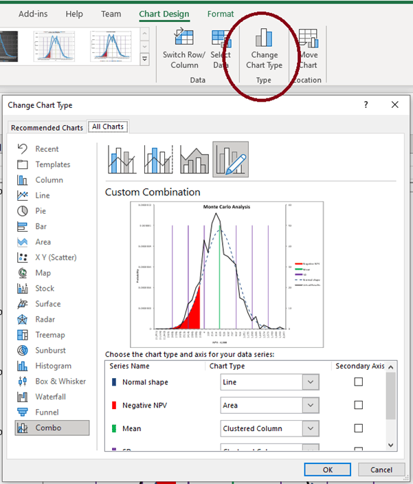
For the display shown we have selected:
- The Normal Distribution curve – a Line chart (smoothed). We have shown this with a dashed line as the values are derived from the actual data
- For the Mean and three Standard Deviations either side of the Mean - these are Column charts (the data being set for the maximum height of the Normal Distribution curve). By making the Gap Width (see blog 6) large you can make columns very narrow (Gap Width = 500%) and thus they appear as lines.
- For the area under the normal distribution curve where the NPV is negative this is an Area chart.
- The black line (which is the capture of the actual NPV values of the 500 scenarios) is a Line chart. This shows the number of incidents that fall within each quarter of a standard deviation. It is a simple count and is of a scale far in excess of the that needed to display the probabilities and thus needs to be plotted against a second axis. If one axis were used, then the other four data series would be so small they would become part of the horizontal axis. Simply tick the Secondary Axis to the right of the Chart Type to enable this.
The benefit of the second axis is that Excel will scale the data so that the chart on both axes start and finish in the same place and thus overlay effectively.
This dual axis functionality is great for charts such as Revenue v Customer numbers or Payroll cost v Staff numbers etc. In each case there is a correlation between the two data series, but each one is a different order of magnitude to the other.
Waterfall charts
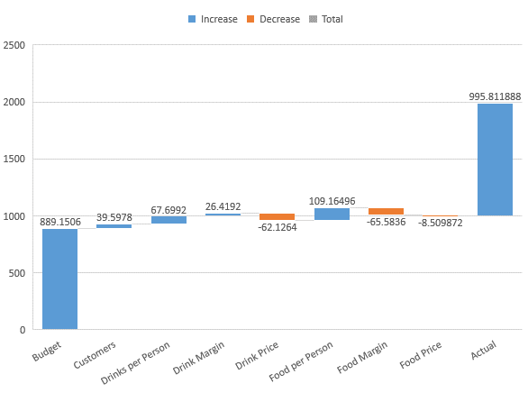
These are sometimes known as bridge charts or cascade charts and are great to show differences between Budget and Actual results. Up to 2016 they were only possible by using a stacked Column Chart and then setting the Fill for the base blocks to No Fill and thus leave the upper blocks ‘floating’ in mid-air.
The new built-in Waterfall chart is a much quicker way of creating this chart especially if the data crosses the horizontal axis and goes negative at any point. However, it does have some limitations – namely the colour scheme you are able to apply.
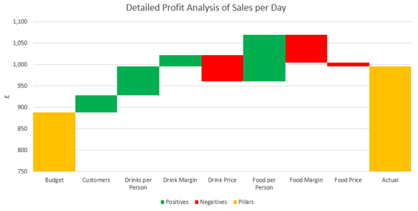
The following data is used for the chart – it is an example pub restaurant showing the causal factors to explain the reason for achievement over budget. When designing these charts, it is helpful to limit the number of columns to around 10. More than this and the detail detracts from the clarity of message (ie focus on the main reasons for difference). In limiting the number of columns, it may be tempting to group all the smaller values into a single column called ‘Other’. Be careful this column does not become the largest reason for difference and thus need an explanation of its components.

When the Waterfall chart is selected it will first appear as following:
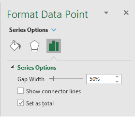
The chart needs to have the pillars established as Totals at each end. To do this double click each of them and in the right-hand menu bar select the ‘Set as total’ check box. At this point it can be helpful to set the Gap Width as zero to join the columns together. Whilst the ‘Set as Total’ applies to the individual column selected, the Gap Width will apply to all columns.
Unfortunately, the colour scheme is your default scheme, there are two ways to change this.
- Change the default colour palette (as described in blog 9).
- Individually change the Fill colour for each column. This is frustrating in that should you want to reuse the chart next month you will have to individually update the colours should a column switch from being positive to negative. Double click on each column to individually colour them.
To finish off this chart it is helpful to zoom in on the key data and not have half the chart displaying white space. To do this adjust the Axis Bounds (as described in Blog 4).
The finished product will look as follows:
In the next blog we will cover the addition of trend lines through data series and using the functions =FORECAST, =TREND, =SLOPE and =INTERCEPT.
- Exploring Charts (Graphs) in Excel – Part 2: Sparklines
- Exploring Charts (Graphs) in Excel - Part 3: Line Charts
- Exploring Charts (Graphs) in Excel - Part 4: Enhancing line charts
- Exploring Charts (Graphs) in Excel - Part 5: Column/Bar Charts, Clustered, Stacked and 100%
- Exploring Charts (Graphs) in Excel - Part 6: enhancing bar charts – creating funnel and tornado charts
Archive and Knowledge Base
This archive of Excel Community content from the ION platform will allow you to read the content of the articles but the functionality on the pages is limited. The ION search box, tags and navigation buttons on the archived pages will not work. Pages will load more slowly than a live website. You may be able to follow links to other articles but if this does not work, please return to the archive search. You can also search our Knowledge Base for access to all articles, new and archived, organised by topic.
