
So far in this blog series we have looked at the more common types of charts – line, column and bar. In this blog we take a look at some of the other types available which are area, scatter, bubble, surface, stock, doughnut and pie. The options can only be revealed in Excel by having some chartable data.
Key in a row of values such as the following:
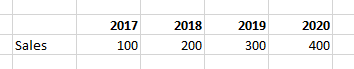
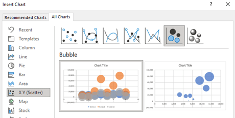
Highlight the block of data and on the Insert Ribbon in the Chart section click on Recommended Charts. At the top of the dialog box select the All Charts tab to reveal the full list of available options.
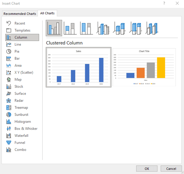
In recent releases of Excel the list has been extended so if you do not have the latest version some of the options displayed above may not be shown. Among the most recent additions are Waterfall and Funnel.
In 1907 the US tools company True Temper created the advertising slogan of ‘The right tool for the right job’. Charts are much the same – it is easy to fall back on the line and bar charts that we know – they are not always the most effective way to display and analyse data.
In the descriptions below we highlight a variety of charts, where they might be best used and illustrate what they would look like. To create each chart the principle described in blog 3 has been applied – highlight the data, including column headers and row titles, but keeping the top left cell of the array blank – then click on the preferred chart type.
Area
These are solid filled line charts and are great to display the way a set of values develop over time such as the sales from software versions.
Time development is the key and thus they should not be used to compare the product sales mix for a particular year - a column chart would be more appropriate (see blog 5).
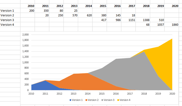
To avoid seeing dominating blocks of colour they can be gradient filled or made semi-transparent. More of this in Blog 9.
Scatter
This is a great way to compare two sets of data without regard to time. For example, a group of retail stores comparing the size of the store with its profitability.
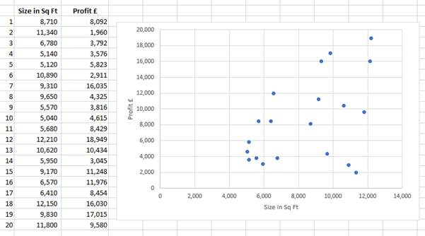
There are three types of correlation that can be determined:
- Positive – As one variable rises the other also rises – this is what can be seen in the chart above.
- Negative – As one variable rises the other falls – this might be seen when comparing the number of cash transactions versus credit card transactions.
- Random – where there is no pattern – an example could be the proportion of credit card transactions versus the USD/GBP exchange rate – there is unlikely to be a relationship.
Bubble
This chart has similar characteristics to the Scatter chart above, but adds a third dimension – the size of the marker or bubble. Because the bubbles displayed can become quite large it is helpful to limit the number of items being plotted. By having too many points they will inevitably start overlapping each other making it difficult to interpret the information being displayed.
The bubble chart does not show up as one of the items on the list of available charts, but can be found as a sub option of X Y (Scatter). Second from the right.
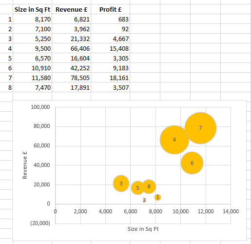
In this chart the size of the bubble is the profit. To set this up quickly it is easiest to have the first column of data for horizontal axis, the second column for the vertical axis and third column for the size of bubble.
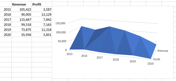
Surface
As with a bubble chart a surface chart works with three sets of data and starts our look at 3D charts – more of which is in blog 9.
The bubble chart is great for discrete data points – in our example retail branches. The surface is better for continuums such as time.
In this example we are displaying profit on the front line and revenue on the back line. While these may look clever and even more so when strata colours are added (used to separate bands of values eg over 100,000 is orange, between 50,000 and 100,000 is grey and under 50,000 is blue). However, this pre-empts my view (especially of 3D charts) that the medium should not detract from the message. While this may look clever and intriguing, perhaps a simple line chart of revenue and profit would be clearer to read.
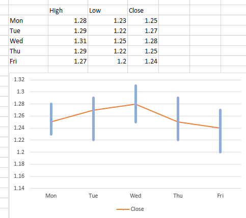
Stock charts
These are good for displaying trading prices – commodities, stocks and FX.
For each day it displays the trading range (the vertical line) and then plots the closing price as a line that goes horizontally.
Widening and colouring the bars was covered in blog 5. For quick reference, it is repeated here. Right click one of the bars and select Format Data Series. To widen the bars, use the Gap Width tool. It defaults to 150% and for the chart displayed this is changed to 20%.
To colour the bars select the paint pot icon at the top and choose your preferred colour.
In blog 3 we described how to populate the Chart Title text box. Simply right click and enter the title or in the formula bar use =cell refence to link the title to the cell contents where the title already exists.
These can be extended with two further additions:
- A collar that has the opening and closing price as well as the vertical line of the daily high and low range
- A block at the bottom of the chart to show trading volume in that stock for each day.
Doughnut and pie
These charts are essentially the same with the doughnut having a hole in the middle (the size of which can be made larger or smaller). They are great for displaying proportions of the total. For example, the sales from each country.
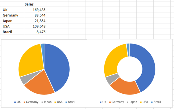
The benefit of the doughnut chart is that it can be used to show two years together (an inner and outer ring).
With all of these charts that have been illustrated there are lots of options enabling you to flex the data order, colours and styles – as mentioned in blog 3 many of these options can be accessed by right clicking the attribute you want to change and a context sensitive menu will appear.
The next two blogs will explore more of the layout and design options available to enhance these charts.
- Exploring Charts (Graphs) in Excel – Part 2: Sparklines
- Exploring Charts (Graphs) in Excel - Part 3: Line Charts
- Exploring Charts (Graphs) in Excel - Part 4: Enhancing line charts
- Exploring Charts (Graphs) in Excel - Part 5: Column/Bar Charts, Clustered, Stacked and 100%
- Exploring Charts (Graphs) in Excel - Part 6: enhancing bar charts – creating funnel and tornado charts
Archive and Knowledge Base
This archive of Excel Community content from the ION platform will allow you to read the content of the articles but the functionality on the pages is limited. The ION search box, tags and navigation buttons on the archived pages will not work. Pages will load more slowly than a live website. You may be able to follow links to other articles but if this does not work, please return to the archive search. You can also search our Knowledge Base for access to all articles, new and archived, organised by topic.
