
With the plethora of chart options available it is all too easy to get ‘carried away’ and as mentioned in blog 5 there is a balance between medium and message. We also mentioned that in a pole of FDs that were asked to vote on their least favourite Excel feature, it was 3-D charts that topped the list. In the words of A.S.C. Ehrenberg “a Chart is a means of making results clear and memorable” and thus clarity is the primary objective.
Colours
The colours used are entirely personal choice however, using a theme tends to look more professional than a set of random bright colours. Using shades of one colour can become difficult to interpret especially when there are more than a couple of series to display on the legend.
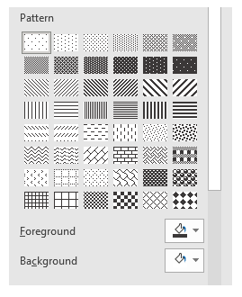
If the chart will be printed in black and white it will be important to ensure the different coloured series can still be interpreted and thus test it out to ensure clarity – the use of Pattern Fill for charts with areas can assist for black and white presentations. To access these: right click the data series, select Format Data Series, choose the tipping paint point and select the Fill options. Pattern Fill is the fifth option on the list.
To change any Element once it appears on the Chart simply right click it and a context sensitive menu appears – normally with the word Format in front (eg Format Chart Title, Format Axis etc)
Chart Title
To change the text you can either click on the Text Box and type directly onto the Chart or once clicked go to the Formulae Bar and type = to link it to the contents of a cell. The second method will mean any changes to the linked cell content will be reflected in the Title. This can be helpful for monthly reporting and automatically changing the Chart Title to reflect the month of the report.
Right click the Chart Title and selecting format will allow you to change Font, Colours and Text Direction.
Axis Labels
Once the Elements for labelling both the horizontal and vertical axis have been added they can be edited and formatted in the same way as the Chart Title.
Legend
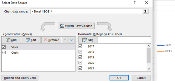
The legend enables the coloured lines and bars to be interpreted. Add the Element as explained above. The order that the components appear in the legend is the same as the order when they were defined. To change this order right click any one of the lines or bars on the Chart and chose Select Data. By using the up and down arrows at the top of the left-hand box will change the order of the items and the legend.
Axis Crossing
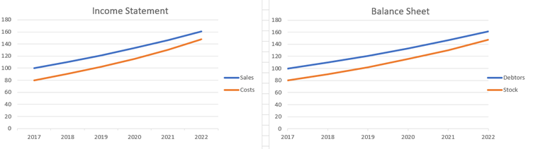
This may be a minor detail but many a financial chart that I see displays this incorrectly. The points on the horizontal axis are either at a date (balance sheet) or for a period (Income statement/cash flow). In the charts below you will see the horizontal axis labels are ‘Between tick marks’ on the left to indicate the value displayed is for a period and ‘On tick marks’ on the right to indicate the value displayed is at a date. To select the appropriate alignment, right click the horizontal axis and select Format Axis and under Axis Options the two alternatives are displayed. While in this option set, just below is another option to display the ‘Categories in reverse order’ a very helpful option when you want to display a chart the opposite way around without having to rebuild the data source.
Gridlines and Tick Marks
These elements can put a grid of reference lines behind the chart. They are helpful for being able to read values off the lines. The key is make them subtle and not more dominating than the chart itself.
Typically I will display horizontal grid lines and vertical tick marks as shown above. However, it will depend on the type of chart and information to be conveyed.
Gridlines
These can be added and removed both horizontally and vertically with the Add Elements button explained above. Right click them to format them. My preference is to use a light grey (default) so that they are subtle. The Minor gridlines tend to create a graph paper background that may be useful for mathematical charts, but for financial ones they can reduce, rather than aid, clarity.
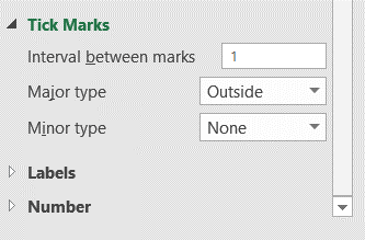
Tick marks
These are found under Axis Options and the number of them will automatically fit your data (like Axis Bounds explained in Blog 4). It will select 10 points rounded to whole numbers to create the vertical scale and use each item on the horizontal axis until there are greater than 10 at which point it is best to start simplifying the number of points. Using the Units Major on the vertical axis the interval between points can be manually selected and increased or reduced in detail.
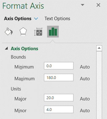
Continuing under Axis Options the tick mark can be displayed or hidden. For the Horizontal axis the interval displayed is 1 – in the example above that is one year between each. Then the Major tick marks can be displayed Inside the axis, Outside the axis or Crossing the axis. In the example above they are Outside the axis. The Minor type puts fractional marks between the tick marks and can make the chart looked cluttered.
Recycling charts
This a process whereby instead of having a lot of charts in one report you have one chart and select the data that you want displayed.
There are two functions that can help you to create this:
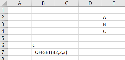
=OFFSET(Reference, Rows away, Cols away) This is a function that allows you to do indirect cell addressing. You set a fixed point on the worksheet and move a variable number of rows and columns away from that point to find a value. In the example below the formula in B6 is =OFFSET(B2,2,3). This is interpreted as going to cell B2 and move 2 rows away and 3 columns away and thus show the letter C in cell E4.
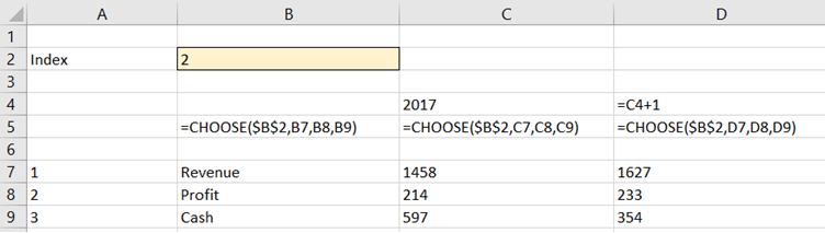
=CHOOSE(Index, Value if 1, Value if 2, Value if 3, value if 4….) This function will select the value of a cell depending on the index number it is given. If the index it is given is the number 1 it will use the reference in the second part of the formulae, if the index is 2 it will use the reference in the third part of the formula and so on. This is useful for a up to around 5 options, above that it would be better to set up a table and use OFFSET.
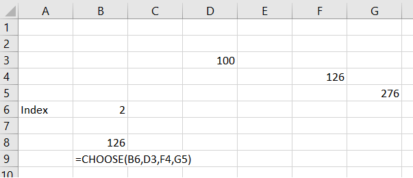
In the example above if the index in B6 is 2 then the value of the CHOOSE function in B8 will go to the third part of the formula and get the value in F4 which is 126.
The example below uses this to display three alternative charts. The great feature of the Chart function in Excel is that it will recalibrate all the Axis, Gridlines and Labels to fit the data it is fed. By changing the value in Cell B2 a different line can be shown. It may be more elegant to use a drop down menu to select between the three options, but the creation of that is outside the scope of this blog.
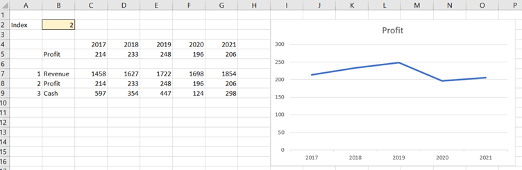
The code to create this recycling option is as follows. It uses the =CHOOSE function but could equally well be done with OFFSET as the data is in a table. Cell C5 would then be =OFFSET(C6,$B$2,0)
The next blog in the series will explore colours, shadows and graphics.
- Exploring Charts (Graphs) in Excel – Part 2: Sparklines
- Exploring Charts (Graphs) in Excel - Part 3: Line Charts
- Exploring Charts (Graphs) in Excel - Part 4: Enhancing line charts
- Exploring Charts (Graphs) in Excel - Part 5: Column/Bar Charts, Clustered, Stacked and 100%
- Exploring Charts (Graphs) in Excel - Part 6: enhancing bar charts – creating funnel and tornado charts
Archive and Knowledge Base
This archive of Excel Community content from the ION platform will allow you to read the content of the articles but the functionality on the pages is limited. The ION search box, tags and navigation buttons on the archived pages will not work. Pages will load more slowly than a live website. You may be able to follow links to other articles but if this does not work, please return to the archive search. You can also search our Knowledge Base for access to all articles, new and archived, organised by topic.
