
Colours
The colours used are entirely personal choice however, using a theme tends to look more professional than a set of random bright colours. Using shades of one colour can become difficult to interpret especially when there are more than a couple of series to display on the legend.
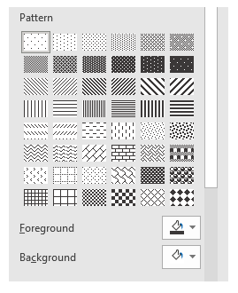
If the chart will be printed in black and white it will be important to ensure the different coloured series can still be interpreted and thus test it out to ensure clarity – the use of Pattern Fill for charts with areas can assist for black and white presentations. To access these: right click the data series, select Format Data Series, choose the tipping paint point and select the Fill options. Pattern Fill is the fifth option on the list.
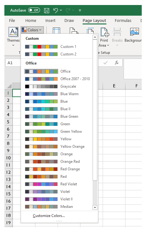
At the bottom of the list is Customize Colors which allows you to build your own palette which can be great to set up a series that aligns to your corporate or client colours.
Be careful when you change the colour palette as all charts using that palette will change not just the one you are editing.
Shadows
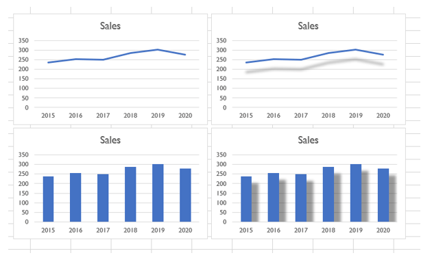
Shadows can be an effective way to ‘lift’ a chart off the page. What is created is a rather curious illusion through a medium that for all other aspects of reporting is a 2D piece of paper. When shadows are overdone it can appear to add another data series for which there is no explanation.
The following two examples show a sales chart with and without shadow.
To use shadows, right click any data series and select series options. The first set of options is Shadow. Below that are further options to cover Glow, Soft edges and 3-D format.
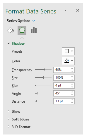
- Presets - Dispays a set of alternative angles and styles.
- Color – The colour of the shadow.
- Transparency – Makes the shadow line partially coloured and thus the gridlines can be seen through the shadow – 60% is the default with 0% being a solid colour and at 100% the line completely disappears.
- Size Makes the shadow line a percentage scale of the original line – 100% is the most likely use for this.
- Blur This is the width of shadow – 0 is a hard line the same as the sata series, 4 (default) is the most appropriate. Over 10 looks makes the line look like a badly rubbed out pencil mark.
- Angle – Where is the light shining and thus how does the shadow fall? 0 is light to the left and shadow falls to the right, 90 (default) light to the top and shadow falls below and it continues round clockwise to 360 back to the start point.
- Distance – This is how far away the shadow line is placed from the original – the default is 3pt – the larger the number the higher it appears the line has been elevated.
Transparency is also a setting that can be set for displaying the main data series and thus for charts where there is overlap it can be a helpful way to see all the displayed data.
Graphics
Instead of using colours, shades and patterns for filling block charts you can use images.
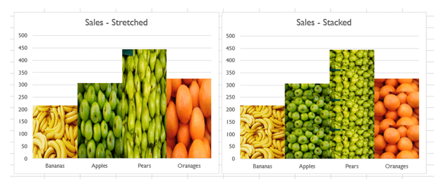
There are two modes - Stretch, whereby the image is stretched (distorted) to fill the area and Stacked whereby the aspect ratio is maintained (retaining the image integrity) and multiple images are stacked on top of each other to fill the bars.
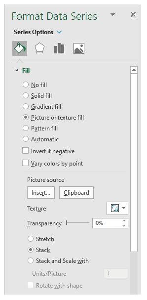
To use this feature, select the Fill area of Series Options and choose Picture or texture fill. The texture provides various images of materials. For a picture click on the Insert button below Picture source and load an image. The stretch and stack options are beneath the Insert button.
Adding backgrounds
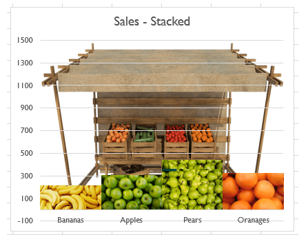
Just as we can add colours, patterns and images to a data series you can also add them to the background. Right click the background area where no data is displayed and select Format Plot Area and the same options appear as for the data.
In the chart below a picture of a market stall is showed as the background. All colourful, but how clear is the final product in conveying the message you want to present?
In the next blog we will cover Data series, dual axis, multi-chart overlays and waterfall charts.
- Exploring Charts (Graphs) in Excel – Part 2: Sparklines
- Exploring Charts (Graphs) in Excel - Part 3: Line Charts
- Exploring Charts (Graphs) in Excel - Part 4: Enhancing line charts
- Exploring Charts (Graphs) in Excel - Part 5: Column/Bar Charts, Clustered, Stacked and 100%
- Exploring Charts (Graphs) in Excel - Part 6: enhancing bar charts – creating funnel and tornado charts
Archive and Knowledge Base
This archive of Excel Community content from the ION platform will allow you to read the content of the articles but the functionality on the pages is limited. The ION search box, tags and navigation buttons on the archived pages will not work. Pages will load more slowly than a live website. You may be able to follow links to other articles but if this does not work, please return to the archive search. You can also search our Knowledge Base for access to all articles, new and archived, organised by topic.
