Origins
It was the College of Heralds who granted the Institute's original coat of arms on 22 January 1881. The figure chosen by the Heralds to stand at its centre would appear to be Economia, taken from the book 'Iconologia' by Cesare Ripa (1603) which is now held by ICAEW in its collection of rare books.
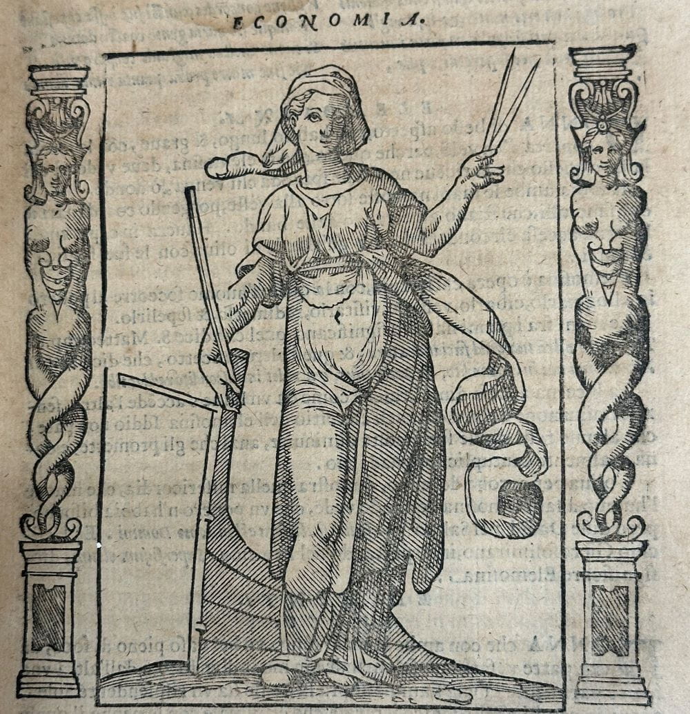
In an article written for The Accountant in 1948, Cosmo Gordon (the ICAEW Librarian at that time) explained that 'The rod signifies command, the rudder guidance; with the dividers she measures her powers and so estimates what she has to spend'.
Further information on Economia's origins and meaning can be found in Gordon's full article, which was first published in The Accountant on 6 November 1948.
Earliest known depiction of the coat of arms — 1881
The earliest known version of the ICAEW coat of arms can be seen on the front page of the 1881 List of Members. It continued to appear in this annual publication until 1947.
In the upper part of the shield is a pair of scales (the symbol of justice), and in the lower part stands Economia (a personification of economy). The Latin motto — 'Recte Numerare' — literally translates as 'Rightly to number'.
This foundational design established the key elements that would shape all later interpretations.
Stone sculpture and stained glass — 1890s
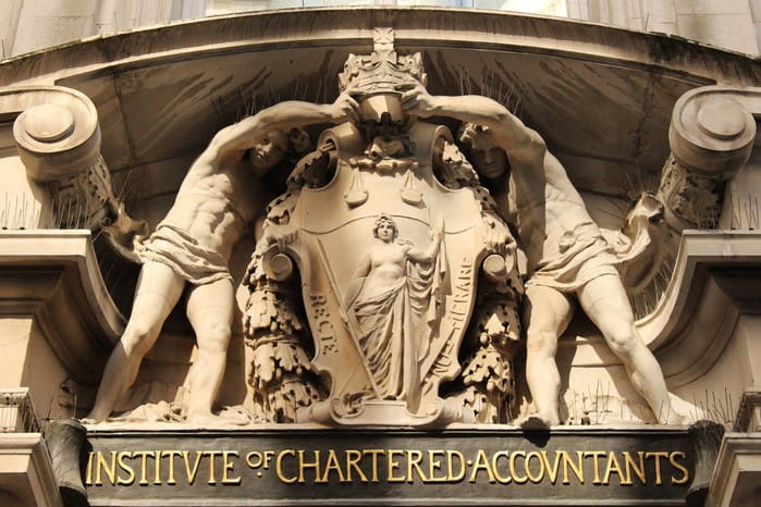
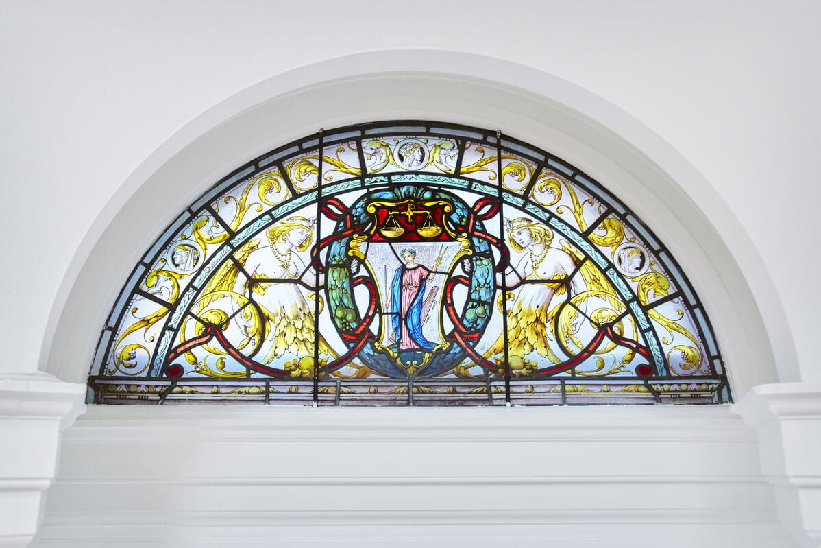
Several other early depictions of the coat of arms can be seen on the interior and exterior of Chartered Accountants' Hall, headquarters of ICAEW in the City of London.
Perhaps most conspicuously, the sculpture over the main entrance — built between 1890 and 1893 — shows the coat of arms (with Economia at its centre) surrounded by two classical figures holding a crown which represents the Royal Charter. It was created by Harry Bates, a British sculptor who was elected to the Royal Academy.
Notable also are the depictions of the coat of arms on the stained glass windows in the Main Reception Room (formerly the Council Chamber).
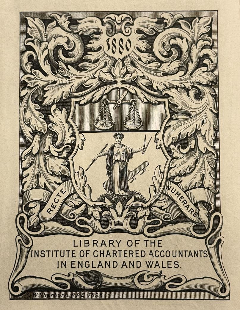
Bookplate design by Charles William Sherborn — 1893
Another early version of the coat of arms can be seen in the bookplate which was designed for the ICAEW Library by the noted English engraver Charles William Sherborn in 1893.
The engraved bookplate block from which prints of this design were produced for use in Library books was lost during the Second Great Fire of London on the night of 29 December 1940, when the factory of ICAEW printers Henry Good & Son, of King William Street House, was destroyed by bombing. (Though, according to Sherborn's son, this engraving was not created by the original designer himself.)
A new bookplate design was subsequently produced by Sir Henry Badeley.
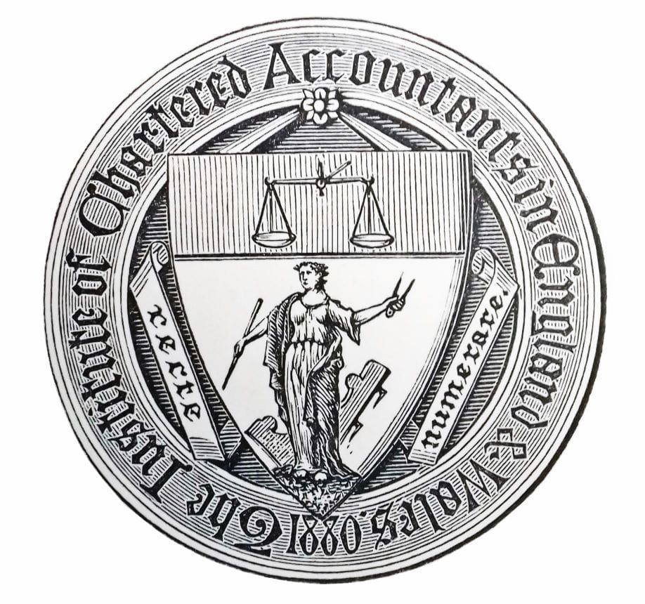
Entry in the Book of Public Arms — 1915
In 1915, the Institute's coat of arms was included in Arthur Charles Fox-Davies's extensive illustrated work on heraldry, 'The Book of Public Arms'. The illustration of the coat of arms which appears in the book is reproduced below.
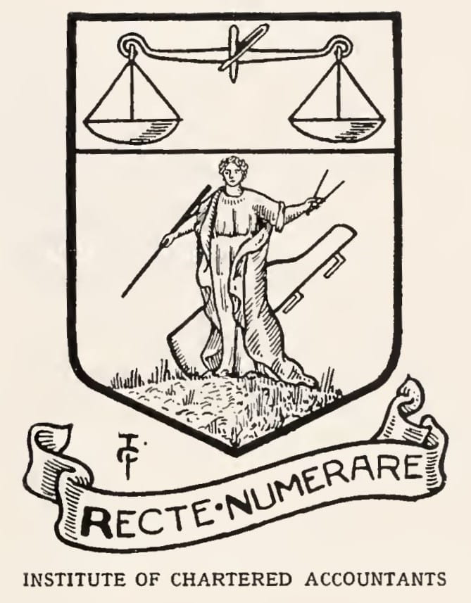
Argent, on a mount in base, in front of a rudder in bend sinister, a female figure proper representing “Economy,” habited gules, mantled azure, about the temples a wreath of olive, in the dexter hand a rod, and in the sinister a pair of compasses also proper; a chief of the second thereon a balance suspended also or. Motto — “Recte numerare.”
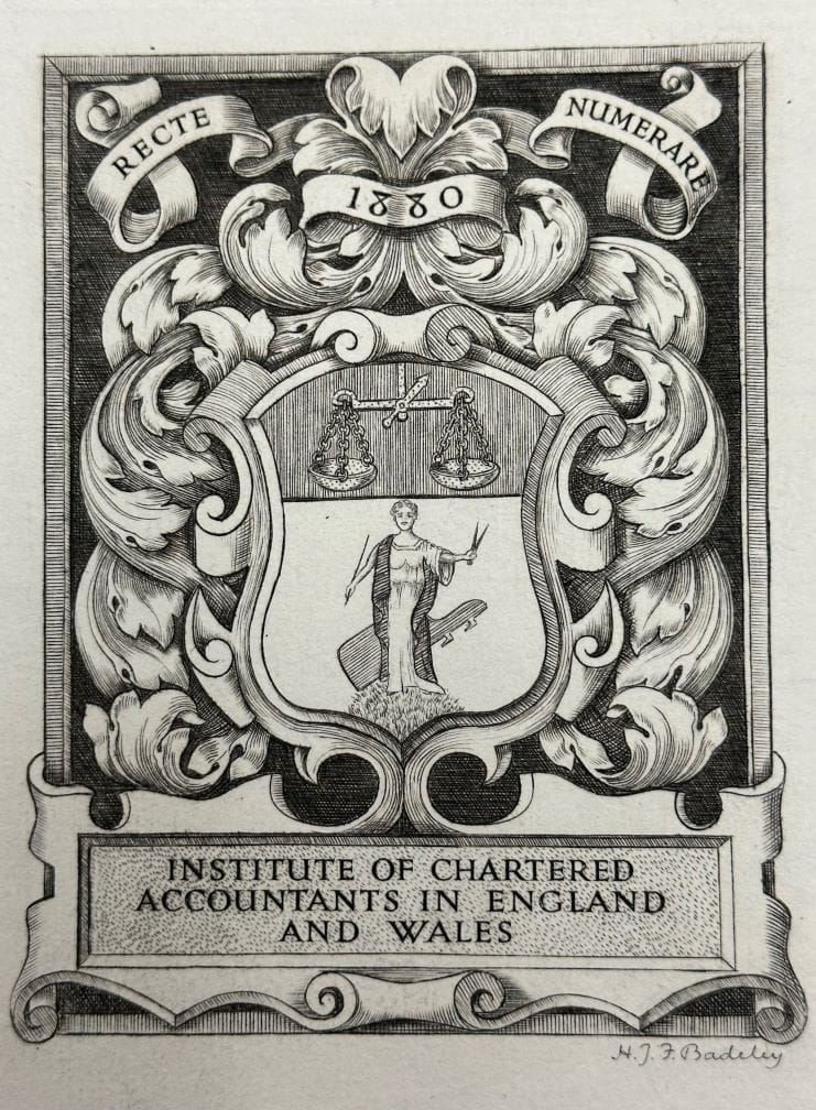
Bookplate design by Sir Henry Badeley — 1944
A mid-twentieth century representation of the Institute's coat of arms can be seen in the bookplate below, which was designed and engraved by Sir Henry Badeley, K.C.B. in 1944 and presented to the library by Mr. R. W. Bankes, C.B.E.
Badeley was a prolific designer of bookplates, having previously designed a bookplate for the House of Lords Library, among many others.
New ICAEW coat of arms — 1981
In 1981 (one hundred years on from the granting of the original) ICAEW was granted a new coat of arms which introduced a number of new elements — though the central figure of Economia was retained. This can be seen below.
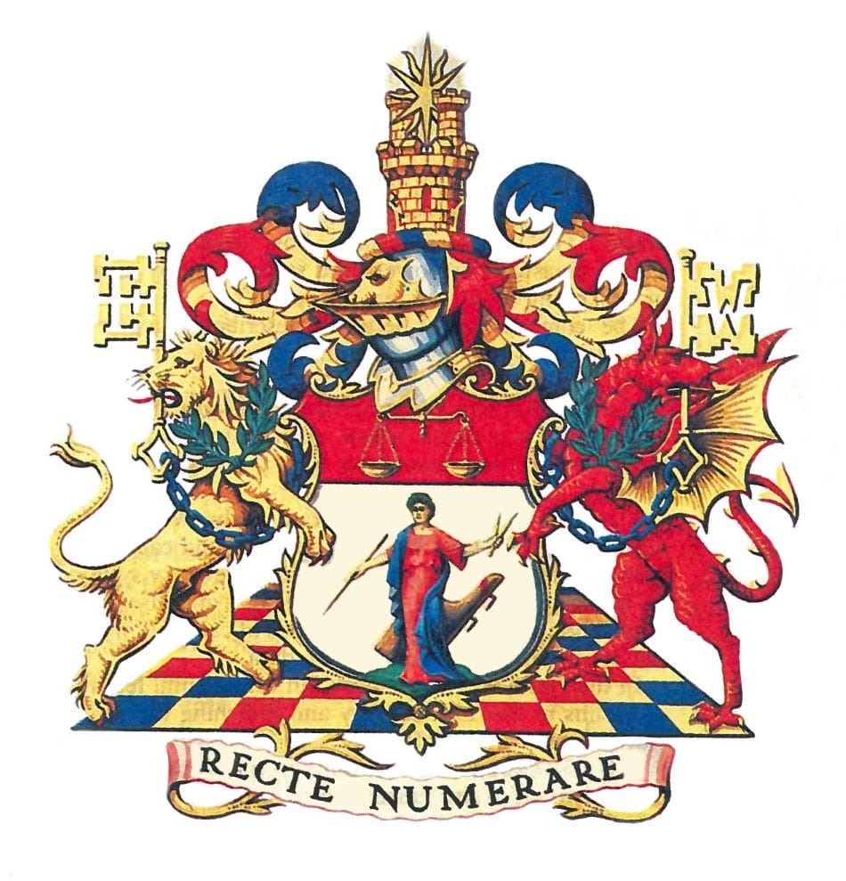
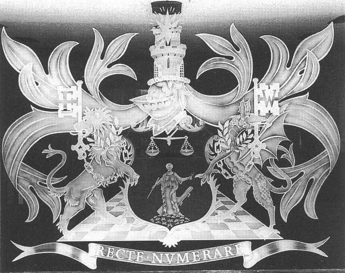
Extract from the ICAEW Report and Accounts, 1981
A Crest and Supporters have been added to the Shield of Arms of the Institute, granted in 1881.
In the original Shield, which is retained unaltered, the 'Female figure proper representing "Economy"' stems from a book by Cesare Ripa, entitled Iconologia, which appeared in Rome in 1603. The author describes Economia as: 'A matron of serious aspect crowned with olive and holding a compass in her left hand, a rod in her right. Behind her is a rudder. Every family has need of its own particular laws, so she is shown holding a rod signifying command. The rudder is the symbol of guidance. The garland of olive shows that the good economist must necessarily maintain peace in her house. The compass teaches how each economist should measure her powers and so estimate by means of reckoning what she has to spend'.
The 'compass' might better be described as a pair of compasses or dividers, denoting accurate measurement.
The Shield is now ensigned by a Helm with Mantling, upon which is a Crest, whose main feature is a tower with portals. Twin turrets rise from the tower, and set between them is a heraldic star.
The tower suggests a corporate body, well established on a solid foundation of accuracy and care. The twin turrets are an allusion to the double-entry system of book-keeping. The radiated star symbolises the application of electronics to methods of calculation and the speed of communication of data.
In the Helm is a lion's mask, an ornamental feature of Helms in the 19th century and matching the scroll work of the original Shield.
A lion and dragon are the Supporters. Each has been garlanded with olive, a wreath of which is about the temples of Economia.
Each Supporter has a key of gold fastened to a chain and a blue ring, the key being a symbol of security. The ward of the key held by the lion of England is shaped as an 'E', and the key held by the dragon of Wales has its ward in the form of a 'W.
Red, blue and gold, being the major colours used, appear again in the 'compartment', the base upon which the Supporters stand, which is designed to resemble a chequerboard, originally an aid to monetary calculation. The compartment is made of exactly 100 squares, thus noting emblematically the Institute's centenary.
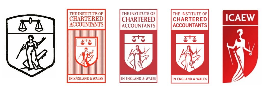
Evolving logo and brand identity — mid-20th century to 2017
From around the 1960s until the adoption of the present logo in 2017, ICAEW used a succession of different logos and brand identities. Each version incorporated a simplified version of the coat of arms and Economia, though the details varied over time.
Below, we set out a selection of logos and simplified coats of arms used by ICAEW at particular times during this period.
Contemporary reinterpretation — 2017 to present
In 2017 ICAEW completed a major rebranding project, updating its visual identity and corporate logo.
At the centre of this refresh was a subtle reinterpretation of the long-standing allegorical figure of Economia. Most notably, the dividers in her left hand were coloured red (contrasting with the black and white of the rest of the logo), representing and emphasising "her unique powers of measurement and assessment, as well as her ability to draw perceptive insights from the world around her".
The themes underpinning the rebrand were encompassed in the tagline “A world of strong economies”, with communications setting out how the new brand was intended to embody ICAEW’s values and the role of chartered accountants in fostering trust, clarity and prosperity in complex economic environments.
Writing at the time, ICAEW's then-CEO explained that it was intended to “differentiate us from others in an increasingly crowded marketplace” and to align ICAEW’s image with its forward-thinking strategic ambitions and growing international footprint.
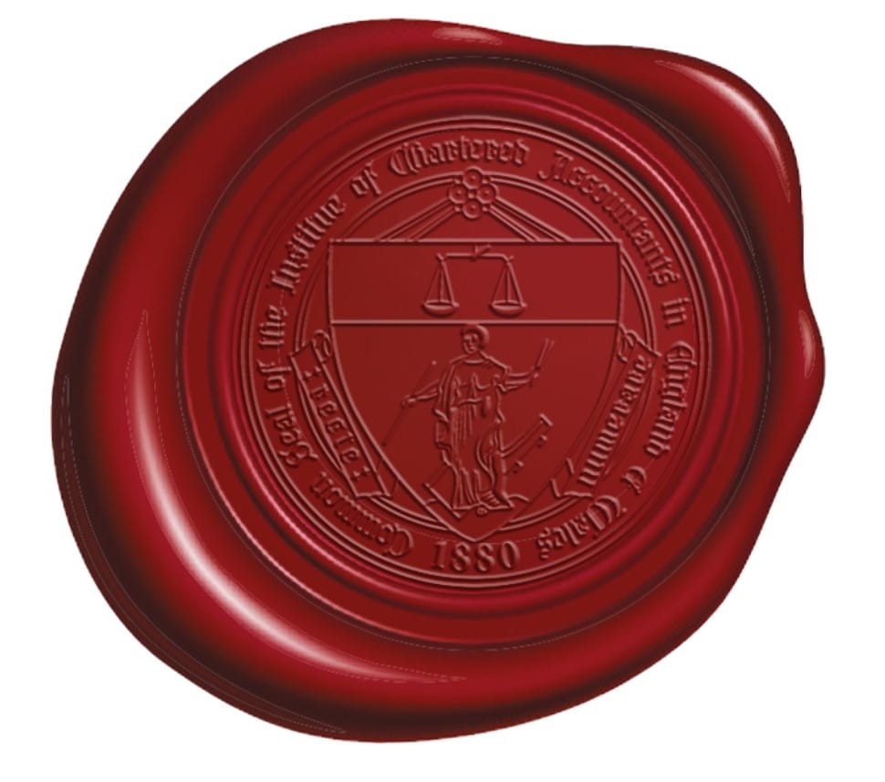
More recently, an updated version of the original coat of arms has been used for the embossed ICAEW seal on digital ACA certificates, bringing us right back to where we started.
Whilst the ICAEW logo and brand have been refreshed at various points during the organisation's existence, you can be sure that whatever form they take, the principles and values at their core will endure.
Further reading
Can't find what you're looking for?
The ICAEW Library can give you the right information from trustworthy, professional sources that aren't freely available online. Contact us for expert help with your enquiries and research.
ICAEW accepts no responsibility for the content on any site to which a hypertext link from this site exists. The links are provided ‘as is’ with no warranty, express or implied, for the information provided within them. Please see the full copyright and disclaimer notice.