
Hello all and welcome back to the Excel Tip of the Week! This week, we have another Creator post – the second part of our two-part examination of the wonders of Power Pivot.
If you haven’t already checked out last week’s instalment or our recent webinar on the topic, you probably want to start there.
Measures vs. calculated fields vs adding columns
The concept of a “Measure” in Power Pivot builds from pre-existing concepts in traditional PivotTables, such as the calculated field. In old-style PivotTables, you could use the Fields, Items & Sets menu on the special PivotTable => Analyze menu to create one of these – essentially, you would define a calculation in terms of the existing fields in the Pivot, and Excel would imagine that such a column existed and then you could include it in your PivotTable.
In Power Pivot, we don’t have to deal with imaginary calculations hidden several menu clicks away: From the Power Pivot window, we can directly add new columns to any table. Here’s an example, continuing on from the same Northwind data as last week:
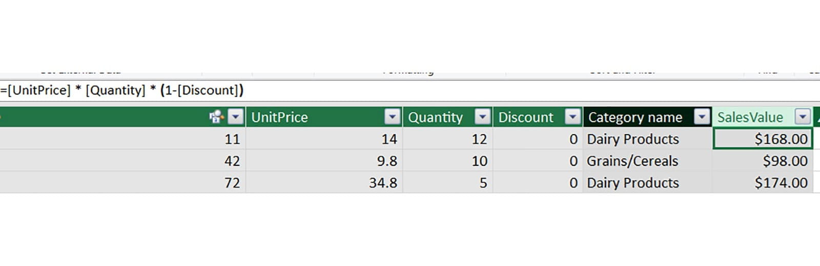
This new column – which we have called SalesValue – is defined in terms of other columns. Because of Power Pivot’s ability to use data connections, these need not necessarily be columns in the same table – we could specify another table with the syntax TableName[ColumnName] just like with regular Excel Tables.
But Measures go one step further – allowing us to create a calculation and summarise it in a specified way all at once. This means we can avoid ambiguity about how a particular measurement of our data is calculated and displayed. To make a measure, we can type in the measure space, which is displayed underneath our table in the Power Pivot window:
The syntax we need is as follows:
NameOfMeasure:=Formula
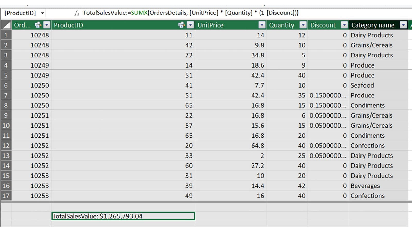
And for most Measures, we will not use the standard formulas like SUM, AVERAGE, and so on – but instead special equivalents designed just for measures – called Data Analysis Expressions, or DAX. Most of these are easily recognised because they have an X at the end of their name – e.g. SUMX, AVERAGEX. The difference here is that SUM could only add up values from a field already present in our table, whereas SUMX can first evaluate an expression for each row, and then sum up the total. Here’s a total sales measure that can be added even without adding a calculated column first:
The generic syntax for most basic DAX functions is:
MeasureName:=DAXFUNCTIONNAME(table to evaluate the expression over, expression to evaluate)
Our specific Measure here is:
TotalSalesValue:=SUMX(OrdersDetails, [UnitPrice] * [Quantity] * (1-[Discount]))
Or, expressed in English:
“For each row in the OrdersDetails table, calculate this expression, and then return the sum of all the results.”
So what’s the value of doing all of this? Well, as soon as our Measure is written, we can immediately switch back to regular Excel and build a PivotTable using our new measure:
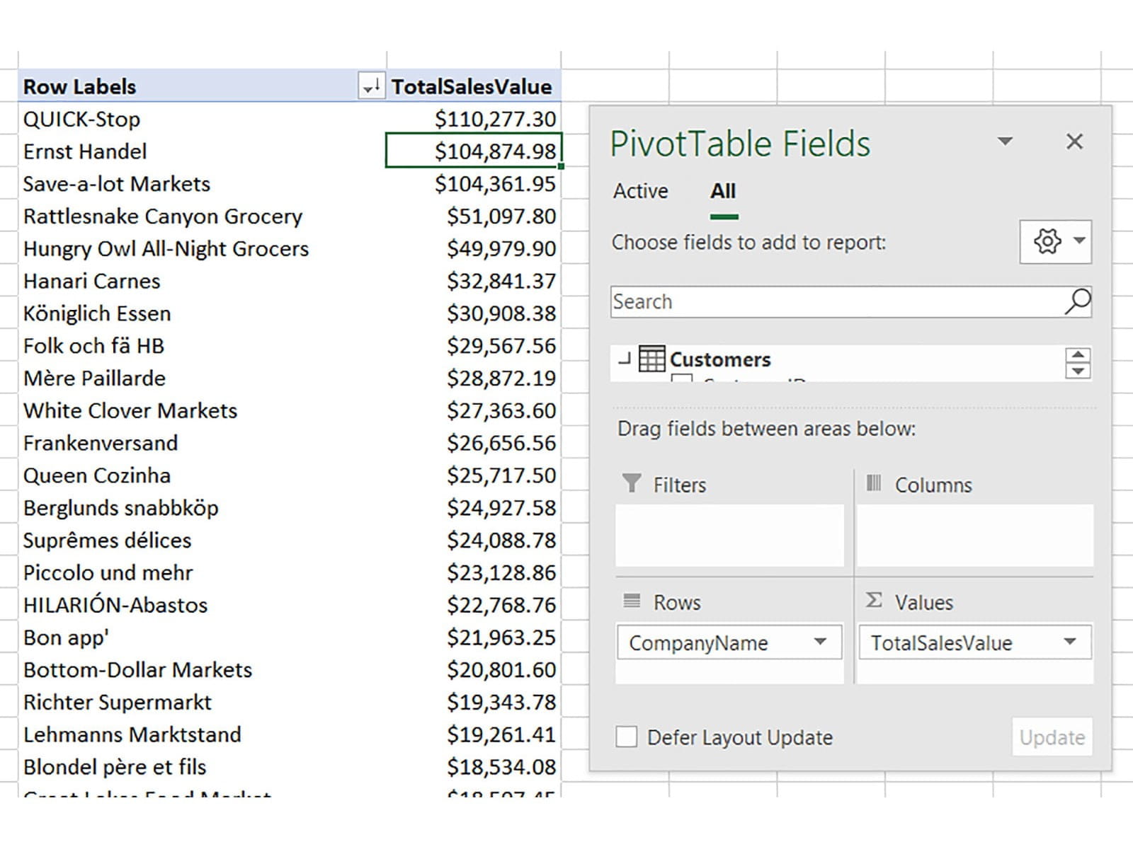
Note that we don’t have to specify how we want the resulting value to be summarised – that’s baked into the definition of the Measure and can’t be changed. Also notice how the formatting we chose for the Measure cell back in the Power Pivot window is automatically carried over to the values in the Pivot.
Going further with CALCULATE
As you can see in the above example, the result of a DAX Measure such as a SUMX is automatically affected by the way we lay out the Pivot. If we create Row Labels which use our customers’ names, then that follows through into how the Measure is shown. But with the powerful CALCULATE function, we can amend that if we want to.
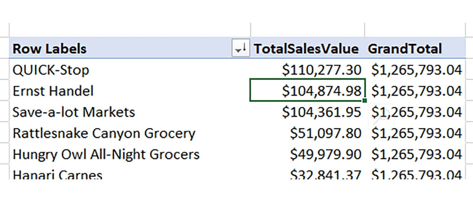
Continuing our current example, let’s say we want to compute what share of the total sales was represented by orders from each customer. We can do this with a couple of Measures and the CALCULATE function. CALCULATE lets you compute the result of some expression (or another Measure), but change or remove the filter context that exists in the PivotTable. So for example you could create a Grand Total that would always show the total in every row, rather than being broken down by customer like TotalSalesValue is.
Here’s what that looks like in practice:
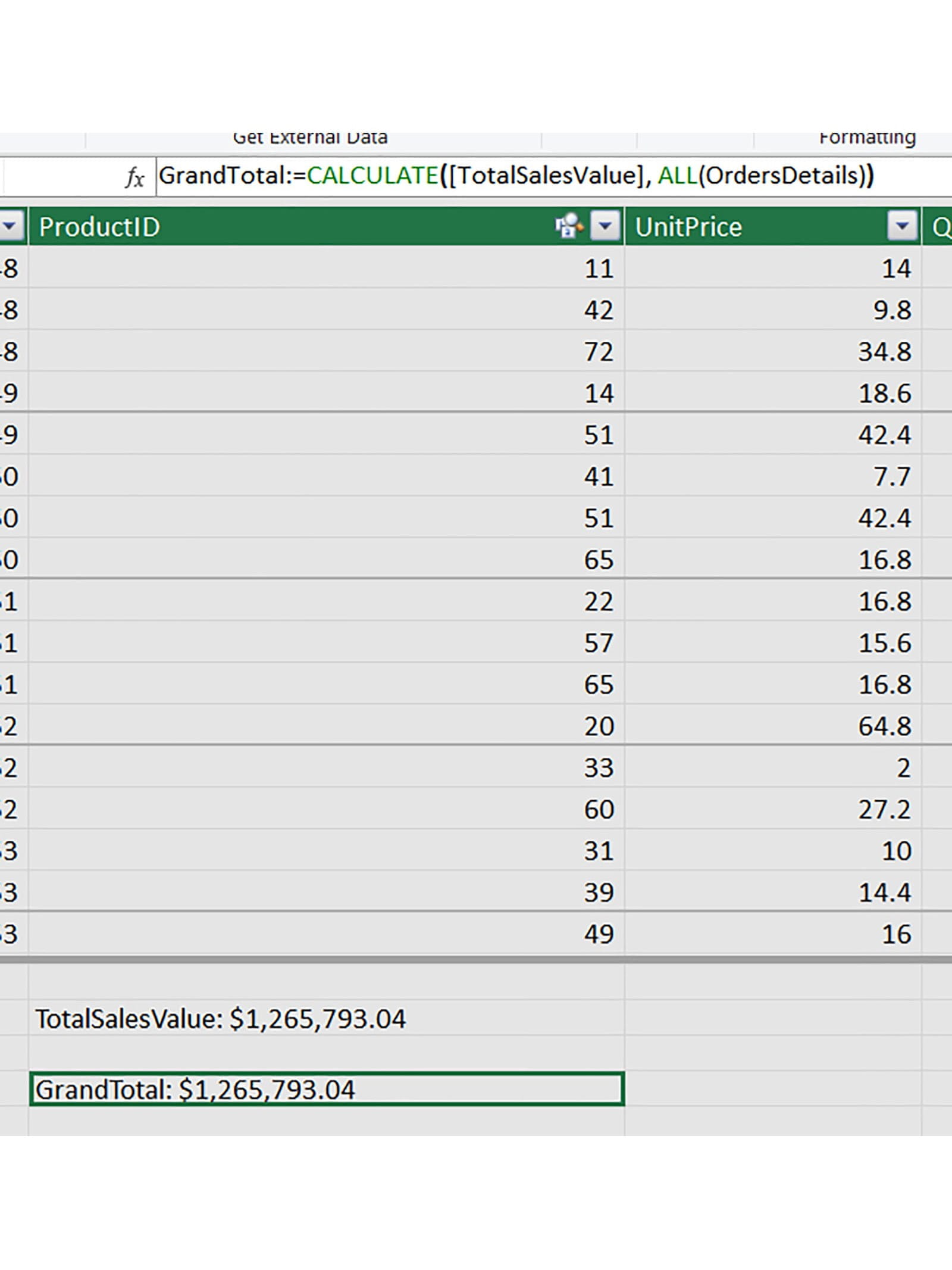
We have used yet another special Power Pivot function here – the ALL function, which simply ignores anything else going on that would normally filter a table and always returns all the rows. While this measure looks the same as TotalSalesValue in this view, in a Pivot it looks very different:
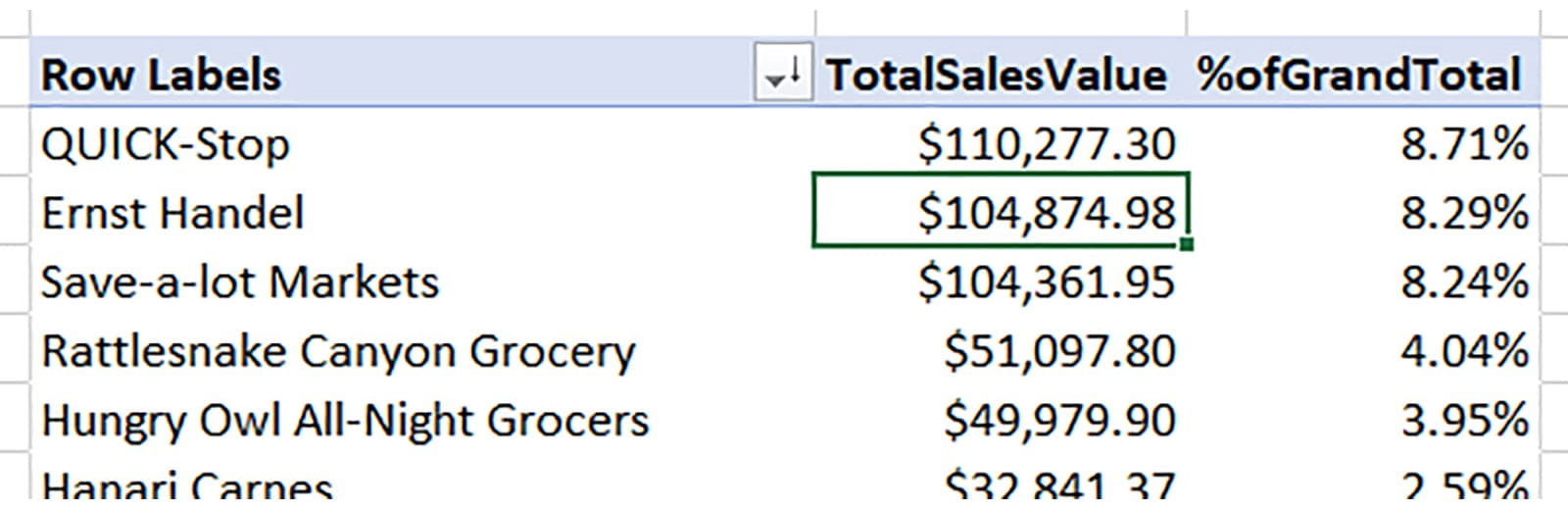
We can also go one step further – creating a “percentage of grand total” measure:
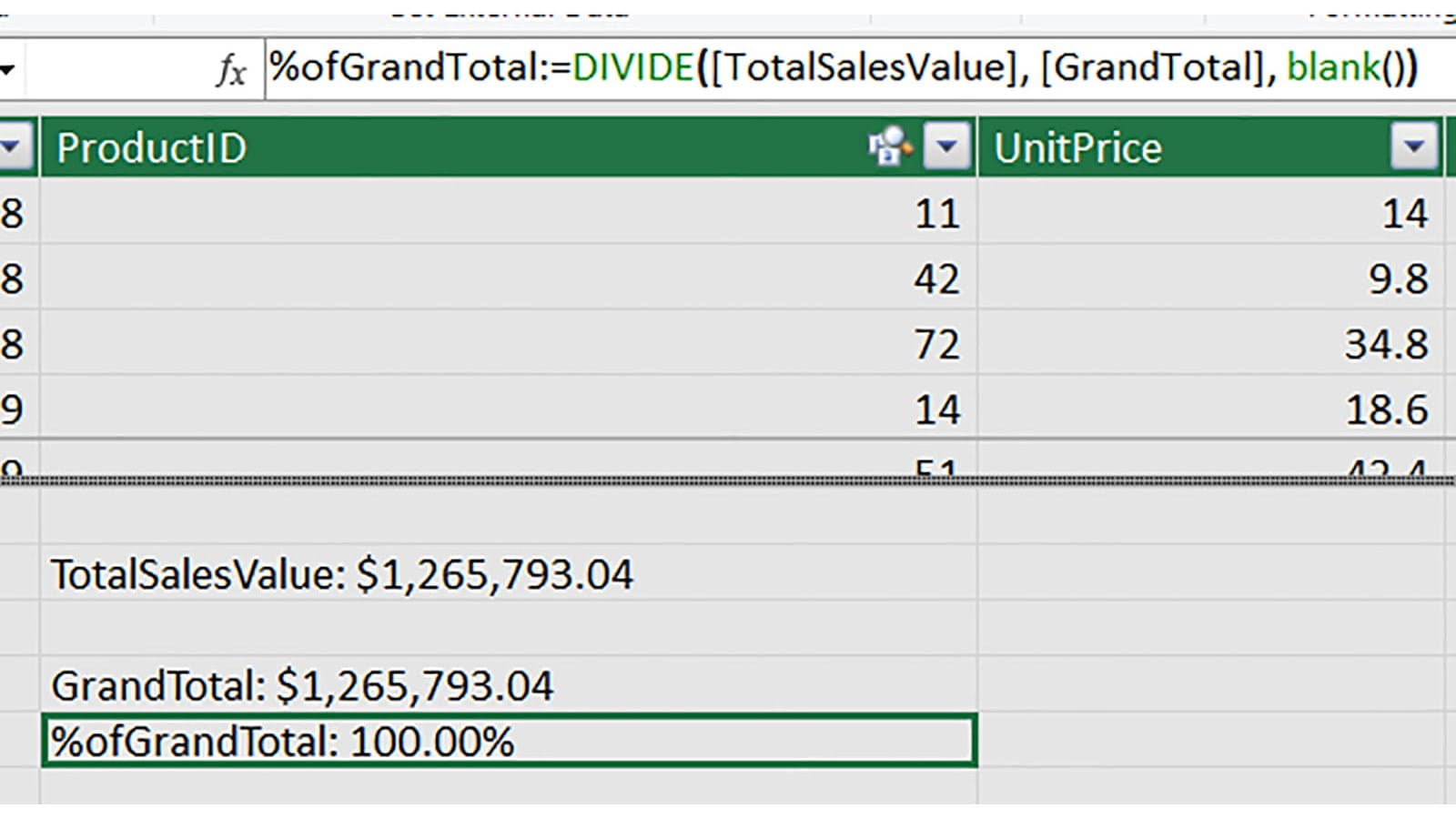
Once again, while we could do a simple division, here we have used two handy Power Pivot formulas to improve the functionality:
- DIVIDE, which can safely divide one value by another and return an alternative in the case of a divide-by-zero error; and
- BLANK, which returns a blank cell
Here’s the end result:
There are plenty of other special functions that you can use within Power Pivot Measures, but a critical family of them is the so-called Time Intelligence functions. These let you alter the time- and date-based elements of the filter context. Put more simply, these let you make CALCULATE-based Measures that can show things like “prior year balance”, automatically.
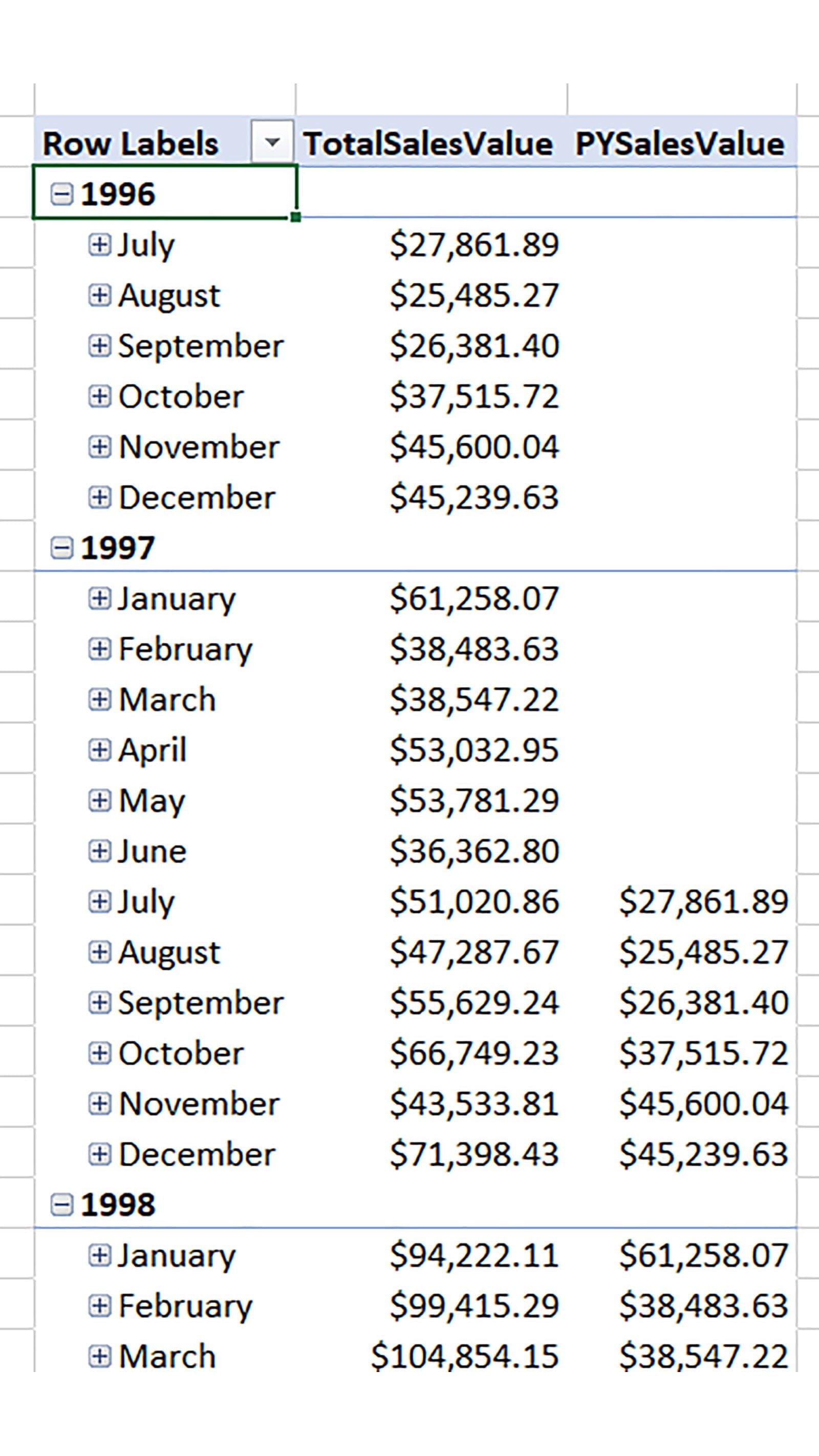
Here’s a basic PY Measure for TotalSalesValue:
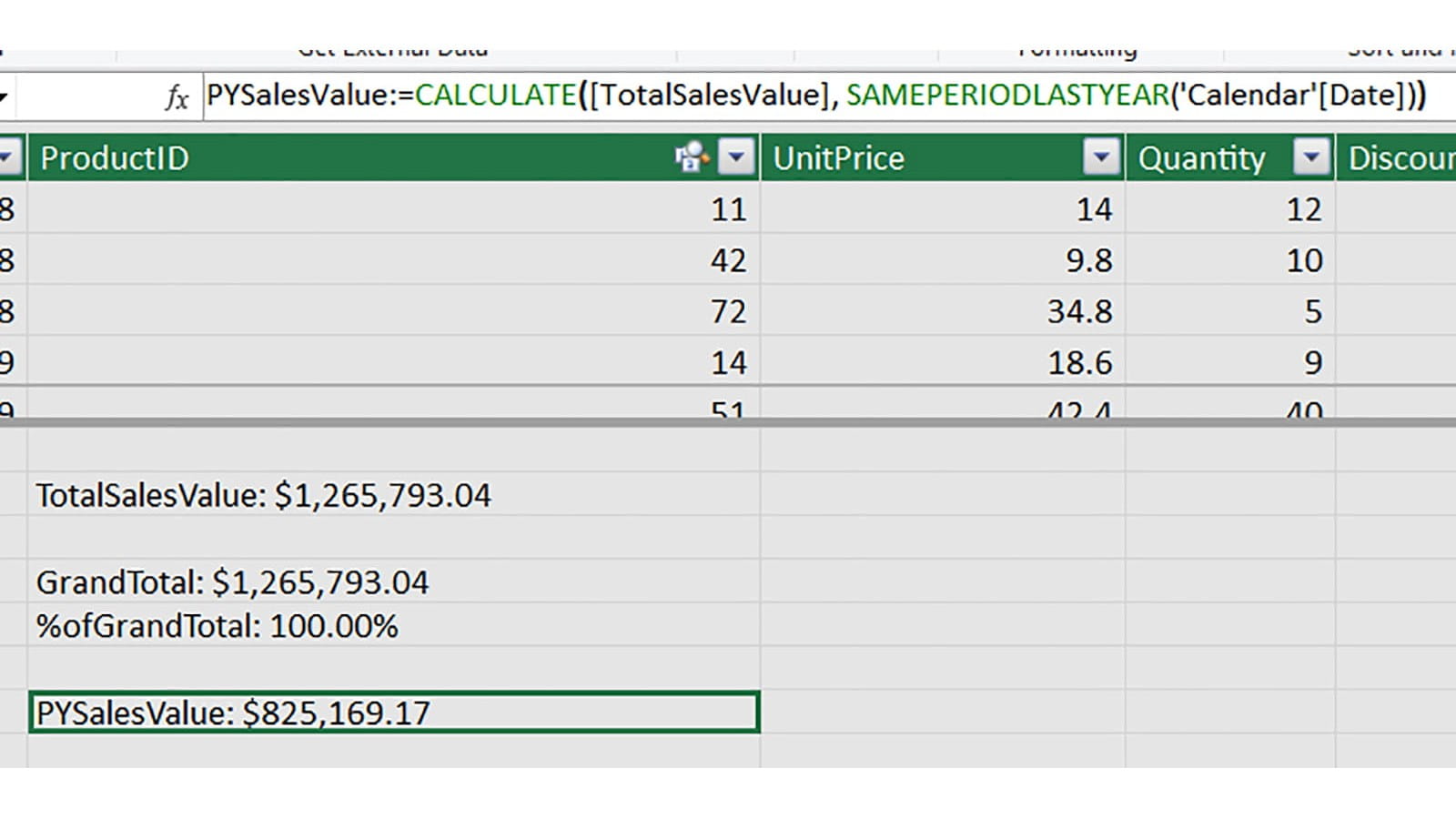
Here we have used the Ronseal-esque SAMEPERIODLASTYEAR function to move the dates we are using to do this calculation back by one year. This produces our prior year figure:
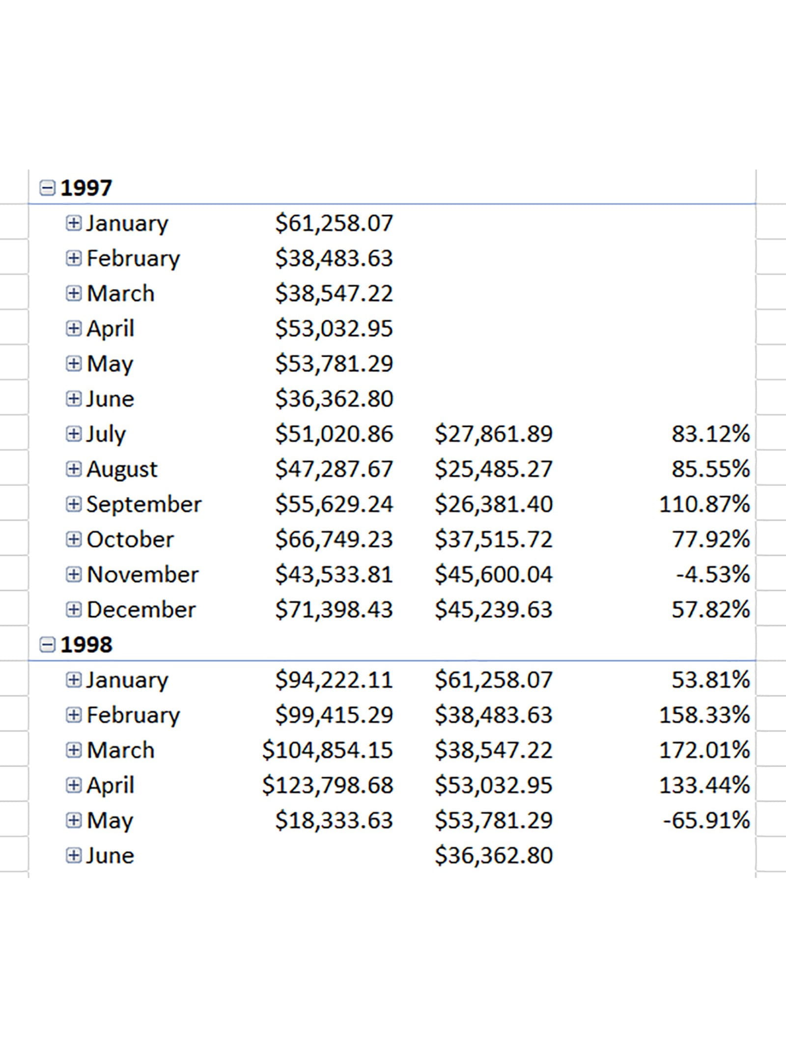
For one final step, we’ll create a Measure that calculate the year-on-year change in the total sales value:
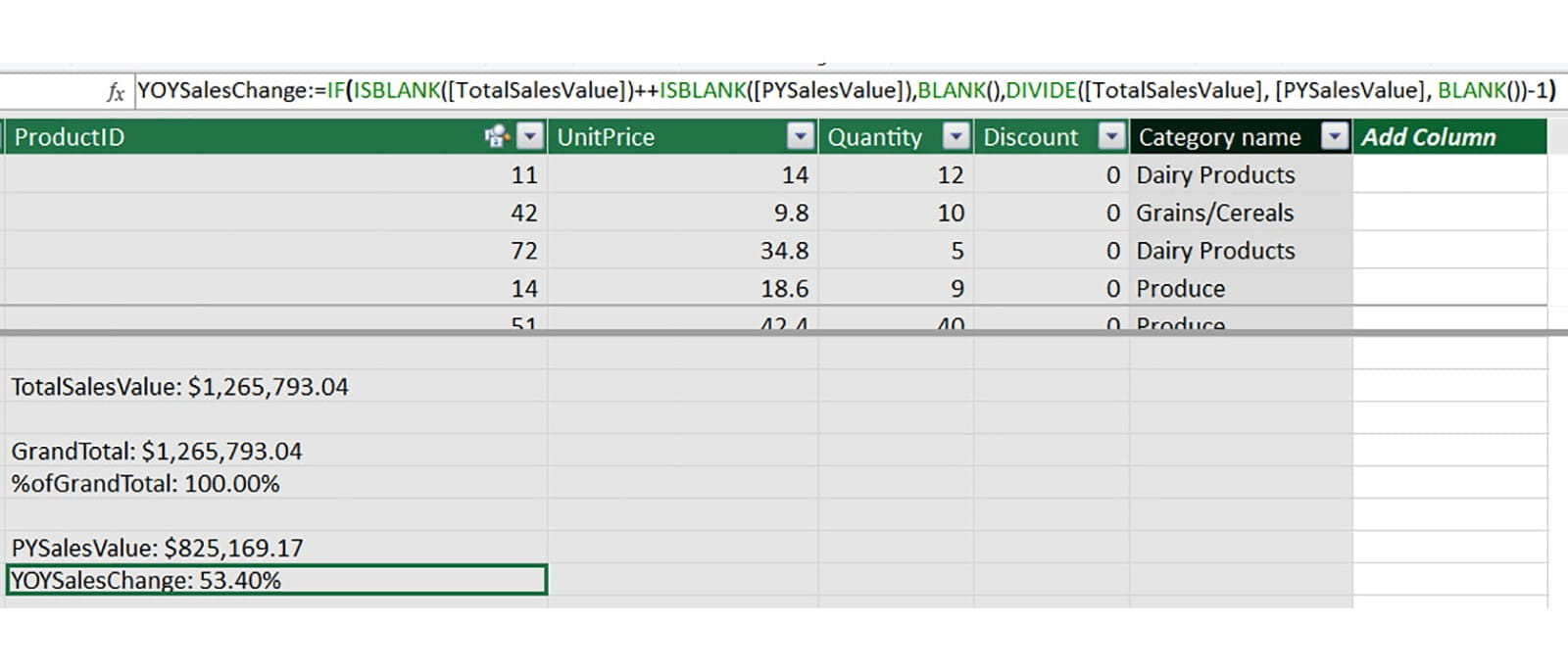
Here we see one additional difference in how Power Pivot formulas work – the AND and OR functions are replaced by using && and ++, respectively. We have written an IF function into our Measure that ensures it is blank unless there are values for both the current and prior years – this helps us to avoid annoying meaningless values for periods where we don’t have proper overlap. The actual calculation is just a DIVIDE function minus 1 to get the percentage change. And here’s the final look at it in the Pivot:
There’s plenty more to learn and discover with Power Pivot – from more DAX functions to KPIs and beyond – but that’s all we have room for right now. Download the accompanying file and have a play for yourself!
You may also like
Excel community
This article is brought to you by the Excel Community where you can find additional extended articles and webinar recordings on a variety of Excel related topics. In addition to live training events, Excel Community members have access to a full suite of online training modules from Excel with Business.

Archive and Knowledge Base
This archive of Excel Community content from the ION platform will allow you to read the content of the articles but the functionality on the pages is limited. The ION search box, tags and navigation buttons on the archived pages will not work. Pages will load more slowly than a live website. You may be able to follow links to other articles but if this does not work, please return to the archive search. You can also search our Knowledge Base for access to all articles, new and archived, organised by topic.
