
When working with reports interactively, it's often useful to be able to set a date or range of dates to filter the information. Here, we are going to compare the way date filtering works in Excel and in the free Power BI Desktop app.
Prior to the introduction of Slicers in Excel 2010, tables and PivotTables were filtered using a dropdown in the table column or PivotTable field containing the relevant date. Slicers introduced a new, more graphical, way to apply a filter to PivotTables by selecting discrete items from a list using a range of keyboard/mouse combinations to select individual items, multiple discrete items or a contiguous range of items. Excel 2013 extended the capability of Slicers to include a new type of Slicer, the Timeline designed to work exclusively with Time and Date fields. In addition, the Excel 2013 update enabled standard Slicers to work with Excel Tables as well as PivotTables. Timelines were, and still are, restricted to only working with PivotTables.
In this example, we have added a Timeline to a PivotTable as well as adding the same OrderDate field to the Filter area and clicking on the dropdown:
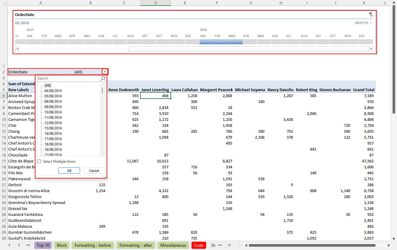
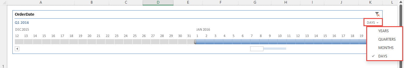
As we can see, the dates in our Timeline are currently grouped down to the month level. The dropdown towards the top right-hand corner of the Timeline allows you to select grouping level: from YEARS, to QUARTERS, to MONTHS, to DAYS:
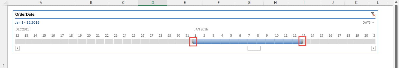
The filter is set by clicking and individual item, or dragging across a contiguous range, in the Timeline. It is also possible to select a range by clicking the first or last item required and then holding down the Shift key whilst clicking on the item at the other end of the range. Note that it is not possible to select multiple, non-contiguous items. Once an item, or range of items, has been selected, the range can be extended by dragging the markers at either end of the selection:
It is also possible to move the selection range by clicking in it and dragging whilst holding down the keyboard control key.
When the Timeline itself is selected, the Timeline contextual Ribbon tab will be displayed:
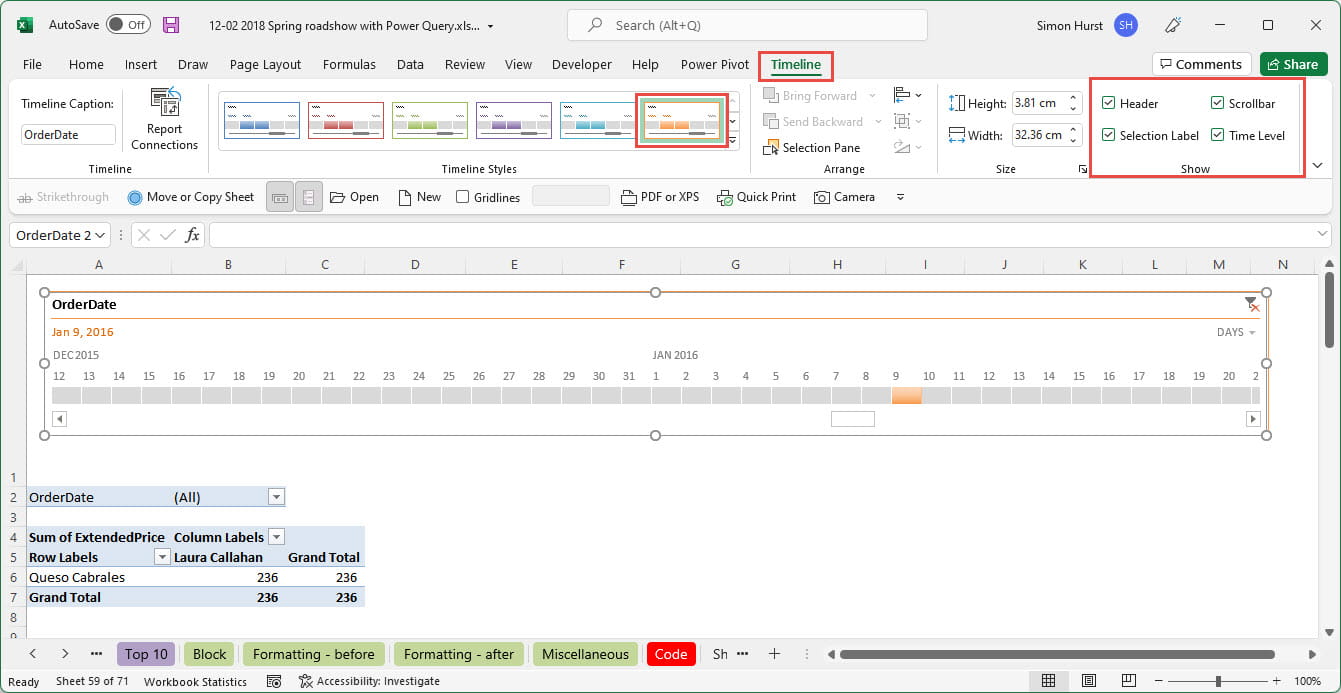
The Timeline tab allows you to choose the Timeline Style, including the colour of the Timeline, as well as deciding which elements of the Timeline should be displayed using the options in the Show group.
Next, we will compare the Excel Timeline with a Power BI Slicer based on a date field. We will be using our Excel Community Archive Dashboard as our example. Firstly, we have right-clicked on our Main page tab and chosen to duplicate the page before dragging the duplicate version to the right of our other pages and renaming it as 'By date'. Then we have clicked on the column chart graphic immediately beneath our heading and chosen the Slicer visualisation from our Visualizations gallery. This changes our visualisation from the existing column chart to a Slicer. We have added the Date field from our Fields list as our Field Slicer:
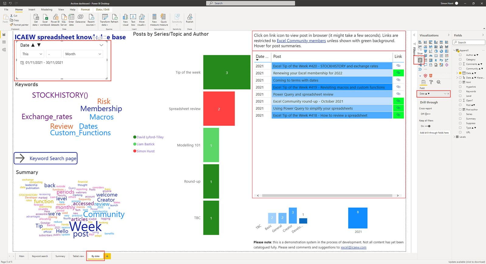
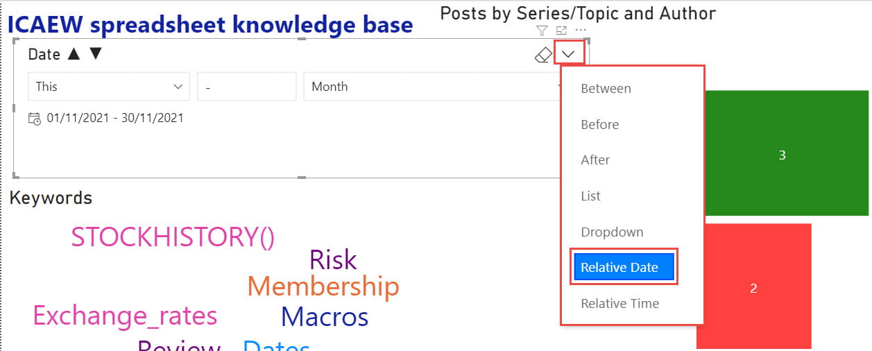
Rather than there being separate item and date/time Slicers in Power BI, there is one Slicer that adapts to the type of field. We have added a field containing dates, so our Slicer options adapt accordingly. If we click on the dropdown in the top right-hand corner of our Slicer, we can see the options we have available. We can choose to filter records to show only those Between, Before or After our selected date or dates. We can display the dates as a List or Dropdown, or we can choose a Relative Date or a Relative Time. Here we have chosen a Relative Date which, rather than going down the pub with a distant cousin, allows us to choose a time period relative to the current date:
In the above screenshot, we have chosen 'This' from our dropdown list of relative options and Month from our list of available periods to filter our other visualisations to show those posted in the current month:
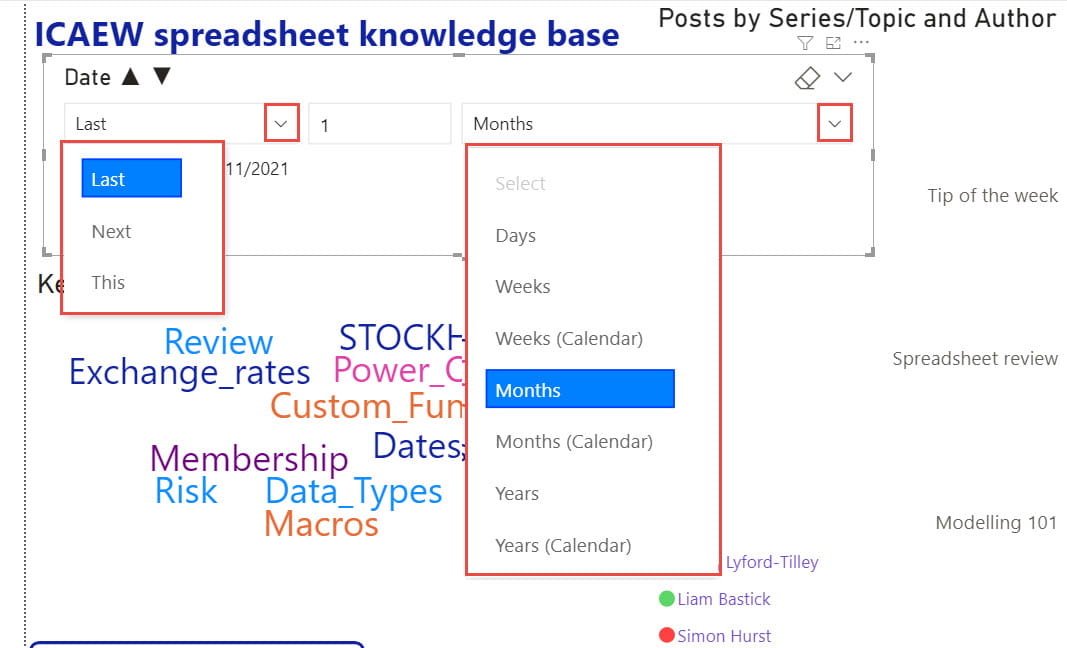
Our relative options are Last, Next and This and our available periods are Days, Weeks, Months and Years, with Weeks and Months having additional Calendar options. So, for example, on the 22nd of November, with our relative option set to 'Last', choosing 'Months (Calendar)' would set the filter range to 1/10/2021 to 31/10/2021 whereas 'Months' would set the range to 23/10/2021 to 22/11/2021. For the Last and Next options we can also choose the number of periods by which to filter.
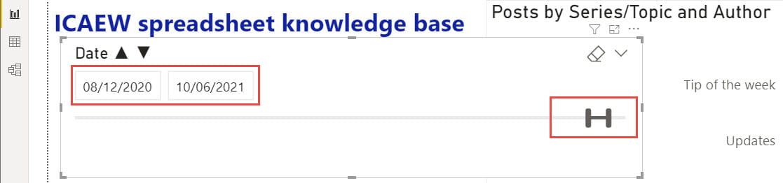
Changing our main Slicer option from 'Relative Date' to Before, After or Between will change our Slicer into something much more like our Excel Timeline. Here we have chosen Between:
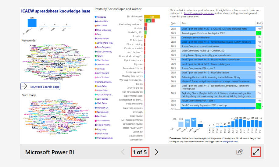
We have added this 'By date' page to our publicly available article portal:
Click in the page number area to display the list of available pages and choose the new 'By date' page. You can also click on the Full Screen icon to expand the portal to full-screen mode:
Excel community
This article is brought to you by the Excel Community where you can find additional extended articles and webinar recordings on a variety of Excel related topics. In addition to live training events, Excel Community members have access to a full suite of online training modules from Excel with Business.

Archive and Knowledge Base
This archive of Excel Community content from the ION platform will allow you to read the content of the articles but the functionality on the pages is limited. The ION search box, tags and navigation buttons on the archived pages will not work. Pages will load more slowly than a live website. You may be able to follow links to other articles but if this does not work, please return to the archive search. You can also search our Knowledge Base for access to all articles, new and archived, organised by topic.
