
Additional visualisations
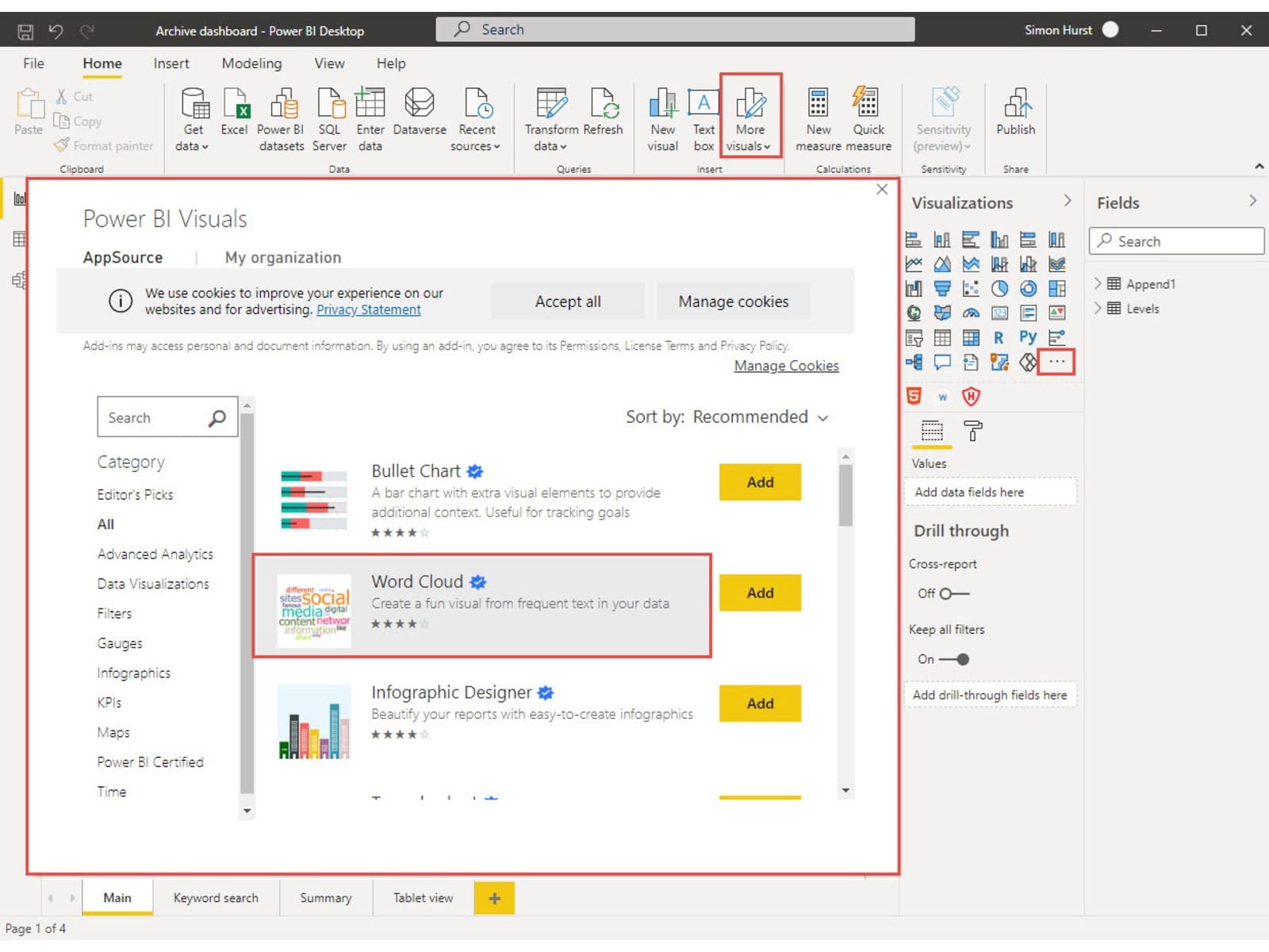
So far, the visualisations that we have used in our BI report have come from the gallery of built-in visualisations. One of the great strengths of Power BI, and one of its greatest advantages over just using Excel, is the range of additional visualisations that are available. It is also possible to create your own visualisations using R Script or Python. Given that our report is based largely on the text content of web posts, a visualisation designed around words rather than numbers would prove useful. We can search for additional visualisations by clicking on the 'Get more visuals' button in the bottom right-hand corner of the Visualizations gallery, or by clicking on the 'More visuals' command in the Insert group of the Home Ribbon tab:
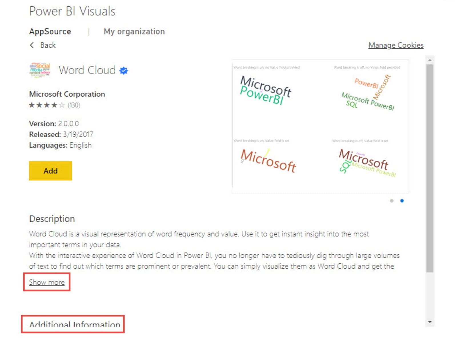
The 'Show more' link expands the Description text while the Additional Information section includes a link to explain what the certification of the visual means. Clicking the Add button will import the visual into the report and display it underneath the gallery of built-in visuals.
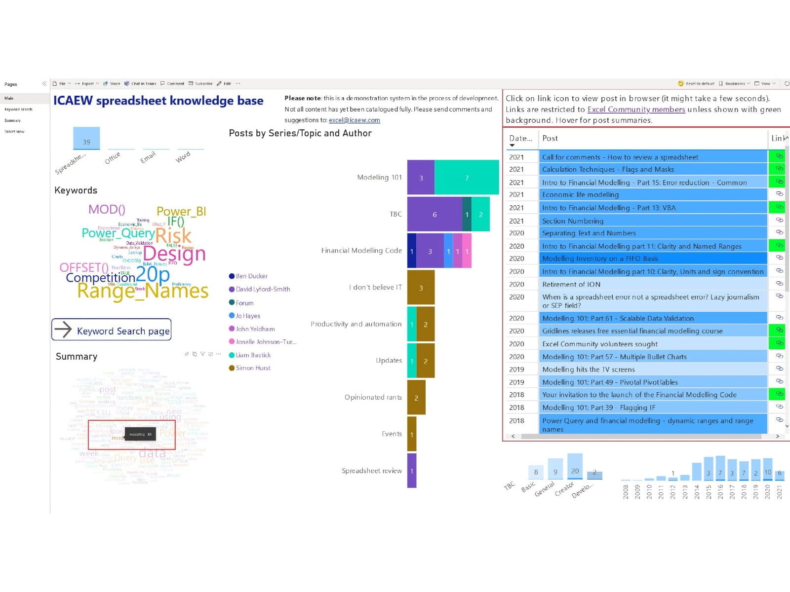
This allows it to be added to any page in the same way as for a built-in visual. In our report, we have added two Word Cloud visuals – one based on our Keywords field and the other based on our Summary field. The options available for any type of visual depend on the type of visual. For a Word Cloud visual, we can just add our required text field as the Category.
The Values area allows another field to be used to determine the weighting allocated to each word which will be reflected in the size of font used. If the Values field is not used, the weighting will just be based on the frequency of occurrence of each word. The Excludes area can be used to exclude certain words based on the contents of a separate linked table but, in most cases, it is much easier just to enter Stop Words. This is one of the options available in the Format section.
You can turn Stop Words on to exclude a default list of unwanted words such as 'and' and 'the'. You can also enter specific words to be excluded. Here we have a Word Cloud based on our Summary field. This is our Word Cloud with the relative font size indicating frequency, and before turning on the Stop Words option. We have also turned off Rotate Text to make the text in the cloud easier to read:
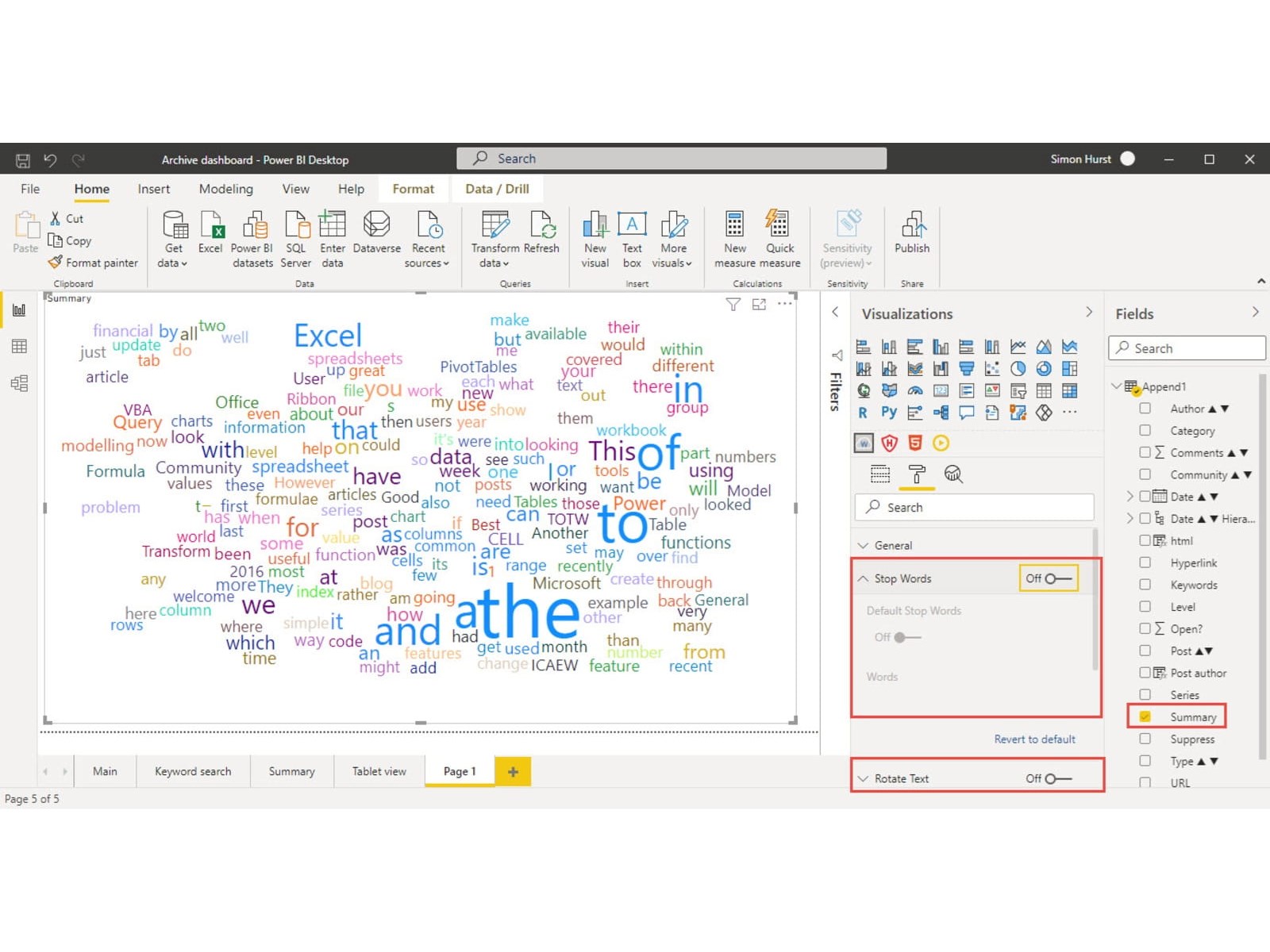
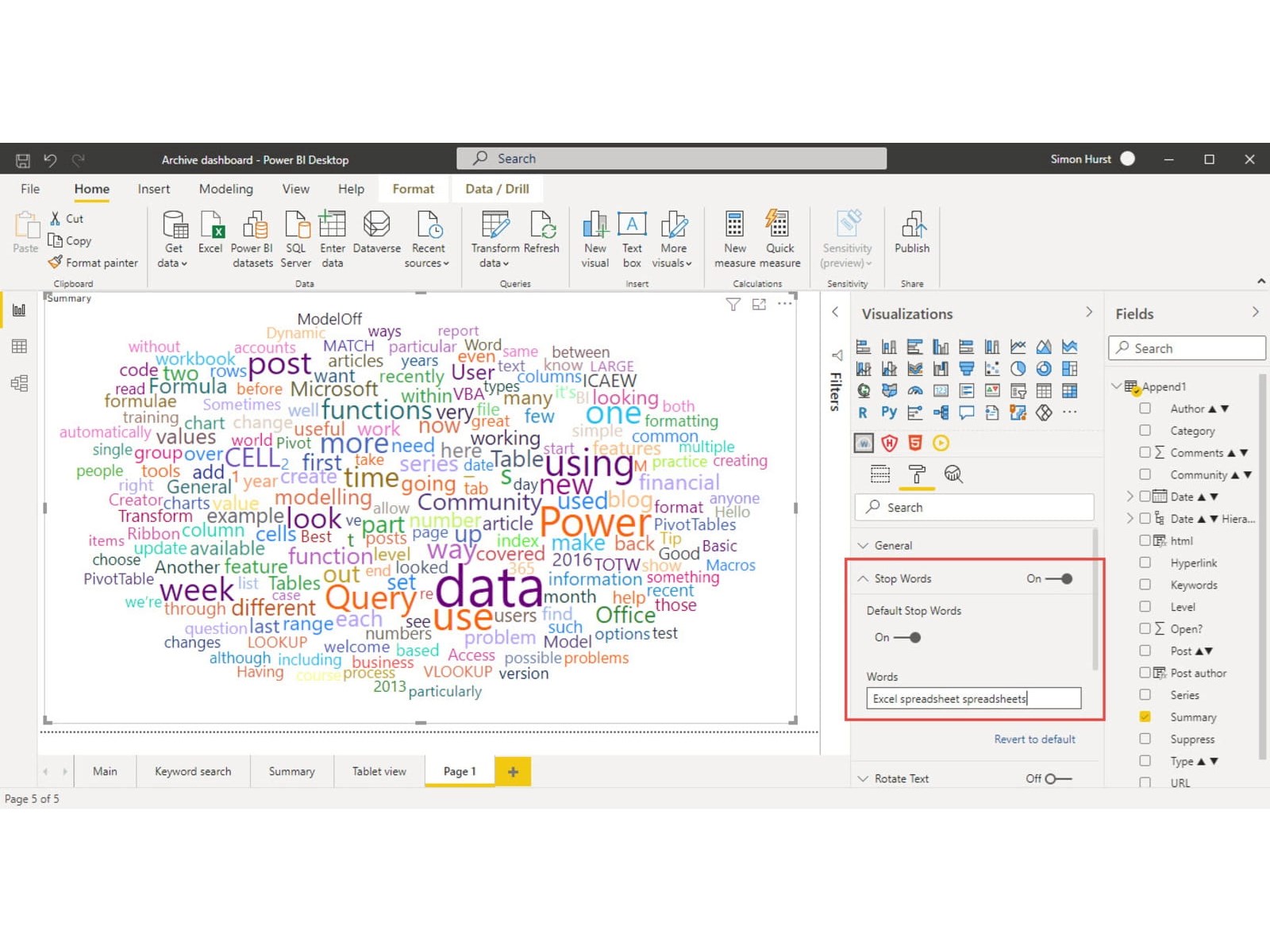
As you can see, the cloud is dominated by words such as 'The', 'to', 'of', 'in' and 'and'. It also includes more specific words which are probably not useful in this context such as 'Excel' and 'spreadsheets'. Here is the same visual but this time with Stop Words turned on, Default Stop Words turned on and 'Excel', 'spreadsheet' and 'spreadsheets' (each separated by a space) having been entered in the Words stop list:
Resources and feedback
We have embedded the current stage of project development below:
