
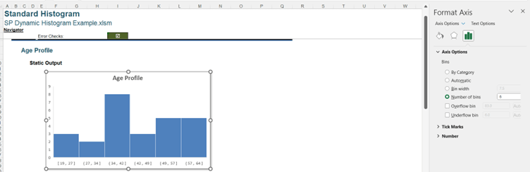
Last time, I provided several reasons why Excel’s built-in Histogram charts can cause problems. This time, I consider workarounds to achieve the same visualisations.
However, we cannot put a cell reference in the ‘Number of Bins’, so it can only be changed manually.
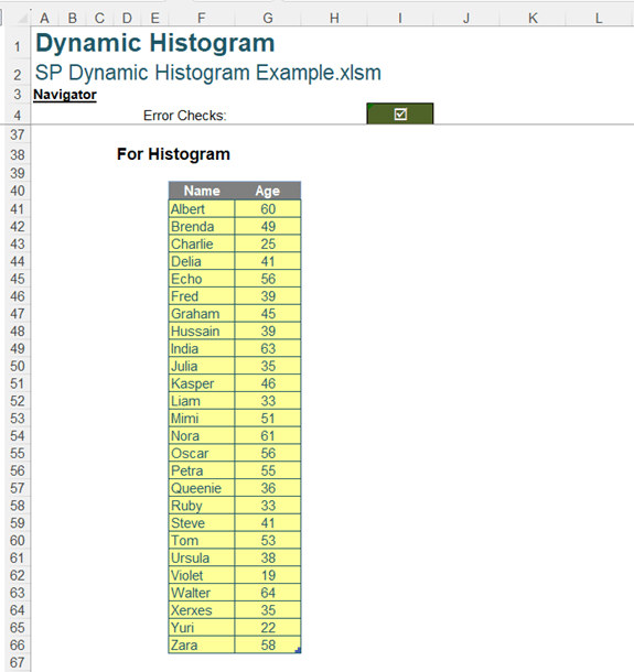
We may take a different approach. Instead of using the standard Histogram chart provided by Excel, we can use a Clustered Column chart. We start with the data as before:
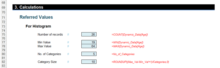
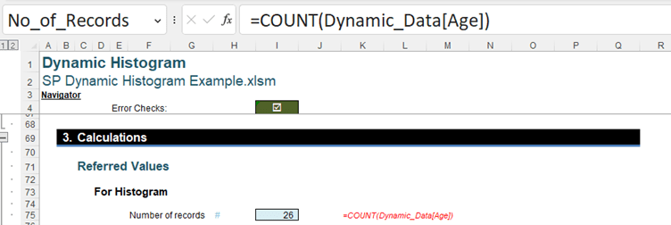
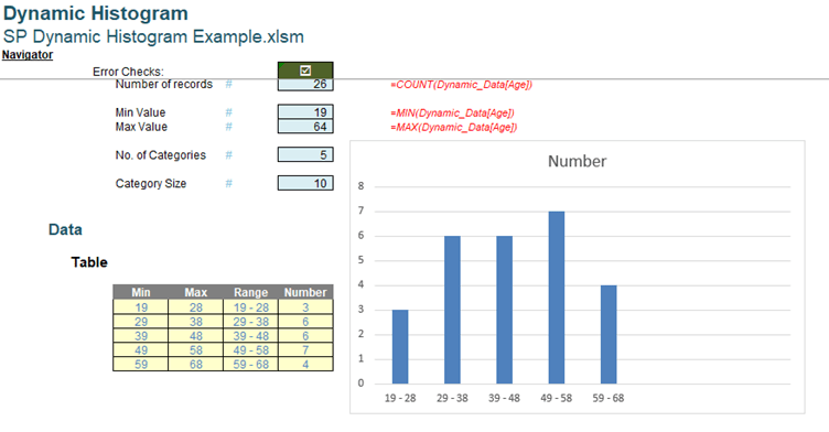
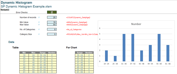
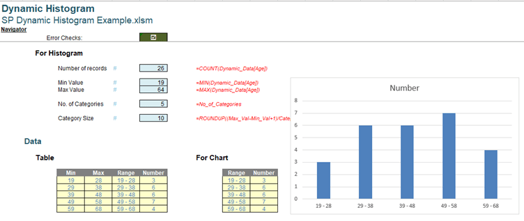
Number of records is a count of all the ages in the Age column of Dynamic_Data, which is given by:
=COUNT(Dynamic_Data[Age])
Note that we use COUNT() rather than COUNTA() or ROWS(). ROWS() would return the number of rows, regardless of whether they are blank or not numerical. COUNTA() would return the number of values that are not blank, but would include non-numerical data. We want to count the numerical values only.
We have assigned a named range No_of_Records to this value:
Assigning named ranges to the results of the intermediate calculations will make the calculations in the chart data table easier to follow.
Min Value is simply the minimum age in the Age column of Dynamic_Data, which is given by:
=MIN(Dynamic_Data[Age])
Similarly, Max Value is the maximum age in the Age column of Dynamic_Data, which is given by:
=MAX(Dynamic_Data[Age])
These have also been assigned names Min_Val and Max_Val respectively.
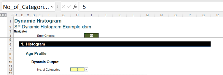
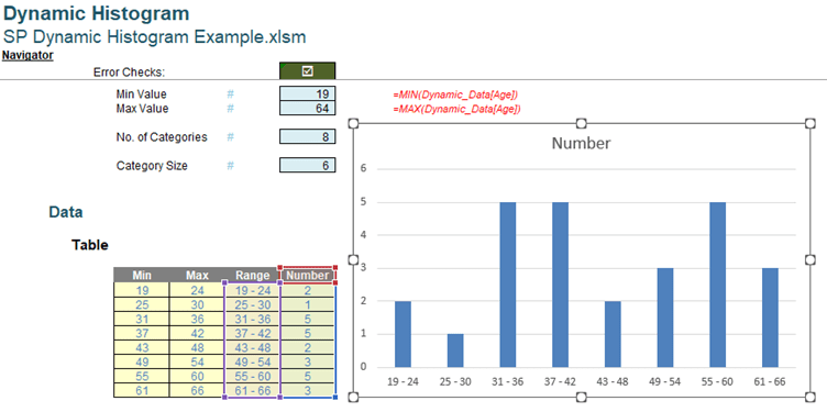
No. of Categories is the number of bars or buckets we want to see in our chart. Since we are creating a dynamic solution, this points to our input cell.
=No_of_Categories
No_of_Categories is the defined name for our input field:
Note that the input field has dropdown values:
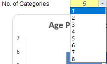
This list has been created using ‘Data Validation’:
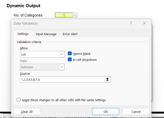
We have set this up so that the user must use a whole number between one [1] and eight [8]. We select eight [8] and continue.
Returning to the ‘Referred Values’:
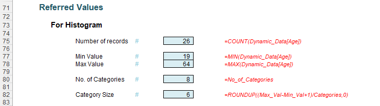
The final intermediate calculation is Category Size, which is the width of each category or bucket. This is defined as:
=ROUNDUP((Max_Val-Min_Val+1)/Categories,0)
This takes the difference between the oldest age (Max_Val) and the youngest age (Min_Val), and adds one [1] as we cannot have a width of zero [0]. We then divide by the number of categories. Since we need the next whole number, we apply the ROUNDUP() function to the result. The result of this calculation is given the defined name Category_Size.
Now we have the intermediate calculations, we can move on to the chart data:
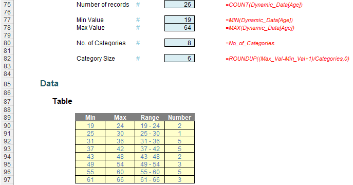
Although this looks like a Table, it has been created using Dynamic Arrays. The number of rows corresponds to the number of categories selected.
The Min column is created by a single formula which calculates the minimum age for each category as an array:
= Min_Val+(SEQUENCE(Categories)-1)*Category_Size
This starts with youngest age and adds the product of the numbers in sequence from zero [0] to one [1] less than the value in Categories, and the width of each column (Category_Size). In this example, Categories is eight [8], so we will have eight [8] rows. SEQUENCE() begins with 1, so by subtracting one [1], this means that the first value in the column is Min_Val.
The formula to create the Max column is similar:
=Min_Val+(SEQUENCE(Categories))*Category_Size-1
This time, we are not subtracting one [1] from the SEQUENCE(Categories) result, so the first row returns the same value as the second value in the Min column. We then subtract one [1] to get the Max. The final value in the Max column is greater than Max_Val so that all values are contained in a bucket.
The Range simply concatenates the values in the Min and Max column so that we have the column labels:
=IF(F90#,F90#&" - "&G90#)
To prevent what Microsoft refers to as coercion (formulae not spilling as intended), it is good practice to check that there is a value in the Min column (identified using F90#). If there is a value, then we concatenate the Min and the Max column values, using a hyphen and a space either side of the hyphen ( - ) as the separator. If there is no value in the Min column, Range would be blank too.
The final column, Number is the number of values in each bucket, and therefore the height of the bar.
=COUNTIFS(Dynamic_Data[Age],">="&F90#,Dynamic_Data[Age],"<="&G90#)
We are counting how many values in the Age column of the data Table Dynamic_Data are in the range between Min and Max. If we look at the ‘Function Arguments’ dialog, we see:
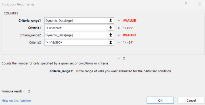
We are counting the number of cells where Dynamic_Data[Age] is :
">="&F90# which evaluates to >=19 (greater than or equal to 19) for the first row in our example
and "<="&G90# which evaluates to <=24 (less than or equal to 24) for the first row in our example.
For the first row, Number will be two [2]. Note that the #VALUE! errors in the ‘Function Arguments’ dialog appear because a full column cannot be shown.
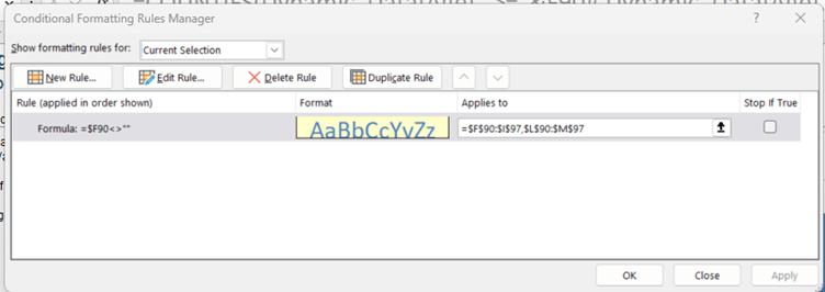
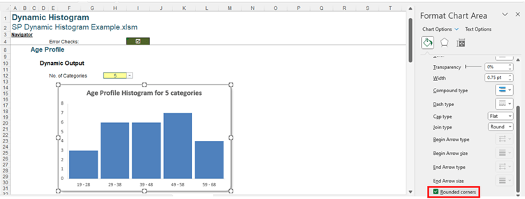
When we apply the formatting for our ‘Table’, this needs to be dynamic too. We have used conditional formatting:
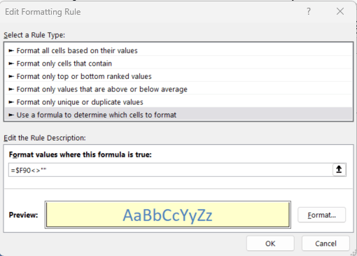
This formatting is only applied if is populated. Note that the number of the cell is not anchored, so this will apply to any values below $F90 in the range that this applies to. To apply this to the ‘Table’, we apply it to the range $F$90:$F90$I$97, which is the area the table could occupy. Also, do consider the trick where the border is not included for the top of the cell when using it on a list going down a column.
Having explained the chartd Number columns an data, we can select the Range and go to ‘Recommended Charts’ on the Insert tab:
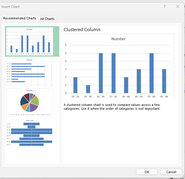
This time, a ‘Clustered Column’ is suggested, and it looks good, so we click OK:
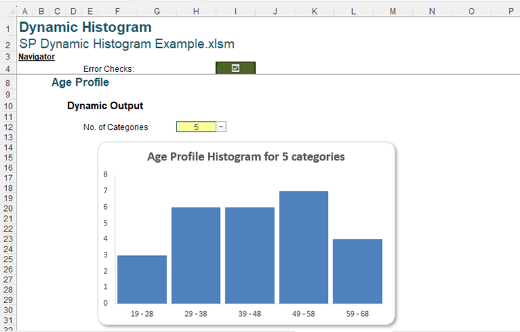
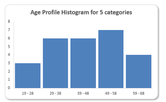
We need to do some tidying up, but first, we should check that this chart is dynamic. We change the No_of_Categories to five [5]:
Clearly, we are not quite there yet. When the number of categories changes, we want to our chart to resize automatically. The question is, why when the ‘Table’ is clearly dynamic, is the Chart not reflecting the changes?
The answer is that we are using two [2] different dynamic ranges to create Range and Number. For the chart to be dynamic, the source data needs to be one [1] dynamic array.
We need another step. We delete the chart and create another set of data to create the chart from:
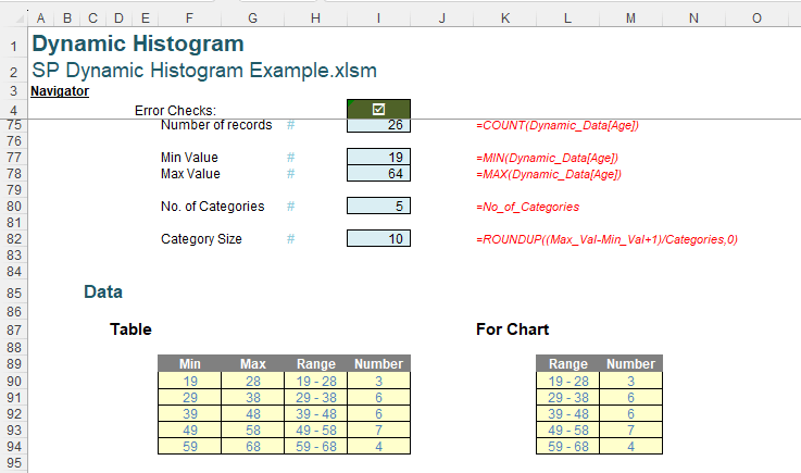
Chart’ data has been created from the ‘Table’ using the OFFSET() function.
=OFFSET(H90,,,Categories,2)
To understand this formula, we should first understand how OFFSET() works.
The syntax for OFFSET() is as follows:
OFFSET(reference, rows, columns, [height], [width])
The arguments in square brackets (height and width) may be omitted from the function. The default values are the same dimensions as the original reference.
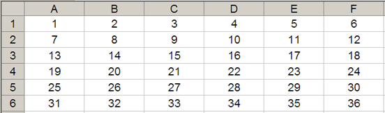
In its most basic form, OFFSET(ref, x, y) will select a reference x rows down (-x would be x rows up) and y columns to the right (-y would be y columns to the left) of the reference ref. For example, consider the following grid:
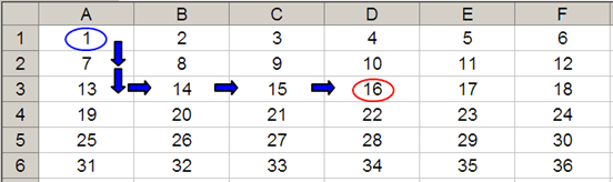
OFFSET(A1,2,3) would take us two rows down and three columns across to cell D3. Therefore,
OFFSET(A1,2,3) = 16, viz.
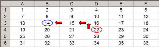
OFFSET(D4,-1,-2) = 14, viz.
Furthermore, we can use the height and width arguments. Consider the OFFSET example from earlier. If we extend the formula to OFFSET(D4,-1,-2,-2,3), it would again take us to cell B3 but then we would select a range based on the height and width parameters. The height would be two rows going up the sheet (-2), with row 14 as the base (i.e. rows 13 and 14), and the width would be three columns going from left to right (3), with column B as the base (i.e. columns B, C and D).
Hence OFFSET(D4,-1,-2,-2,3) would select the range B2:D3, viz.
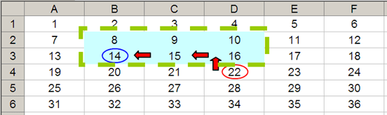
Note that OFFSET(D4,-1,-2,-2,3) would result in a spilled array (or a #SPILL! error since Excel cannot display a matrix in one cell, but it does recognise it).
In the formula we are using for the chart:
=OFFSET(H90,,,Categories,2)
H90 is the reference, and we are not inputting any rows or columns, but we are using the optional height and width arguments. The height is Categories (giving us a row for each category), and the width is two [2], since we want to copy the Range and Number columns. We have extended the conditional formatting rule that we created for the ‘Table’ to cells $L$90:$M$97:
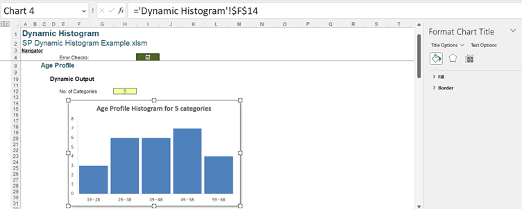

The formula in this cell is:
=C8&" Histogram for "&No_of_Categories&" categor"&IF(No_of_Categories=1,"y","ies")
Cell C8 is the title of the solution, ‘Age Profile’. This is concatenated with the text “ Histogram for “ and then the input number of categories (given by No_of_Categories). In case the user selects only one [1] category, we trap for this when we specify the ending of “categor”. If it is true that No_of_Categories is 1 we use “y”, otherwise we use “ies”.
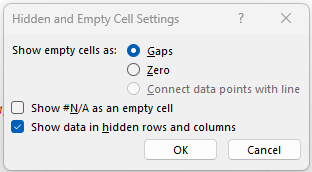
We are now able to stop our chart from disappearing if the data is hidden as we can access the ‘Hidden and Empty Cell Settings’ dialog:
Archive and Knowledge Base
This archive of Excel Community content from the ION platform will allow you to read the content of the articles but the functionality on the pages is limited. The ION search box, tags and navigation buttons on the archived pages will not work. Pages will load more slowly than a live website. You may be able to follow links to other articles but if this does not work, please return to the archive search. You can also search our Knowledge Base for access to all articles, new and archived, organised by topic.