
Hello and welcome to the continuing series from the Excel Community's Financial Modelling committee, in which we will work through the chapters of our Financial Modelling Code and explain how each element translates into practice.
User guidance
I split my thinking on user guidance into two categories: explicit and implicit. Given the reluctance of most people to read user guides and instruction manuals, I believe as much as possible of the guidance should be provided implicitly.
Implicit user guidance
Implicit guidance means laying out your model structure and formatting such that it is self-evident to the user how to interact with it to perform their analysis. When I am laying out dashboards and input sheets what I always keep at the front of my mind is the title and main principle of a book I read when doing web development early in my career “Don’t make me think”. This means making the required interaction obvious to the user and it is something done exceptionally well on many websites (have you ever read a website’s instruction manual?).
Implicit user guidance is very often a by-product of transparency. An example of implicit guidance that is used in most models is formatting inputs in a consistent, unique and prominent colour. However, this can be taken further to make inputs even easier to interact with by:
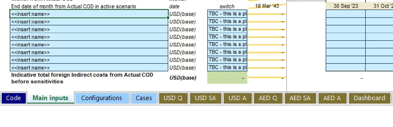
- Colouring the tabs of input sheets in the same colour as input cells. (as seen below in Figure 1)
- Applying this as a prominent colour for the input section of the navigation sheet.
- Entering dummy data or stating what is expected in the cell rather than leaving it blank is also a big help. (You will struggle to find anywhere on a Google site where they give you a blank entry field)
Figure 1:
Side note: What would be ideal for input colours is for Excel’s default “Input” style to be used everywhere, as convention is the best friend of implicit guidance, but unfortunately they have chosen this horrible sandstone colour for their style and so for aesthetic reasons I’m not going to bang that drum too hard.
Explicit user guidance
When we think of user guidance this is what first jumps to mind. There are several methods of providing explicit user guidance and I would rank them in order of preference as follows:
- Contextual user guidance throughout the model
- A user guide worksheet
- A separate user guide document
Contextual user guidance
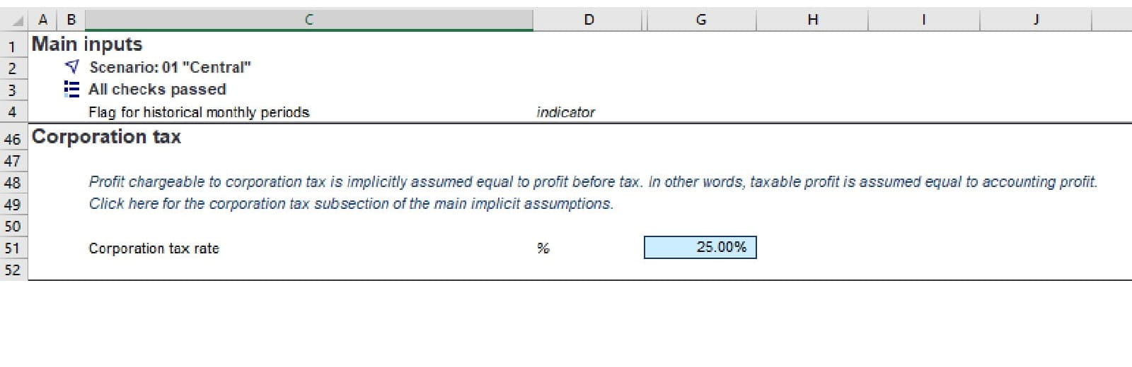
The reason I rank contextual user guidance first is that you are giving the user information at exactly the point they need it, which makes it more likely to be read and understood. Figure 2 provides an example of this. It is simple, clear and very easy to add as you build.
Figure 2:
User guide sheet
A user guide sheet is often helpful to overcome two types of guidance that contextual guidance isn’t ideal for.
- Guidance relating to the entire model, such as what is the overall purpose of the model and what different formats and conventions in the model relate to
- When providing the contextual guidance would clutter the model or be repetitive and so the user guide sheet can be linked to provide details
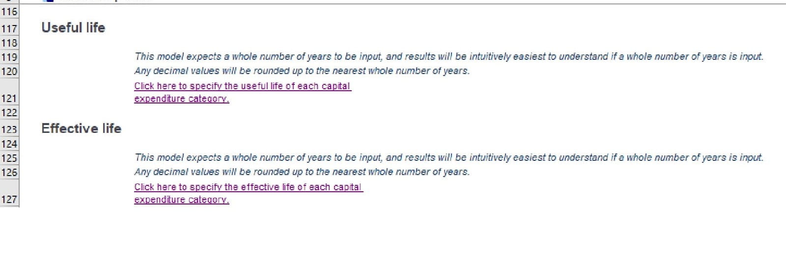
An example of point 2 is shown below. Figure 3 shows input columns for “Useful life” and “Effective life” and adding long sentences above each would lead to a cluttered table here and at each similar table in the workbook. Providing a link to the description (shown in Figure 4) means the input sheet can be kept concise and the description only has to be written once and linked to.
Figure 3:
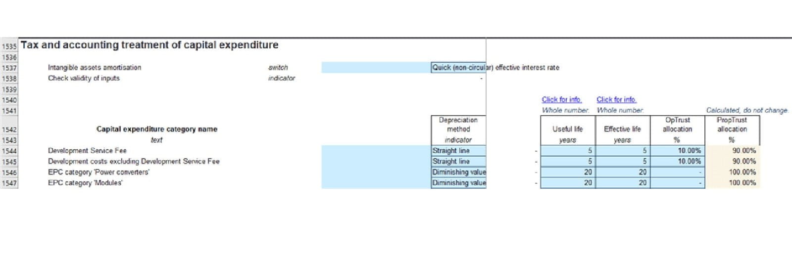
Figure 4:
A separate user guide document
For me this is a last resort as it is regularly not shared with the model and so becomes separated from the model. Additionally, it is often not updated as the model is tweaked and added to making it quickly become out of date. However, there are cases such as rail bids where bid compliance requires a user guide document and, in these situations, care is required to avoid the document becoming outdated and inaccurate.
Test user guidance
My last point on user guidance is to test it. It is unlikely you would share a model without testing the results but if the user does not understand how to work the model correctly your correct results could be interpreted completely incorrectly. Find someone you trust to give you honest feedback, give them the model, the tasks the ultimate user will want to perform, and see how they get on.
Transparency
Transparency in modelling parlance refers to how much effort is required to understand the trail of both inputs and logic that a given cells value is dependent on.
Input transparency
First let’s touch on how we can make inputs transparent. The most important aspect of this is labelling, this will be covered in more detail by a later blog and so to avoid stepping on their toes all I will say on it here is:
- Always label
- Label all inputs, calculations and outputs
- Label with title and units
- Label, label, label
Instead I will focus on a different element of input transparency titled in the code as “Identify and separate forecast or dummy data”. It has the following recommendations that are worth drilling into.
Create separate entry areas for forecast and actual numbers, with formulas that select which data is currently in use
Although this recommendation highlights forecast and actual numbers it can equally be applied to any input where the context of the input changes over time.
Identify dummy data clearly with formatting or labelling
This recommendation could be simplified to “Identify data source clearly”. For most inputs why the existing value in the input cell is that value will not be clear to all users but all data is either dummy or has source and that source should be recorded.
Don’t overwrite forecast data with actuals on a rolling basis
Forecast and actual data have a key difference in that forecasts will change, and actuals will not. This key difference is why they should be treated identified as separate and entered separately. Additionally, if you overwrite your forecast you then cannot go back and compare performance against that forecast.
A similar but much worse issue often seen (especially in operational project finance models for some reason) is overwriting logic with actuals. This should never be done and would be a red flag to me as to whether to trust the entire model.
Calculation transparency
Calculation transparency is often thought of as reducing the complexity of formulae and avoiding VBA as far as possible. But most of the guidance in the financial modelling code is geared towards transparency from consistent column structure to sign convention. Here I touch on two points which are less often thought of.
Avoid duplication
Avoiding duplication helps the developer by reducing the number of locations changes have to be made if the logic requires adapting but I would argue the bigger help is to the user. The user will usually assume that if the model includes the same calculation twice there must be some difference between them and then their mind jumps to why. This loops back to the point I made earlier “Don’t make me think”.
Don’t hide things
It is self-explanatory that hidden rows columns and sheets are not transparent, however giving the option not to display data often improves usability. This can be achieved by using grouping rows and columns that may not be required by the user at that point in time. I like to go further than just leaving the plus on the top of left-hand side as I think it is always helpful to have a reminder of what is grouped away. Examples of this are in figures 5 and 6 below.
Figure 5:
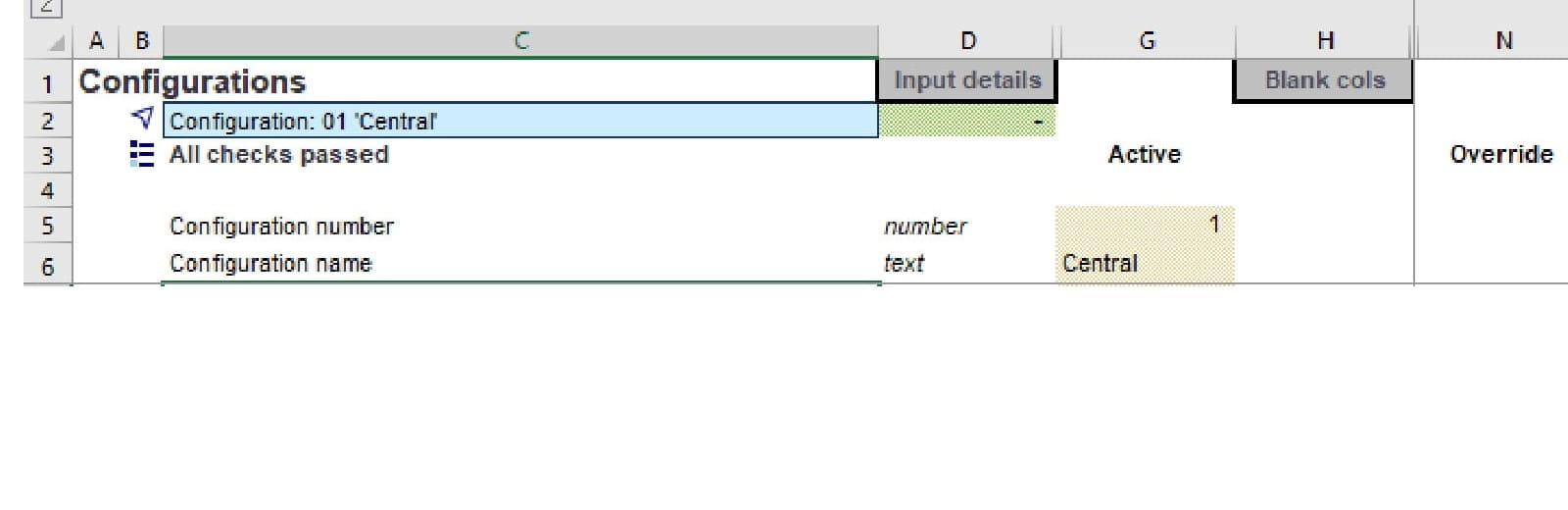
Figure 6:
Final thoughts
Always be thinking about the future users of the model. What will make it easier for them to understand how to use the model and find their way through the logic and inputs? and as far as possible, don’t make them think.
Next in the series
- Intro to Financial Modelling - Part 19: Wrap-up
- Intro to Financial Modelling - Part 18: Sensitivities and Scenarios
- Intro to Financial Modelling - Part 17: Calculation Techniques - Loan Calculations
- Intro to Financial Modelling - Part 16: Calculation Techniques - Flags and Masks
- Intro to Financial Modelling - Part 15: Error reduction - Common pitfalls
Excel community
This article is brought to you by the Excel Community where you can find additional extended articles and webinar recordings on a variety of Excel related topics. In addition to live training events, Excel Community members have access to a full suite of online training modules from Excel with Business.

Archive and Knowledge Base
This archive of Excel Community content from the ION platform will allow you to read the content of the articles but the functionality on the pages is limited. The ION search box, tags and navigation buttons on the archived pages will not work. Pages will load more slowly than a live website. You may be able to follow links to other articles but if this does not work, please return to the archive search. You can also search our Knowledge Base for access to all articles, new and archived, organised by topic.
