
Hello all and welcome back to the Excel Tip of the Week! This week we have a Creator post in which we are going to look at how to build visual KPIs into PivotTables created with Power Pivot.
The example we are going to use builds directly from where we left off in TOTW #369, so you might want to refresh yourself on that before we begin here.
What is a KPI?
A KPI, or Key Performance Indicator, is a familiar business term for a particular metric that is useful for understanding how our business is going. But in Power Pivot terms specifically, KPIs are associated with Measures, and allow us to apply some automatic visual cues to support those Measures.
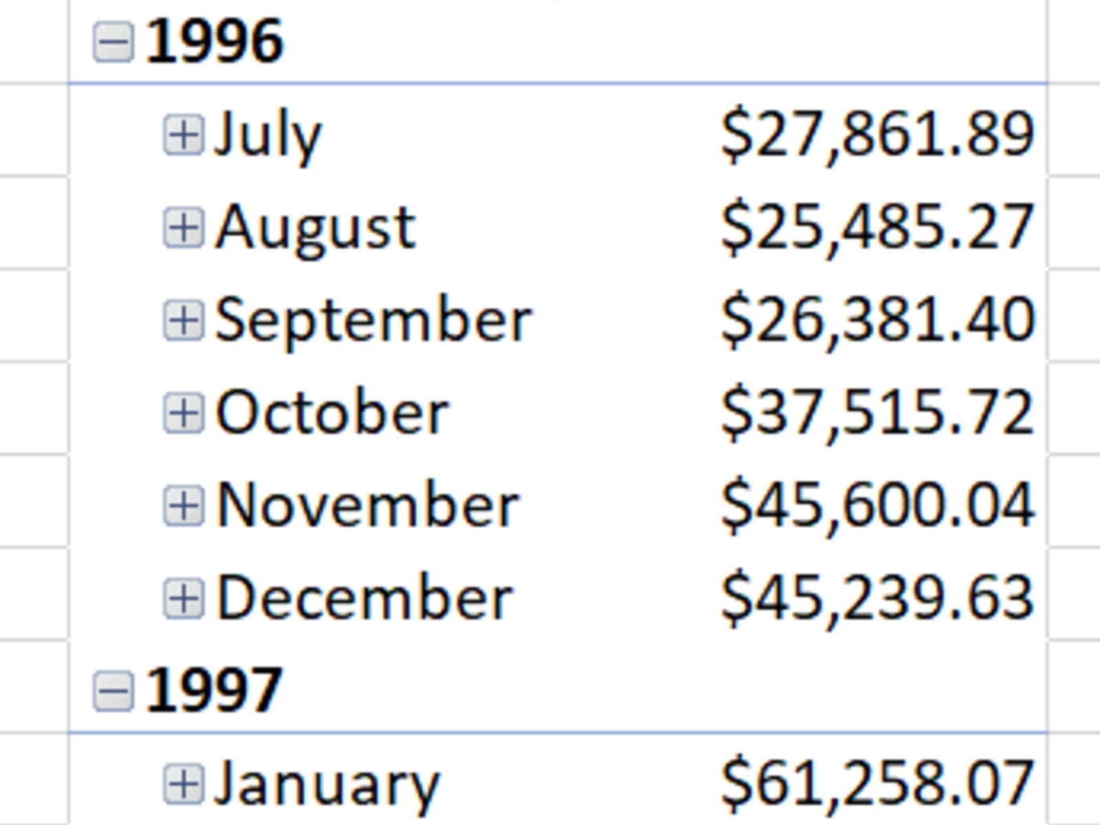
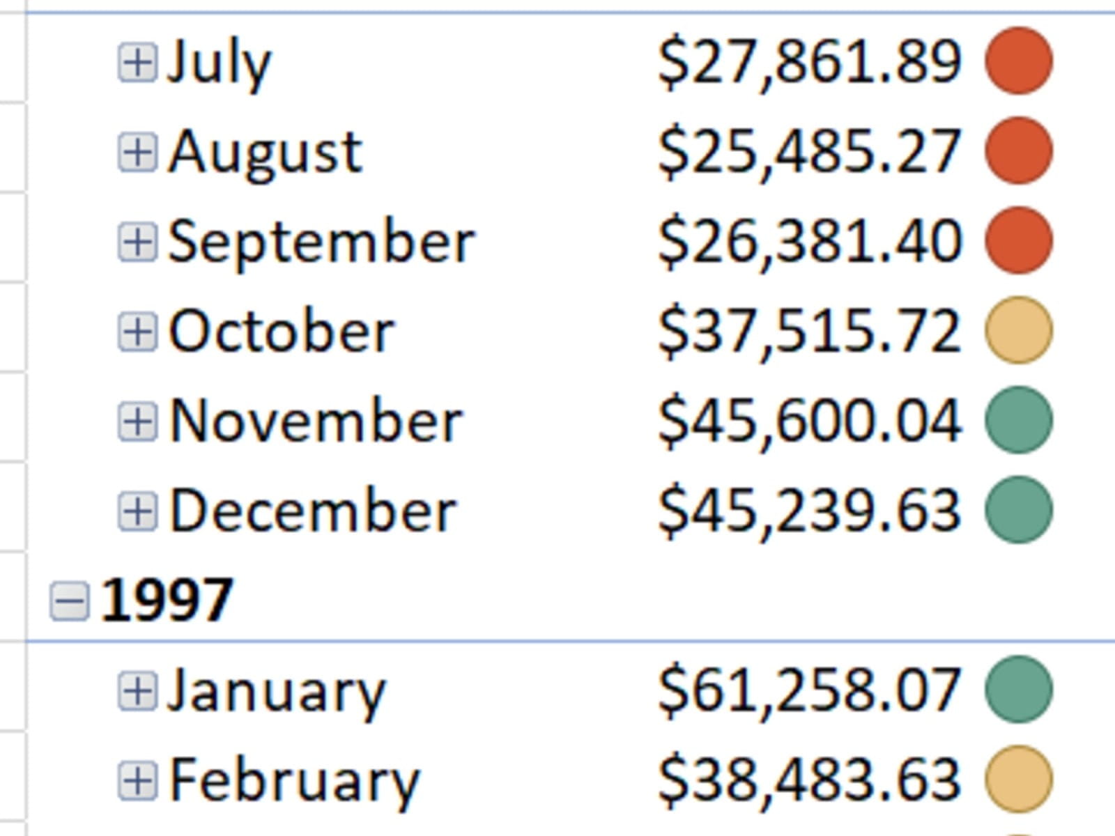
Let’s take a look at a particular Measure which we calculated last time, our TotalSalesValue, and how that varies across time:
This launches a menu from which we can design our KPI, and define how our success will be measured. The target can be a stated value, or defined based on another Measure. You can also set thresholds for different traffic-light values that will be shown against the measure. Here’s a look at our definition:
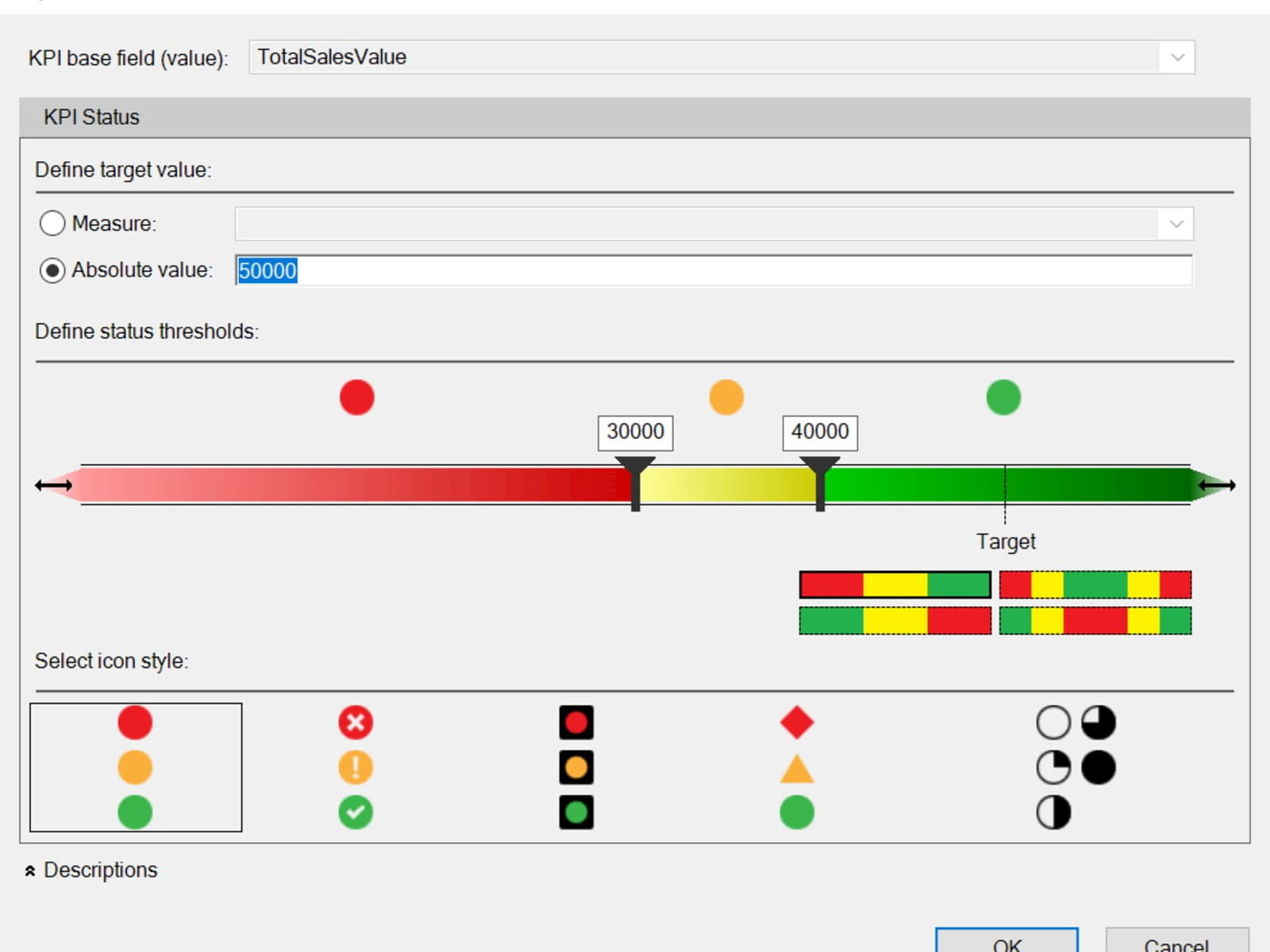
If you use a Measure to determine the target instead, you can set the grading according to a percentage of that Measure. You can also see in the bottom right that different gradings are available – the default is “low bad, high good” but you can reverse this, or set boundaries for KPIs that should be near or far from a central figure. There are also several different options for icons – we’ll see how that comes in shortly.
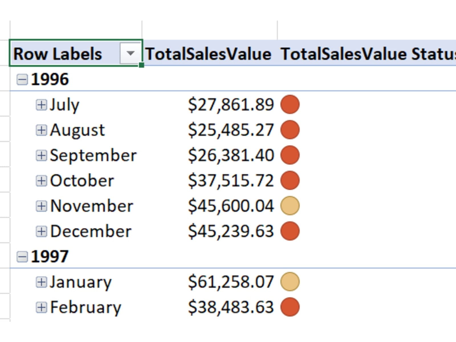
Once our KPI is defined, you can then find it and add to the table in the usual PivotTable Fields menu; the Measure itself is replaced with a menu showing the KPI options for this Measure:
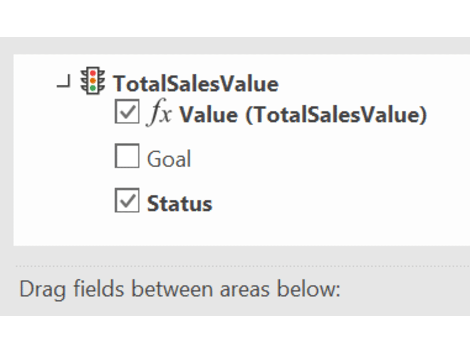
Value is the base Measure we are applying; Goal is the target value we set earlier, and Status is the symbol associated with the current month based on values. If we add to our Pivot, this is what we see:
You can check out the finished product in the accompanying file.
Archive and Knowledge Base
This archive of Excel Community content from the ION platform will allow you to read the content of the articles but the functionality on the pages is limited. The ION search box, tags and navigation buttons on the archived pages will not work. Pages will load more slowly than a live website. You may be able to follow links to other articles but if this does not work, please return to the archive search. You can also search our Knowledge Base for access to all articles, new and archived, organised by topic.
