
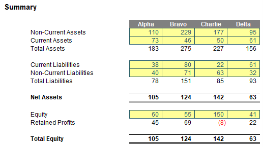
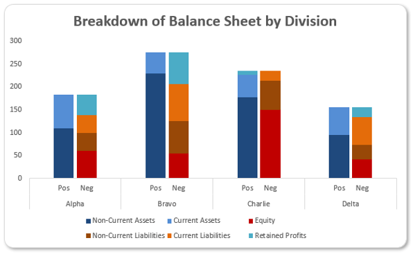
Imagine I had the following numerical summary for four [4] divisions:
The intention is to provide a graphical representation of this data, i.e. I wish to analyse the components of my Balance Sheet. The problem is some of the values represent positive attributes and others represent negative ones. In fact, there is an added complication that in my above illustration Retained Profits may be both positive and negative.
Pie and do(ugh)nut charts are not recommended for comparatives, e.g. contrasting one division with another or one time period with another. Bar and column charts, either stacked or clustered, do not cope with positive and negative values well, so it leads us to a problem that even Excel’s built-in ‘Recommended Charts’ option seems to run away and hide from.
I have a suggestion though… What about the following?
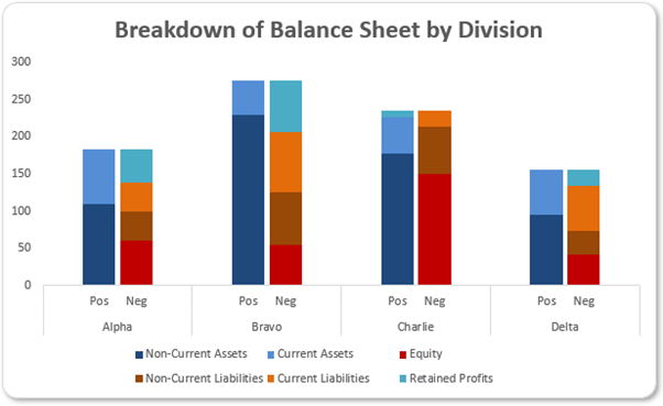
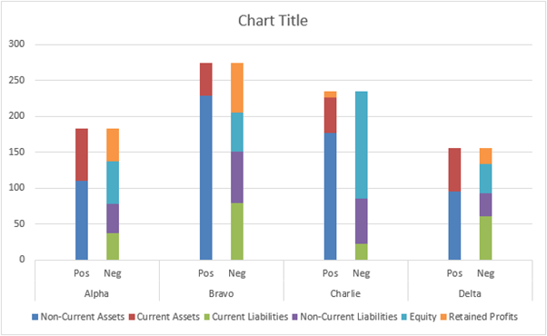
Here, the positive elements of each Balance Sheet are stacked, and then clustered with their negative counterparts – clearly demonstrating breakdown, relativity and the fact that for each division, they are equal and oppositive in total. You may hate the colour scheme, but hey, deal with it.
This is clearly a clustered stacked column chart rather than a stacked clustered column chart. This distinction is important: we create stacked charts that we cluster, rather than create clustered charts that we stack. I need to remember this when preparing the calculation.
It is very easy to create this chart. It’s all about layout. In the attached Excel file, I have restated my four Balance Sheets as follows:
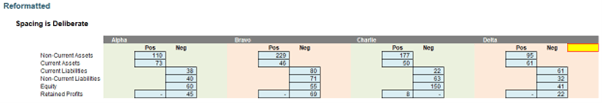
For each division, I have four [4] columns set aside (hence the shading). There are key elements to note:
- the first and last column of each data block (other than the first row and the final column) is completely blank
- the names of each division are entered in the top left-hand corner of each data block and the labels to denote positive and negative values are positioned in the second row, in the middle two columns of each data block
- positive values are referenced in the second column of each data block negative values are referenced in the third column of each data block
- for the “awkward” Retained Profits, I have used an IF statement to put this value in either the Positive or Negative column as a positive number, either way
- there is a trick as well: the final cell in the second row (highlighted in “Work in Progress” yellow to make it stand out) is not empty. A space has been typed in this cell. This is important!
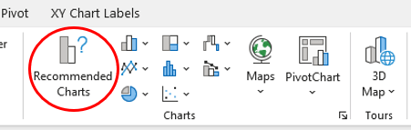
Now, I simply highlight this block and click on ‘Recommended Charts’ in the Charts group of the Insert tab of the Ribbon, viz.
This doesn’t seem helpful initially, as the resulting dialog box explains:
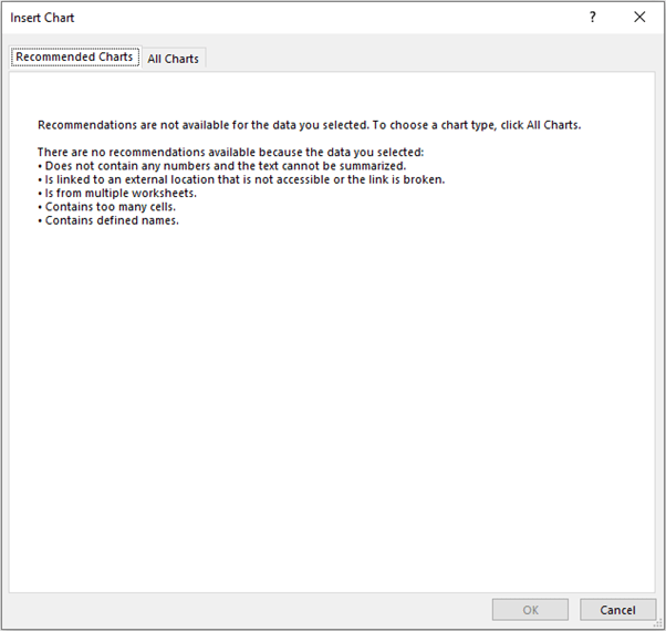
To heck with it! Let’s click on the ‘All Charts’ tab instead:
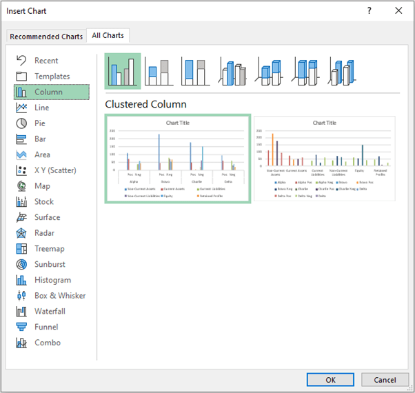
Er, not quite… But do you see what the problem is? It is considering a clustered Column chart. As explained earlier, this is not what we require: it is a stacked Column chart that I want to cluster. Therefore, I stay in the ‘Column’ chart section, but select the second type which is the stacked Column type:
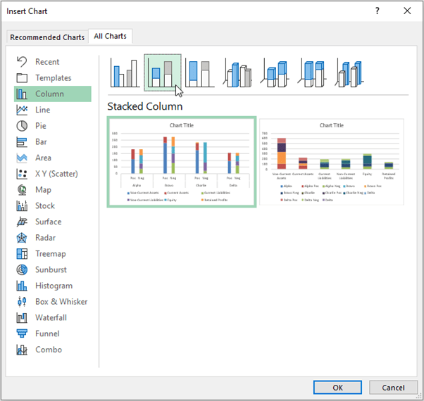
The first chart suggested is exactly what I require, so I click ‘OK’.
If you didn’t add the final space in the second row of our chart data, the horizontal axis will not appear as above. Instead, you will have a narrower fourth category (Delta) and a blank fifth category. The blank space tricks Excel into ensuring the final column is considered to be part of Delta and not the start of an unfinished new segment.
Now it is a matter of formatting the series to change the series colours and to modify the series ‘Gap Width’ to a smaller number (I used 15%) to make the columns wider and closer together, giving the impression of being clustered.
You may also note that the legend labels are in a different order. Moving both the stacking order and the legend labels is simple. Simply right-click on the chart and select ‘Select Data…’. IN the resulting dialog, simply reorder the ‘Legend Entries (Series)’ in the left-hand pane by either using the arrow keys or dragging with the mouse.
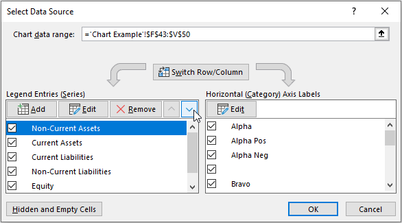
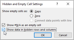
Further, if you click on the ‘Hidden and Empty Cells’ button in the left-hand corner, you may tick the second check box, ‘Show data in hidden rows and columns’, so that the chart data may be hidden without affecting the chart, should you wish.
With a little bit of simple formatting, you may have a chart (as below) in seconds!
Word to the Wise
Layout is often the key to creating charts simply. If you ever find yourself making aerobatic manoeuvres to obtain the chart of your dreams, you may wish to reconsider how you have set your data out. Excel’s assistance in helping construct charts is getting better and better all the time. Often the problem with chart creation is situated between the computer and the chair…
Join the Excel Community
Do you use Excel in your organisation? Are you using it to its maximum potential? Develop your skills and minimise spreadsheet risk with our Excel resources. Membership is open to everyone - non ICAEW members are also welcome to join.

Archive and Knowledge Base
This archive of Excel Community content from the ION platform will allow you to read the content of the articles but the functionality on the pages is limited. The ION search box, tags and navigation buttons on the archived pages will not work. Pages will load more slowly than a live website. You may be able to follow links to other articles but if this does not work, please return to the archive search. You can also search our Knowledge Base for access to all articles, new and archived, organised by topic.
