
Charting has always been an important aspect of creating reports and dashboards in financial models. Given their importance, I thought I would turn my attention to a feature that is rolling out as I write – because it’s going to prove very useful. In Excel for the web and Excel Desktop (Insiders Beta), charts will now respond to dynamic arrays.
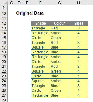
You can now create a chart with a data source range aligned to the result of a dynamic array formula (i.e. one that “spills). As a reminder, let me explain what a dynamic array is. Consider the following data:
But no more.
Look at what happens when I type =F12:H27 into cell F33:
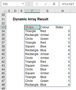
In Excel for the web and Excel Desktop (Insiders Beta), the chart will now update to capture all data whenever a spilled array formula recalculates, rather than being fixed to a specific number of data points. Yippee!
For example, consider the following:
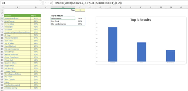
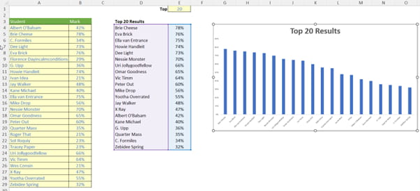
In cells A4:B29 (purposely not placed in an Excel Table), I have entered the results of the Home Cookery & Poisoning (Joint Honours) vocational course. Cell E1 contains an input number that specifies the top “X” students to chart, and the formula
=INDEX(SORT(A4:B29,2,-1,FALSE),SEQUENCE(E1),{1,2})
has been entered into cell D4 as a spilled / dynamic array formula to summarise the said top X students and their respective marks.
Whilst the mechanics of the formula is not the main thrust of this topic, to explain briefly, the SORT function sorts the contents of a range or array:
=SORT(array, [sort_index], [sort_order], [by_column]).
It has four arguments:
- array: this is required and represents the range that is required to be sorted
- sort_index: this is optional and refers to the position of the row or the column in the selected array (e.g. second row, third column). 99 times out of 98 you will be defining the column, but to select a row you will need to use this argument in conjunction with the fourth argument, by_column. And be careful, it’s a little counter-intuitive! The default value is 1
- sort_order: this is also optional. The choices for sort_order are 1 for ascending (default) or -1 for descending. It should be noted that you might not want to hold your breath waiting for ‘Sort by Color’ (sic), ‘Sort by Formula’ or ‘Sort by Custom List’ using this function
- by_column: this final argument is also optional. Most people want to sort rows of data, so they will want the value to be FALSE (which is the default value if not specified). Should you be booking your mental health check, you may wish to use TRUE to sort by column in certain instances.
Here, SORT(A4:B29,2,-1,FALSE) sorts the data in cells A4:B29 based upon the second column (the second argument, 2, specifies the column number). The third argument (-1) denotes the data should be sorted into a descending order (i.e. top score first). The final argument (FALSE) ensures the data is sorted by row.
The INDEX function forces the table. Normally, INDEX(array, x, y) selects the item in the xth row and the yth column. However, both x and y are ranges here. If the value in cell E1 were 3 for example, SEQUENCE(E1) generates the array {1, 2, 3}, i.e. there would be three [3] rows in the output, whereas the final argument here, {1, 2} would generate a two-column array consisting of the first and second columns of the source data (cells A4:B29). This would give the dynamic table output we want, as depicted.
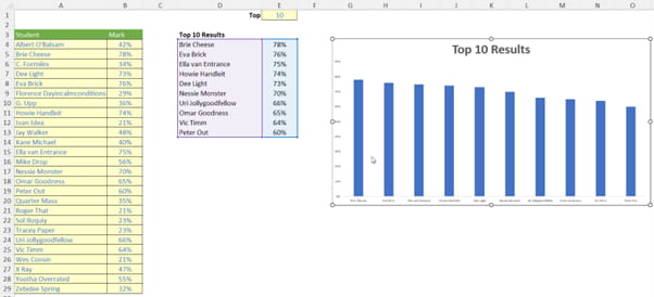
Thus, a chart may be inserted linking to the dynamic range (cells D4:E6 in the above illustration) in the usual way (e.g. Insert -> Recommended Charts). Nothing that exciting so far, but then, let’s change the vale in cell E1 to 10 (say):
Join the Excel Community
Do you use Excel in your organisation? Are you using it to its maximum potential? Develop your skills and minimise spreadsheet risk with our Excel resources. Membership is open to everyone - non ICAEW members are also welcome to join.

Archive and Knowledge Base
This archive of Excel Community content from the ION platform will allow you to read the content of the articles but the functionality on the pages is limited. The ION search box, tags and navigation buttons on the archived pages will not work. Pages will load more slowly than a live website. You may be able to follow links to other articles but if this does not work, please return to the archive search. You can also search our Knowledge Base for access to all articles, new and archived, organised by topic.
