
In earlier versions of Microsoft Excel, you can use report filters to filter data in a PivotTable report, but it is not easy to see the current filtering state when you filter on multiple items. In Microsoft Excel 2010 and later versions (that is, from when Slicers were introduced), you have the option to use Slicers to filter the data
You can actually use Slicers with Tables, PivotTables, PivotCharts and Power Pivot’s PivotTables. Unfortunately, there is a minor issue that occurs when you use Slicers on Power Pivot’s PivotTables.
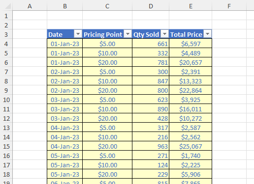
Imagine we had an Excel Table (created by going on the Insert tab on the Ribbon and selecting ‘Table’ else using the keyboard shortcut CTRL + T) called Data, viz.
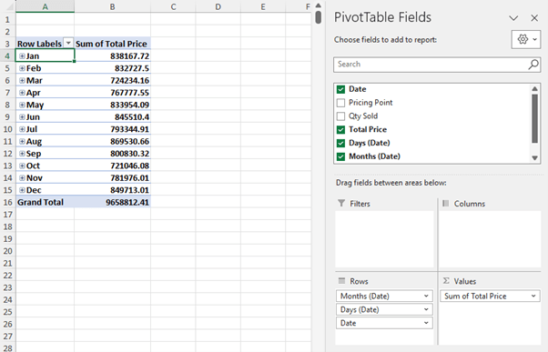
(The ‘Days (Date)’ and ‘Months (Date)’ fields are generated automatically as part of a date hierarchy.)
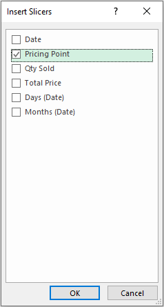
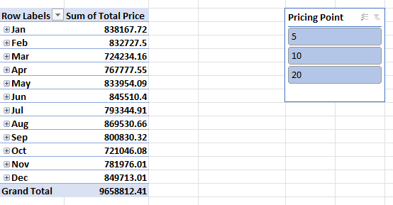
Accepting that Best Practice would be to change the header names and format the values, let’s ignore these points as this is not what this article is about! Instead, ensuring that we select a cell within the PivotTable once more from the context specific tab “PivotTable Analyze’ (again, in green), let’s select ‘Insert Slicer’ from the ‘Filter’ grouping (the user-friendly keyboard shortcut ALT + JT + SF). Let’s select ‘Pricing Point’:
(The ‘Days (Date)’ and ‘Months (Date)’ fields are generated automatically as part of a date hierarchy.)
Accepting that Best Practice would be to change the header names and format the values, let’s ignore these points as this is not what this article is about! Instead, ensuring that we select a cell within the PivotTable once more from the context specific tab “PivotTable Analyze’ (again, in green), let’s select ‘Insert Slicer’ from the ‘Filter’ grouping (the user-friendly keyboard shortcut ALT + JT + SF). Let’s select ‘Pricing Point’:
Great; it all works sell. So what’s the problem?
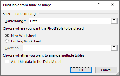
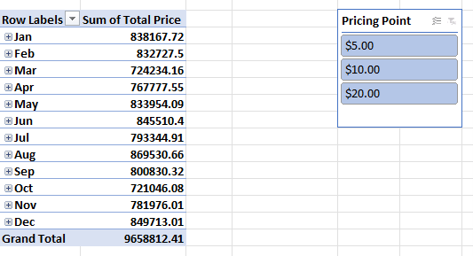
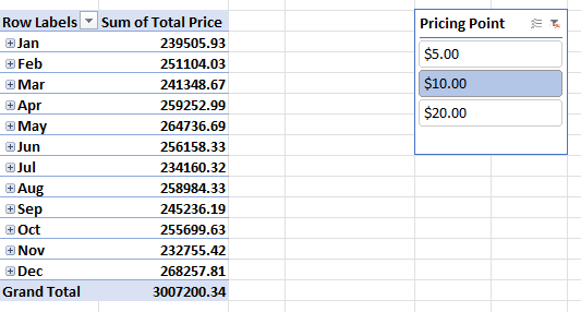
Slicers retain the underlying data formatting (using the $ currency symbol and displaying to two [2] decimal places) in this instance. However, let’s imagine we wanted to create a Power Pivot report instead. In this case, we need to add the data to Excel’s Data Model – the “filing cabinet” where all data used for Power Pivot is stored. We would repeat the above process with one lyrical deviation. When we get to the ‘PivotTable from table or range’ dialog box we require one seemingly minor adjustment:
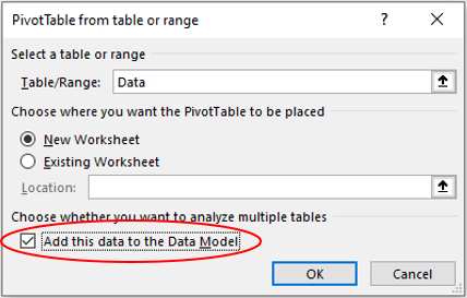
The ’Add this data to the Data Model’ checkbox must be ticked. We then follow all the remaining steps and obtain the following instead:
The underlying formatting in the Slicer has been excluded. Especially when the (custom) formatting applied is even more complex, this can prove immensely frustrating. So how do you modify the formatting to a Slicer in this instance?
Newsflash: you can’t.
So what do we instead?
The reason we stored the original source data in an Excel Table (called Data) was deliberate. This allows us to automatically extend the range of the source data for the PivotTable. Therefore, let’s add a new calculated column to the Data Table:
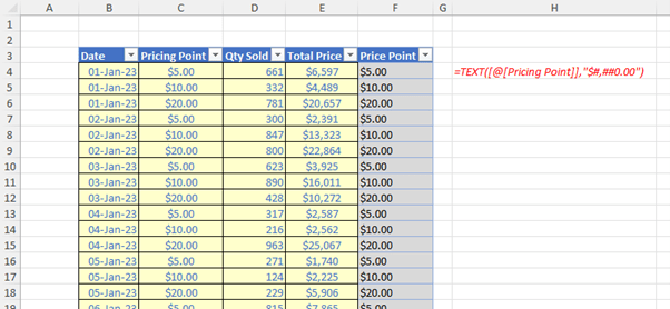
In our example, we may type the following formula into cell F4:
=TEXT([@[Pricing Point]],"$#,##0.00")
You don’t need to type [@[Pricing Point]] – you can simply select cell C4 and the Structure Referencing syntax prevalent in the Excel will do the rest for you.
The TEXT function forces data to be formatted in a particular way. It uses the syntax
=TEXT(reference, “format code”)
where:
- reference is the cell, string or value you wish to format
- “format code” is the custom formatting code you wish to apply in quotations (speech marks).
Here, the format $#,##0.00 forces a number to appear in dollars and cents (i.e. to two [2] decimal places) with a comma to act as a thousand separator. You can use other similar formats for alternative displays (do experiment!).
Note that the ‘Price Point’ field name differs subtly from its source (you cannot have the same field name twice). Further, the values in the field default to left aligned. This highlights these values may appear to be numbers but are actually text (“Fraudulent Numbers” anyone?). The TEXT function will convert numbers to text, which may make it difficult to reference in later calculations. Therefore, it’s a good idea keep your original values in one field, then use the TEXT function in another cell as we have instigated. Then, if you need to build other formulae, you can always reference the original value and not the TEXT function result.
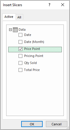
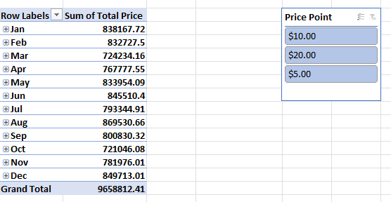
Since the ‘Price Point’ field is text and formatted as ‘General’, when used in a Slicer the values shall appear precisely as they do in the field. Therefore, if we now refresh the PivotTable (select ‘Refresh All’ from the ‘Queries & Connections’ grouping in the ‘Data’ tab on the Ribbon, ALT + A + R + A), we may then repeat the exercise but select ‘Price Point’ as the Slicer field instead:
Word to the Wise
Reading through this, you might think, “why bother with Power Pivot?”. Well, you should “bother” with Power Pivot. Available as an add-in to Excel, this lets you employ data modelling technology to create models, establish relationships between source tables (goodbye VLOOKUP!) and create output calculations / metrics. It’s essentially “PivotTables on steroids”. Having to employ a minor trick to force Slicers to “format” is a small inconvenience for the benefits you will otherwise reap. If you haven’t explored Power Pivot, you must!
Archive and Knowledge Base
This archive of Excel Community content from the ION platform will allow you to read the content of the articles but the functionality on the pages is limited. The ION search box, tags and navigation buttons on the archived pages will not work. Pages will load more slowly than a live website. You may be able to follow links to other articles but if this does not work, please return to the archive search. You can also search our Knowledge Base for access to all articles, new and archived, organised by topic.