
Hello all and welcome back to the Excel Tip of the Week! This week we have a Creator post in which I’ll be sharing a few of my thoughts on how to structure your spreadsheet data in order to make data analysis and further work easier.
Building on the Twenty Principles
You may be aware of the Excel Community’s principle publication around all things Excel practice, namely the Twenty Principles for Good Spreadsheet Practice. It’s a high-level discussion of the most important lessons for any spreadsheet builder, and is the distillation of our volunteer committee’s many years of experience. In this week’s Tip, we’re going to be looking at some particular thoughts about how to store data that you want to analyse and use in your spreadsheet, but we should start with the Principles. The most relevant to us is:
Principle 10: Separate and clearly identify inputs, workings and outputs
The lesson here is that inputs should be kept separate from calculations and outputs. There are several reasons for this. Firstly, it makes the structure of the spreadsheet easier to understand when all the cells in an area have a shared nature and purpose. Secondly, keeping all the inputs together makes reviewing and updating them easier. And furthermore, this approach reduces the likelihood that formulas will be missed or overwritten as the spreadsheet is updated.
Depending on the scope of your spreadsheet, this might mean keeping the inputs in a separate part of a sheet or keeping them on a dedicated worksheet of their own. The key thing is to keep the inputs separated and clearly identified, and to avoid mixing in any kind of calculations.
What your input data should look like
A common temptation can be to store your input data in something approaching the format you ultimately want it in. For example, if we are dealing with sales data over time for several stores, this kind of format is commonly seen:
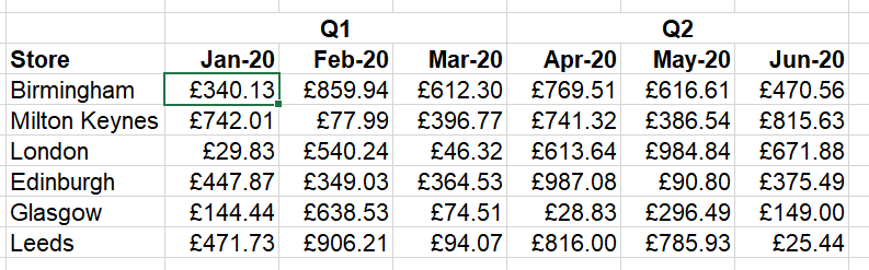
This looks nice at first because this is the output format we ultimately want, but it makes future formulas very difficult. Because the table will grow in both directions, it makes writing flexible formulas that refer to the entire dataset very tricky. And looking up a specific value for a particular month/store combination is also quite tricky:
=INDEX(data, MATCH(target store, stores column, 0), MATCH(target month, months row, 0))
This also won’t easily expand as time goes on. And while the Q1/Q2 headers here aren’t really functional, this kind of data layout is often used with multi-row labels that are relevant:
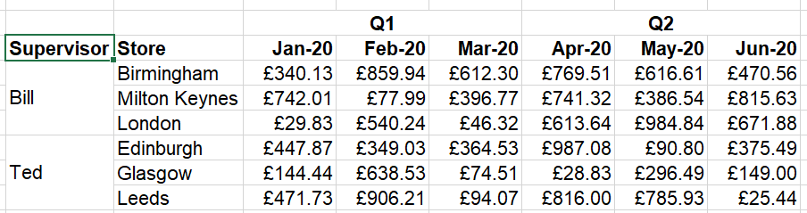
The use of merged cells here makes formulas nearly impossible to write – Excel only sees a value of “Bill” in the first row of the merge, and blanks in the other two.
Finally, when an additional dimension is needed – for example, if we have purchases data as well as sales data for this same set of stores and dates – then the approach usually is to make an entire second table, sometimes on a second sheet. This further complicates the process of analysing and referring to the data.
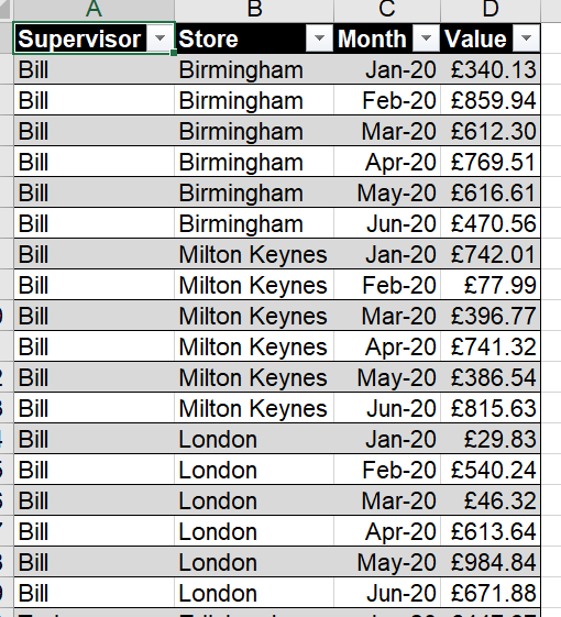
Instead, the easiest way to store data is in a strictly columnar format, with as many columns as needed being used to describe the data in the different dimensions (supervisor, store, date, sales / purchases), and then a value (or multiple values if we have e.g. quantity and unit price, although again these could just be a single value).
I also strongly recommend the use of Excel Tables. These automatically grow as new data is added, allowing for easier future-proofing. Here’s the same data, transformed into this recommended format:
The important thing is that, if the original format is what’s desired for presentational reasons, a quick PivotTable can still accomplish that – but with a much simpler data format in the background should you need to do anything else. Here’s an example PivotTable of the data back to the original format, using the “Tabular” report format option:
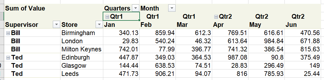
But now we can calculate sales for a particular target month with:
=SUMIFS(SalesData[Value], SalesData[Store], target store, SalesData[Month], target month)
This is a simpler formula to read and understand – and much easier to expand if we add more dimensions later on. The use of structured references to the Excel Table also make adding new data simple yet robust.
There are a few other important points to consider here also:
- Make sure each column has a name that is clear, unambiguous, and unique (Tables automatically enforce this last point)
- If you are using Tables, likewise give them good names
- Consider colouring worksheets to indicate their purpose – e.g. standing data, rolling data, presentation
Overall, putting some thought into how you are going to structure your data up front, and not being tempted to try matching your data input format to your desired output presentation, can really save you a lot of time and reduce risk in the long run. It’s always worth taking the time to think it through.
Related content
Excel community
This article is brought to you by the Excel Community where you can find additional extended articles and webinar recordings on a variety of Excel related topics. In addition to live training events, Excel Community members have access to a full suite of online training modules from Excel with Business.

Archive and Knowledge Base
This archive of Excel Community content from the ION platform will allow you to read the content of the articles but the functionality on the pages is limited. The ION search box, tags and navigation buttons on the archived pages will not work. Pages will load more slowly than a live website. You may be able to follow links to other articles but if this does not work, please return to the archive search. You can also search our Knowledge Base for access to all articles, new and archived, organised by topic.
