
The data used in the examples below is completely fictional and is about the social media followers of retail company. The retail company owners want to understand a bit more about the ages of their social media followers across different channels. However, they are struggling to intuitively understand the large volume of data associated with their X00,000s social media followers.
The retail company promote their brand using i) Instagram, ii) Facebook and iii) Twitter and want to optimise their content for each channel based on the age groups of their current follower base. The main questions they want to answer are:
- What is the distribution of my followers for each channel?
- How does that compare across channels?
Box plots
A great way to show the range of a numerical variable, such as age, is to plot the data in a box plot (also called a ‘box-and-whisker’ chart). Box plots show the distribution of a numerical variable and are useful for showing whether the data points in the data set are tightly grouped or spread out and what the range of the data set it.
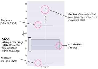
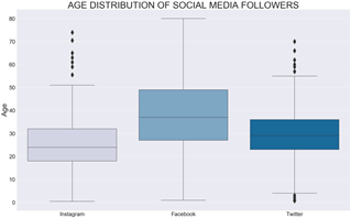
This chart is most effective when different categories of things are plotted on the same chart and can be compared. In the example of the retail business who wants to understand their followers across different social media channels, they can use box plots to plot the information together and gain insights from comparing the different channels, rather than reviewing in isolation.
Violin plots
While box plots are highly effective and widely used in data analytics, they are limited in the fact that they only show specific statistical points, such as the median average or outliers, rather than the distribution of a data set as a whole.
Violin plots focus on illustrating the distribution of the entire data set and can generate different insights, that are hidden in the structure of box plots.
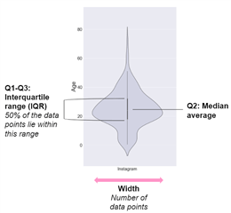
Although box plots are an intuitive way of understanding statistical metrics, such as interquartile range, outliers and median average, violin plots give a complete overview of a data set. Box plots are essentially summaries, meaning that the underlying distribution of the data driving the statistical metrics is obscured.
Comparatively, violin plots will give a complete overview of the distribution of data, which is especially powerful when comparing different categories within a data set, such as splitting data across seven charts to compare days of the week.
This is illustrated below, again with the example of a retail business looking to understand the ages of their social media followers. From the chart, you can quickly build intuitions about the age distributions across the channels.
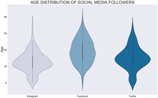
Although these charts look downright weird at first, they can sometimes be a more intuitive way of understanding the distribution of data points in a data set. The two main advantages of basic violin plots are:
- Clusters - Violin pots can identify unusual groups of data points. In the example above, in the Instagram channel there is a concentration of users below the Inter Quartile Range ("IQR"), users between 0-10, versus a large spread of users above the IQR, users over 30. This information is more difficult to pick out of the box plot above
- Quick & powerful insights - Fundamentally, the purpose of charts is to provide insights more intuitively and more quickly than looking at raw numbers. Once you get used to them, violin plots can give a birds eye view of an entire dataset with one glance, especially when used with multiple categories for comparisons.
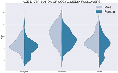
Next level violin plots: The Split Violin Plot
The hidden power of violin plots is that they can be split across an additional category to give an extra level of comparative analysis. This is a unique feature of violin plots and allows for particularly useful insights and, if used in the correct scenario, it can create an extremely intuitive way of explaining complicated patterns of a data set.
In the example below, the social media follower data is further split by sex of follower. As can be seen, this demonstrates the variation across category about the distribution of the ages of male and female followers. This additional split can only be used with a boolean (yes/no) variable.
Conclusion
Violin plots are very handy to have in the data visualisation toolbox. They are highly effective in showing the distribution of data points in a data set in a clear and intuitive way, and are particularly useful when used to compare different categories of data points. Violin plots can be turbocharged be being split across a yes/no variable to give even greater insight.
Coder’s corner
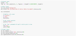
I made these box & violin plots using Python’s Seaborn library in a Jupyter Notebook. The code below generates the final chart (split violin plot).
You can also make violin plots in Microsoft Power BI.
The views expressed are the author’s and not ICAEW’s.