
For details of what this project is all about and how to develop your own version, please look at the Excel archive file linked to below.
The story so far:
- Excel archive file
- Part 1 – from web page to Excel Table
- Part 2 – from Excel Table to web page
- Part 3 – Using Power BI
- Part 4 – charts and interactions
- Spreadsheet Knowledge Base launches
Visualisations and interactions
So far, we have added a single visualisation to our Power BI report, a Table that lists our archive posts showing the original publication date, the post title and a hyperlink to open the article in a browser. In addition, we have used conditional formatting to indicate the Spreadsheet Competency Framework level of the article and to highlight articles that are publicly available.
We can add visualisations to our report by making sure that no existing visualisation is already selected, and then clicking on the type of visualisation that we want to add in the Visualizations pane. An empty visualisation should then appear on our report page that can be moved and the size changed as required. The lower section of the Visualizations pane will display the visualisation areas available, and the Fields that you want to use for each area can be dragged from the Fields pane to each area. Here we have selected the Stacked Bar chart vizualisation at the top left of our gallery of visualisations and positioned it to the left of our original Table. We have then added Series as our Axis, Post Author as our Legend and Post as our Values Field which, being a text rather than a number field, will default to displaying Count of Post:
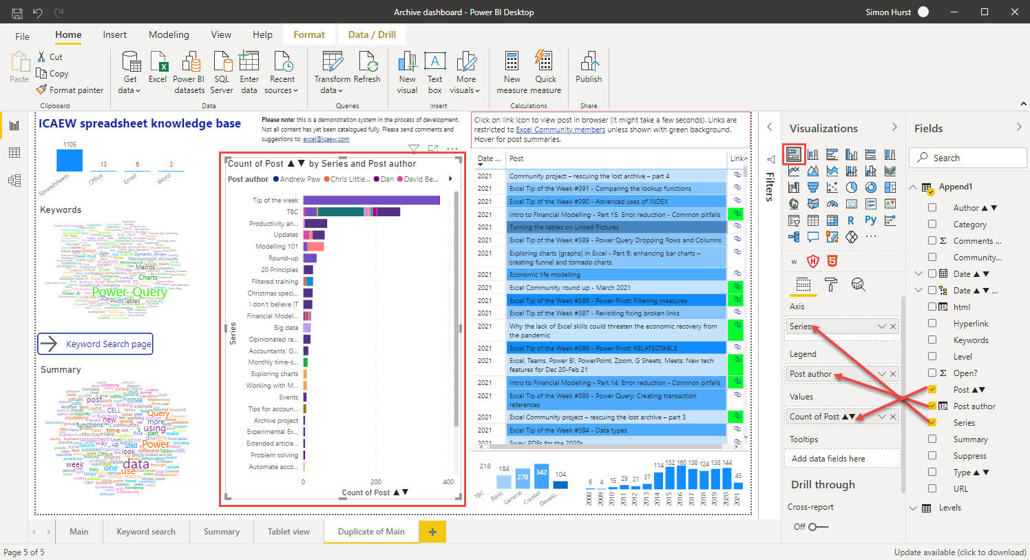
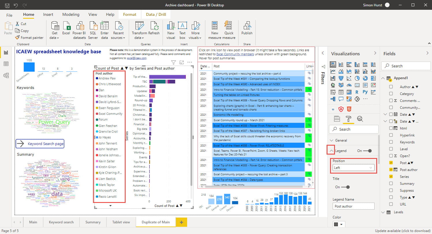
By default, the legend is shown horizontally at the top of the visualisation. Because so many different Post Authors have contributed to the article archive, the legend isn't very useful in this position. Accordingly, we can click on the 'paint roller' icon at the top of the lower section of the pane to format the different components of our visualisation. We can click the dropdown for Legend to see the detailed options for this component and change the Position to Left:
Interactions
If you are relatively new to Power BI and your previous experience was mainly limited to Excel charts, then it would be worth thinking a little differently about visualisations. Not only does Power BI offer a much wider range of visualisations, but those visualisations are much more interactive. Within our single stacked bar chart, if we click one of our post author names, our bars will change to highlight the section of each series bar that represents the number of posts contributed by that author. Selecting items within one chart can also change other charts. When we select our post author in our stacked bar chart, our table visualisation is changed to apply that author as a filter so we just see that author's posts in the list. We can control these interactions by turning on Edit interactions in the Interactions group of the Format Ribbon tab. This will display interaction options in all the other charts that can change how those charts are affected when we click on an element of our selected chart:
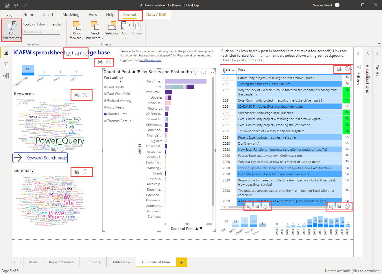
The options available depend on the type of visualisation. Our table visualisation has options for applying the selection as a Filter or for no interaction whereas the two stacked column charts below the table additionally display a Highlight option. As we can see, these two charts highlight the number of posts within each column that were contributed by our chosen author.
The interactivity of visualisations allows them to be used creatively. For example, the 'levels' column chart beneath our table operates not only as a chart in its own right, but also operates as a filter to let us just display posts of a particular level and as a key to the colours used to represent the levels in the table visualisation.
Resources and feedback
We have embedded the current stage of project development below:
The 'Open in full-screen mode' icon in the bottom right-hand corner of the embedded report should show the contents at a more readable size with the Escape key returning you to the post.
At the moment, it is still very much a work in progress and any comments on useful ways in which we could provide access to the community content would be very welcome:
Excel community
This article is brought to you by the Excel Community where you can find additional extended articles and webinar recordings on a variety of Excel related topics. In addition to live training events, Excel Community members have access to a full suite of online training modules from Excel with Business.

Archive and Knowledge Base
This archive of Excel Community content from the ION platform will allow you to read the content of the articles but the functionality on the pages is limited. The ION search box, tags and navigation buttons on the archived pages will not work. Pages will load more slowly than a live website. You may be able to follow links to other articles but if this does not work, please return to the archive search. You can also search our Knowledge Base for access to all articles, new and archived, organised by topic.
