How do you display profit and loss results so they can be quickly interpreted? Mike Younger, FD of Ian Macleod Distillers, explains the methods he uses to show company comparative trading performances
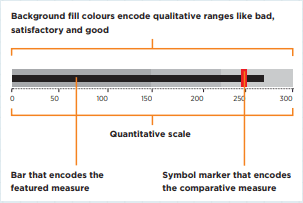
To date, I have not seen a method which conveys the relative management performance in a simple but readily interpretable way. The Visual Analytics course run by ICAEW caught my eye and I attended, looking for a solution. The horizontal bullet graphs drew my interest (in basic form in figure 1).
This was something to build on. The main drawback of the presentation is the light grey shaded peripheral areas. In practice, the boundaries between poor, satisfactory and good are subjective and they are another way of showing tolerances around the target performance. It was obvious that the light grey area should be used to report last year’s performance. This is a figure that is known and immutable. The symbol marker noted in figure 1 as the comparative measure is the clear candidate for the budget figure.
Figure 1
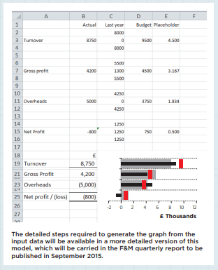
The use of individual graphs for each reported element needed to be overcome and the format of the input data simplified. Using other resources, I was able to adapt and perfect the graphing so that all the reported items could be included in one Excel graph. This ensures a common scale and allows the graph to re-size automatically with fresh figures. The figure shown below (figure 2) shows the arrangement of the input data and resultant graph in a simplified form.
The content of the input data is largely self-explanatory, except for the placeholder element. This is required to control the positioning of the budget measure, which is graphed on a secondary axis. As each figure is against a different heading on the profit and loss, spaces have been inserted between the bars within the graph data area to deliver a normal spatial layout. The placeholder value needs to be adjusted to position the budget amount correctly against the respective headings. The graph has been snapped to the grid to appear alongside the description and value, so it can be moved and sized along with them. Most normal Excel graphing elements, such as borders, scales, grid lines and axis descriptions, are suppressed so that the main visual message is the performance and its comparison.
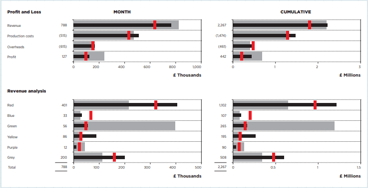
For each measure it is necessary only to show the actual figure, as thereafter the relative position of the comparative figures of budget and last year give the information normally derived from a value and percentage variance reported as numbers. The figure 2 example clearly displays that each type of performance yields its own unique shape.
An excess result over last year and budget (overheads in this example) looks different from where the result is better than last year but below budget (turnover). The user quickly gets used to the shapes that indicate each type of performance outcome.
Figure 2
Costs are graphed as positive figures so that they fall on the same side of the axis as revenue. Clearly the shape for excess costs is the same as excess revenue and yet the impact on profit is adverse. The reader will get used to this, but the design demands this to avoid confusion; the reported measures are few in number and kept at a high level.
The source profit and loss for the top part of the above figure has some other minor figures that were too small to report meaningfully, so they have been excluded and the figures displayed do not vertically cast. This fits with the aim of producing a high-level visual summary. Where identically-sourced measures are reported (turnover or margin), as many items as needed can be displayed.
The remainder of the MI pack consists of an in-depth commentary and supporting financial schedules. Extra detail can then be found where required, and as prompted by the graphs. They fulfil a dashboard purpose and are my first place to look when assessing new period figures.
I have received a good reaction to these visual P&Ls and think that they are a significant aid to high-level conditioning of the reader to the entity’s financial performance. The graphs are also a good way to display high-level sales figures.
Figure 3
Download PDF article
- Visualise this, Finance & Management magazine, Issue 211, June 2015
About the author
Mike Younger is FD at Ian Macleod Distillers. This article is an abbreviated version of the Finance & Management Faculty’s September 2015 Quarterly Report.
Further reading
The ICAEW Library & Information Service provides access to a selection of key business and reference eBooks from leading publishers.
Further reading on displaying financial data is available through the eBooks below.
Terms of use: You are permitted to access, download, copy, or print out content from eBooks for your own research or study only, subject to the terms of use set by our suppliers and any restrictions imposed by individual publishers. Please see individual supplier pages for full terms of use.
More support on business
Read our articles, eBooks, reports and guides on Financial management
Financial management hubFinancial management eBooksCan't find what you're looking for?
The ICAEW Library can give you the right information from trustworthy, professional sources that aren't freely available online. Contact us for expert help with your enquiries and research.
-
Update History
- 12 Jun 2015 (12: 00 AM BST)
- First published
- 15 Nov 2022 (12: 00 AM GMT)
- Page updated with Further reading section, adding related resources on displaying financial data. These new eBooks provide fresh insights, case studies and advice on this topic. Please note that the original article from 2015 has not undergone any review or updates.
