
Hello and welcome back to Excel Tips and Tricks! This week, we have a Creator level post which explores how to create map charts using Excel.
Accountants often work with geographical data in Excel. That may be sales data by region or customer addresses or anything else that is specific to a physical location in the real world. It is natural then to consider visualizing this data on a map, and Excel provides several features to support this.
Too many map options!
Looking at the Insert tab in the Excel ribbon there are, somewhat confusingly, three references to maps.
Too many map options!
Looking at the Insert tab in the Excel ribbon there are, somewhat confusingly, three references to maps.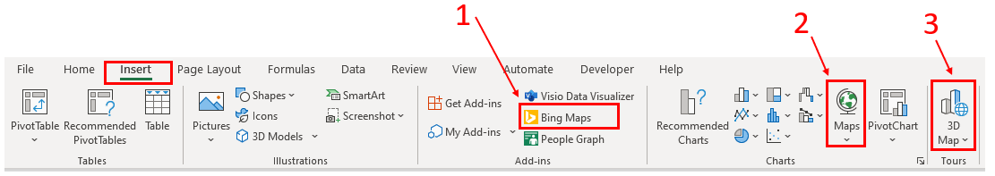
In this article we will look at map charts (second option). Being built in charts, they are a core part of Excel and don’t require enabling any further add ins. They are a great starting point for working with location data and thinking about plotting geographic data.
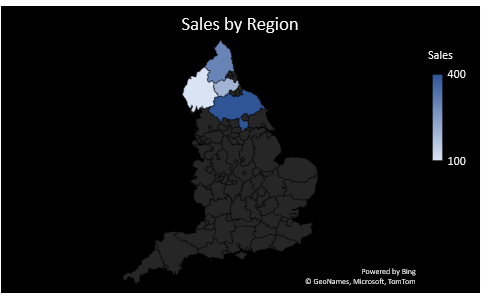
Here we have some sales data for a trader based in the North of England, giving sales by region.
Preparing your data
The starting point for plotting a map chart – or any chart for that matter - is to have some data to work with.Here we have some sales data for a trader based in the North of England, giving sales by region.
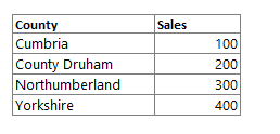
We can select anywhere in this data and choose Filled Map from the Insert menu.
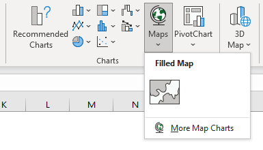
The first time you insert a map chart you will be prompted with a data privacy notification:
By clicking accept you acknowledge the data will be shared with Bing.
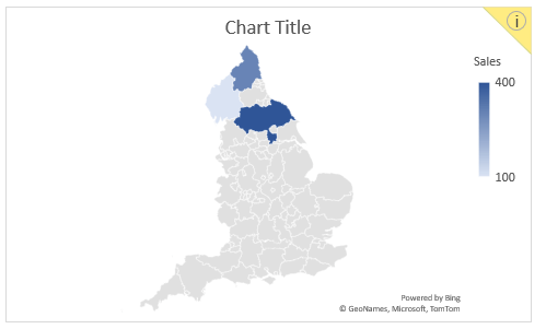
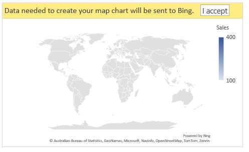
After clicking accept, Bing will match your data to real world locations, and based on this will produce a map relevant to the areas in question. In this instance the map chart has automatically zoomed in from the whole world to just a map of England.
Notice how we have an information notification at the top right of the chart. The presence of this yellow “i” tells us that Bing was unable to match all the data to real world physical locations. Let’s click on it to find out more.
Notice how we have an information notification at the top right of the chart. The presence of this yellow “i” tells us that Bing was unable to match all the data to real world physical locations. Let’s click on it to find out more.
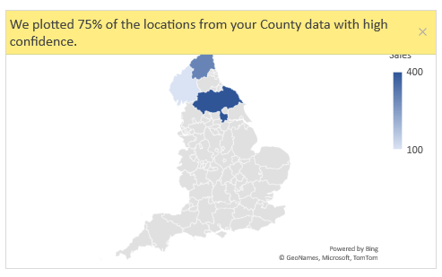
Here we can see that Bing has confidently identified 3 out of the 4 locations. Let’s review our original data again:

Ooops, we made a typo! The second entry should read County Durham. Let’s correct that.
Now our chart has automatically updated with all data points (i.e., locations) shaded.
If you are working with data that contains place names that may match to multiple geographical locations (e.g., London, England vs London, Ontario) then it would be advisable to add an additional column in your data with some disambiguating data, for example country (UK, Canada, etc.).
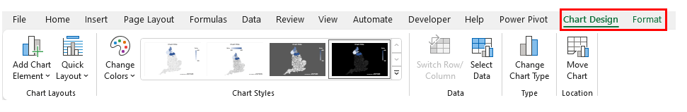
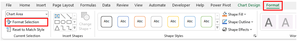
Selecting our chart will give us access to two additional tabs on the Excel ribbon: Chart Design and Format.
If you are working with data that contains place names that may match to multiple geographical locations (e.g., London, England vs London, Ontario) then it would be advisable to add an additional column in your data with some disambiguating data, for example country (UK, Canada, etc.).
Formatting options
As the map chart is a standard chart in Excel you have access to the full range of formatting options that are available for any chart in Excel.Selecting our chart will give us access to two additional tabs on the Excel ribbon: Chart Design and Format.
We can create striking map charts easily by flicking between the Chart Styles shown above.
There are also options specific to map charts, but they are buried and a little hard to find if you’re not very familiar with charting in Excel.
To access them first click on Format Selection under the Format tab to bring up the Format task pane.
To access them first click on Format Selection under the Format tab to bring up the Format task pane.
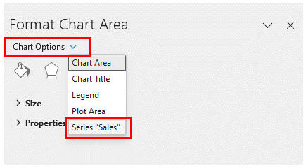
The Format task pane should appear on the right-hand side in Excel. You can navigate to the specific map options by choosing the Series option from the drop down just under the heading.
From here you can find the Series Options just under the bar chart icon.
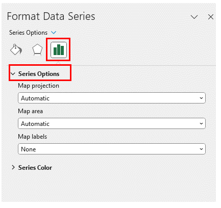
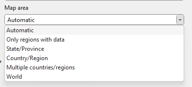
Finally, we can adjust some map specific settings such as type of projection (Mercator, Miller, Albers – you don’t need to have a technical understanding of what this means to have a play around and see what looks best!). There are also useful options under the Map area should we need to override the automatic geographical area shown (i.e., zoom level) within the chart.
Mapping alternatives
We have shown how to create a filled map in Excel using the map chart feature. As the name “filled” suggests, this chart type is most appropriate for colouring in regions, rather than highlighting specific points.For those interested in alternative mapping options in Excel, including the ability to plot specific points (e.g. cities), Tip #430 introduces the 3D Map feature in Excel.
Further mapping alternatives exist via the Add-Ins and as shown above Bing Maps can be accessed directly from the Excel ribbon. Happy charting!
Archive and Knowledge Base
This archive of Excel Community content from the ION platform will allow you to read the content of the articles but the functionality on the pages is limited. The ION search box, tags and navigation buttons on the archived pages will not work. Pages will load more slowly than a live website. You may be able to follow links to other articles but if this does not work, please return to the archive search. You can also search our Knowledge Base for access to all articles, new and archived, organised by topic.