Author Steve Wexler reflects on the importance of feedback, iteration and constant improvement when it comes to creating the best data visualisations.
And why did it work? Because we had one overarching goal in common: clarity.
When I am asked about the process I think of a band breaking up because of “artistic differences”. That didn’t happen with the three of us because we weren’t trying to create art. For certain, we wanted dashboards that were beautiful, but more than anything else we wanted dashboards that allow the largest number of people to get the greatest degree of understanding with a minimum amount of effort.
Let me take you through a case study on how the Churn dashboard came to fruition and how following the approach we used could also help you to make better dashboards.
Background
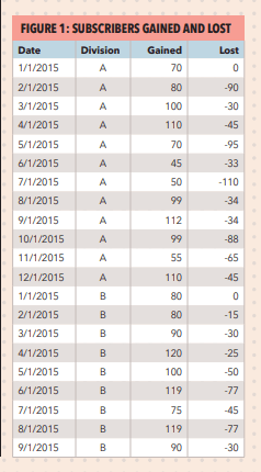
I asked the attendee what she thought she needed to be able to show and she said it was important to know when and where things were really good (ie, many more people signing up than cancelling) and where and when things were really bad (ie, more people cancelling than signing up). She also stressed that management would insist on seeing the actual numbers and not just charts.
Not a horse, but a dashboard
This was not the case with the Churn dashboard as I received more input from more people over a longer period than any other dashboard in the book – and it resulted in a much better product than if I had just gone at it alone.
Let’s look at the evolution of the dashboard.
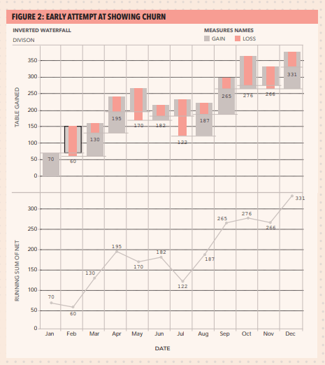
Churn - take one
Starting with the left side of the top chart, we see the starting point for the month (0 for January), number of people subscribing (the grey bars going up) and number of people cancelling (the pink bars going down). It’s easy to see that I had more people subscribing than cancelling in January, and more people cancelling than subscribing in February.
The second chart shows the running sum over time.
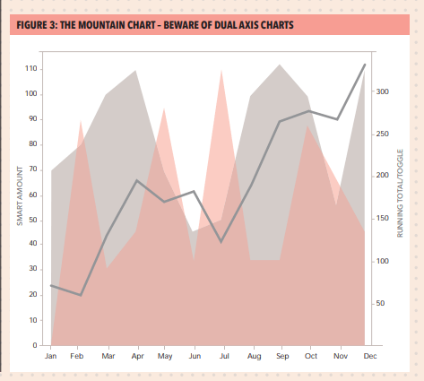
Churn - takes two through 50: The mountain chart
While some people “got” this, most had a problem with the negative numbers (the cancellations depicted as pink mountains) being displayed as a positive. The idea was to allow people to see in which months the negatives exceeded the positives and you can in fact see this easily (February, May and especially July). But most people were simply confused, even after receiving an explanation of how the chart worked.
In addition, superimposing a second chart (in this case the running total line) almost always invites confusion as people must figure out how the axes work (eg, do the numbers on the left axis apply to the area chart or to the line?)
Getting closer
I took the feedback to heart and came up with a solution that I think works well.
Still more tweaking
When I showed this to Jeff there was a long pause, and then I recall him saying that he didn’t think this added much to the analysis. By this time I had worked with Jeff for well over a year and I knew that “I don’t think this adds much” was Jeff’s way of politely telling me that he hated that component of the dashboard.
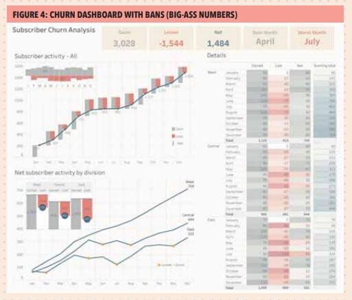
I started to argue with him that there was a stated demand by the audience to show the actual numbers driving the charts when I realised that Jeff was, in fact, correct. Just showing the numbers didn’t add much and there was a better way to meet the requirement and provide additional insight: use a highlight table (also called a “heat map”).
Where are the bans?
Figure 4 – Churn dashboard with BANs (Big-Ass Numbers) – is the dashboard I would submit now. There are BANs along the top and these elements can do a lot to help people understand key components of a dashboard, they can be conversation starters (and finishers), provide context to adjacent charts, and serve as a universal colour legend.
Reflections
Example dashboard: churn or turnover
Options include:
- What-if analysis (wage increase ramifications)
- Ranking by now, comparing with then
- Multiple key performance metrics
- Year to date, year over year – at the same time
- Sentiment analysis – showing overall distribution
- Sentiment with net promoter score
- Showing rank and magnitude
- Showing churn or turnover
- Show actual versus potential utilisation
- Economy at a glance
Wexler uses two examples to demonstrate different churn/turnover dashboards: the growth of a subscriber service and airport passenger flow.
For the subscriber service, his dashboard monitors fluctuations in subscriptions over time; comparison of overall gains and losses by division; a way of identifying where losses outweigh gains; the details for each month, and the ability to spot best and worst months’ performance. The various merits of waterfall diagrams, spark bars, mountain charts and heat maps are compared to see which works best for the dataset (Figure 4 also shows examples of waterfall, spark bar and heat diagrams).Raw tabulated data arranged by month also records gains, losses, net and running total (a waterfall diagram). Data is presented month to month in each ‘step’ of the waterfall, with colours to differentiate the gain and loss columns. Wexler also uses a sparkbar in the top left of his dashboard to make easy comparison of monthly gains and losses, while also highlighting the months with the greatest gain/loss.
In an airport flow diagram, Wexler uses a sparkbar arrangement without a waterflow chart as a better measure. He layers multiple bars on top of one another to show inbound and outbound flights against the number of planes on the ground, with this bar changing colour when a certain number of planes is exceeded. This is plotted over time on an X-axis to show change throughout the day.
About the author
Steve Wexler, data visualisation presenter and trainer, and founder and principal of Data Revelations. The Big Book of Dashboards: Visualizing Your Data Using Real-World Business Scenarios (Wiley) is nominated for a Kantar Information is Beautiful award.
Download PDF article
- Data visualisation in presentations
Business & Management Magazine, Issue 259, November 2017
More support on business
Read our articles, eBooks, reports and guides on Financial management
Financial management hubFinancial management eBooksCan't find what you're looking for?
The ICAEW Library can give you the right information from trustworthy, professional sources that aren't freely available online. Contact us for expert help with your enquiries and research.
