
Hello and welcome back to Excel Tips and Tricks! This week, we have a Creator level post exploring the basics of the different chart types in Excel.
Introduction
Excel has a rich collection of chart types available for adding visualisations to your data.
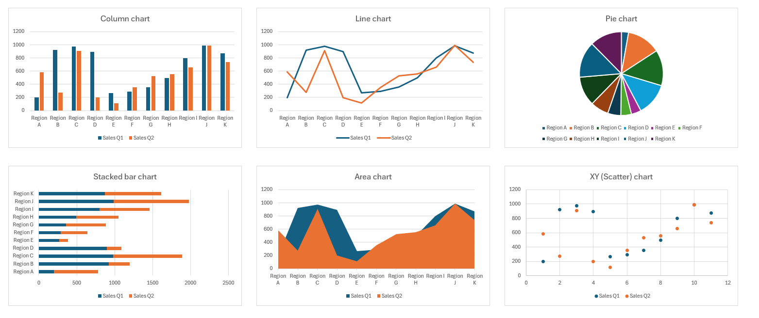
A lot of the most common chart types have been available since the earliest versions of Excel. Here we see some examples of classic chart types in Excel.
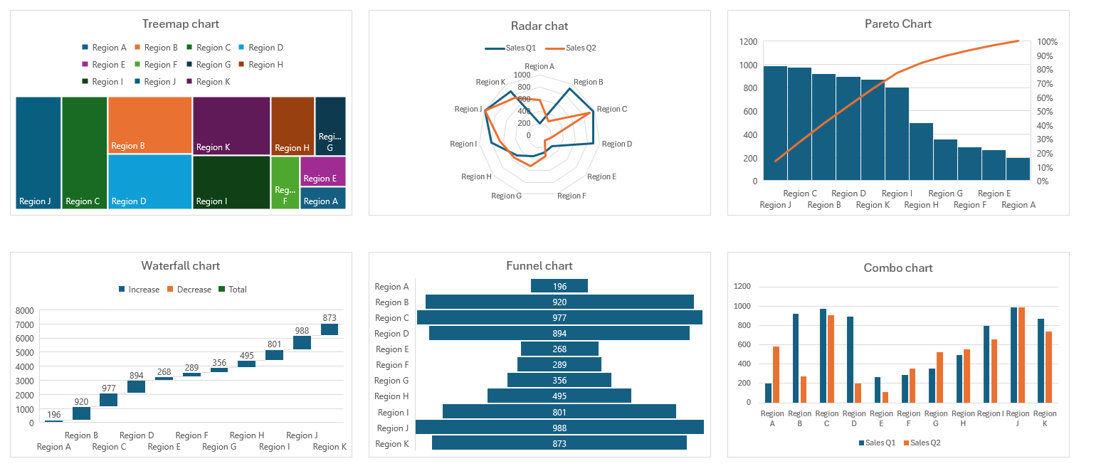
Since 2016 there have been some additional built in chart types to further extend the possibilities of charting in Excel.
Despite the variety on offer, the fundamental approach of creating and editing a chart is the same across all chart types.
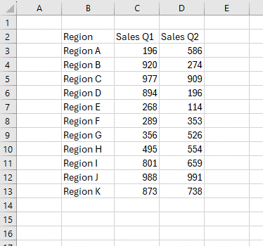
In the examples above, every single chart was created in a couple of clicks, using the default settings and the following data:
Already we can see that with a simple data set we already have quick access to some great visualisation options!
In the rest of this article, we will cover the basic process to get started with charts in Excel.
With the basics covered you should have the skills and confidence to explore the many chart types available!
Inserting a chart
The starting point for creating a chart in Excel is to have some data. As shown above a simple table with headings is more than sufficient.
The next step is to select anywhere in our data and navigate to the Insert tab on the ribbon and then to the Charts group.
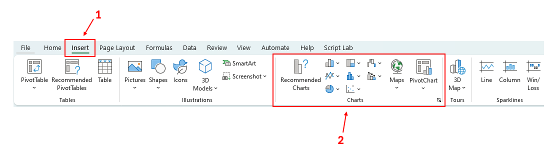
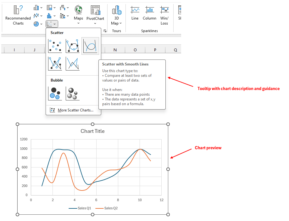
This is a great place to start exploring the available chart types. Clicking any of the drop downs and hovering the mouse over each icon will give a useful tooltip and preview below.
Alternatively, for the full list of possible chart types click on the “Recommended Charts” button and click on the second tab in the “Insert Chart” dialog.
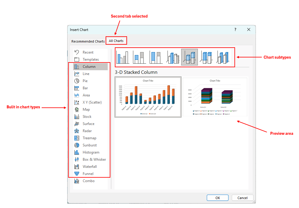
Within this dialog we can see the full list of built in chart types on the left-hand side.
They roughly correspond to the order in which they were introduced to Excel over the last 30+ years. In any case if you are running Excel 2016, Excel 2019 or have a Microsoft 365 licence you should see all chart types available.
Let’s select the humble Column chart to insert this into our worksheet.
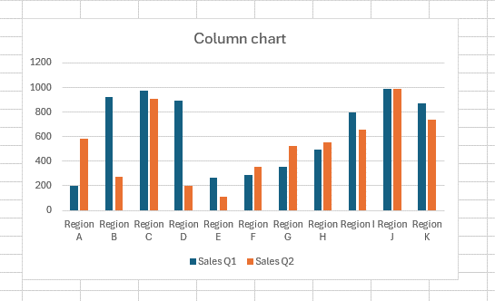
Chart design
With the chart selected two new tabs appear on the ribbon: Chart Design and Format.
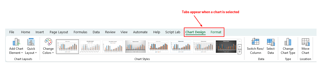
Under the Chart Design heading there will a choice of suggested Chart Styles. Hovering the mouse over each of these will temporarily apply the style to your chart so you can preview the formatting changes before you commit.
If you decide to completely change the chart type altogether you can do so by choosing “Change Chart Type”. Any applied styles and formatting will be applied even after changing chart type.
Chart elements
Within the main chart object there are chart elements. Each one is a distinct part of the chart that can be manipulated as a mini-object in its own right. The exact list will vary depending on the chart type, but standard chart elements will include:
- Chart title
- Chart data (i.e. series)
- Horizontal and vertical axes
- Legend
- Data labels
Each of these objects can be edited via the Format Pane. This can be accessed by right clicking any chart element and choosing “Format [element]…”
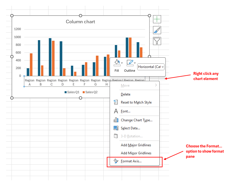
Choosing this option will show the Format Pane on the right-hand side in Excel.
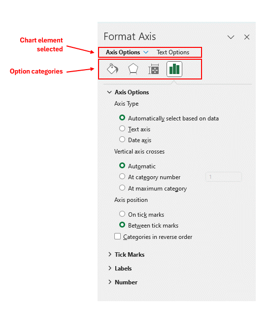
The Format Pane is an incredibly powerful tool for finessing the style and design of the chart.
There are a lot of customisation options available; both of the general sort (colour, size etc.), but also particular to the selected chart element (e.g., axis options as show below).
With the format pane visible it is easy to navigate between the different chart elements by choosing the drop-down arrow next to the subheading.
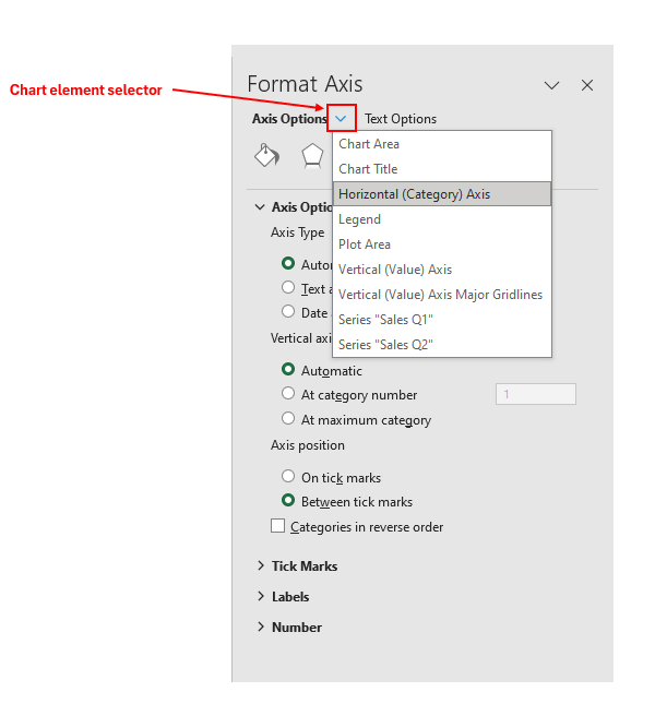
This will select the chart object and show the relevant options in the Format Pane.
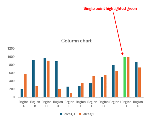
Bonus Tip: to highlight a particular data point, select the point directly in the chart. With this single point selected any changes made in the Format Pane will only apply to this one point.
Conclusion
Excel charts are a highly versatile and powerful tool for visualising your data.
With the basic concepts covered it is very easy to explore all the options and turn your spreadsheet into a work of art!
- Excel Tips and Tricks #506: Creating a single master list after merging data
- Excel Tips and Tricks #505 – 3 ways of converting US Dates into UK formats
- Excel Tips and Tricks #504 - Accessing accessibility checkers for good spreadsheet practice
- Excel Tips and Tricks #503 – Printing under pressure, super quick presentation tips
- Excel Tips and Tricks #502
Archive and Knowledge Base
This archive of Excel Community content from the ION platform will allow you to read the content of the articles but the functionality on the pages is limited. The ION search box, tags and navigation buttons on the archived pages will not work. Pages will load more slowly than a live website. You may be able to follow links to other articles but if this does not work, please return to the archive search. You can also search our Knowledge Base for access to all articles, new and archived, organised by topic.
