
Hello all and welcome back to the Excel Tip of the Week! This week, we have a Creator post in which we’re taking a look at how to extend a basic PivotTable with PivotCharts.
If you want more of a refresher on PivotTables in general, I’d recommend our webinar from earlier this year introducing the basics – listen to the recording.
A PivotChart is a chart that is based on a summarised version of data. You can either create a PivotTable to summarise and compress your data, and then create a Chart of that – or you can skip the middle-man and just make a chart directly from the original data. The first option is essentially just making a regular Chart, but with a different data source – so we won’t dedicate time to it here. The really interesting avenue is creating a PivotChart directly.
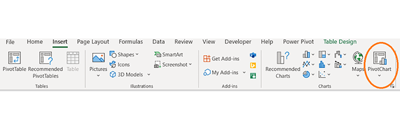
The option is in a different place depending on your version. In earlier Excel versions, it’s a dropdown under Insert => PivotTable that lets you select PivotChart instead. In later versions, it’s a separate item on the Insert menu, grouped with other types of Chart:
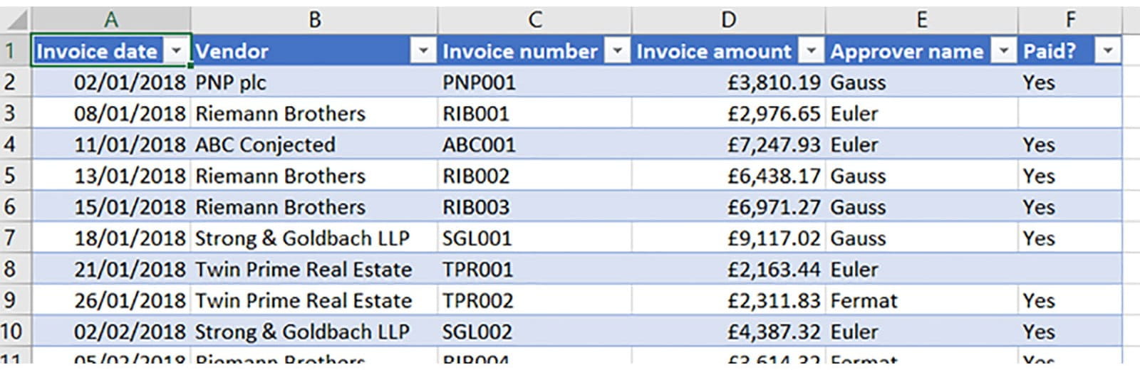
In fact, that menu now contains the option if you want to insert a PivotTable and associated chart simultaneously. But we’re going the straight PivotChart route. Here’s the dataset we’ll be using for this example:
And here’s the result of pressing that button:
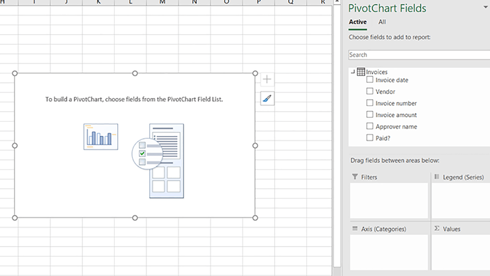
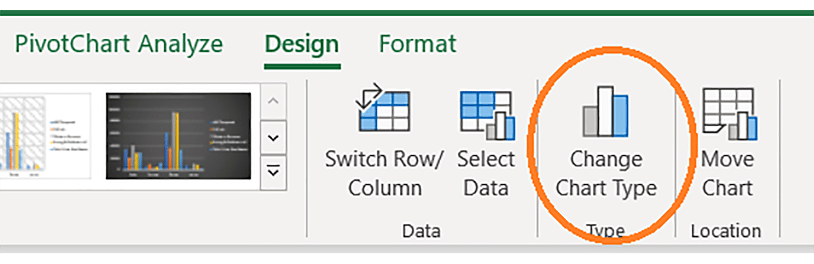
At first glance, the right-hand menu looks like the typical PivotTable menu – but a closer look reveals the differences. Instead of “Row labels” and “Column labels”, this version has “Axis (Categories)” and “Legend (Series)”. These are what will control how our chart looks. We can also use the special contextual menus to change the chart type:
Most of the time for the simple PivotChart options, you’ll want a Column or Stacked Column chart. More complex charts are probably better made by first creating a PivotTable.
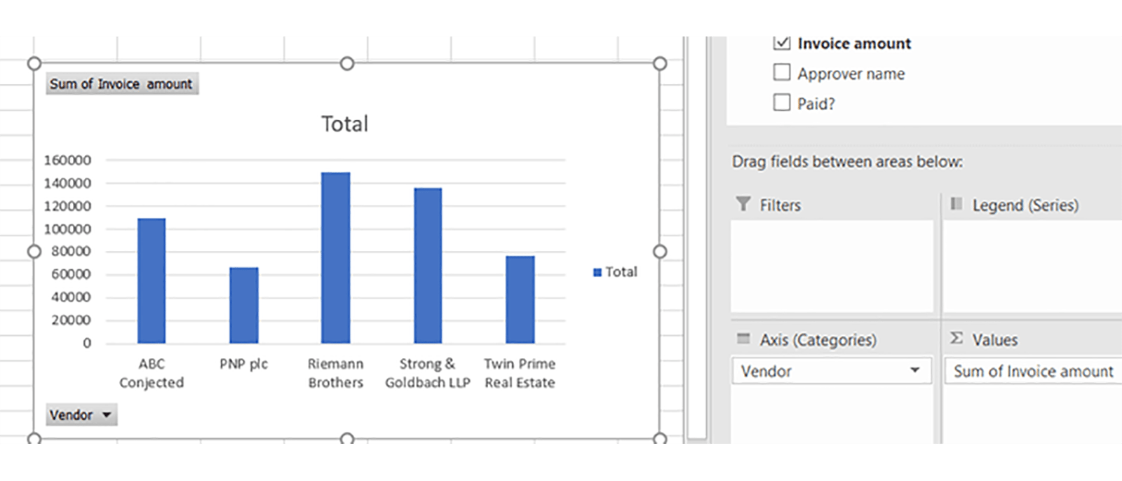
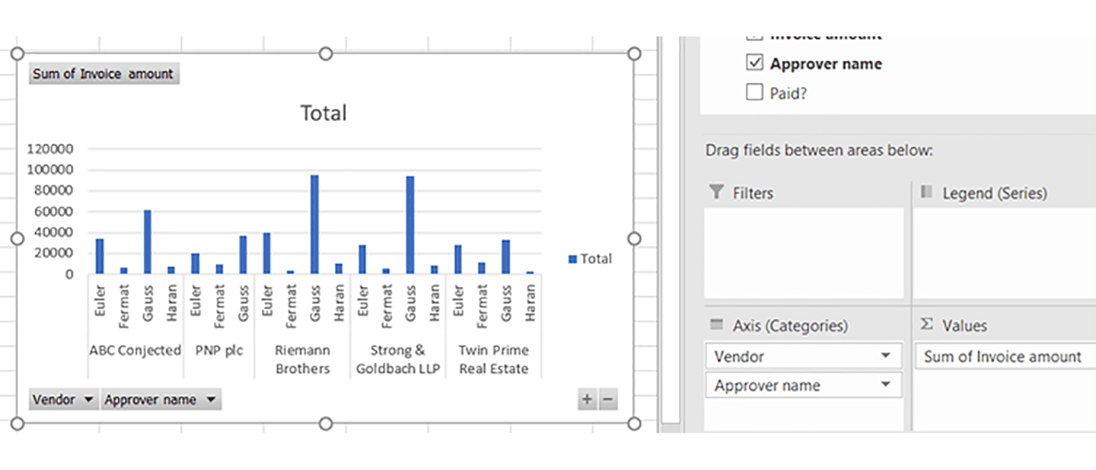
Once we have our PivotChart in place, we can just drag and drop fields into the boxes in the menu to instantly create different types of chart. Here are a few examples:
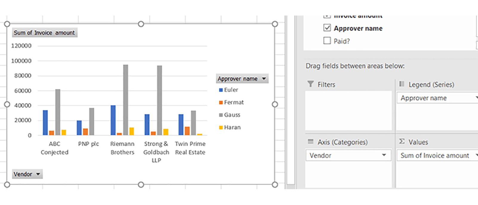
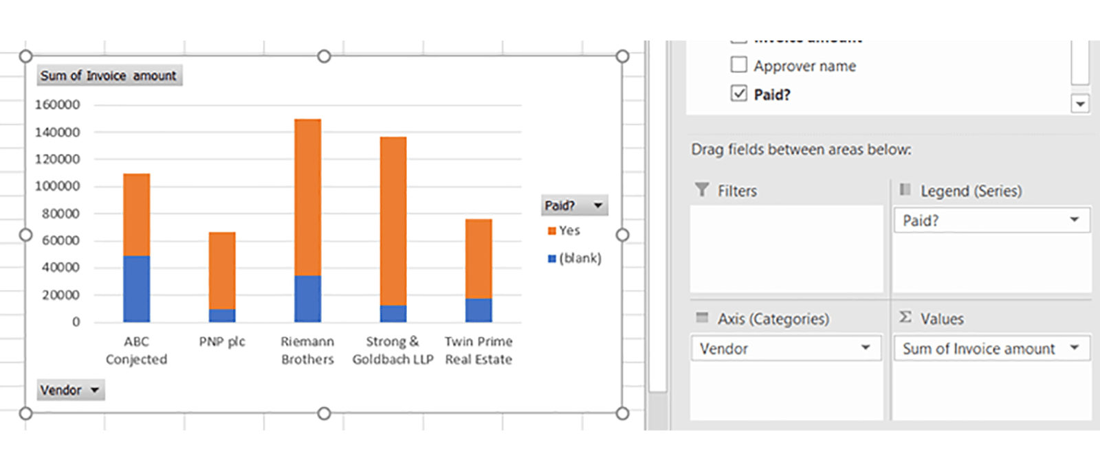
The only difference between the last two examples here is changing the chart type between regular and stacked.
Note that many more complex chart types are not available within PivotCharts – such as scatter plots or histograms. You can create combo charts, but of course only with the chart types that are available.
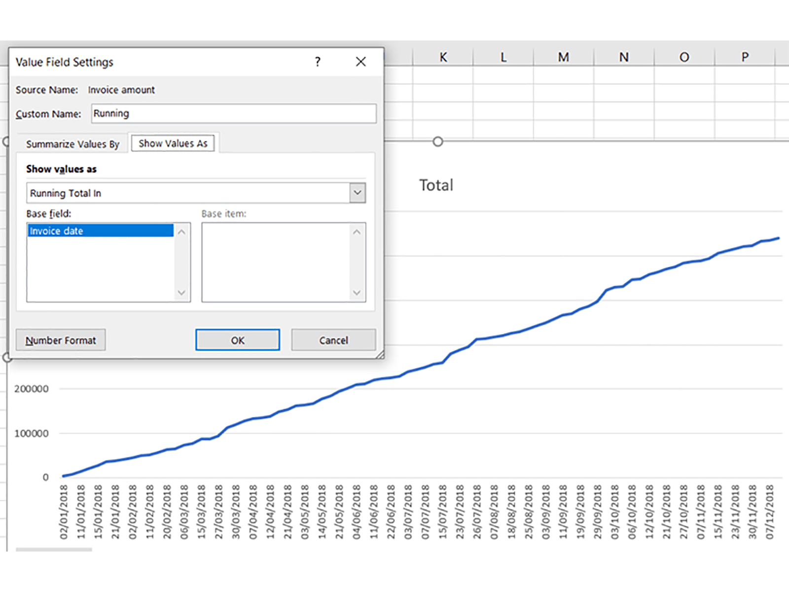
There are other options too – for example, you can change how data is displayed in the Value Field settings in order to make something like a cumulative total line chart:
But the real strength of PivotCharts is that you can just easily mess around with different simple charts without having to spend ages messing around in menus. Download the example file here and give it a go!
You may also like
- Excel Tips and Tricks #506: Creating a single master list after merging data
- Excel Tips and Tricks #505 – 3 ways of converting US Dates into UK formats
- Excel Tips and Tricks #504 - Accessing accessibility checkers for good spreadsheet practice
- Excel Tips and Tricks #503 – Printing under pressure, super quick presentation tips
- Excel Tips and Tricks #502
Excel community
This article is brought to you by the Excel Community where you can find additional extended articles and webinar recordings on a variety of Excel related topics. In addition to live training events, Excel Community members have access to a full suite of online training modules from Excel with Business.

Archive and Knowledge Base
This archive of Excel Community content from the ION platform will allow you to read the content of the articles but the functionality on the pages is limited. The ION search box, tags and navigation buttons on the archived pages will not work. Pages will load more slowly than a live website. You may be able to follow links to other articles but if this does not work, please return to the archive search. You can also search our Knowledge Base for access to all articles, new and archived, organised by topic.
