
In part 3 we drew a line chart and in this article we will be adding axis bounds, axis units and then formatting axis text and dates. The screen shots are from Excel 365 and while your version may look slightly different the functionality will be the same.
Axis bounds
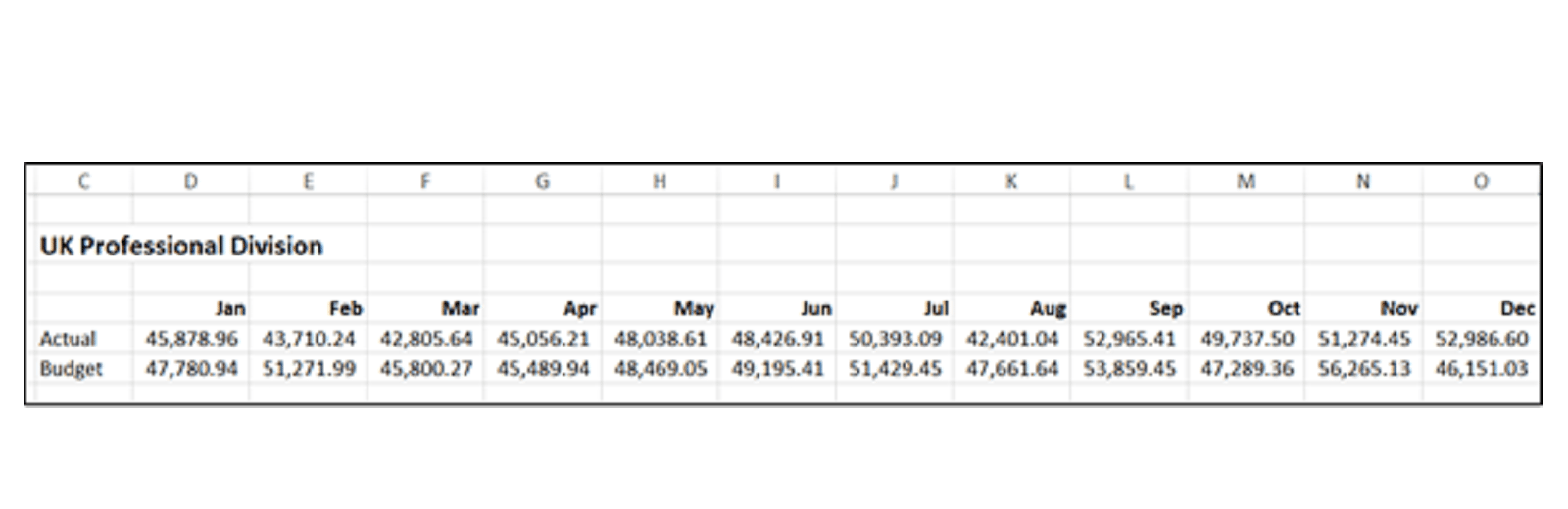
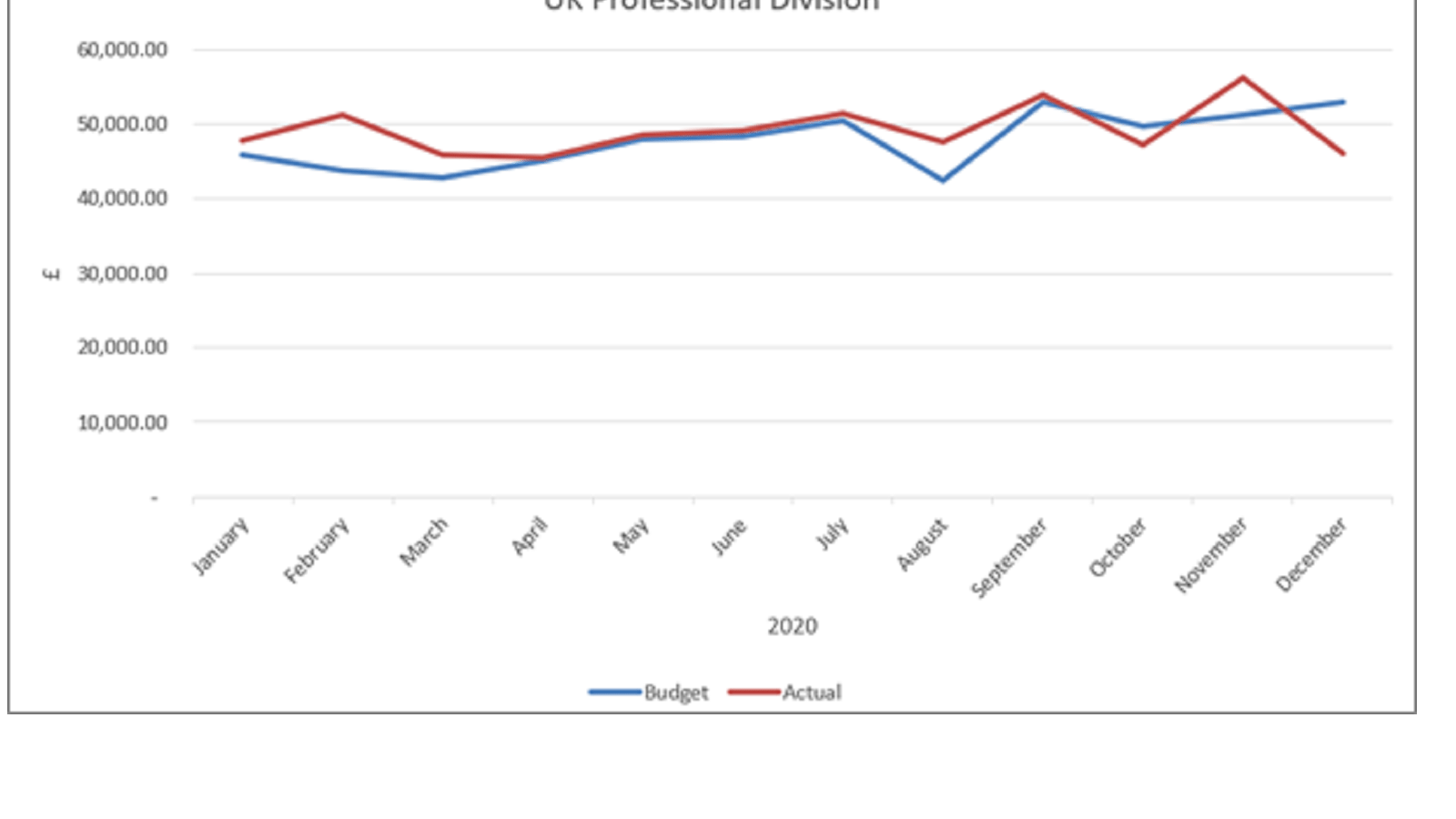
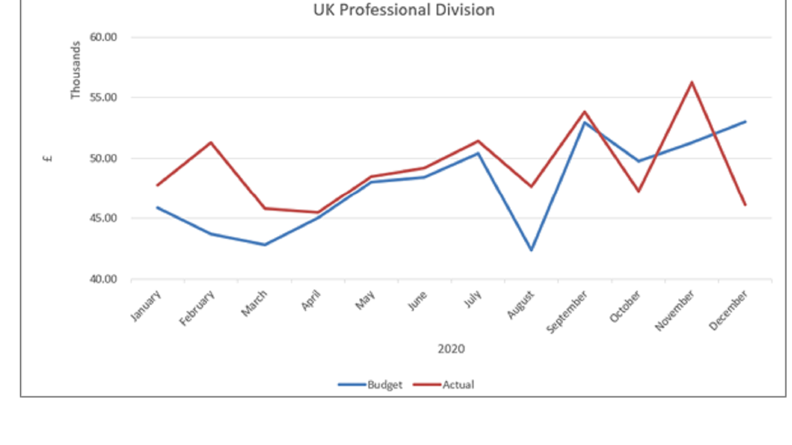
As can be seen the data values are between £40,000 and £60,000. The area below £40,000 is blank. With all the information squashed into a narrow band much of the detail is lost. What might be better is to reset the view so the vertical axis starts at £40,000. This can be achieved by using Axis Bounds.
On the vertical Axis right click any of the values and from the options offered select the bottom one Format Axis… If not already shown select the right hand set of four tabs called Axis Options.
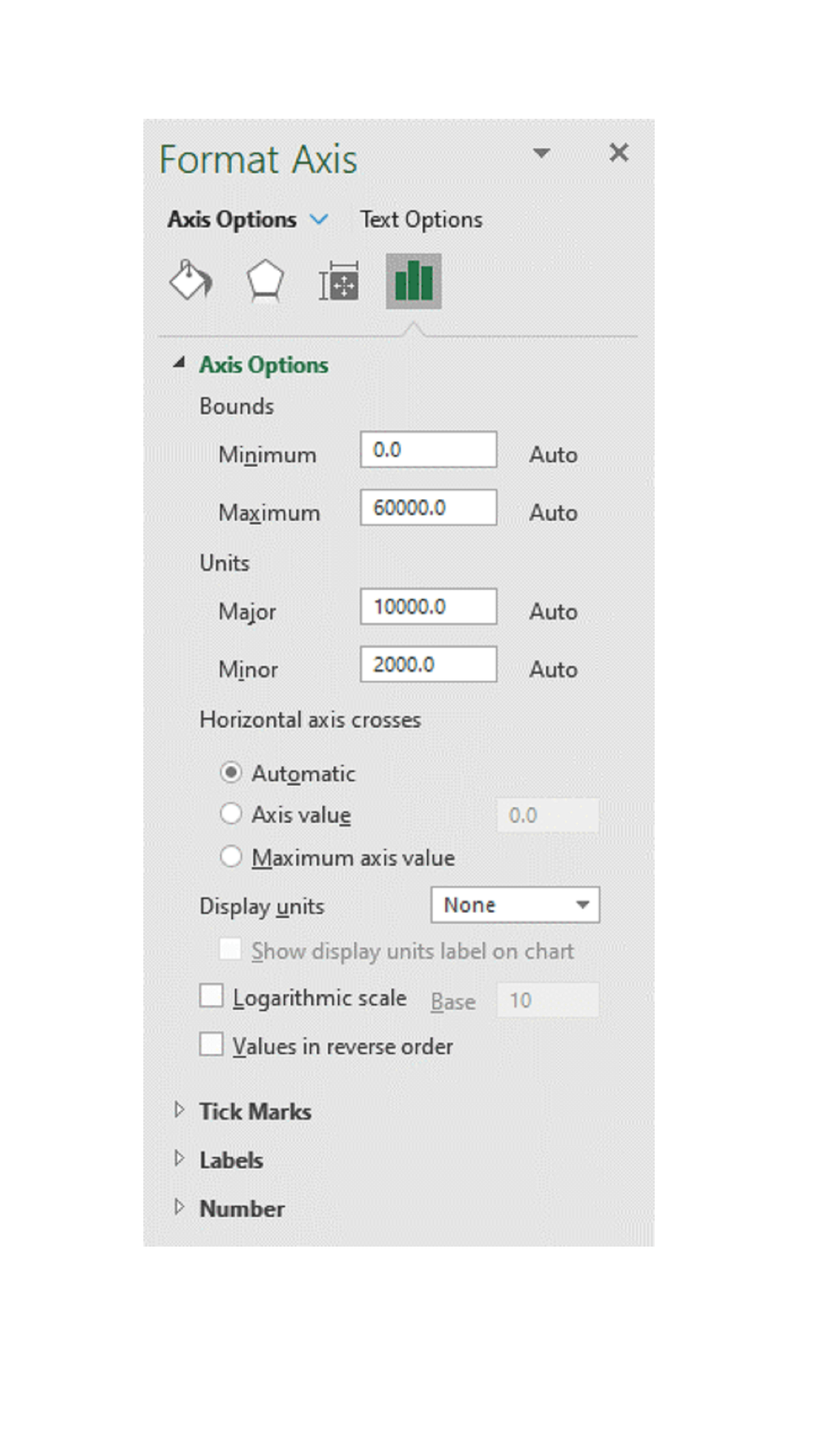
At the top are the Axis Bounds. You will see that the Minimum is set as 0 and the Maximum as 60,000. Both these have the word Auto to their right, which means that Excel has determined these are the bounds that will enable all values on the chart to be displayed.
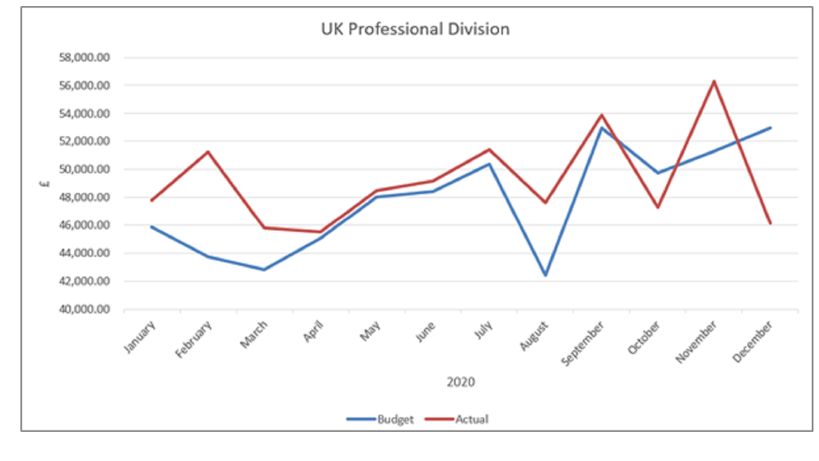
In order to start the chart at £40,000 change the minimum value from 0 to 40000. The chart will now be more detailed as below. The Minimum value will now have the word Reset to the right which means you have overridden the automatic setting but you can revert by clicking on the Reset button.
You can see that it now shows the horizontal gridlines at intervals of £2,000. You may prefer $5,000. This can be done in the section called Units that is displayed below Bounds. Change the Major setting from 2000 to 5000 to make this effect.
Axis Units
The next detail to refine is the way the values on the vertical axis are displayed. Certainly the .00 is superfluous and actually they could be presented in whole 1,000’s to make is even clearer.
On the same menu set as above you will see further down a line for Display Units with a drop down box set as None. Change this to Thousands and immediately the three zeros have disappeared, but you are still left with each number showing .00. Also the word ‘Thousands’ has appeared in a text box beside the vertical axis.
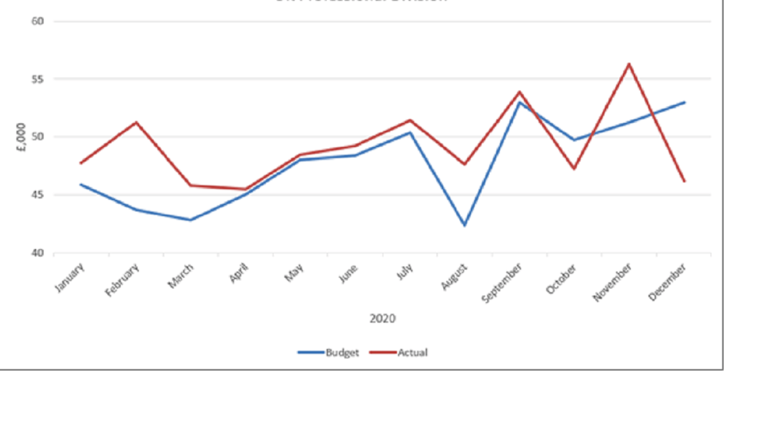
My preference is to change the Vertical Axis Title to £,000 and remove the Thousands word. This can be achieved by editing the Vertical Axis Title (as shown in Blog 3) and to remove the new Text box just click on it and press delete alternatively below the drop down box for Thousands is a tick box saying ‘Show display units label on chart’. Just uncheck this and it will disappear.
Formatting Axis Numbers and Text
To format the numbers and remove the two decimal points you need to continue down the list of Axis Options, scroll to the bottom of the list where there is a section called Number.
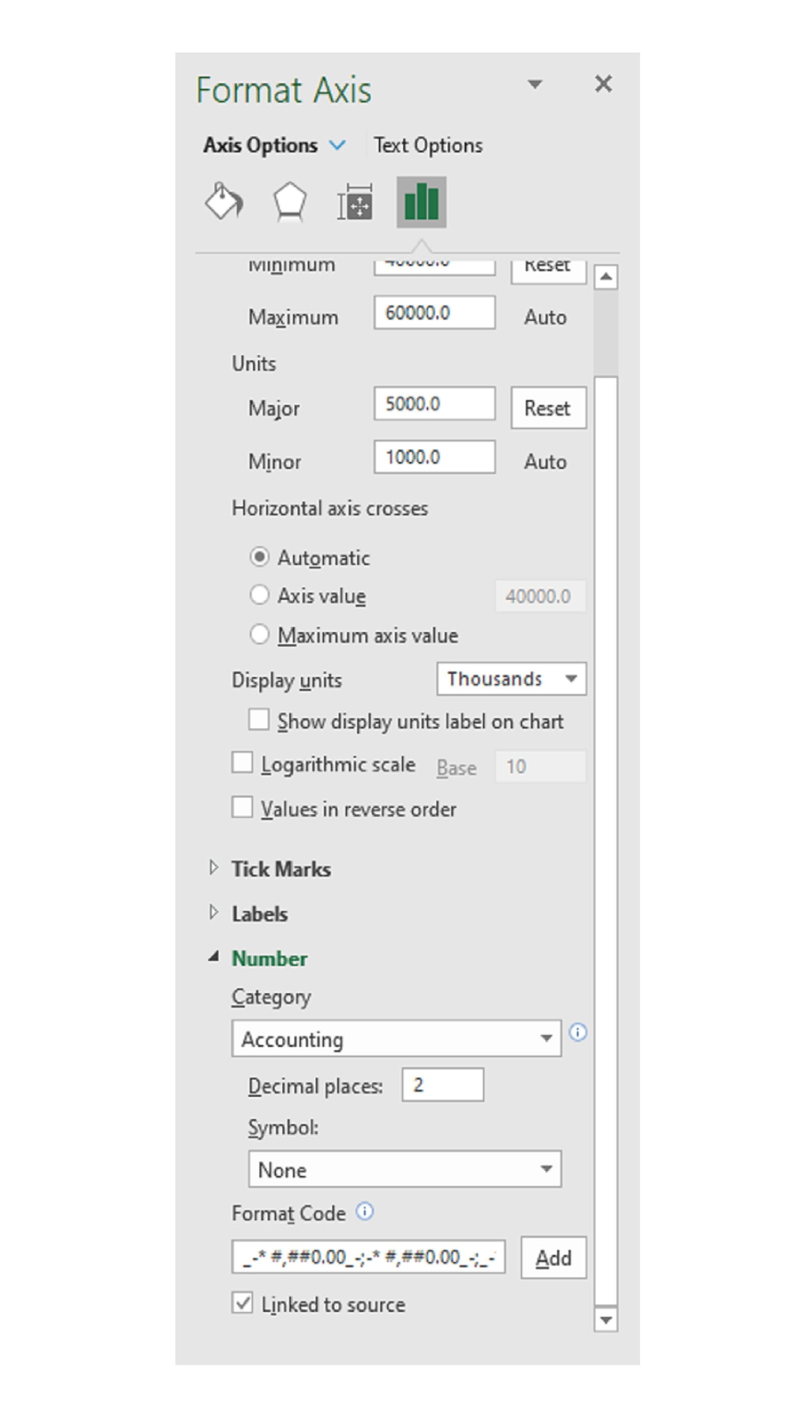
You can select a pre-defined format from the drop down titled Category. This is the same set of options as for normal Number formatting of cells on the Home ribbon.
My preferred format is #,##0 which ensures a zero rather than a – is used for a nil value. Select the Category of Number (second option in the list), Decimal places 0 and a tick in use 1000 Separator (,) box.
To create your own format select Custom as the Category (bottom of the list). In the box marked Format Code you can enter the format required. Positive numbers are first followed by a semi colon and then negative numbers.
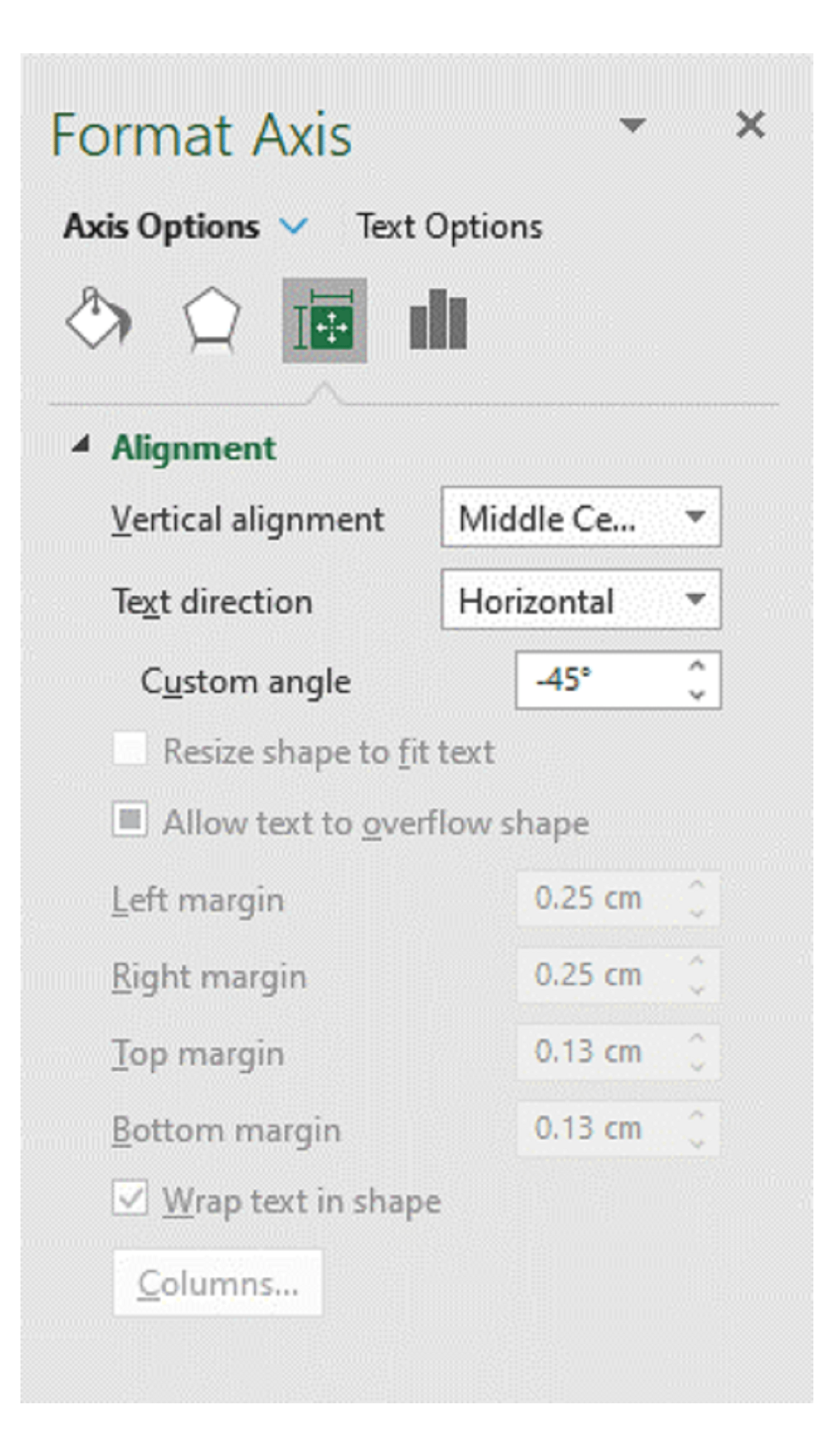
For the horizontal axis the number option can also be used for dates, there is a useful tick box called ‘Link to source’ at the bottom of the list. If this is checked then whatever the format that is used in the data source will be repeated. If it is mmm (three letter month abbreviation) then that is what will be displayed. Change the source data format on the Worksheet to mmmm (full length word for each month) and the chart will similarly change.
However, some of the words are quite long and this can make the axis text look somewhat clumsy. An option is to show them at an angle. If they have not already formatted for you go to right click on the horizontal axis and click Format Axis… on the Axis Options tab – Alignment. Under Custom angle enter -45 which will show them at an angle as shown below.
The final version now being:
As with the previous articles the best way to understand all the options is to simply play and explore the range of permutations that are available.
- Exploring Charts (Graphs) in Excel – Part 2: Sparklines
- Exploring Charts (Graphs) in Excel - Part 3: Line Charts
- Exploring Charts (Graphs) in Excel - Part 4: Enhancing line charts
- Exploring Charts (Graphs) in Excel - Part 5: Column/Bar Charts, Clustered, Stacked and 100%
- Exploring Charts (Graphs) in Excel - Part 6: enhancing bar charts – creating funnel and tornado charts
Archive and Knowledge Base
This archive of Excel Community content from the ION platform will allow you to read the content of the articles but the functionality on the pages is limited. The ION search box, tags and navigation buttons on the archived pages will not work. Pages will load more slowly than a live website. You may be able to follow links to other articles but if this does not work, please return to the archive search. You can also search our Knowledge Base for access to all articles, new and archived, organised by topic.
