In the new era of digitalisation, there are emerging challenges relating to the new technology risks while fraud risk increases, adopting new and innovative methods in line with technological progress. In this environment, audit should develop data analytics skills that are beyond traditional risk monitoring and fraud detection tools to meet stakeholders’ evolving expectations.
The good news is that there are alternatives for performing more advanced analytics in a “no-code environment”. A recurring topic for auditors has always been the identification of irregularities or anomalies in a population which may indicate errors, omissions or fraud. Clustering is a data analytics technique that can be a useful tool to assist this pursuit. Nevertheless, not all auditors are familiar with coding languages that traditionally are required to perform such calculations.
Being internal auditors, we have experimented with clustering both in coding and no-coding environments. In this context, we soon realised the potential of Power BI to support users who are not programming language experts, while enabling the execution of externally developed machine learning scripts, therefore integrating other powerful tools.
What is Clustering?
Clustering is an unsupervised Machine Learning (ML) algorithm (i.e. an algorithm that learns and improves from experience, without input from users) that looks for patterns in data by dividing it into clusters. These clusters are created such that the points are homogenous within the cluster and heterogenous across clusters. Clustering is commonly used in market segmentation and several areas of marketing analytics as well as in fraud detection.
A Practical Example: Outliers (Fraud) Detection – Credit Card Purchases
We used the ML clustering functionalities of Power BI Desktop to identify outliers that could serve the purpose of potential fraud detection, taking the following data analysis steps:
1. Exploratory Data Analysis (EDA) – Know-Your-Data
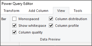
- Power BI through the Power Query Editor offers an overview of the dataset, assisting evaluation of the data validity and cleansing needs. It allows for an analysis of the data including column statistics like error, empty cells, unique values, min, max, average, standard deviation etc…
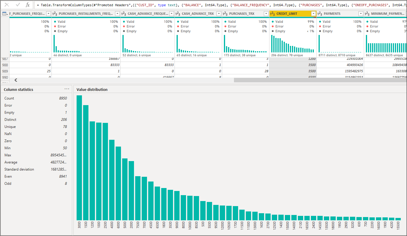
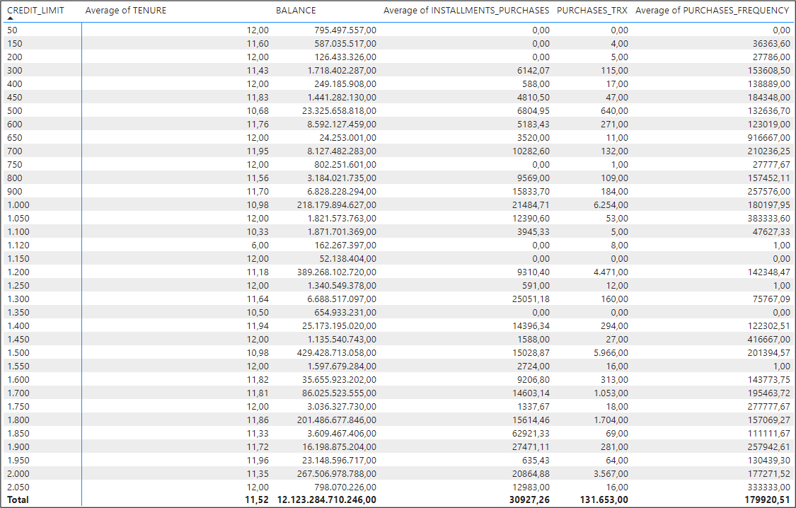
- Aggregated tables & matrices (like pivot tables in excel): This is the first step that should be ideally performed in every dataset. It provides a good insight into the data we are processing as you may aggregate its data type (categorical/numerical) while also identifying which columns should be further analysed and/or cleansed (e.g. nil, missing or erroneous/irrelevant values). We note that the dataset we are working on has no categorical/qualitative criteria relating to the customers e.g. demographic criteria. Therefore, we focused our analysis on the numerical aspects i.e. number of lines, total and average balances & purchases etc.
This is an example of an aggregated table where we have filtered out the null values of the ‘credit limit’ column (one case as shown above):
- Data cleansing: Data exploration reveals blank values in the dataset. There is a variation of techniques to deal with missing values (e.g. exclusion, fill in with average). We decided to only filter out of our analysis the rows where the credit limit is blank (one such case).
- Correlation plot (‘get more visuals’ section – right-click on the three dots): highlights correlations among the different data columns that could be useful for our analysis. It investigates the dependence between multiple variables at the same time and highlights the most correlated variables in a data table. Note that although this may indicate related variables, additional statistical tests are required to confirm the dependence and the causality (which variable causes the movement of the other), which goes beyond our analysis.

2. Clustering Graphs – Know-Your-Model using Visualisation
Power BI offers various clustering graphs, to assist in understanding how the model aggregates similar characteristics into clusters; the one that is most often used is the scatter plot which shows the relationship between two numerical values.
Additional visualisation is offered under the ‘get more visuals’ section – right-click on the three dots
Some useful visualisations include:
Scatter plot (included in default visuals)
Clustering helps us interpret a scatter plot. We selected to plot balance (as an independent variable on the x-axis) and purchases (as a dependent variable on the y-axis). We then opted for ‘Automatically find clusters’, that creates the graph below.
It seems that the clusters are grouped based on the volume of the balance, i.e. the amount left in the account to make purchases.
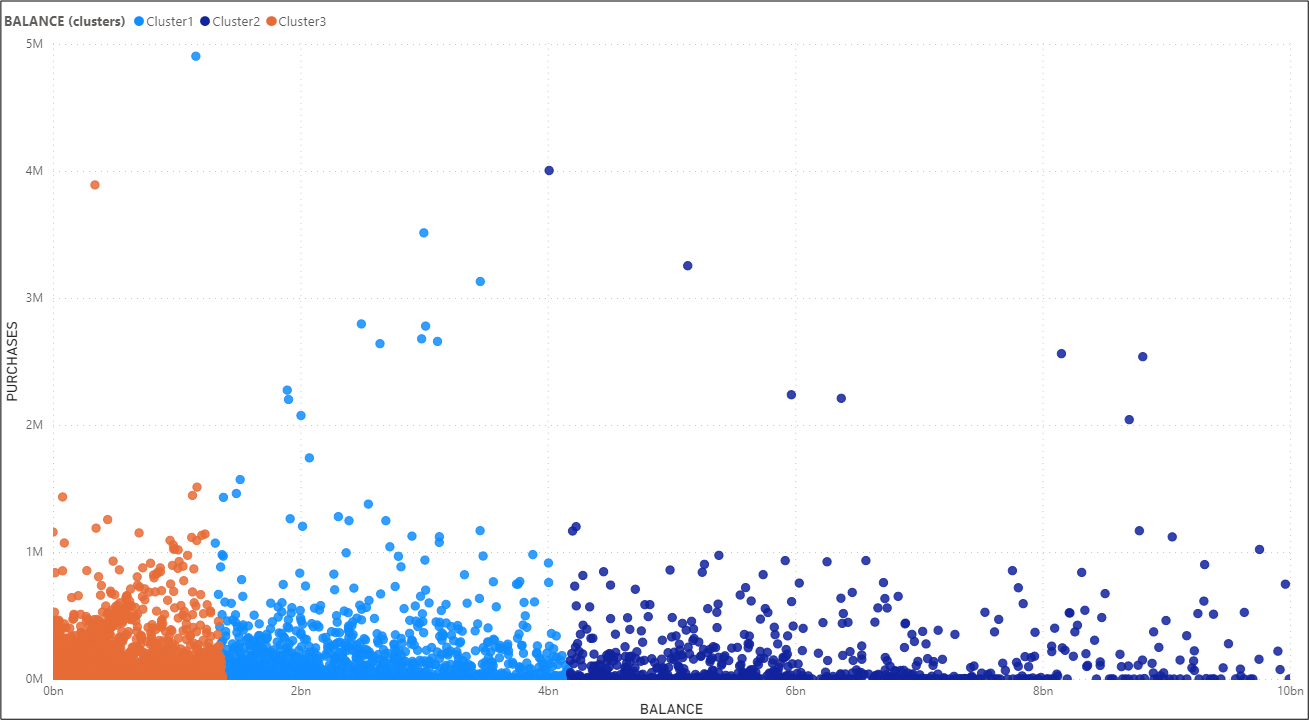
Clustering graph
Apart from the scatter plot visual that allows clustering and is included in the default visuals of Power BI, other clustering visuals can be found through the ‘get more visuals’ section.
We selected the ‘Clustering’ graph, as one which is Microsoft-developed. This visual uses a well-known k-means clustering algorithm. You can control the algorithm parameters and the visual attributes to suit your needs.
We note that the specific graph (as well as other graphs that run ML algorithms) require the installation of R studio.
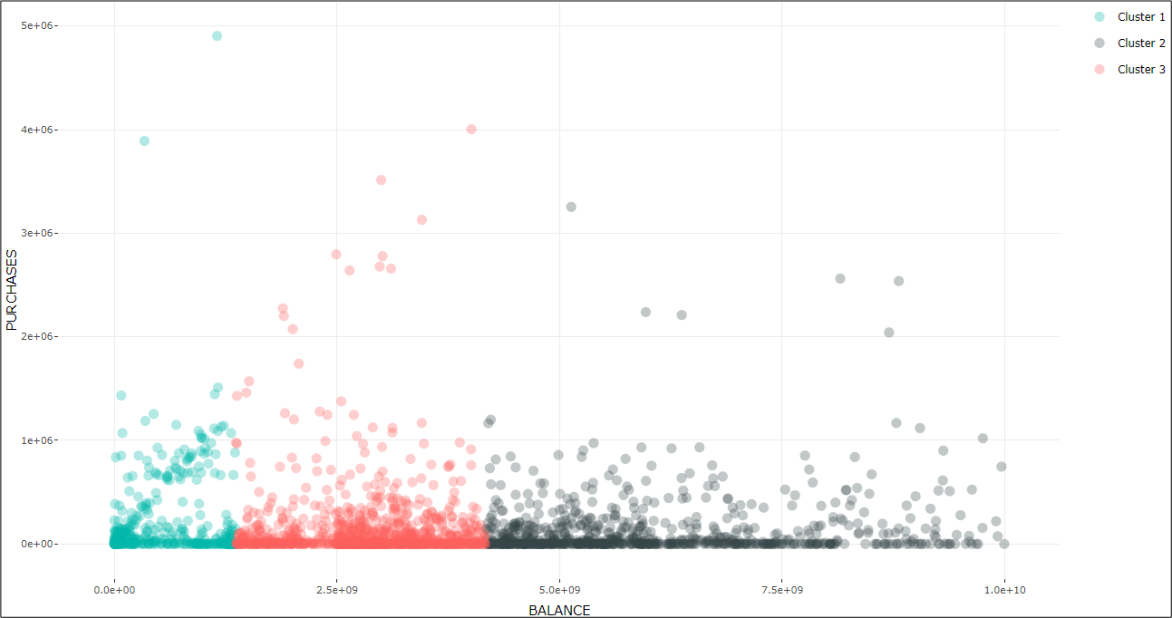
In both clustering graphs, Power BI automatically chose to classify data under 3 clusters. However, the user may opt for a predefined number of clusters, following a methodological assessment like the ‘Elbow criterion’ or the ‘Silhouette coefficient method’.
Outliers Detection graph
The outliers are those data points that are away from regular data points. As you may observe the outliers are the same in both charts above and are these data points with higher purchases that are away from the main population and do not form a tight cluster.
We also employed a graph to confirm our understanding of the outliers noted through the clustering process.
The ‘Outliers Detection’ graph – which again you can find under the ‘get more visuals’ section – can be used to confirm understanding of outliers noted through the clustering process. Here, it denotes the blue-coloured data points as the inliers and the red-coloured as the outliers.
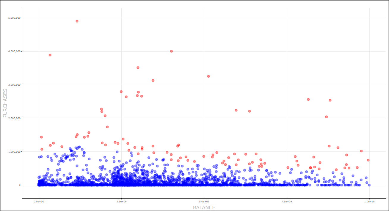
Power BI gives the user a good overview of this graph. In particular, in this Custom Visual, we can implement one of five popular detection methods: Z-score, Tukey’s method, Local Outlier Factor - LOF method, Cook's distance, and by manually defining upper and lower thresholds.
We selected the Cook’s distance as this is the most commonly used diagnostic statistical value.
One Cluster to Rule Them All?
Following the identification of the outliers, you could choose a sample for further investigation to understand the reasons behind the outlier classification and verify whether these could relate to fraudulent transactions.
An auditor may benefit more from the flexibility and variety of a programming language that offers a deep dive view through machine learning and the ability to more precisely define the clustering, however, lack of coding skills should not be an obstacle when there are no-code alternatives that can serve the same purpose. Of course, even though Power BI offers a variety of choices – or can remove choice entirely, for example through the automated determination of clusters – there are many sources available for a user to go deeper and have a better understanding of the mechanics behind calculations!
Notes about the dataset
About the authors:
Polyna is member of both Eurobank Internal Audit Data Analytics team and the Finance & Global Markets Audit Division. She is an Associate Chartered Accountant (ACA) and holds the ICAEW Data Analytics Certificate
