
Hello all and welcome back to the Excel Tip of the Week. This week, we have a General User post in which we’re taking a look at two more unusual chart types that were added to Excel for the 2016 version: Treemap and Sunburst charts. These are both types of hierarchy charts designed to show layered categories of items.
Laying out our data
Both of these chart types are designed to show amounts or constituents of items in a layered hierarchy. For example, we could look at sales by country and product. In order for either chart type to work, we need to sort the data so that all the items with the same label are sorted together. Here’s an example:
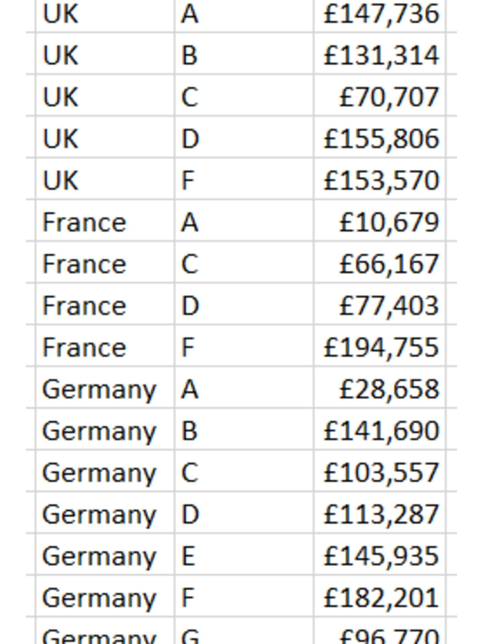
We have a top-level category (country), an item-level category (product), and a value for each. Again, we need to sort this chart to keep the chart working properly.
Note that Treemap charts can only really handle two layers – but Sunburst charts can have more. We’ll explore that later.
Making and customising our charts
From the above data, this is what we get from Insert => Hierarchy Chart => Treemap:
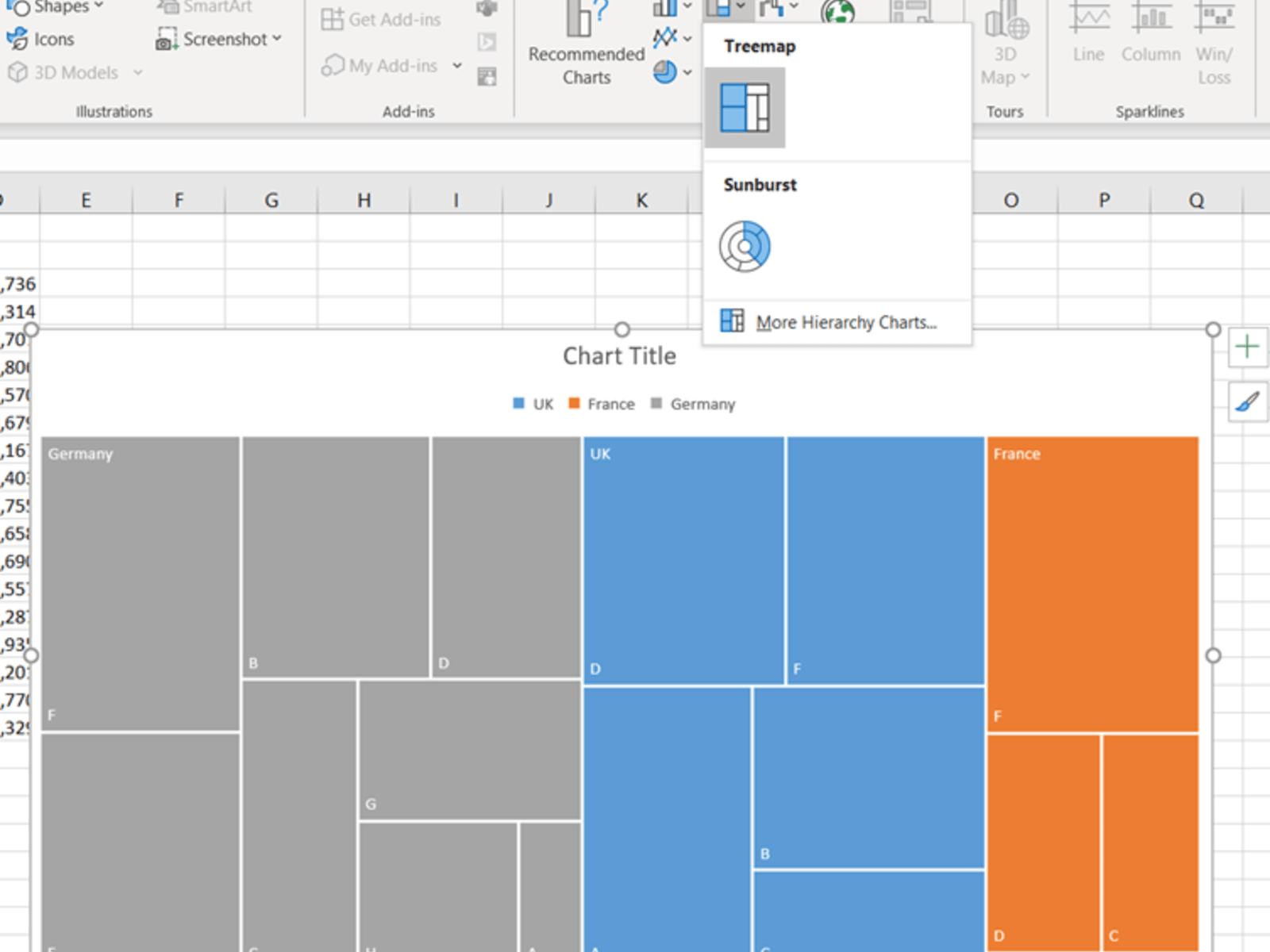
A treemap shows a rectangle for each subcategory’s value, with the area approximately proportional to the value. The rectangles are grouped together into the categories in the original chart. We can tidy this up a bit by removing unnecessary labelling and adding values to the labels with a right-click.
Another neat feature of Treemap charts is that they automatically redraw if we resize the window. Here’s our finished product:

You can see this chart in the accompanying file.
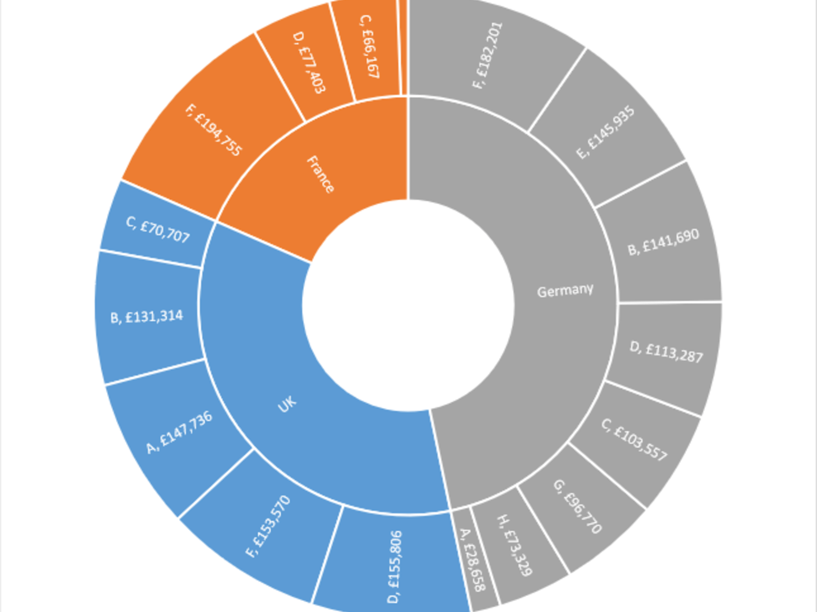
We can make a sunburst chart in the exact same way. This is a ring-based version of the same basic concept:
Going further
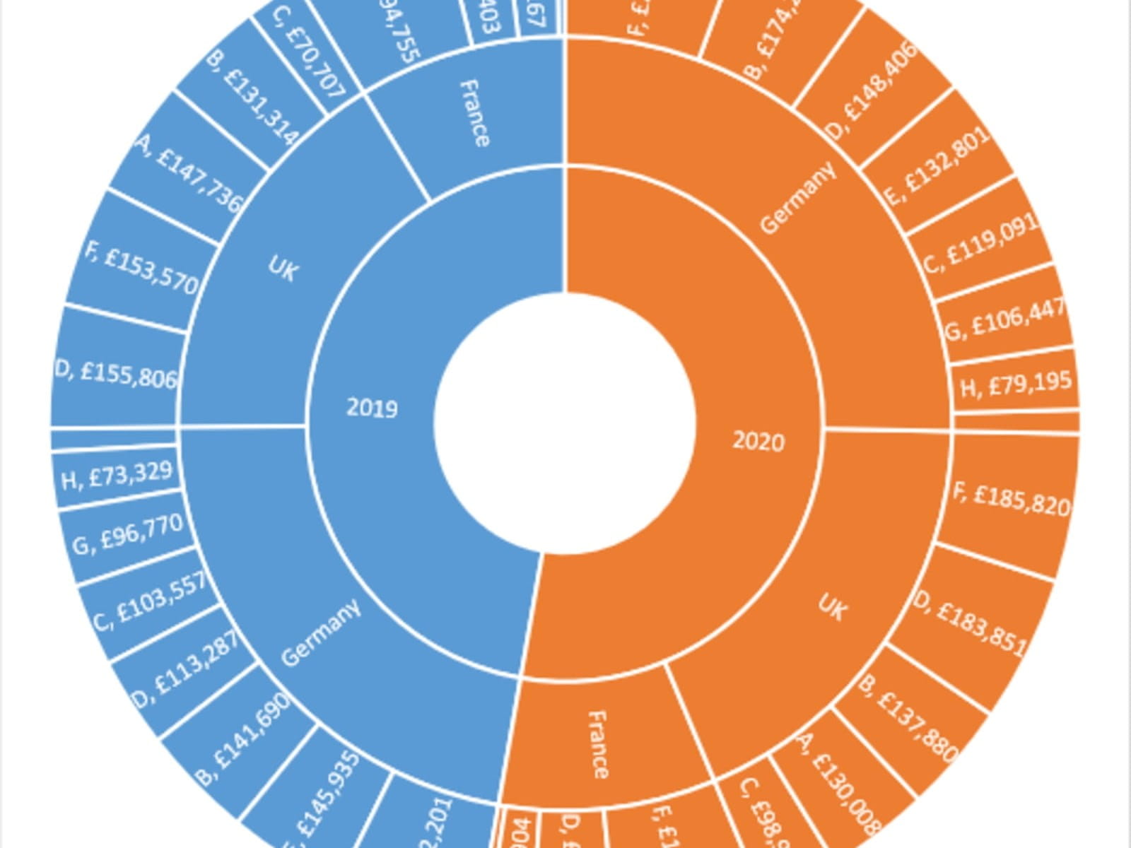
One simple extension we can do with the Sunburst chart is to add another level of detail. Here’s the same data but with two years’ data included:
Of course, you can also reorder the columns and data to change how the chart works.
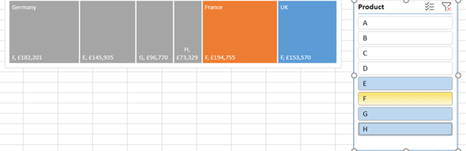
You can also use Insert => Slicer for both kinds of chart – this will give you a quick and easy way to filter which data is included in the chart. You do need to format the source data as an Excel Table for this to work.
You may also like
- Excel Tips and Tricks #506: Creating a single master list after merging data
- Excel Tips and Tricks #505 – 3 ways of converting US Dates into UK formats
- Excel Tips and Tricks #504 - Accessing accessibility checkers for good spreadsheet practice
- Excel Tips and Tricks #503 – Printing under pressure, super quick presentation tips
- Excel Tips and Tricks #502
Archive and Knowledge Base
This archive of Excel Community content from the ION platform will allow you to read the content of the articles but the functionality on the pages is limited. The ION search box, tags and navigation buttons on the archived pages will not work. Pages will load more slowly than a live website. You may be able to follow links to other articles but if this does not work, please return to the archive search. You can also search our Knowledge Base for access to all articles, new and archived, organised by topic.
