
For this final blog in the series, we sweep up a few of the more unknown charting features that can add significant value to the display of data.
Controlling zeros or missing data
When analysing data there can be some instances of missing values. These can be entered as zeros or left blank. Unless controlled appropriately they can give rise to false impressions being created. Take for example the following series of observation data where the number for June is missing.

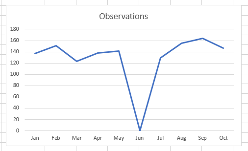
The plumet shown on the chart for June looks alarming and perhaps the absence of a data item becomes the chart’s most significant attribute.
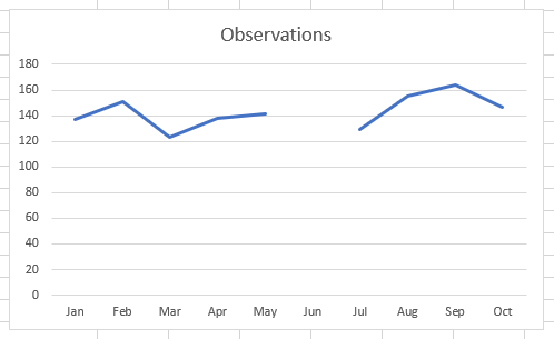
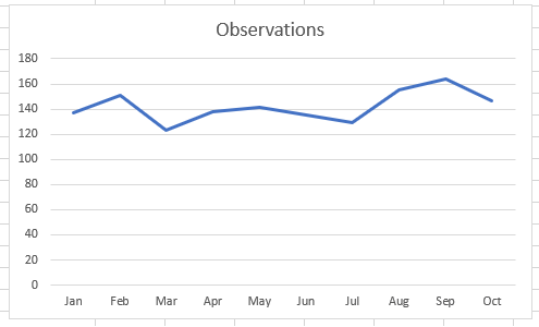
One alternative is to leave the value for June as blank and it is interpreted as a gap in the data:
Instead of using a zero or blank for the missing item there is the function =NA() which has the same effect as a blank. This function does not look very elegant and for those unfamiliar with its use, it can appear more like an error than a purposeful function. The benefit is to automatically prevent zeros in chart data. Before drawing a chart test each item using an IF statement. If data is present then display it alternatively use =NA(). Plot the tested data to ensure no unexpected zeros.

There are some other options for handling this missing data that are accessed via the Select Data Source Dialog Box. On the chart right click a line and then click on Select Data…
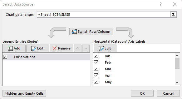
At the bottom left click on the Button for handling Hidden and Empty Cells (this button was first mentioned in Blog 3 and its explanation deferred until this Blog).
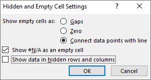
The initial part offers a set of three options for handling empty cells these can be displayed as a gap in the line, as a Zero value or a line can link the points either side thus removing the focus that the previous two options unhelpful give to the missing data. The ‘bridged’ chart looks as follows:
The other two tick boxes at the bottom allow N/A to be shown as an empty cell (the default) and if there are hidden rows and columns, these can still be plotted even though the data in those cells may not be visible.
Conditions to highlight attributes
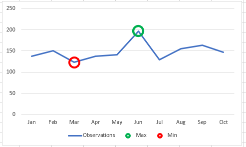
On a chart it may be helpful to highlight attributes such as a peak or trough. This can be done manually, but if data is changing it is much more effective to automate these highlights. Take the example below that highlights the Maximum and Minimum of the line.
To do this you will need the following data. As explained in previous blogs if you want to plot different colours on a chart each one needs to be a separate data series. Therefore three rows of data are needed as follows:
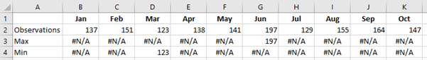
To create the Max and Min lines use an =IF statement with the =NA() Function used for the points that are not the Maximum or Minimum.
For example:
G3 to highlight the Maximum number =IF(G2=MAX($B$2:$K$2),G2,NA())
G4 to highlight the Minimum number =IF(G2=MIN($B$2:$K$2),G2,NA())
To turn them into circles at the Max and Min point:
- Highlight the data bloc (A1:K4) and click on a 2-D line chart
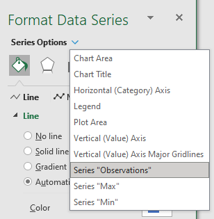
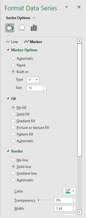
- Right click the line and select Format Data Series
- Under Series Options at the top of the dialog box select Series “Max” (as shown below)
- Select the Fill & Line option set (The tipping paint pot icon)
- Click on the Marker options at the top of the dialog box
- Under Marker Options select Built-in, select Type as a Circle and change size to 15 (as shown below)
- Under Fill select No Fill
- Under Border select Solid Line, select your Color and set Width to 3pt
- To remove the Line through the circle on the legend click on the Line options at the top of the dialog box and in Line select No line
Repeat the steps for the Series “Min”.
There are numerous permutations, marker types and formats to select from.
Using the chart in other applications
To be able to display the chart in other applications such as Word or PowerPoint there are two options. The easiest is to save the chart as a picture and paste this into other applications. The chart will remain static and un-editable. To grab the chart right click the border around the edge and select the option Save as Picture…. A number of formats are provided Jpeg, Bitmat etc. To get the best resolution for the picture make sure the image is as large as possible before saving.
The alternative is to add it to your application as an editable file. For this option right click the border as before and this time select Copy and then Paste it into the other application. The data comes across with the file and all aspects can be edited from within the new application.
Series concludes
I hope these blogs have been helpful to you in creating charts that will enable you to enhance the way you report results with additional clarity and impact.
- Exploring Charts (Graphs) in Excel – Part 2: Sparklines
- Exploring Charts (Graphs) in Excel - Part 3: Line Charts
- Exploring Charts (Graphs) in Excel - Part 4: Enhancing line charts
- Exploring Charts (Graphs) in Excel - Part 5: Column/Bar Charts, Clustered, Stacked and 100%
- Exploring Charts (Graphs) in Excel - Part 6: enhancing bar charts – creating funnel and tornado charts
Archive and Knowledge Base
This archive of Excel Community content from the ION platform will allow you to read the content of the articles but the functionality on the pages is limited. The ION search box, tags and navigation buttons on the archived pages will not work. Pages will load more slowly than a live website. You may be able to follow links to other articles but if this does not work, please return to the archive search. You can also search our Knowledge Base for access to all articles, new and archived, organised by topic.
